
A BIRTHDAY TRIBUTE: The late, great DC letterer was born 129 years ago…
We’ve paid tribute to DC letterer extraordinaire Ira Schnapp (October 10, 1894 – July 24, 1969) many times over, but we’ve mostly focused on his Silver Age designs.
This year we’re picking 13 SUPERB IRA SCHNAPP DC COMICS LOGOS FROM THE GOLDEN AGE, including excerpted commentary by the pre-eminent expert in the field, letterer Todd Klein.
This is not even close to a comprehensive list. Rather, it’s a selection of 13 I dig. Oh, and be sure to check out Todd’s blog. That’s not just a rabbit hole, it’s a rabbit warren.
Swell!
The picks are mine. The words are Todd’s.
—
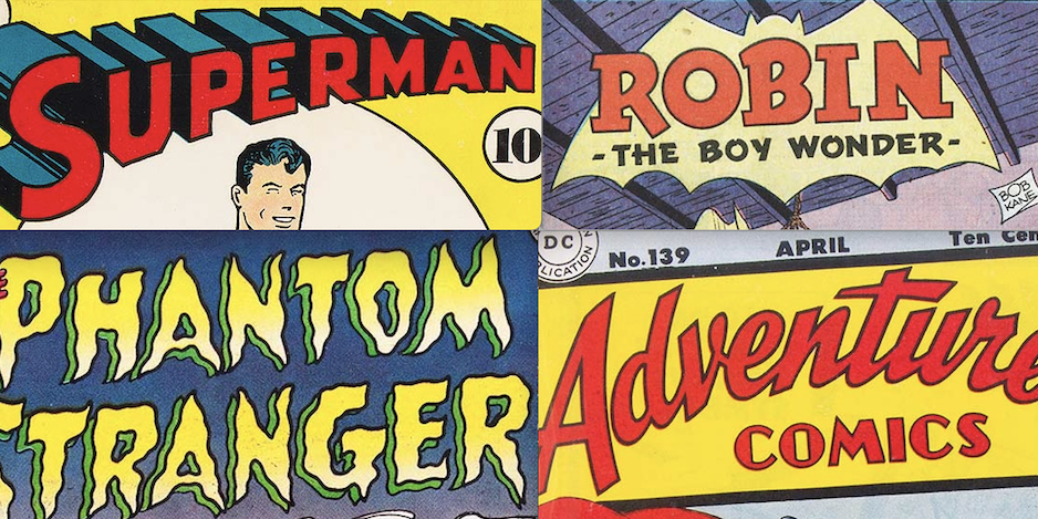
SUPERMAN

All images © DC Comics. From Superman #6, Sept-Oct 1940
I’m starting at the beginning of Ira Schnapp’s logo work at DC with his revamp of Joe Shuster’s Superman logo, above. Ira told a young Michael Uslan it was his first logo for DC, and I have no reason to doubt that. More about this logo is HERE. At the time, Ira was a busy freelancer probably designing logos for the pulp magazines owned by Harry Donenfeld and Jack Liebowitz as I describe in a series of articles beginning HERE. He was also doing other kinds of freelance work such as showcard lettering on signs for movie theaters in Manhattan, as he told artist Murphy Anderson.
Gradually he picked up more and more comics work from National (DC) Comics through the early 1940s, until by 1945 he was probably working almost exclusively for them. It’s hard to imagine he had time for much else! I have little hard evidence about who designed any of the early DC logos, but my ideas are in THIS article and more beginning HERE. Mostly I’m going by style, but a lot of guesswork is involved. Certainly his Superman revamp was excellent work that DC was very happy with, so it seems likely they would have offered him more.

Stationery header from an image found online, circa late 1940
It seems likely any variations of Ira’s Superman logo would have been done by him, and this is the earliest one I’ve seen, created for the company DC set up to handle Superman licensed products. The address is the same as the DC offices at the time, and this logo must have been created a month or three after Ira’s Superman revamp. Not a comics logo, but I think it counts in this case.
(Dates are cover dates where that applies, but keep in mind that those were at least two months later than the actual release date, and the work was probably done at least a month before that, so the Superman logo was probably created around June of 1940.)
—
ROBIN

From Star Spangled Comics #65, Feb 1947
Robin received a solo feature for the first time in Star Spangled Comics #65, and a new feature logo by Schnapp. ROBIN is based on the one in this older logo by Jerry Robinson that began appearing in the summer of 1941:

Ira’s version copies some of the letter shapes, but his right leg of the R looks better to me, and the serifs are wider and more effective, even with one missing from the upper left corner of the N. Ira’s tagline THE BOY WONDER is in a style he was using at the time with squared-off strokes that leave small notches in some places. The bat shape is not as good as Robinson’s but gets the idea across. Ira’s feature logo for Robin was used for many years.
—
WONDER WOMAN

From Wonder Woman #60, July-Aug 1953
Wonder Woman’s original writer and co-creator William Moulton Marston had died in 1947. His artist collaborator H.G. Peter continued as the character’s artist for another 10 years, but Robert Kanigher, the book’s editor, gradually took over writing the stories and moving the character away from Moulton’s ideas into ones he felt were more in line with DC’s other superheroes. One step in that process was this new logo design by Ira Schnapp, replacing the original elegant script one I think was by Peter. There’s still a script influence, but Schnapp’s very bold letters are separated rather than joined, and more like block lettering than script. This logo would last for years. While I like it, it always bothered me a little that the E and R of WONDER are not joined together, though they seem to be reaching for each other.
—
AQUAMAN

From More Fun Comics #100, Nov-Dec 1944
The next logo I suspect might be by Schnapp is this one. Aquaman was created in 1941 by writer Mort Weisinger and artist Paul Norris, and first appeared in More Fun Comics #73. He had many logo variations on his stories, probably by artists Paul Norris and later Louis Cazaneuve, and/or the letterer for any particular story. At the time, feature logos were not always prepared and reused, some artists redid the logo as if it were a story title on every issue, or at least did many different versions, and that happened with Aquaman. See THIS post for more on that.

From More Fun Comics #97, May-June 1944
This was the version that appeared in Issue #97. As you can see, it’s pretty close to the one above, but uneven and kind of bottom-heavy. I think Ira was asked to created a revised and more professional version that could become the regular series logo, and if so, he did a fine job. He retained the most interesting parts of the previous one: the bubble-like openings in the A’s and Q and the fish-tail look of the Q’s extension, made it more even, and gave it a better drop shadow. This logo was used on all Aquaman stories going forward, and even on the covers of Aquaman’s appearances in Showcase in the 1960s. Ira created a new Aquaman logo when his own title was launched.
—
ADVENTURE COMICS

From Adventure Comics #139, April 1949
Schnapp continued his roll of fine logos with this vast improvement over the previous Adventure Comics logo. COMICS keeps the old design, but I think redrawn by Ira, and ADVENTURE is a much better open script treatment than the one on the book for many previous years. Again the arc adds interest, and this logo is in a slightly tilted box, as was the style for other titles at the time like Action and Detective, giving these superhero anthologies a similar look that fans could spot quickly.
—
SUPERBOY (Early)

From More Fun Comics #101, Jan-Feb 1945
The next issue of More Fun after Aquaman’s revised logo saw the beginning of a new feature starring Superboy, and it had another logo by Schnapp based on his Superman one. This logo appeared only on a few covers as part of the caption, small, and when he gained his own series in 1949, it had a completely new logo by Schnapp. Here the B and O have angled corners like the U, though the P and R keep the original rounded ones. This logo might have been produced earlier in the 1940s.
—
SUPERBOY (Later)

From Superboy #1, March-April 1949

Original logo from the DC files.
With this logo, I feel that Ira Schnapp had truly arrived at his role as the primary logo designer for National (DC) comics. Perhaps for legal reasons, it did not follow the style of Ira’s Superman logo but headed off in a new direction. The influence is Art Deco, the curve adds interest, and the drop shadow provides a three-dimensional aspect as the logo seems to float above the cover. It’s friendly and appealing, perfect for the character. From this time forward Schnapp would design logos for nearly all new titles at DC until he left the company in 1968, even as he set the style for the publisher through lettering nearly all the covers and house ads as well.
—
REX, THE WONDER DOG

From The Adventures of Rex the Wonder Dog #1, Jan-Feb 1952
When National (DC) Comics and All-American Comics merged around 1946, that brought in a raft of All-American titles with logos Ira Schnapp did not do, but over the next few years some of those were cancelled and others were renamed because of a genre change. A few of DC’s long-running titles had logos created before Ira began working at the company like Action Comics and Detective Comics, but all the new titles of the late 1940s and 1950s were designed by Schnapp. Above is the first new one for books with 1952 cover dates. I think it’s one of Ira’s best. The short word REX gets the most space and attention, but the tagline THE WONDER DOG is equally appealing. THE ADVENTURES OF is again pulled from a previous title, The Adventures of Ozzie and Harriet. If Rin-Tin-Tin and Lassie could attract movie viewers, why not a comic about a dog? It did pretty well.
—
THE ADVENTURES OF DEAN MARTIN AND JERRY LEWIS

From The Adventures of Dean Martin and Jerry Lewis #1, July-Aug 1952
Bob Hope had been a hit in a DC comic, and Martin and Lewis were equally popular, suggesting that movie comedians were a better choice than stars like Alan Ladd. This title is WAY too long, but Ira makes it work by cleverly emphasizing and matching the words MARTIN and LEWIS on the bottom line, with double borders for a second color. THE ADVENTURES OF looks like type, but I think it’s lettered by Ira in his block letter style.
—
THE PHANTOM STRANGER

From The Phantom Stranger #1, Aug-Sept 1952
DC tried another “mystery” title with a story host like EC Comics, but it did not sell well or last long. The character later became a mainstay of the company’s spookier types. Ira Schnapp rarely seemed to do well with scary logos, and this is no exception. The wavy outlines tend to look poorly-drawn rather than ghostly or frightening to me.

Before settling on the name for the series, DC was considering a different one and had Schnapp also design this logo for an ashcan, a hand-made sample sent to the U.S. Copyright Office to secure rights to the name. A similar one was probably made for Phantom Stranger, but is not in public hands if it still exists; the one above was found on the Heritage Auctions site ha.com where Alex Jay spotted it, thanks Alex! For some reason I like this logo a little better than the one that was chosen. While STRANGER is very similar in each, there are differences, showing that Ira completely drew the word twice. Note that the cover art and contents on ashcans were completely random and had nothing to do with the name.
—
STRANGE ADVENTURES

From Strange Adventures #1, Aug-Sept 1950
Editor Julius Schwartz had been an early science fiction fan and agent before taking a job at All-American Comics, and then when that company merged with National (DC) became one of their long-term editors until his retirement. I imagine this was something he campaigned for, and in 1950 he was finally able to launch a science fiction anthology.

Original logo from the DC files
Ira’s logo, seen here in a later version where the black areas were opened up for color, suggests he was looking at science fiction pulp magazines, perhaps provided by Julie as examples. It could also be showing the inflluence of science fiction movies, and the first issue featured a short adaptation of one, “Destination Moon.” The block letters themselves are ordinary, it’s the angle and the telescoping that make it memorable. Science fiction fans were often comics fans, and this book was a success that led to more.
—
HOUSE OF MYSTERY

From House of Mystery #1, Dec 1951-Jan 1952
Always looking to expand their line, it was inevitable that DC would try horror comics, though theirs were mild compared to others on the market, and they preferred to call them “mystery” comics after this first title. Ira’s logo is not at all scary (perhaps a good thing, as scary was not a strong point for him), but the open letters with a drop shadow are effective all the same.

Here’s a photostat of a later version from the DC files with the drop shadow opened up for color. Not as effective in black and white, but it worked fine on the covers.
—
GANG BUSTERS

From Gang Busters #1, Dec 1947-Jan 1948
With the appeal of superheroes falling, DC was looking to branch out into as many new genres as possible, and this was their first entry into crime comics that didn’t involve a superhero. Again, it was based on a popular radio show, and the series did well. The feel is again Art Deco, which seems appropriate for a genre that first became popular during Prohibition years in pulps and movies when Art Deco was the latest thing.
—
MORE
— PAUL KUPPERBERG: My 13 Favorite DC HOUSE ADS Lettered by IRA SCHNAPP. Click here.
— 13 GROOVY Silver Age GASPAR SALADINO DC Comics Logos. Click here.
October 11, 2023
Happy late birthday to the late Ira Schnapp. You did a fantastic job discussing his tenure at DC Comics.
October 13, 2023
Unforgettable fonts