
A BIRTHDAY TRIBUTE to a comics workhorse…
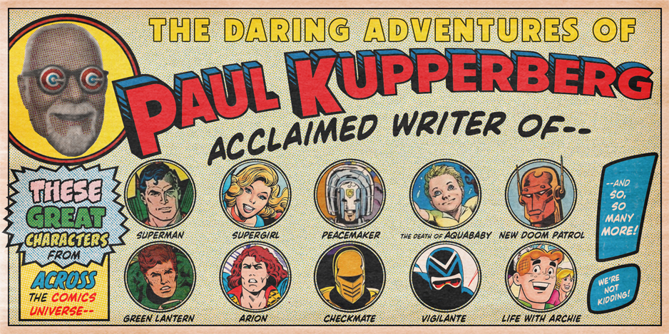
By PAUL KUPPERBERG
For every comic book Mount Rushmore, there’s a face just out of frame, quietly doing the heavy lifting while flashier names soak up the spotlight. In Marvel Comics’ formative years, that face belonged to Don Heck (January 2, 1929 – February 23, 1995), to my mind the most overlooked of the original Marvel artists working alongside Jack Kirby and Steve Ditko.
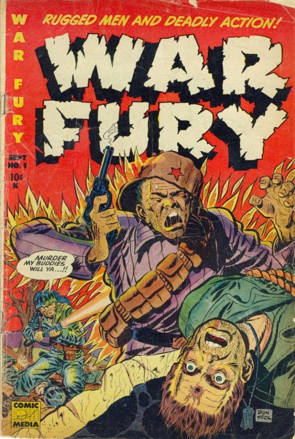
Heck got his start working in the production department at Harvey Comics before following fellow employee Allen Hardy over to newly formed publisher Comic Media, where he produced his first work for comics, the cover and an 8-page story for War Fury #1 (September 1952). He freelanced for a variety of publishers, including Quality and Hillman, before arriving at Marvel (then Atlas) in 1954 and he would stay through the company’s explosive Silver Age growth, proving his versatility by working across an impressive range of genres. Don drew everything the company put in front of him: crime stories with hard, unsentimental edges; war tales that emphasized mood and human cost over spectacle; Westerns populated by weary lawmen and moral gray areas; and romance comics that required a deft touch with facial expression and body language.
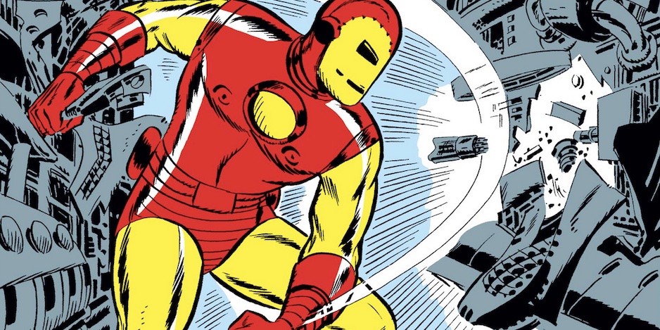
While Kirby thundered and Ditko brooded, Heck’s work was clean and clear — with distinctive characters, storytelling with expressive figures, and an intuitive sense of pacing. And while it was Jack Kirby who drew the cover to Tales of Suspense #39 (March 1963) and designed the gray armor that introduced Iron Man to the world, it was Don who “created the look of the characters, like Tony Stark and his secretary Pepper Potts,” according to the artist in Les Daniels’ Marvel: Five Fabulous Decades of the World’s Greatest Comics (Abrams, 1991).
I liked Don Heck’s work in those early Marvel years. He wasn’t explosive like Kirby or idiosyncratic like Ditko, but his style was distinctive and solid, and he finally cemented his place in the Marvel Universe when he took over as penciller on The Avengers, beginning with the ninth issue (October 1964). He was all over that universe across the 1960s: In addition to Iron Man and The Avengers, he did the Ant-Man strip in Tales to Astonish; The X-Men, The Amazing Spider-Man, and Captain Marvel, as well as an endless stream of short stories for anthology titles.
But in the words of the late Rodney Dangerfield, Don Heck didn’t get no, or at least not very much, respect. Always overshadowed by Kirby and Ditko, Don was now faced with younger, flashier talents who were coming into the business. The veteran artist was feeling undervalued at Marvel, despite being one of the company’s foundational talents and a co-creator of Iron Man. He had also become increasingly frustrated with Marvel’s production practices, particularly the so-called “Marvel Method,” where the writer would supply a brief plot — sometimes as vague as, “This issue, Iron Man versus Mandarin” — leaving it to the artist to work out the details and come up with 20 pages of story and action, but without any additional compensation or credit for essentially doing half the writer’s job.
Very few comics were created Marvel Method at DC in 1970. DC was old school and old school meant writers who wrote full scripts and artists who drew what the scripts told them. From 1977 to 1988, Don was exclusive to DC, co-creating Steel, the Indestructible Man with Gerry Conway, and working on characters including Wonder Woman, Batgirl, Flash, Aquaman, Hawkman, and the Justice League of America.
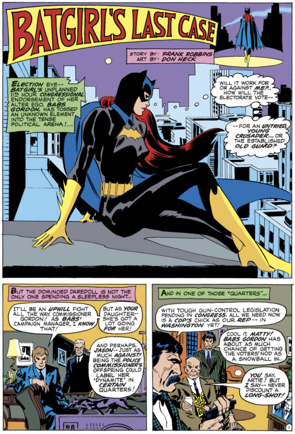
The timing couldn’t have been better for this young fan-turned-professional in 1975 to have Don draw several of my scripts, including the Aquaman strip in Adventure Comics and a story for Weird War Tales (which led to “A Comic Moment With” the artist in DC’s offices in 1979), as well as a back-up story in Checkmate #4 (July 1988).
Don Heck may never get the accolades of his peers, but Marvel, and comics as a whole, would look very different without him. Fortunately, the “Mount Rushmore of Comics” is purely hypothetical and fully customizable to individual tastes, so, if only for today, let’s welcome Don’s visage to those granite cliffs.
Here, then, MY 13 FAVORITE DON HECK COVERS:
—
War Fury #1 (September 1952). Don’s first professional job, a brutal pre-Code war scene complete with flame-thrower revenge!
—
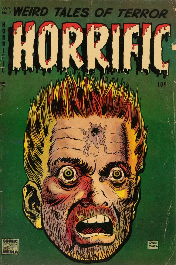
Horrific #3 (January 1953). It’s beautifully drawn, but hey, Comic Media, what was up with all the bullet holes in foreheads?
—
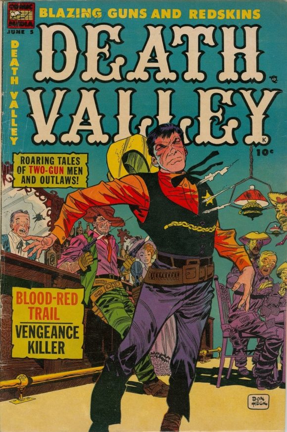
Death Valley #5 (June 1954). This time, a brutal but beautifully rendered pre-Code Western scene and, for variety’s sake, this one’s got bullets going through the torso instead.
—
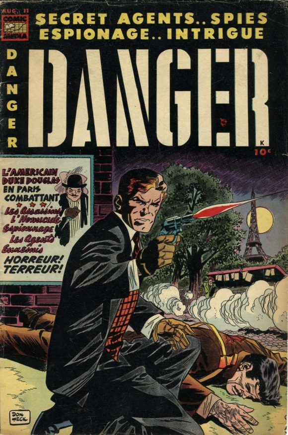
Danger #11 (August 1954). Shots fired, no idea whether they went through some guy’s forehead or not.
—
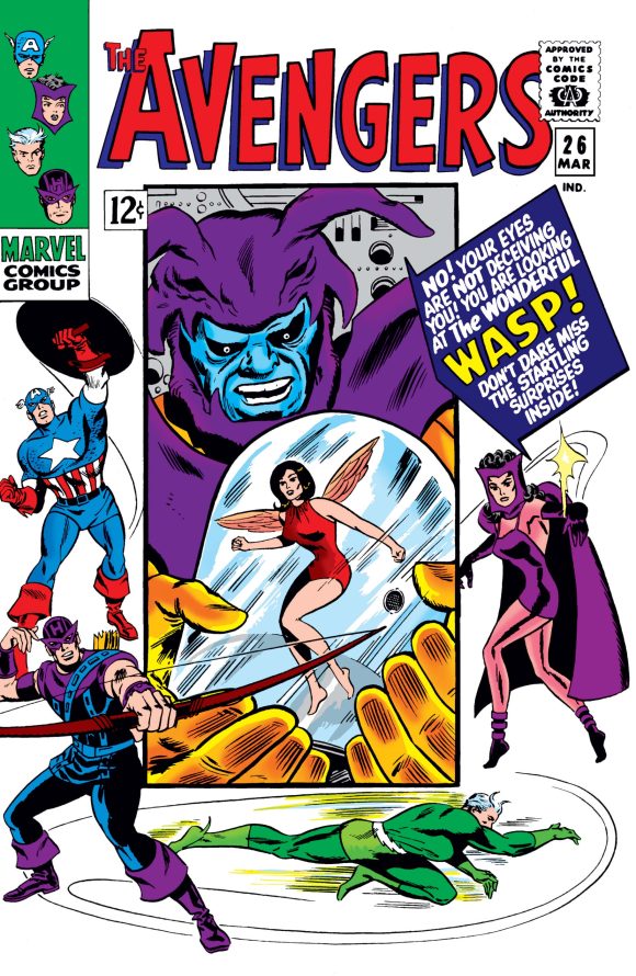
The Avengers #26 (March 1966). The Avengers is where I locked into my appreciation for Don’s art, and these covers were what first drew me to the book, long after he had taken it over. Inked by Frank Giacoia.
—
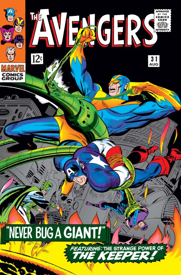
The Avengers #31 (August 1966). Thanks to his size, Hank Pym’s Giant Man/Goliath was guaranteed to dominate any cover, but Heck managed to give the giant his due without diminishing the importance of the other figures on the cover.
—
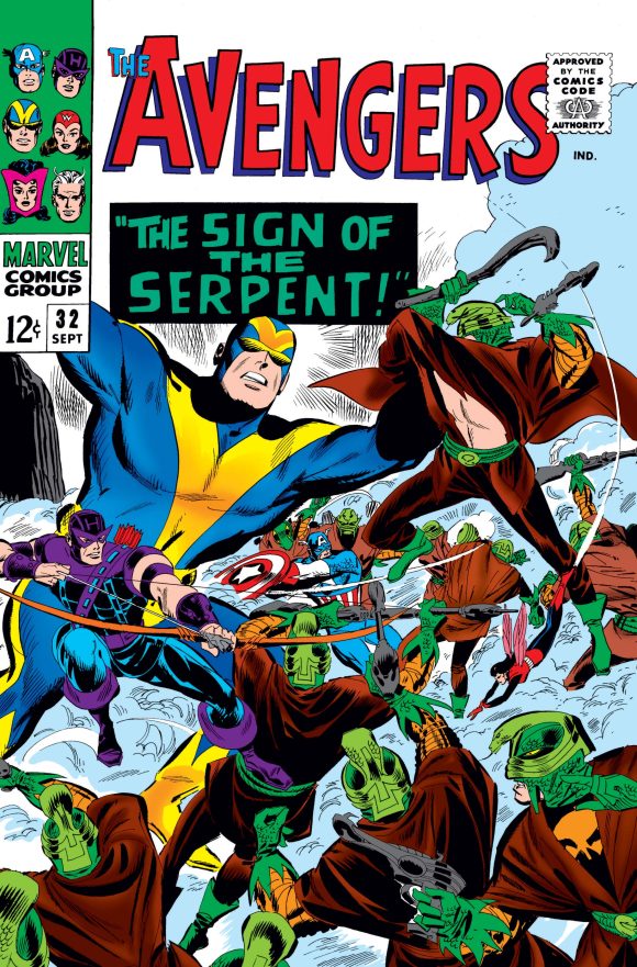
The Avengers #32 (September 1966). Ditto!
—
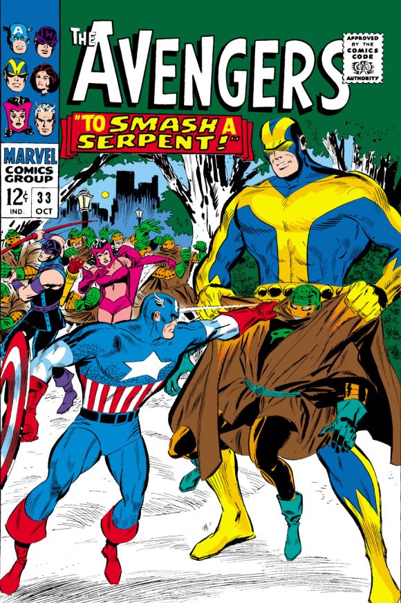
The Avengers #33 (October 1966). Heck takes a dozen figures—including one giant—and designs the image to tell a story, and does so in a way that leaves breathing space on the page.
—
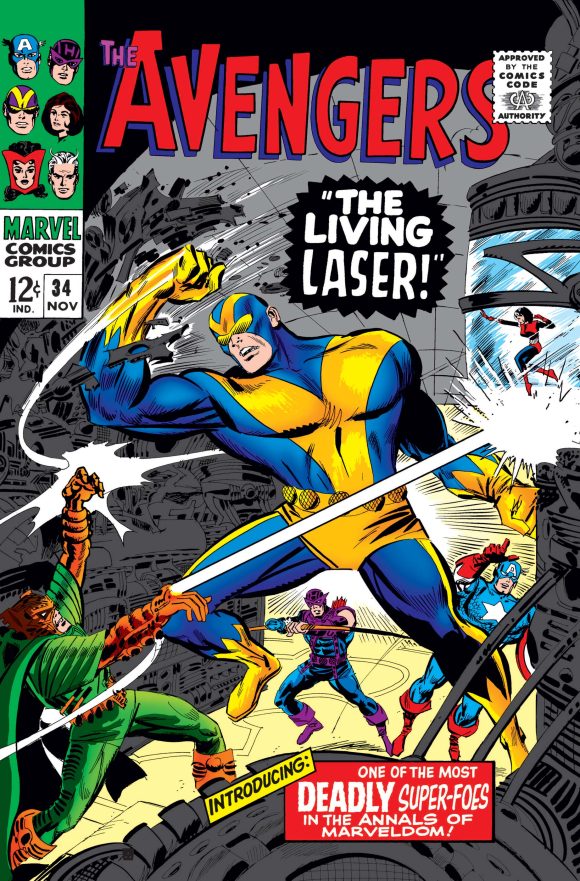
The Avengers #34 (November 1966). A powerful piece!
—
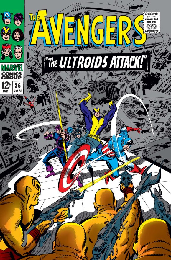
The Avengers #36 (January 1967). Again, Don’s sense of design and use of the space is impeccable.
—
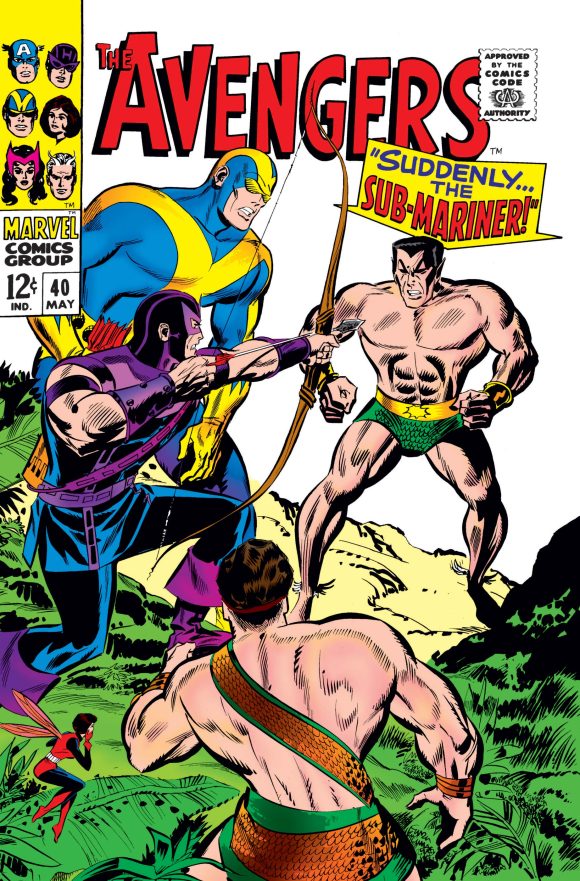
The Avengers #40 (May 1967). A tense moment of quiet menace!
—
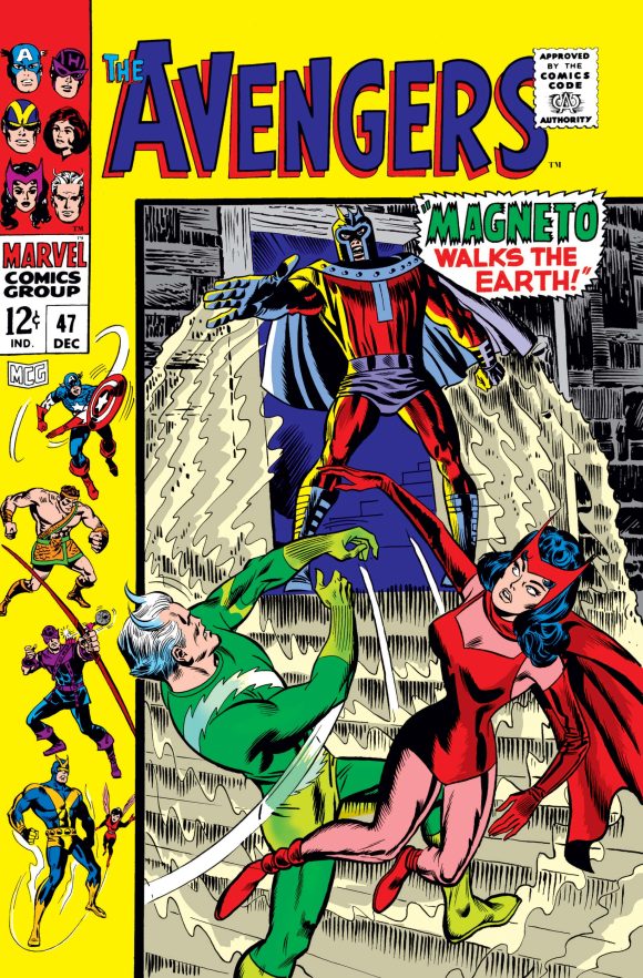
The Avengers #47 (December 1967). A tender family reunion. Inked by Frank Giacoia.
—
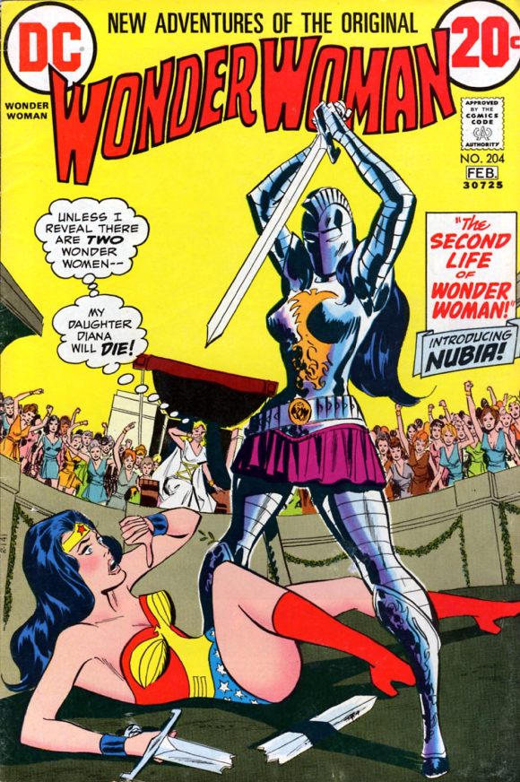
Wonder Woman #204 (January/February 1973). When her time with I Ching and wearing a white jumpsuit was finally wrapped up, Don was brought in to take over the book. And introduce Nubia! Inked by Dick Giordano.
—
MORE
— 13 SPLASH PAGES: The IRON MAN of DON HECK. Click here.
— 13 SPLASH PAGES: The BATGIRL of DON HECK. Click here.
—
PAUL KUPPERBERG was a Silver Age fan who grew up to become a Bronze Age comic book creator, writer of Superman, the Doom Patrol, and Green Lantern, creator of Arion Lord of Atlantis, Checkmate, and Takion, and slayer of Aquababy, Archie, and Vigilante. He is the Harvey and Eisner Award nominated writer of Archie Comics’ Life with Archie, and his YA novel Kevin was nominated for a GLAAD media award and won a Scribe Award from the IAMTW. Check out his new memoir, Panel by Panel: My Comic Book Life.
Website: https://www.paulkupperberg.net/
Shop: https://www.paulkupperberg.net/shop-1
January 2, 2026
As a young fan, I was always disappointed by Heck and other artists that seemed “lesser” in style compared to Kirby, Ditko, Adams, Steranko, etc…But it is the “unsung”+unseen workhorse that makes the industry go, so here is to you Don and to so many other “non-famous” artists…especially in the 60’s and 70’d
January 2, 2026
Was never a huge fan of Heck’s, though he was pretty good at his female characters. His pre-code horror work looks much more interesting, but I guess being a workhorse means reusing your own work: Horrific #3’s face is the same one on War Fury #1, lol.
January 2, 2026
THE AVENGERS was the first Marvel comic I started buying regularly. Just like Mike Sekowsky on JLA I bought that regularly also. Sure, I wish they could have been better, but I enjoyed it at that age. And I always remember the issue where Heck inked Kirby on a Captain America/Red Skull story in TALES OF SUSPENSE. I loved the look of that!
Over the years I got a greater appreciation for Don Heck’s work.
January 2, 2026
My first comic was a Detective Comics issue with the lead story written and drawn by Frank Robbins and the Batgirl back up drawn by Don Heck. Great exposure to diverse art to a young fan.
January 2, 2026
Never realized before the EXACT SAME DRAWING from War Fury #1 is used on Horrific #3 with the splatter rotated 180 degrees!
January 2, 2026
Very good story teller, you always knew what was going on when Heck pencilled a book.
January 2, 2026
While I loved his early Marvel work and ‘60s Avengers’ work (especially the covers – classics), his later work at DC was not something I went looking for in my comics of choice. Was this due to time restrictions, age or lack of helpful inking? Either way, his body of work earns him that spot in the comic hall of fame. Definitely.
January 2, 2026
Funny, just last night, I was bagging and boarding my rediscovered collection of Marvel Triple Action, a lot of which have adapted covers of those Avengers you’ve listed. Sadly, they used all new artwork for Avengers 47 (Magneto cover), but I’m glad Avengers 26 was pretty much the same, although recoloured.
The Flash in the late 70s is probably when I first noticed the name Don Heck. I wasn’t a fan of his work. I don’t find his work to be great, but it wasn’t bad, either. His Marvel and DC work was pretty consistent, from what I remember.
January 2, 2026
I love his late 1950s and early 1960s art the most. That scratchy style really appealed to me, especially on Iron Man.
January 2, 2026
Avengers 157 was my introduction to the team, and so many of the characters.
Don was the guest artist that issue.
January 3, 2026
Sorry to say, but Avengers art quality greatly improved with the arrival of John Buscema.
January 5, 2026
Wonder Woman #204 (cover date January-February 1973) was sold in November 1972, not 1971. In 1971 Wonder Woman of Earth-One had no super powers.
January 5, 2026
Correct.
January 5, 2026
I enjoyed Don Heck on his early Avengers works. His work on the Batman Family stories in the 70’s – not so much. As another response noted – it may have been a lack of a good inker.