
A BIRTHDAY TRIBUTE: The celebrated Mr. K makes some Schnapp judgments…
—
UPDATED 10/10/25: The late, great Ira Schnapp was born 131 years ago! Perfect time to reprint this piece from 2021. Dig it. — Dan
—
By PAUL KUPPERBERG
I never actually met letterer Ira Schnapp (October 10, 1894 – July 24, 1969), but I did have the pleasure of once standing over his shoulder with half a dozen other wide-eyed fans in DC’s production department during a tour of the publishers’ offices in late 1967/early 1968 and watch him work for a few minutes. I don’t remember exactly what he was doing, though I’m fairly certain it was the display lettering for, appropriately enough, a house ad.
I had no idea who Ira Schnapp was at the time. I had no idea of the names, or frankly, even the existence of the below-the-line talents whose names didn’t appear in the credit boxes. Fox, Infantino, Schwartz, sure. But DC’s letterers and colorists, not to mention the production artists, were an unknown quantity.
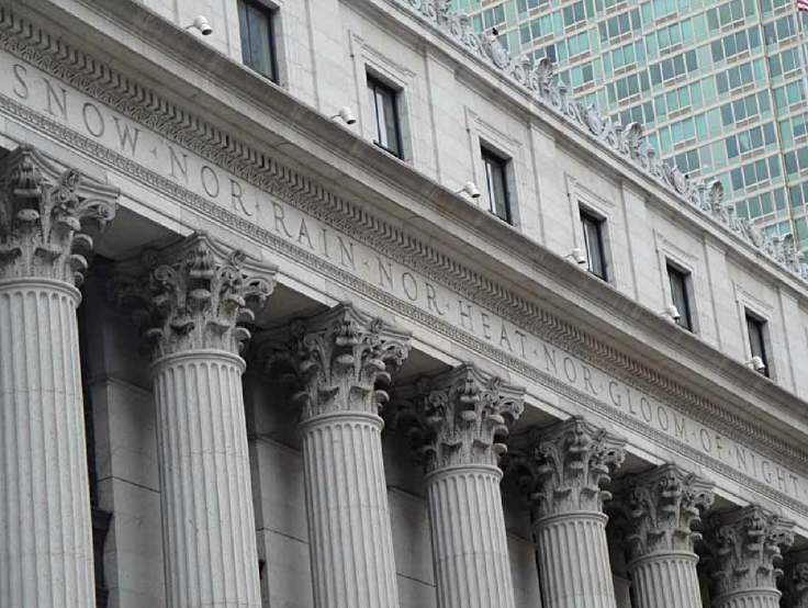
The Austrian-born Schnapp had forged a respectable career for himself prior to his time at what was then National Periodical Publications. He had worked in a variety of fields, including film title designs (i.e., the dialogue cards in silent movies), theater display cards (including for the 1933 premiere of King Kong at Radio City Music Hall), advertising, pulp magazine logos, and architecture. He was famously part of the design team for the architectural firm of McKim, Mead and White, designers of New York’s James A. Farley Post Office Building, who worked on transferring the lettering for the inscription (“Neither snow nor rain nor gloom of night…”) that runs across the front of the building.
Jack Liebowitz didn’t have to go far for references when he hired Ira Schnapp in 1940 to rework and bring consistency to the logo of the company’s hit character, Superman; the two were related by marriage. Schnapp’s redesign, based on Joe Shuster’s design, first appeared on Superman #6, and remained in use until 1983. Schnapp freelanced as a letterer and logo designer until 1949, when he accepted a staff position with duties that included everything from logos to lettering covers, ads and stories.
While I may not have known who was behind all those ads in the DC Comics of the 1960s that made me spend my dimes and quarters, there was nothing like a Schnapp. His way of delineating a simple “the” was a sure indication of the mystery artist at work, as distinctive as Carmine Infantino’s pincher-fingered hands or Gil Kane’s nostrils.
Because of the use of Schnapp’s trademark style “the” I had long believed that this piece of art I own was Schnapp’s original, from the cover of Showcase #34 (1961), but closer examination shows it be the logo that appeared on the splash page of “The Birth of the Atom,” which is credited to Gaspar Saladino. Did Schnapp create more than one variation on his theme, or did Gaspar do his own version, in the style of Schnapp?

I became conscious of Schnapp’s work on DC’s house ads near the end of his illustrious career, those last few years before his retirement. When I began researching this column, I was so overwhelmed by the sheer volume of his output from 1940 on that I would have to restrict myself to those years of his main influence on me, 1965 to 1968, if I ever hoped to whittle the list down to 13.
Tough as it was to narrow down the final 13 from even those few years, these are ads that I have vivid memories of first coming across in the course of my daily comic book reading, even if some of them were for love comics.
Here then, on the 127th anniversary of his birth, let it be writ in letters large, MY 13 FAVORITE DC HOUSE ADS LETTERED BY IRA SCHNAPP, in no particular order:
—
THE FLASH 80-PAGE GIANT #9
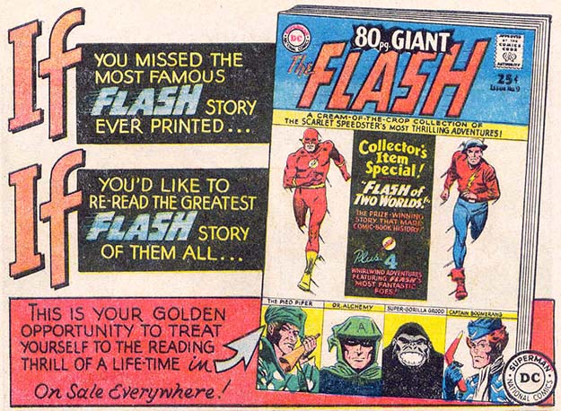
“If”? I had, DC Comics… I had missed that story, whatever it was! From April 1965, this simple but effective half-page ad led me to seek out this 80-Page Giant “cream of the crop collection” of stories, including one that was literally life-changing for me, “The Flash of Two Worlds.” Yes, it was a great story, reviving the Golden Age Jay Garrick Flash and igniting the Multiverse.
By the time I read this story, I was already aware of Earth-One/Earth-Two from at least one JLA/JSA crossover event and a couple of cameos by their Golden Age versions in Green Lantern and The Atom. But until I read that annual, I hadn’t known that the first contact between the two Flashes took place on my birthday (according to the date shown on the Keystone Gazette front page the Flash looks at). I was hooked! Thanks for making me notice, Mr. S!
—
COMING… SUPER-ATTRACTIONS!
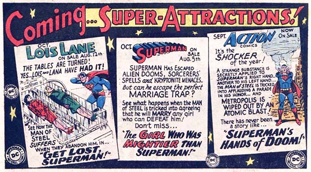
Don’t ask me why, maybe because I was 9, 10 years old and Mort Weisinger was a genius, but his third-page “Coming… Super-Attractions!” ads each featuring three different Superman Family titles are forever imprinted in my brain and my heart. I loved these dense little nuggets of information, like these from late 1965. Could a lesser letterer than Ira Schnapp have made all that copy work so beautifully in so cramped a space?
—
OUR FIGHTING FORCES
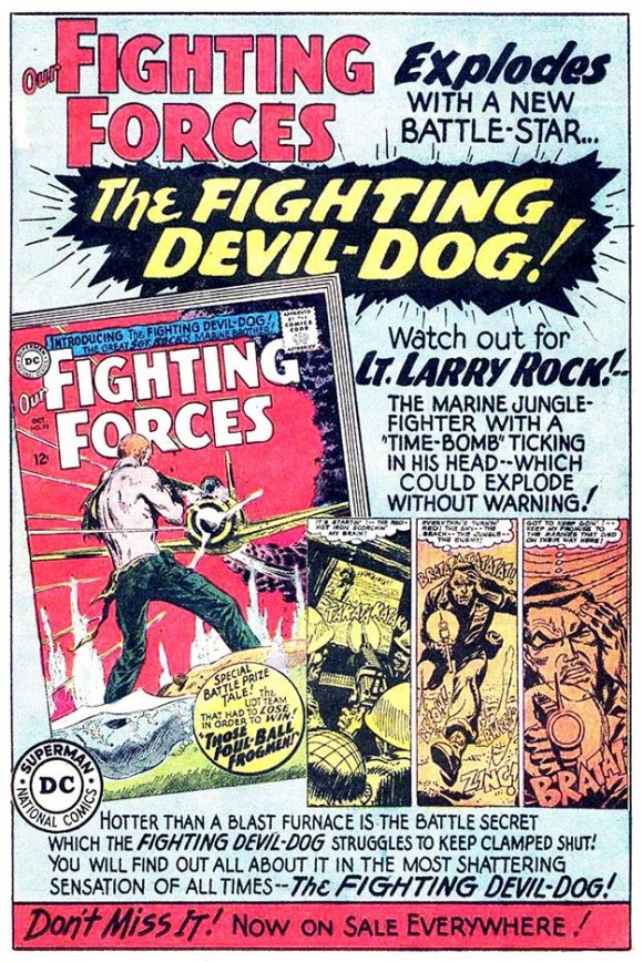
Another fine example of Schnapp’s superpower at work, the ability to fit the equivalent of a short story in a limited space shared with graphics. I wouldn’t get into the war titles until a few years later when I started acquiring them from the 10- and 25-cent bin, but this 1965 house ad stuck with me, partly because it’s a great big shouty war comic ad probably written by Bob Kanigher and excitedly designed by Schnapp, and partly because the hero’s name is Larry. Larry? What kind of name is Larry for a war hero? His brother Frank knows what I mean.
—
SUBSCRIPTION AD
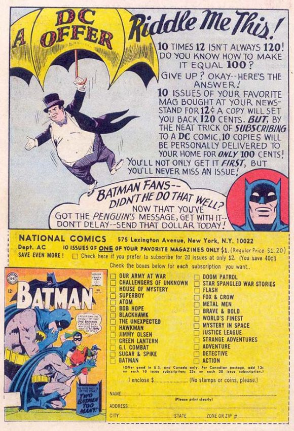
From clip art to subdued lettering, this 1965 Ira Schnapp subscription ad comes across as retro, even for the era, but it got me to send in my buck. (One year of Action Comics, but I didn’t renew because the mags came folded. In a plain brown wrapper. Honest.
—
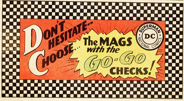
GO-GO CHECKS
What were they thinking? Well, it actually made a bit of poorly designed sense. Spinner racks and newsstands maximized shelf space by stacking titles, so they overlapped and hid two-thirds of the cover of the magazine behind them, leaving mostly the logo visible. The idea was to make DC’s titles stand out under those crowded conditions with a distinctive design element. They even ran a series of Schnapp-lettered ads, like these from 1966, to promote the idea, which lasted just over a year and a half. Readers decided Go-Go Checks were, like, from Squaresville, man.
—
SWING WITH SCOOTER
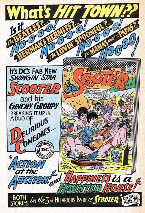
DC was pushing its teen humor titles in the mid-1960s, especially Barbara Friedlander, Jack Miller and Joe Orlando’s Swing With Scooter, which had a six-year run beginning in 1966. The comic, about a British rock star (modeled on Paul McCartney, according to Ms. Friedlander) who comes to America to escape fame and live a normal life, apparently had legs and was rewarded with several ads lettered by that other swingin’ star, Ira Schnapp.
—
SECRET HEARTS #110
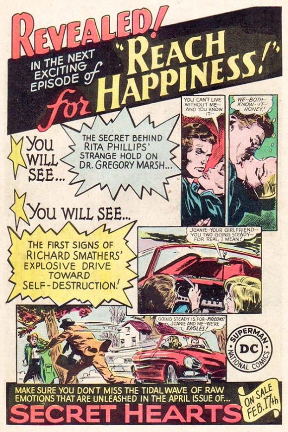
In 1966, DC tried to juice up several of their romance comics with ongoing, multi-issue soap opera stories, like Jack Miller and Gene Colan’s “Reach for Happiness”… lettered by Schnapp, who also put together this exciting ad.
—
LOIS LANE 80-PAGE GIANT (G39) #77
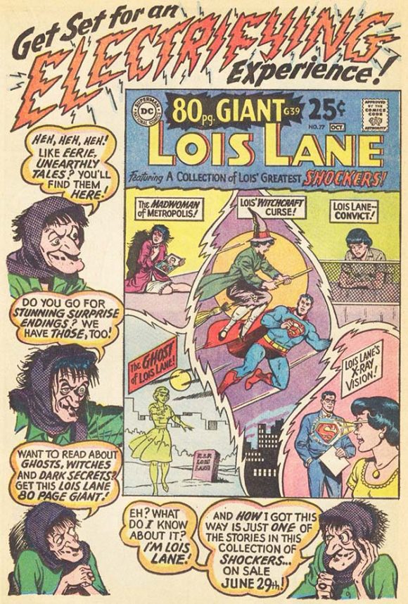
Because it’s electrifying, dammit!
—
STRANGE ADVENTURES #205
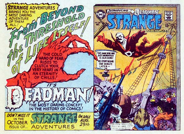
What made this ad irresistible and unforgettable? Was it the cover? The grasping hand? The stylized logo? Schnapp’s lettering? All of the above.
—
SHOWCASE #66
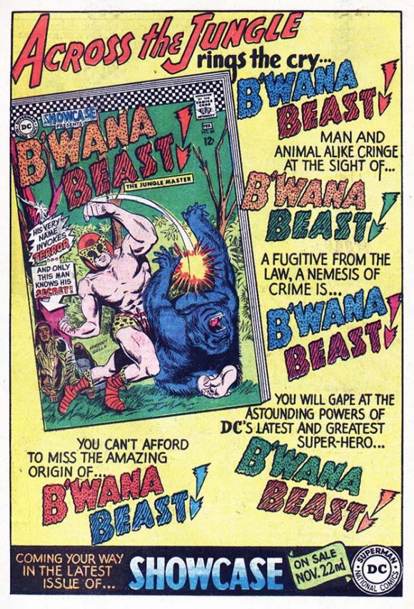
Yes, I know it’s a bad concept so poorly executed that no one has ever claimed the credit for writing the first of B’Wana Beast’s two 1967 Showcase appearances. Schnapp’s house ad actually makes it look sort of interesting. Or maybe it’s just the DC Purple Gorilla® getting punched out by the guy in a bug hat.
—
PLASTIC MAN #3
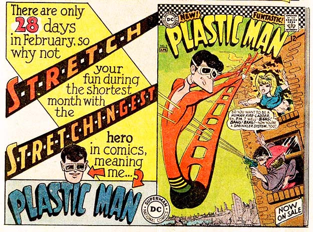
My opinion? After creator Jack Cole, no one has ever gotten Plastic Man right, including me the couple of times he passed through my typewriter. But I was too young to know that in 1966 when this, the absolute rock bottom worst of any Plastic Man revival appeared, or maybe it just proved that Plas is too good a character for anyone to ever totally screw up. In any case, it looked like Schnapp got into the spirit of things with his s-t-r-e-c-h-e-d out lettering.
—
ENEMY ACE
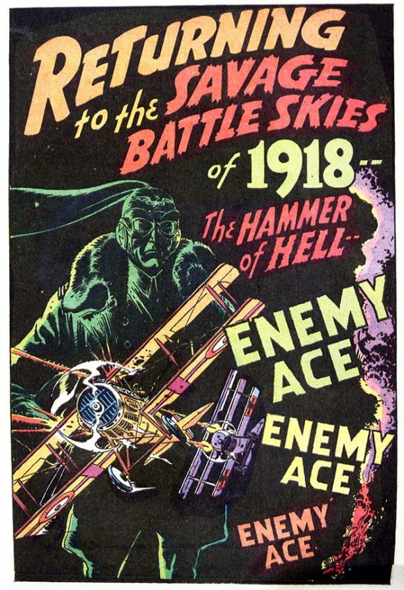
Also from 1968, Schnapp’s last year on staff. He still had it!
—
TEEN TITANS #13
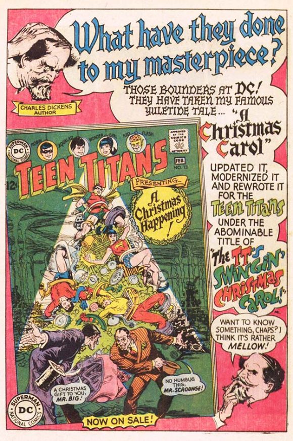
Without doubt, one of my Top 10 (13?) favorite single issues of a comic book from the 1960s. It’s got a fun, hammy script by Bob Haney, exquisite art by Nick Cardy (he told me he drew it as his last “screw you” job for DC so they would see what they were losing after he was refused a modest page rate raise; seeing the work, Carmine Infantino got Cardy his raise), and one of the best coloring jobs of the decade by a colorist unidentified. And not only did Schnapp design and letter this memorable ad, but he also lettered the cover.
—
MORE
— 13 Great Ira Schnapp DC COMICS Logos — RANKED. Click here.
— PAUL KUPPERBERG: My 13 Favorite 1960s DC COMICS HOUSE ADS. Click here.
—
Sure, you know Paul Kupperberg as the prolific writer of over a thousand comic books for such characters and series as Superman, Aquaman, Doom Patrol, Vigilante, Life with Archie, Bart Simpson, Scooby-Doo, and dozens more for DC Comics, Archie Comics, Bongo Comics, and others, and that he is also the creator of the series Arion, Lord of Atlantis, Checkmate and Takion, and is a former editor for DC, Weekly World News, and WWE Kids Magazine. But Paul is also the author of numerous books, including the superhero novel JSA: Ragnarok and the comics industry-based murder mystery, The Same Old Story, not to mention (but we will anyway) Paul Kupperberg’s Illustrated Guide to Writing Comics, I Never Write for the Money, But I Always Turn in the Manuscript for a Check, Direct Comments: Comic Book Creators in their Own Words, The Unpublished Comic Book Scripts of Paul Kupperberg and Son of the Unpublished Comic Book Scripts of Paul Kupperberg. You can follow Paul at PaulKupperberg.com and at Crazy8Press.com.
October 10, 2021
I miss his Superman logo
October 10, 2021
I believe besides the redo of Supernan logo, Schnapp also designed the logos for Superboy, Action Comics, Detective Comics, The Flash and Green Lantern.
October 11, 2021
Thank you for some history on a mostly unknown from the golden & silver age if comics. Like you during the 60’s these eye catching ads had me looking for these wonderful & exciting comics. Now I have a name to go with the ads I so enjoyed. Keep up the good work with your highly informative articles, a job well done.
Ken Loving
October 11, 2021
They had to invent computers just to compete with this guy.
October 12, 2021
Great column! No one could match Ira Schnapp. I too was transfixed by those Weisinger Coming Super-Attractions…they still make me want to seek out the stories! And that Enemy Ace ad is a beaut!
October 12, 2021
I wish TwoMorrowsPublishing would put out a book focusing on Ira Schnapp and Gasper Salidino. These guys need more coverage of their wonderful work.
October 14, 2021
Two comments:
I know I’ve seen Ira’s “electrifying” word in other DC ads… maybe announcing Hawkman joining the JLA?
And Ira told me personally That his first logo job at DC Comics was refining the logo for Superman and that he did not do previous work and was not responsible for the design of the logos for comic books like Detective Comics or Action Comics.
October 10, 2022
I love DC’s great Silver Age ads. They are such a treat when I look through my collection.
October 10, 2022
Ira Schnapp’s mark on the DC Universe is truly empowering.
October 13, 2022
I was influenced by his typographic work.
October 10, 2024
Wow! Schnapp’s work blazed through my teen-age years collecting comics and I read most of the house ads you reprinted above in back-issues! The Lois Lane ad is my absolute favorite! As a kid I imagined June Foray’s voice coming out of the crone version of Lois!! Never read an issue of the 60s Plastic Man but I did read some of Cole’s brilliant originals reprinted! Never read a Scooter issue either, which is ironic because that’s what my Grandmother called me! (Maybe I subconsciously avoided the issues!)
October 11, 2024
Oh, yeah—B’wana Beast (which i never read!) may not be a highly thought of character but he was featured in one of the very best episodes of TV’s cartoon “Brave and the Bold” a while back.
October 10, 2025
It is so hard to imagine that all these incredible yet different styles could come from the same man…but they did!
October 11, 2025
Thanks for spotlighting one of the people who truly made DC great. I could just tell, even as a little kid, that DC’s books were more professionally produced than other companies’ books, and 90% of that was due to Schnapp’s brilliant logos, lettering, and house ads. Correct me if I’m wrong, but he even designed the “Superman DC National Comics” iconic logo, AND the Comics Code Seal!
Here’s a question – sometimes artwork appeared in his ads, which didn’t come from the book being spotlighted (like the Charles Dickens portraits – did Infantino draw those?)…How about the “cold hand of fear” in the Deadman ad? Do you think Schnapp drew that one himself?