
The celebrated Mr. K breaks out the needle and thread…
—
UPDATED 8/21/25: Hey, here’s a reprint for you! Just because it’s cool and I wanted to share it again! This groovy piece first ran in April 2021. Dig it! — Dan
—
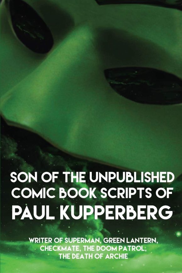
Columnist Paul Kupperberg has costumes on the brain this time around — and maybe it’s because he’s had Green Lantern rattling in his mind. After all, his new book Son of the Unpublished Comic Book Scripts of Paul Kupperberg features a very GLish mask on the cover. (Click here to order!)
Anyway, Paul channels his inner Edna Mode here with MY 13 FAVORITE 1960s SUPERHERO COSTUMES.
Groovy.
—
By PAUL KUPPERBERG
There’s an old saying, “vestis virum facit,” or “clothes make the man,” coined in 1500 by Erasmus, although usually attributed to Mark Twain, who did write, “[One] realizes that without his clothes a man would be nothing at all; that the clothes do not merely make the man, the clothes are the man; that without them he is a cipher, a vacancy, a nobody, a nothing… There is no power without clothes.”
If he’d known what was coming, Twain might have added, “And that goes double for superheroes!”
Without the right costume, a superhero ain’t nothing! Originally, superhero costumes were all cut from pretty much the same pattern, featuring tunics, tights, and capes. Superman wore the first of the great comic book superhero costumes; designed by Joe Shuster, it was based on the traditional circus strongman get-up. Some heroes, like Captain America, Namor, the Human Torch, Wildcat, and Mister Terrific, eschewed the cape, but by and large, there wasn’t that big a difference in superhero silhouettes.
Come the 1960s and the proliferation of hundreds of new characters from scores of publishers, costumes began to take on a modern, sleeker look. The seeds of the new look were planted by Carmine Infantino in his groundbreaking costume of the 1950s, the seamless bodysuit worn by the Barry Allen Flash introduced in Showcase #4 (September/October 1956). It was the skinny tie and narrow lapels of superhero costumes.
Here, in alphabetical order, are MY 13 FAVORITE 1960s SUPERHERO COSTUMES:
—
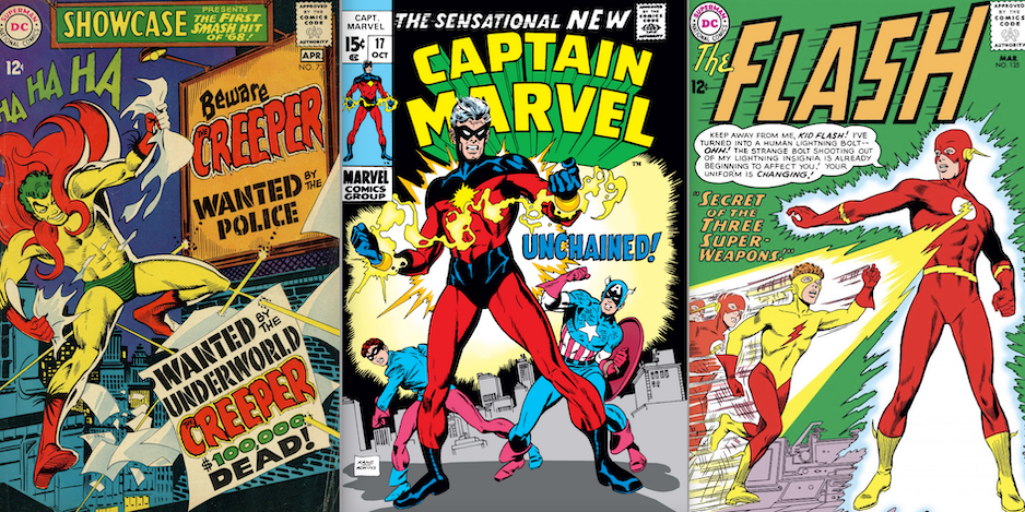
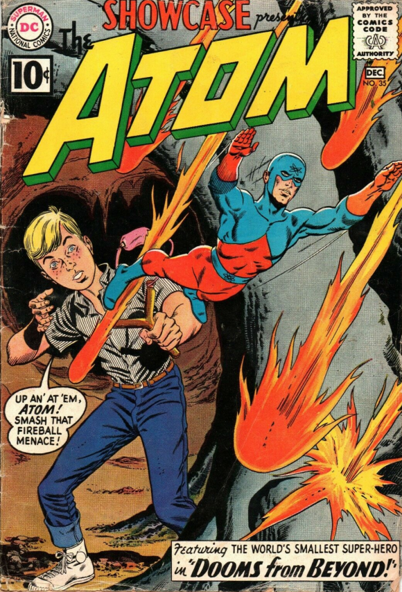
The Atom by Gil Kane (1961). Starting off the decade right, the Atom was one of the many Golden Age heroes revived and revitalized by editor Julie Schwartz and his team of storytelling superstars, which included Gil Kane. Like he’d done with his earlier Green Lantern revamp, Kane ignored virtually everything about the original incarnation’s costume and stripped it down to the basic bodysuit, boots, gloves, and mask. The distinctive diamond shape rising from his belt gave the figure—which would often be the smallest object in the panel—a sense of height and dimension that made the character pop regardless of his overpowering surroundings.
—
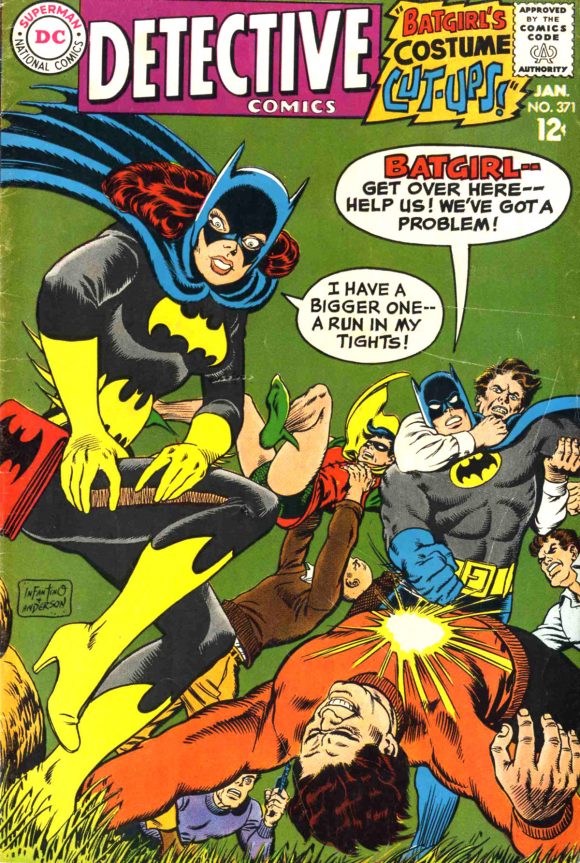
Batgirl by Carmine Infantino (1966). There are only two caped characters on this list and Batgirl is one of them. Carmine Infantino’s costume was perfect for the character and the times, a female and (sexism alert!) girly take on the classic Batman costume. She was just as likely to stop a bad guy dead in his tracks by giving him a glimpse of her gorgeous gams as she was by punching him in the face, so Carmine emphasized her silhouette by making the costume all black (the gray areas are highlights, just like the blue areas in Superman’s black hair are highlights), accentuated by the loudly contrasting yellow bat-shapes. The high heels, as ever on superhero costumes, are just wrong.
—
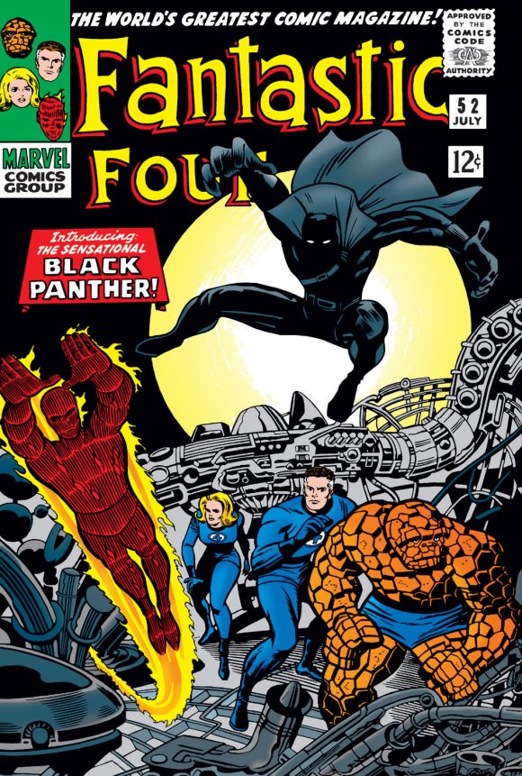
Black Panther by Jack Kirby (1969). Jack Kirby, at his best, translating a superhero sobriquet into an instantly recognizable sartorial representation. The cape and chest strap would soon disappear, leaving the Black Panther in his dramatic all-black costume, perfect for slinking through jungles both literal and urban.
—
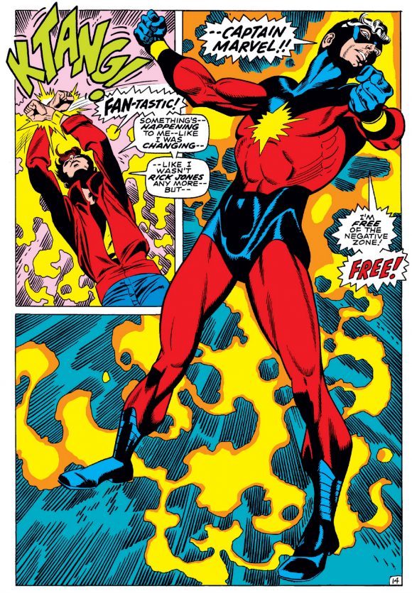
Captain Marvel by Gil Kane (1969). After a couple of years in the drab green-and-white Kree military uniform by Gene Colan, Marvel’s Captain Marvel, aka Captain Mar-Vell, received a new look courtesy of Gil Kane in Captain Marvel #17 (October 1969). Gone was the gladiator-like ridged helmet, replaced by a cut-out mask, and Kane made use of non-traditional lines at the waist and shoulders to give the primary-colored get-up a distinctive, more superheroic look.
—
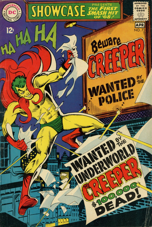
The Creeper by Steve Ditko (1968). Steve Ditko was not a cape guy. From the start, when given the opportunity to visualize new characters (Captain Atom, Spider-Man, the Question), he went with the streamlined, but not always easy, look (just ask anybody who’s had to draw the webbing on Spidey’s costume). And, like the web-crawler’s costume, his designs were always on the nose for the characters. Check out his Blue Beetle, Green Goblin, Electro, Kraven the Hunter, Hawk and Dove, Dr. Strange (a rare cape job, but one in which the cape is actually a functioning part of Strange’s magic), and others; even before you know their names or what they do, their costumes are already cluing readers in to what to expect.
—
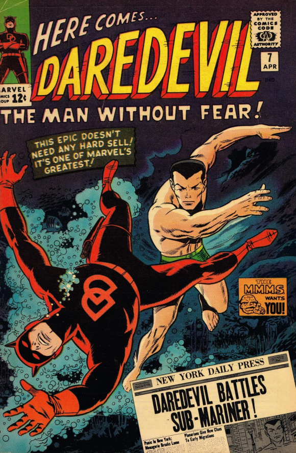
Daredevil by Wally Wood (1965). As brilliantly realized a comic book as I think Stan Lee and Bill Everett’s Daredevil #1 is, the Man Without Fear should have been afraid to be seen in public in his original crimson and yellow suit. I mean, I get what it was meant to convey; it was another circus costume throwback reminiscent of those worn by aerialists and tightrope walking acrobatic daredevils, but even in 1964 it looked clunky and old fashioned. And then came Wally Wood! One of the greatest artists of his generation, if not in the history of comics, Wood’s redesign in Daredevil #7 (April 1965) was radical. Gone was the flashy yellow, replaced by a dramatic head to toe crimson. It’s a timeless classic that has never needed to be altered or brought up to date. My one fanboy quibble: Wood’s change from the original “D” chest emblem to the overlapping “double-D” one; Daredevil is one word. It would be like Superman changing his “S”-shield to “SM.”
—
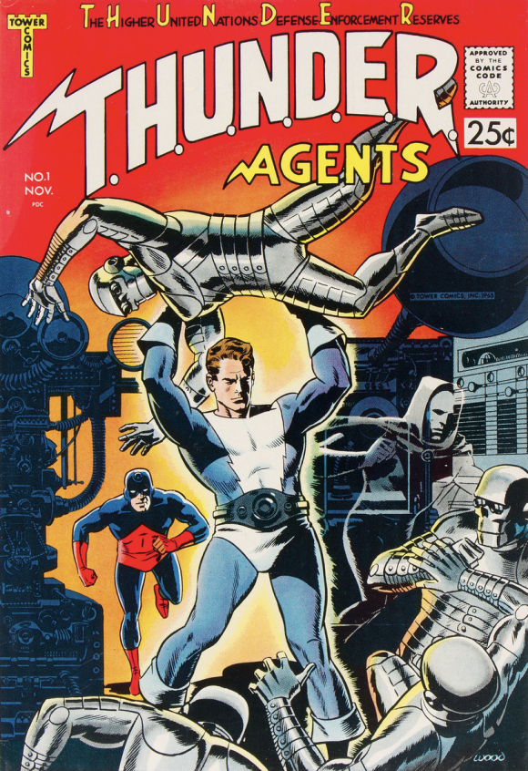
Dynamo by Wally Wood (1965). Meanwhile, over at upstart comics publisher Tower Comics, Wally Wood and writer Len Brown were coming up with the fondly remembered and oft-relaunched T.H.U.N.D.E.R. Agents. Front man hero Dynamo, possessor of the “Thunder belt,” a device that gives him super-strength for 30 minutes at a stretch, won the title of “Best Dressed” for this group.
—
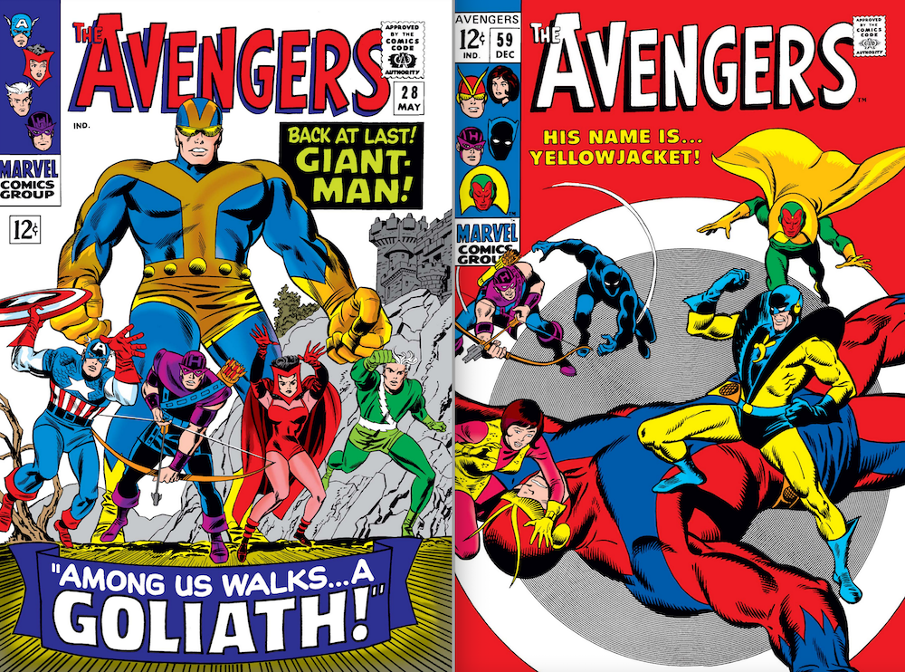
Goliath by Don Heck (1966) / Yellowjacket by John Buscema (1968). Sure, Hank (Ant-Man) Pym had loads of tsuris in his life, but he endured it in serious style to go along with his many alter egos and costumes. The best for me were the Don Heck-designed blue-and-gold Goliath costume he adopted in Avengers #28 (May 1966) and the John Buscema-created suit that debuted with his next new ID, Yellowjacket in Avengers #59 (December 1968). Heck, and later Buscema, made particularly good use of Goliath on an amazing run of Avengers covers in the mid-1960s.
—
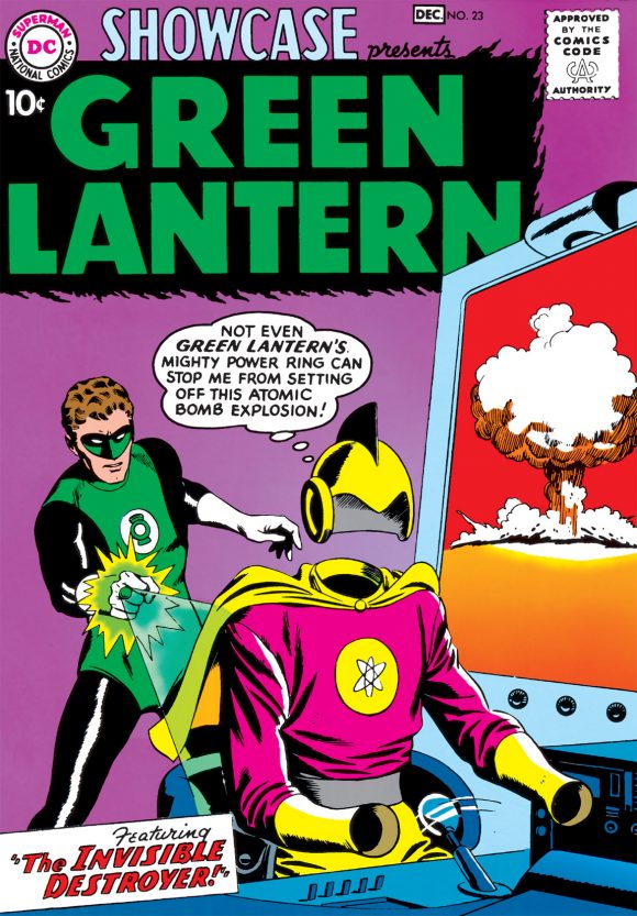
Green Lantern by Gil Kane (1959). Even though the revamped Hal Jordan Green Lantern was introduced just shy of the 1960s, I’m going to grandfather in his debut in Showcase #22 (September/October 1959) because, (a) it’s my article and I wanna, and (b) it’s an important part of the 1960s costume continuum. On the heels of Carmine’s Silver Age Flash revisualization, Gil Kane took the same approach with the new GL, dropping everything from the Golden Age Alan Scott version except the domino mask and stylized symbol of a green lantern. He kept the silhouette simple and uncluttered but gave the costume visual interest by introducing different and contrasting shapes and layering three distinct colors atop one another.
—
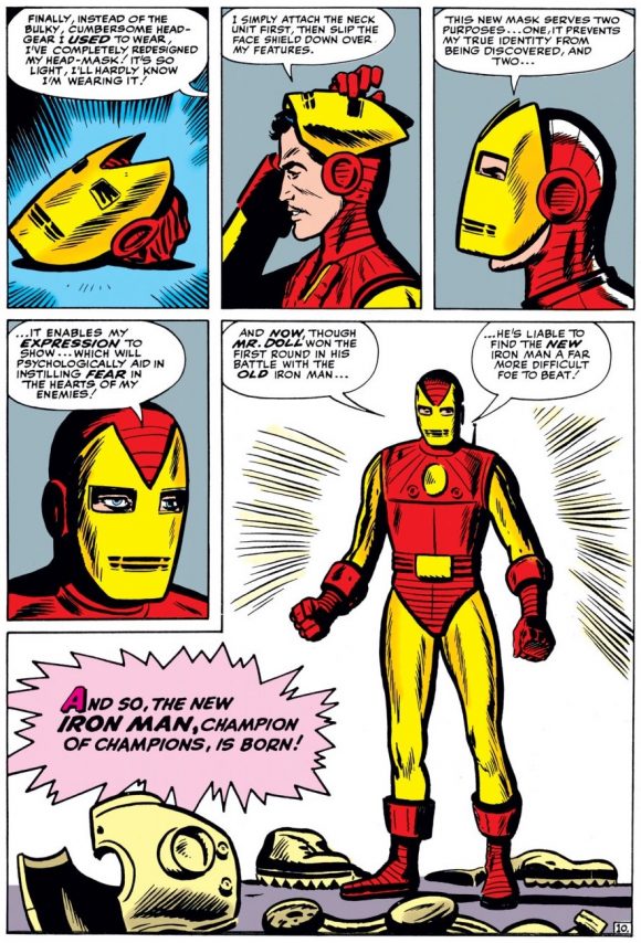
Iron Man by Steve Ditko (1963). As ugly as Iron Man’s original clunky gray tin can of armor had been, it made perfect sense from a storytelling point of view; Tony Stark built it with the scrap and junk he had available to him as a prisoner in Vietnam. It took almost a year before Stark got around to streamlining and sprucing up his suit, introducing the Mk III Armor in Tales of Suspense #48 (December 1963), the first of the now familiar red-and-gold suits, first drawn by Steve Ditko. Stan came up with all sorts of valid story reasons for Iron Man to streamline and change his look, but I’ll bet it was mostly because clotheshorse Tony Stark thought the original was just so tacky.
—
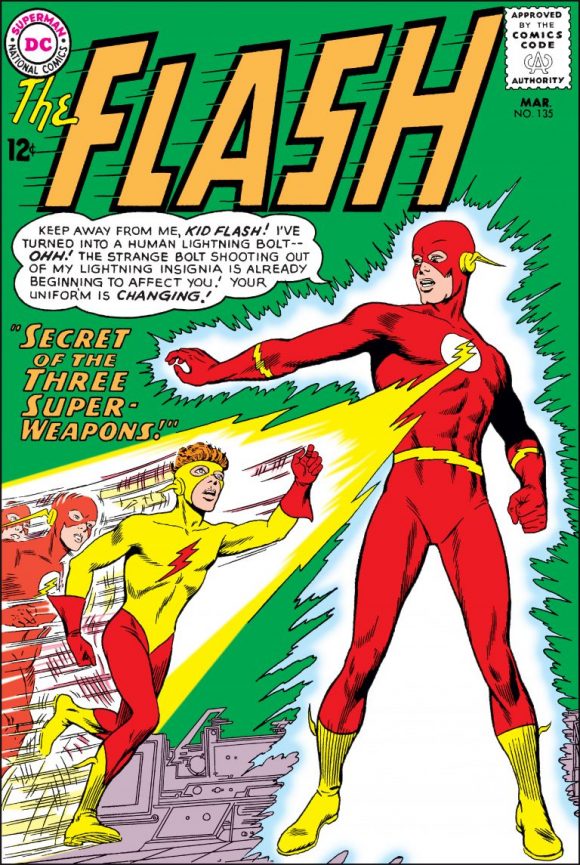
Kid Flash by Carmine Infantino (1963). In the beginning, Barry Allen cut down one of his own Flash uniforms for his protege teenage speedster Wally West to wear as Kid Flash (The Flash #110, December 1959), but even as distinctive a costume as Flash’s loses some of its oomph when there are two of them racing down the street side-by-side. It took four years for Wally to get a makeover (The Flash #135, March 1963), resulting in a look modeled after the original but distinctly its own. Carmine took a page from the Gil Kane costume design playbook and introduced unconventional lines that emphasized the character’s speed and forward motion.
—
Spider-Man by Steve Ditko (1962). This one speaks for itself. Maybe one of the most perfectly realized superhero costumes of all time. (Note from Dan: Maybe? Definitely.)
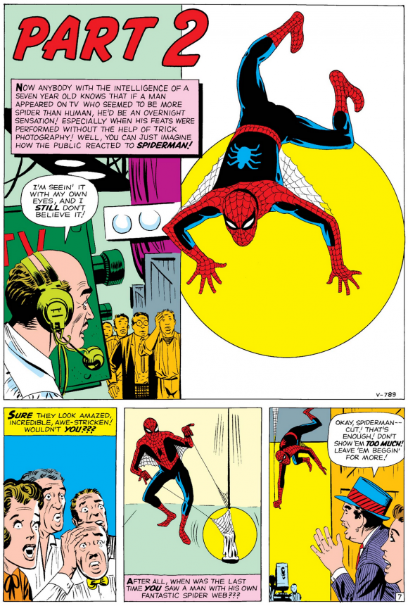
Amazing Fantasy #15
—
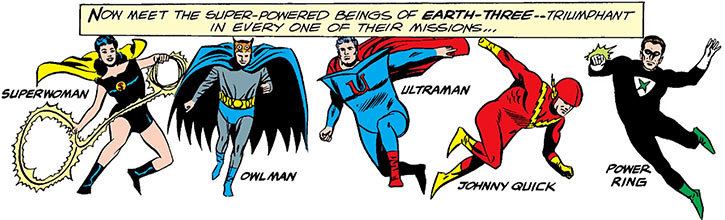
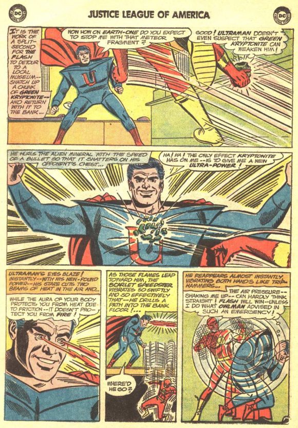
Ultraman, Crime Syndicate of America by Mike Sekowsky (1964). The Crime Syndicate, introduced in “Crisis on Earth-Three” in Justice League of America #29 (August 1964) just blew me away. It was my first exposure to the idea of evil alternate Earth doppelgangers of the JLA, plus, they had kickass costumes, all designed by Mike Sekowsky. Maybe because Superman was my favorite character I was drawn to Ultraman, but I was also intrigued by his plain, stripped-down costume in the Man of Steel’s colors, although I could never quite figure out whether his tunic was attached to his sleeves or if it was worn like a onsie over a long-sleeve shirt of the same color.
—
MORE
— PAUL KUPPERBERG: My 13 Favorite Unpublished DC COMICS Projects. Click here.
— PAUL KUPPERBERG: My 13 Favorite Short-Lived Series of the 1960s. Click here.
—
Paul Kupperberg has been writing comic books from Archie to Zatanna for 45 years at DC, Archie, Charlton, Marvel, Bongo and others. He is also the author of Paul Kupperberg’s Illustrated Guide to Writing Comics (Charlton Neo Press); I Never Write for the Money… But I Always Turn in the Manuscript for a Check (Comics Career); the comic book industry-based murder mystery The Same Old Story, the short-story collection In My Shorts: Hitler’s Bellhop and Other Stories, and JSA: Ragnarok, all from Crazy 8 Press and all available on Amazon, or signed and personalized direct from Paul (email him at pkupps55@yahoo.com for details).
April 17, 2021
Glad to see Kane’s Captain Marvel. It always grabbed me. It had a visceral, tactile feeling to me. Especially the boots. Something about them.
And yes, totally agree about Spider-Man. I believe it may be the most perfectly realized costume also, ever.
April 17, 2021
I may be the only one on the planet, but I preferred Mar-Vell’s original green and white costume. I loved the ringed planet emblem on the chest, Green was, and is my favorite color and Saturn being my favorite planet in the solar system, except, y’ know, my home planet, Earth!
April 18, 2021
I also loved the original costume. The new look by Kane is great too. I just wish the MCU hadn’t skipped over this whole chunk of Marvel history.
August 15, 2023
Me too! Love the original Kree Green and white uniform!
August 21, 2025
And me, it was such a rare colour combo and I loved the fin and chest emblem.
I’m not a big fan of monochrome costumes, but there are lots of winners here.
I might add Green Arrow’s 1969-debuting Neal Adams costume, but using Paul’s Green Lantern argument, it should likely be counting as the first of a whole new wave.
April 17, 2021
And one more thing, Paul. Might we be seeing your 13 favorite 60’s Supervillain costumes in the near future?
April 17, 2021
You’re half-right about the Wally Wood DD costume, Paul. It WAS “head to toe” crimson. AND “head to toe” black. Don’t remember whether they mention it in context or somewhere in a letters page, but it was based on a short-lived fashion trend of the day: two colors of polished polyester thread tightly interwoven so the garment color would shift depending on how the light struck it. This was eventually (probably almost immediately following Woody’s departure) forgotten but when I was a kid I thought it was really cool..
Always thought the Goliath costume was pretty hideous… AND a massive improvement on any Giant-Man outfit, but especially the last one w/the pokey helmet… brrr…
April 19, 2021
I feel like Ditko’s Blue Beetle deserves mention on this list. Or at least, it would if it were my list. His use of the beetle design, along with the bold outlines for the beetle, the boots, and the gloves, lends a nice graphic design treatment, topped off with the bulging bug-eyed goggles. One of my favorite costumes, ever.
April 20, 2021
As I’ve mentioned before, ditching Mar-Vell’s silver hair was one of the worst editorial decisions of the Bronze Age. That was key to his look as far I’m concerned.
August 15, 2023
As a kid in the 60s when I first saw Spider-Man, I was, like many in my generation, completely taken by the look. A full face mask? Groundbreaking! Agree on the DD for Daredevil, yet, one word or not, how many times was he referred to as DD by other characters? As for Yellow Jacket, it always seemed to me that Mr. Identity Crisis must have had peripheral vision issues based on those shoulder flanges. A great article, Paul.
August 15, 2023
Ditko goes through all that effort in redesigning shellhead’s armor, then finishes with a decidedly in undynamic full reveal in the last panel.
“…which will psychologically aid in instilling fear in the hearts of my enemies.” – Hahahahaha!
August 16, 2023
‘Eyebrows! As science has revealed to us, they are the key to instilling fear!’
August 16, 2023
Captain Marvel’s new look debuted in Captain Marvel #16, not #17. The new costume was indeed designed by Gil Kane, but the story in #16 was pencilled by Don Heck.
August 17, 2023
superman has a recognizable logo on the chest, and that’s what wood did for daredevil…it’s an emblem, not near the same as changing s to sm…
August 17, 2023
superman has a recognizable logo on the chest, and that’s what wood did for daredevil…it’s an emblem, not near the same as changing s to sm…
August 21, 2025
I would have chosen the Blue Beetle over the Creeper.
August 21, 2025
While I love Captain Marvel’s second costume, anything would be better than his first.
Meanwhile, if I had to pick a Crime Syndicator, It would be Power Ring over Ultraman, with Superwoman being a close second.
August 22, 2025
Looking at Ultraman today, I think his shoulders are the precursor to those big shoulder thingies women wore in the Eighties. Remember “Dynasty?” Imagine Alexis Carrington saying: “The fools, they don’t know that Kryptonite gives me a new power! And extra shoulder length!!”