
Look, up on the cover … !
Part 5 of a five-part series on the great DC Comics designer of the Golden and Silver Ages.
For Part 1, an overview of Schnapp’s voluminous contributions to the form, click here.
For Part 2, on 16 great Schnapp comics logos, click here.
For Part 3, on Schnapp’s artistic house ads, click here.
For Part 4, on Batmania and the zippy era of Go-Go Checks, click here.
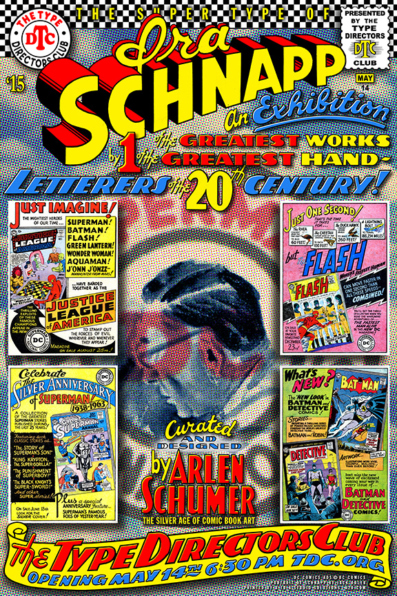
This series is based on Arlen Schumer’s upcoming lecture and exhibit, The Super Type of Ira Schnapp at the Type Directors Club of New York, opening Thursday, May 14 at 6:30 p.m. Click here for tickets to the lecture (seating is limited). For more info, click here.
The exhibit will run through the summer. It’s produced and sponsored by A to A Studio Solutions.
—
By ARLEN SCHUMER
Ira Schnapp, chief DC Comics letterer and logo designer for thirty years (1938-68), did NOT design the famous telescopic Superman logo.
He refined it.
![]()
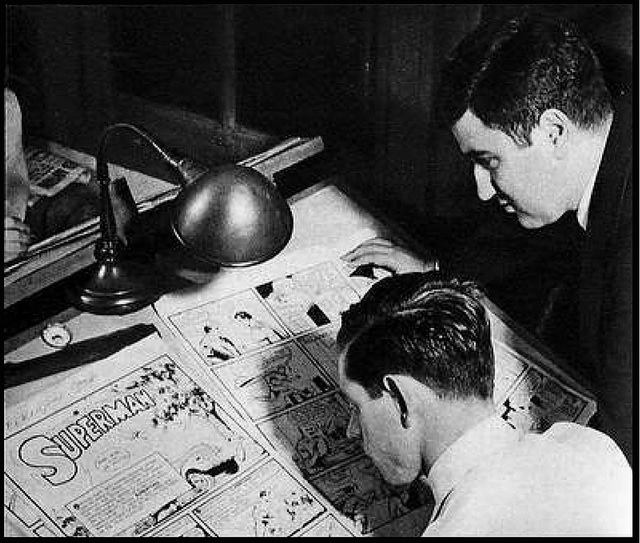
The original artist of Superman, Joe Shuster, designed the logo of the character he co-created with his friend and partner, writer Jerry Siegel.
You can see his first attempts in these early sketches by Shuster that date back to 1933, the year he and Siegel created the character (to be a newspaper comic strip, that they tried to sell to syndicates, unsuccessfully, until the “comic magazine” publisher Detective Comics — soon to be known as DC Comics — bought it out of a slush pile in 1938 to run as the cover feature in their new title, Action Comics—and the rest is comic book history).
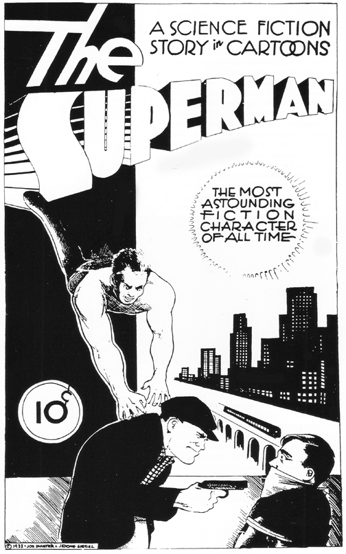
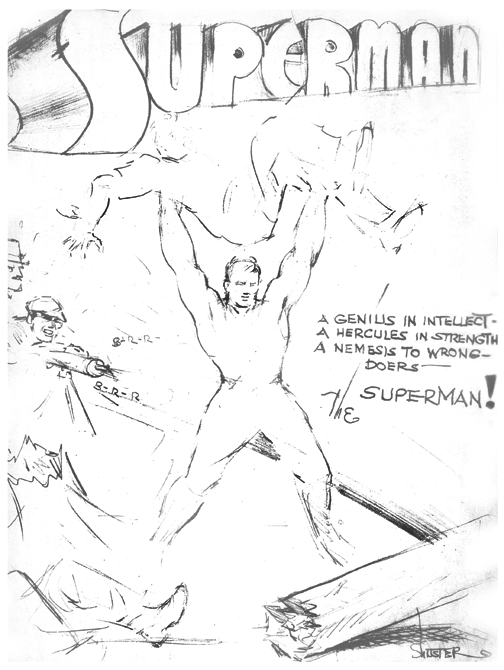
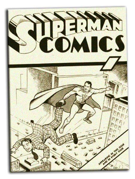
Shuster’s designs, though crude, show that he was always going for that three-dimensional, telescopic perspective for his art deco-like letters, a look dominant in the 1930s. But from his first attempts, through the Superman #1 (1939) “ashcan” edition (denoting a one-off printing of the first issue of a magazine for the sole purpose of securing its copyright, then thrown in the “ashcan”), and up to Issue #5 of the published title, Shuster never quite got the Superman logo right, or settled on a uniform look to the size and weight of its letterforms.

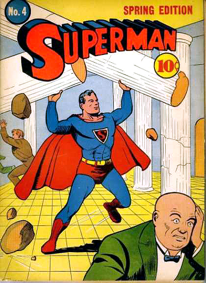
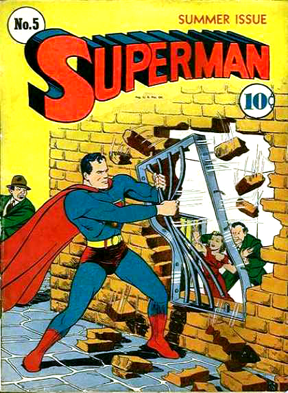
It wasn’t until Schnapp took Shuster’s raw logo and refined it in his patented Schnapp-y style—settling on a uniform size, weight and proper perspective of the industrial-strength letterforms—for the cover of Superman #6 in 1940 did we get the most perfect Superman logo of all time, the logo that’s become the Coca-Cola of comic book logos, as unforgettable and just as immortal.

Schnapp’s Superman logo remained on the cover of DC’s flagship title for decades, until, for some reason, it was modified in 1983 (Superman #386), reflecting a new “S” and rounded-bottom “U”—both of which are blatantly inferior to Schnapp’s, most egregiously marring the graceful diagonal stroke of his signature “S.”
![]()
But those changes came way after Schnapp was alive to see them. After new DC Comics publisher Carmine Infantino decided to let him go in 1968—preferring the work of longtime DC letterer Gaspar Saladino instead—Schnapp retired to Florida.
Neal Adams, who worked often in the DC bullpen during that time and got to know Schnapp well, remembered feeling that if Schnapp stopped working and went to Florida, he’d die.
He was right. Ira Schnapp—the man who refined the Superman logo—designed the DC “bullet” logo and the Comics Code stamp—one of the greatest hand-letterers of the 20th century—died in Florida in July 1969.

Portrait of Schnapp by DC colorist Jack Adler, circa 1960s.
For decades after his death, Schnapp’s work and achievements were largely unknown and forgotten.
I remember hearing his name here and there over the years, but it really wasn’t until the comics historian and creator of the site Dial B for Blog, who goes by the pseudonym Robby Reed (named, like the site itself, for the owner of the titular dial of the fondly remembered DC Silver Age feature, Dial H for Hero), did a massive 10-part series of articles on the great DC letterer in 2006, did Schnapp’s legend become more widely known and acknowledged.
I credit Robby for igniting my always-there Schnapp admiration and influence in my own work that’s resulted, years later, in this exhibition — which fittingly includes a giant (14-foot-long) blowup of the Superman logo.
IRA SCHNAPP LIVES!
May 11, 2015
Dan, thank you so much for running this 5-part series! It’s been a blast, and I look forward to seeing you (and everyone else reading this) at the opening night of the exhibit (and my Schnapp talk, a lecture version of this series) on Thursday night 5/14! For tix: http://www.eventbrite.com/e/the-super-type-of-ira-schnapp-tickets-16397918616