Neal has a lot on his mind.

Week 3 books, out 2/17.
It’s NEAL ADAMS MONTH here at 13th Dimension, and we’re featuring daily commentary by Adams on his variant-cover project for DC Comics. Each of his 27 variants is a twist on one of his famous covers from the past. He provided the pencils, and the inks and colors were handled by some of the biggest names in the business like Frank Miller and Dave Gibbons.
For the full NEAL ADAMS MONTH INDEX of stories — click here.
Yesterday’s installment featured Titans Hunt #5, which was based on The Brave and the Bold #79. (Click here.)
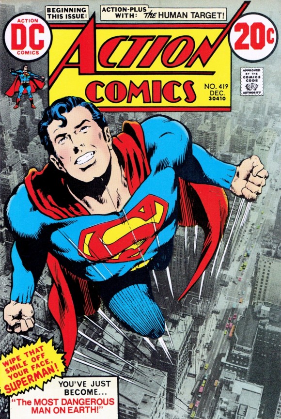
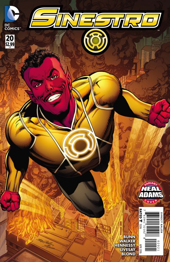
Today, it’s Sinestro #20 — due 2/17 — which grew out of another memorable Bronze Age cover: Action Comics #419.

This one of the few Superman comics I had as a kid. I remember feeling vaguely unsettled by the cover, with that “Wipe that smile off your face, Superman! You’ve just become … ‘The MOST DANGEROUS MAN ON EARTH!'”
I wasn’t clear on whether Superman had turned evil and was into it, or what. It just seemed a little scary that someone with Superman’s powers could be bad — and be happy about it.
Looking at it in that context, Sinestro is an inspired choice for the modern version. (By the way, that’s not what Action #419 is actually about, but that cover definitely stayed with me.)
Anyway, Adams also finds the cover compelling, but for very different reasons:
Neal Adams: This is another one of those, “I hate this cover.” (See Neal’s discussion of the classic Superman #233, here.)
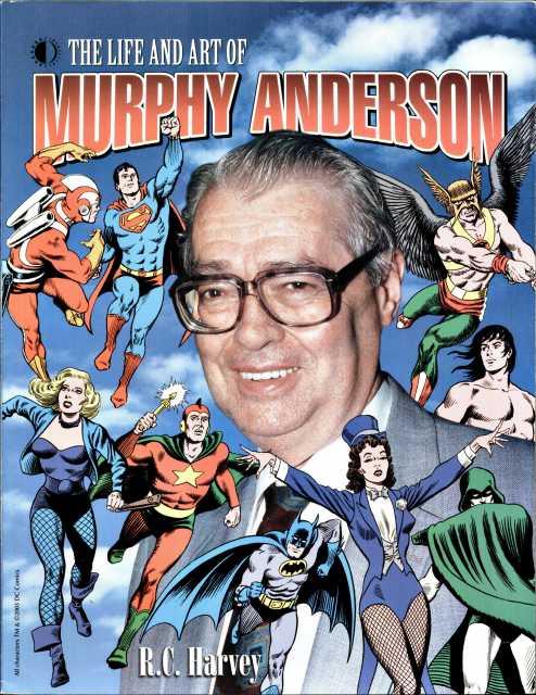
OK, so I’m gonna reveal something here. As a person, I loved Murphy Anderson. LOVED Murphy Anderson. In fact, I think everybody loved Murphy Anderson. He had that kind of deep voice that made, like, the furniture in the room settle. I don’t know what it was but he would talk and (affects deep voice) suddenly every… (Dan laughs) I mean, everything would just settle. (Using deep voice again) “Neal…”

And though I loved Murphy Anderson, I never liked his inking. Because it was always rounded and kind of cuddly, OK? And I never thought of my stuff as rounded and kind of cuddly. It was always a little harsh, a little mean, a little angular. And for some reason it was decided that Murphy was gonna ink this cover.
Who am I to say no? “(I think) ‘Maybe once they ink it’…”
But he inked the cover and I was never happy with the cover because it looked mushy to me. It also was a cover where we used a photograph for the background. You notice that. Something the purists will decry nowadays but, in fact, I think it’s a very good concept.
Dan: It’s fun.
Neal: Unfortunately, because of the reproduction methods, the cover was done at 62 lines per inch so it’s a kind of fuzzy, out of focus, not clear thing and the color on it is flat. There’s no real detail on it.
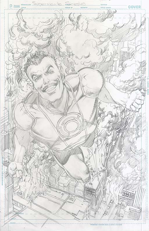
I have since done an illustration like this just to satisfy myself that there’s a good concept there. And I never thought I would see necessarily this thing in print. Now, I have a cover like this. (Gestures to Sinestro #20.)

Dan: And this was inked by Scott Hanna (you can read his commentary, here) and colored by Jeromy Cox.
Neal: Right. Much better line. A much stronger line. So suddenly everything snaps into position and goes well. But the terrible thing was I didn’t want to do the photo background (this time) because I didn’t have the same photo.
I had this cover I could work from but had to draw it. But I realized, look at all this crap! (Indicates the tiny lines of all the buildings.) I’m gonna give the poor inker heart failure. (Both laugh) With all this crap.
So I realized, since it’s Sinestro, I’d better destroy the city and draw a lot of smoke all over this or he’s gonna call me (Dan laughs) and say, “What the hell are you doing to me? I’m not gonna do all this stuff! Are you out of your mind?”
Because imagine turning all this into drawing. Totally insane. So I managed to cover two thirds of it with smoke and then I put some city in there in between the stuff. And then it got colored in such a way that you could barely see it anyway.

Dan: Now let me ask you this. I’m just curious as a fan. I’m not an artist. When I do see that you draw buildings like this that look very much like true-to-life buildings, do you use photo reference?
Neal: I try to. All the time.
Dan: I was wondering about that.
Neal: Some guys do sort of imaginary… Like Jim Lee. Jim Lee’s buildings are sort of fantasy. They’re based on real buildings but really they’re sort of fantasy. The (original) Image guys seem to do that. It came at a time when people were paid more money for pages and could actually do their backgrounds. If you’re paid poorly, you don’t wanna draw cities. You don’t wanna draw crowds.
There’s a thing that happens in comic books. I’m gonna tell you an inside secret, OK? There’s a thing that happens in comics… where the writer (laughs) writes a double-page spread where you have, like, all the X-Men or all the Justice League and all the evil Justice League or whatever it is, coming at each other battling each other and very little dialogue.
The writer then writes it and says “they’re battling and all these characters are here and blah blah blah.” He says: “Have fun.” (Dan laughs)
No. Can I just say this? It’s NOT fun. It’s never been fun. Whatever writer THINKS it’s fun? It’s not fun.
Dan: It’s fun to look at!
Neal: YOU may have a good time looking at it but it is NOT fun. Do your job. Write a story. This is not fun. Cut it out. …
Artists don’t like to draw crowds. They don’t like to draw cities. They don’t like to draw battles with 500 people. Its just tedious and awful and very often when you’re reading it, you go, “I don’t know why I don’t like this,” and you just turn the page.
Hello? You’re turning the page because you’re bored, OK? Understand that the artist likes to draw things where he’s interested and as long as he’s interested, you’re going to really enjoy what he’s doing. But when he gets bored, you’re gonna flip that page and you’ve just given him a lot of work to do for nothing.
Maybe call it a warning to the writers. Don’t have them do things like that. Really. Not crowds of people. Nobody cares.
—
—
You can also find more on Neal Adams at his website, here.

February 16, 2016
On the basis of sheer talent, as well as the impact of his art, his personality and his sense of justice on the industry as a whole, Neal Adams is the greatest artist in the history of comics. It’s that simple.
He is not always right about his own history, though, or about others (e.g. Giordano) who inked his work.
For example, the combination of Adams and Anderson on the cover of Action 419 (over a photo by Jack Adler) is pure magic, and an inspired counterpoint to the “Swanderson” look of the Superman titles at the time. If the image is not “pure” Adams, it is nonetheless spectacularly successful as an evocation of how euphoric it must feel to BE Superman. Neal’s truer-than-life rendering of Superman’s body language in this single image is unsurpassed.
In short, Action 419 is the greatest Superman cover of all time, and gets my vote for greatest comic book cover of all time.
Neal’s recent recreation of the image (mentioned in the interview) is masterful, and I am pleased to have a print of it, signed by Neal, hanging in my office; but, as I enjoyed telling Neal at the Baltimore con a couple of years ago, that print is a grand reboot, not a replacement or correction of Action 419.
Thanks to Neal Adams for the fun of these new covers, and to Dimension 13 for highlighting the event.