
A second chance.
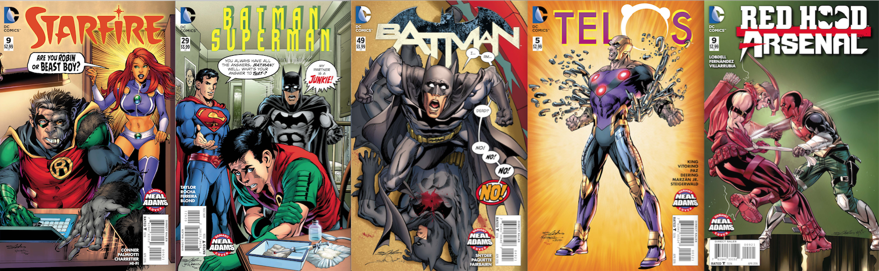
The Week 2 covers, out 2/10.
It’s NEAL ADAMS MONTH here at 13th Dimension, and we’re featuring daily commentary by Adams on his variant-cover project for DC Comics. Each of his 27 variants is a twist on one of his famous covers from the past. He provided the pencils, and the inks and colors were handled by some of the biggest names in the business like Terry Dodson and Dave Gibbons.
For the full NEAL ADAMS MONTH INDEX of stories — click here.
Yesterday, we gave you Batman #49, based on Deadman #1. Click here to read what Adams had to say.
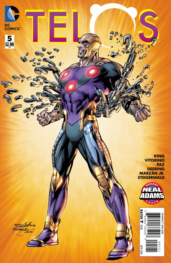
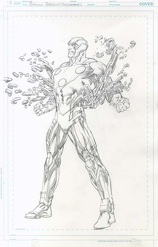
Today, it’s another character swap-out with Telos #5 — out 2/10 — which is a direct take-off of Superman #233.
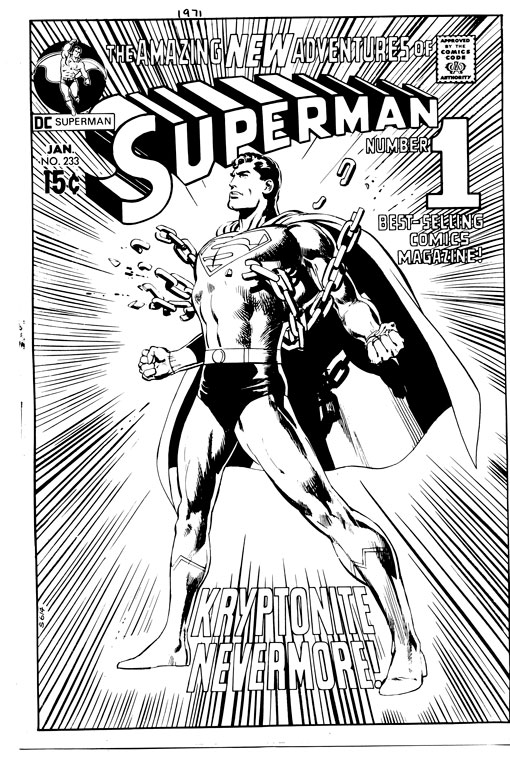
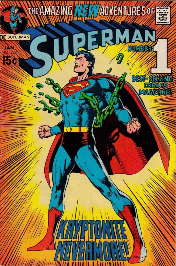
I first met Neal Adams a few years ago and during that interview he insisted that he disliked the cover of Superman #233, his most famous featuring the Man of Steel.
After I ran the piece, some readers accused Neal of false modesty. Iconic is an overused word and one I try to avoid when I can. But Superman #233 is iconic in every sense. So how could he dislike such a classic cover, they wondered.
But they weren’t there to hear him. His passion was real. And I understood his reasoning, in the same way that John Lennon used to criticize half the Beatles’ songs as too simple or too easy.
Artistic genius is like that. If it comes easy, you can’t help but see the flaws, regardless of what others see.
Superman #233 is back this month, in the guise of Telos #5, inked by Richard Friend and colored by Alex Sinclair.
I was very eager to revisit the whole thing with Neal.
—
Neal Adams: There’s nothing easier than doing an iconic cover. When I was first asked to do this cover, I was told by my editor, “We’d like to do something with breaking chains but the chains are Kryptonite.” To which I said, “Really? Really? You’re asking me to do just breaking chains on his chest?”
Dan Greenfield: Was this Julius Schwartz?
Neal: I think it was, yeah. … I was told at the time, “We need the thing today.” This drawing took me — max — two hours.
Dan Greenfield: Yeah, you once told me it was one of your least favorite covers.
Neal: One of the worst drawings I’ve ever done. His left leg is longer than his right leg. His face is nearly nothing. It’s a cipher. OK? Very little of this is carefully considered. Within the time that I had, I did the best that I could but I let it leave my hands knowing that I had done a failure of a cover.
Dan: On my way over here, when I was in Grand Central, there’s a store there that has this up as a poster.
Neal: You’re kidding.
Dan: In the store. When I saw it this morning and I knew we were gonna be talking about this cover, (laughs) I was just, like, shaking my head!
Neal: You can go to Walmart and get it on a tack board. You can go to another store and get it as a print with a frame on it. You can get it everywhere. You can get it on T-shirts!
Dan: When you run into it at places like a Walmart or a whatever kind of store…
Neal: I have to pretend a (messed-up) Neal did it. That’s all. How else do I view it? It’s that bad. It doesn’t become a good drawing by the fact that it’s tremendously successful. It’s a bad drawing. It just happens to have those elements that appeal to people. It has the blue in the middle, it has the yellow going into the red-orange. Everything about it makes it an iconic thing.
You know, I wish I could go back in time and do it just a little bit better. Every once in a while I do. I have a pencil drawing of the same thing, drawn better, but the truth of the matter is, when you look at it quickly, it looks like the same drawing.
So, it’s the addition of the parts that make the whole that make it into whatever it is and very little of it has to do with me. I’m, you know, an artisan. My job is to do this and I have to do Superman breaking chains on his chest and I have to spread his legs far enough to get the copy in the middle between his legs! (Dan laughs)
Dan: Now, when you made the changes for Telos …?
Neal: They both have the same length legs at least. I mean, because they’re in perspective, they seem to work. But it looks the same. You feel it’s the same but it’s not.
If you were to make a copy of this and put it over that, you would see it’s a different spread on the legs. So I corrected it along the way and I gave you a better drawing. So drawing-wise, this is the much better drawing but on the other hand (he indicates the Superman cover) that’ll live forever.
There’s just no way I can…It’s gone beyond me. It’s a legend now. I can’t do anything about it.
And when I say it to people… Nowadays, I’m reluctant to say it’s a terrible drawing.
They look at me like I’m crazy, y’know?
—
NEXT: Red Hood, Arsenal … and a battle to the death. Click here.
—
For Telos #5 inker Richard Friend’s take, click here.
—
You can also find more on Neal Adams at his website, here.
February 9, 2016
If he thought he did badly on that cover, then he redeemed himself with the cover for the reprint issue Action Comics #485. I’m surprised Mr. Adams didn’t mention that one.
June 15, 2022
It’s funny that he hated it so much, it was my favorite action pose as a teenager! So much so that I loved using it as a drawing template for my designs of new heroes and new, male costume designs of old heroes!
June 8, 2023
he may say the left leg is longer but to me its just perspective and it actually gives the pose more impact and power – the thelos one looks just meh in comparison BECAUSE of the shorter leg and narrower stance. i alsothink the superman face is kind of a throwback look. and it only took him 2 hrs max? that’s a worthy brag i say!