
BATMAN WEEK: These great covers just got better – thanks to artist Sandy Jarrell…
—
It’s BATMAN WEEK! We’re celebrating Wednesday’s Detective Comics #1000 — and Saturday’s 80th anniversary of the Caped Crusader. For the complete index of features and tributes — many by some of the top creators in comics — click here.
—
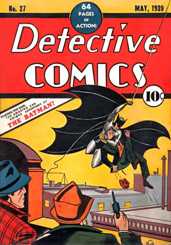
I’ve always thought it weird that DC Comics has for the most part consistently stuck with the basic Action Comics logo (with some notable tweaks) since it was introduced in 1938 while it’s frequently avoided the Detective Comics logo made famous by Batman’s debut in 1939:
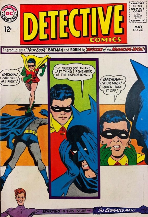
Perhaps it was editor Julius Schwartz who made the call to “modernize” the logo to coincide with the “New Look” in 1964 and once the precedent was set, the publisher opted to keep going with a series of different approaches over the decades. I just don’t know.
Bottom line, though, is that the classic Golden Age Detective Comics logo is still the best the company’s ever produced – a lettering scheme that’s both elegant and, given its history, evocative of Batman himself.
Virtually every cover it adorns is improved by it – so much so that artist Sandy Jarrell decided to take a series of marvelous covers by Marshall Rogers (and inker Terry Austin) and improve them by using the old logo in place of the one in use in the late ’70s.
The results? Fabulous.
Check out these before-and-after images:
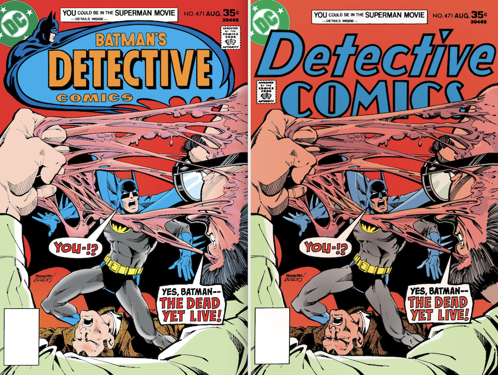
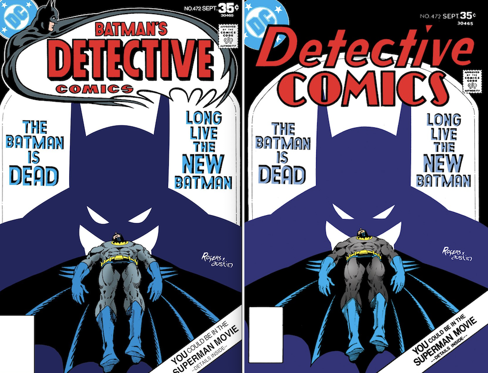
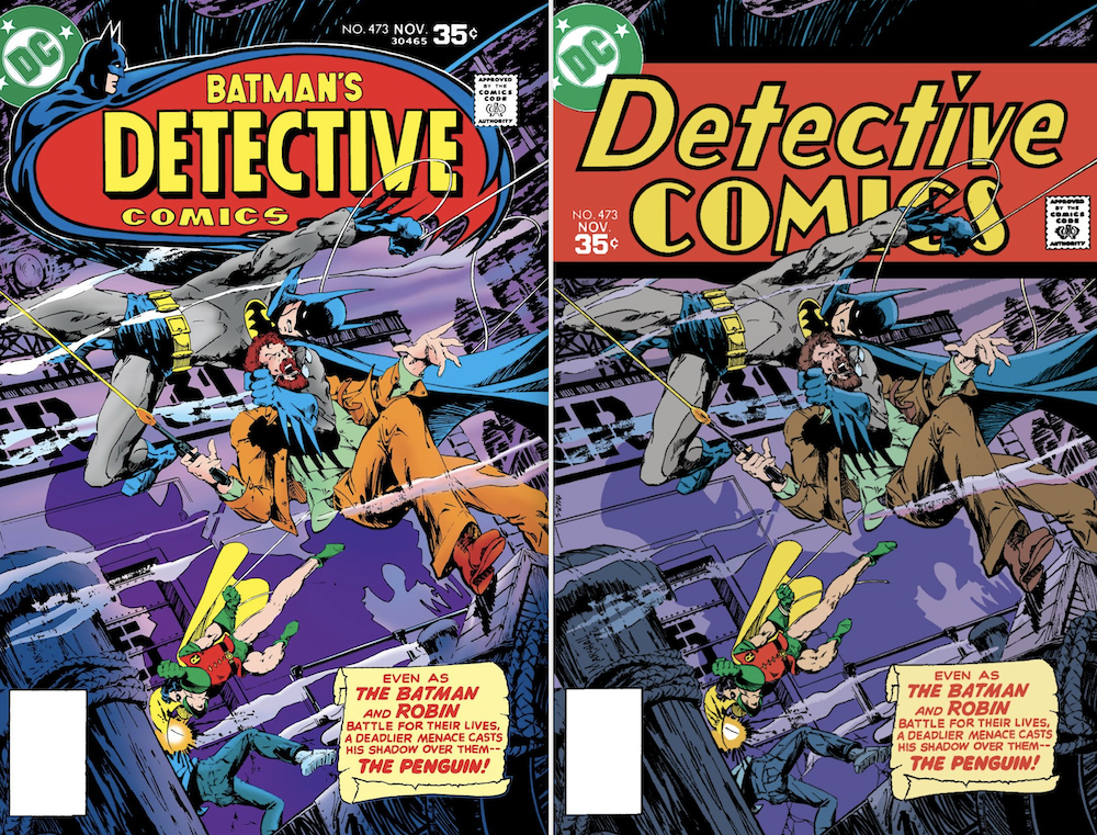
Man, oh, man, is that beautiful.
“I just love the original Detective logo,” Sandy told me. “And with stories that brought back Hugo Strange and the drop-cap captions, it was the obvious choice. I can’t even imagine how that was overlooked!”
Neither can I.
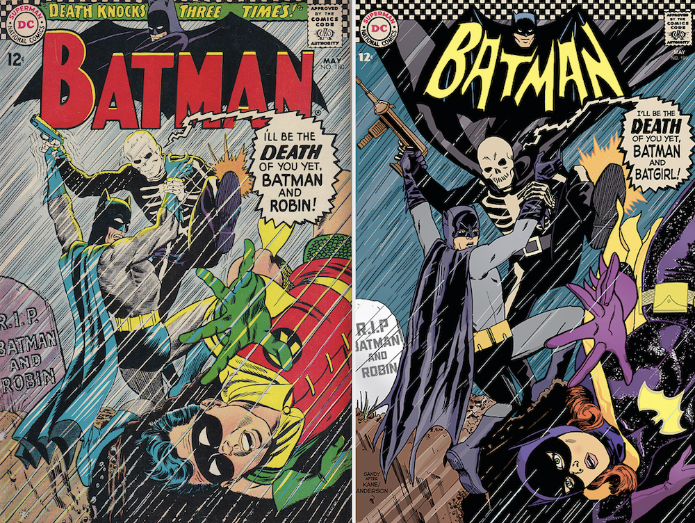
I think Sandy actually has a portal to Earth-Two, by the way. Because remember this?
Oh, and Sandy shared this gorgeousness with me too:
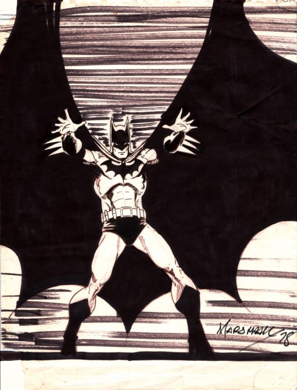
It’s a commission from more than 40 years ago.
“I was a kid at the NYC con, the Seuling one,” he recalled. “It was my first-ever commission, cost me $10. Watched him draw it, start to finish. I remember him smoking True cigarettes (the ones with the triangular plastic filter) while he worked, and he held them just like he drew the hands of smoking characters: thumb, index and middle fingers dead straight, the others bent. His Detective was my JAM; I was in funnybook heaven. Old-school funnybook heaven, with second-hand smoke!”
Ten bucks. TEN BUCKS.
Anyway, I’m posting this now because today is the day Detective Comics #1000 comes out – but it’s more than that: We just revealed the #3 pick in our TOP 13 BATMAN COUNTDOWN — and it’s the Steve Englehart-Rogers run, making it the top-ranked Detective story on the list. (Click here.)
Plus, we asked 13 top artists – including Neal Adams, Bill Sienkiewicz and Dave Gibbons — to pick their fave Detective covers. Sandy was among the crew and you can find all their selections by clicking here.
In addition, Kelley Jones has written a lovely tribute to Rogers and you can click here for that.
Lots of gorgeous art highlighted by the people who would know best.
Meanwhile, I’ve got my fingers crossed that someday soon we’ll be able to do a sequel to this post.
There’s more Rogers magnificence out there, after all…
—
MORE
— The Complete BATMAN WEEK Index of Features and Tributes. Click here.
— The Complete TOP 13 BATMAN COUNTDOWN. Click here.
March 27, 2019
One major complaint I had was that DC kept changing both the Detective Comics AND Batman logos too much over the years. I too think the original is THE BEST and never should have changed. I’m glad they brought it back in the mid-70s for a while. And I had a beef with the Batman logo without a bat figure or at least symbol behind it as it was sometimes done. Yuck. I WISH they’d just keep the same logos; minor variations wouyd be okay. AND I’m SICK of constant new #1 issues!!! There’s something to be said for tradition!
March 27, 2019
The Mike W Barr & Alan Davis run in the late eighties used a very similar cover logo to the original – ties into the whole feel they were going for at the time. 🙂
June 12, 2020
This is SO incredible!!!