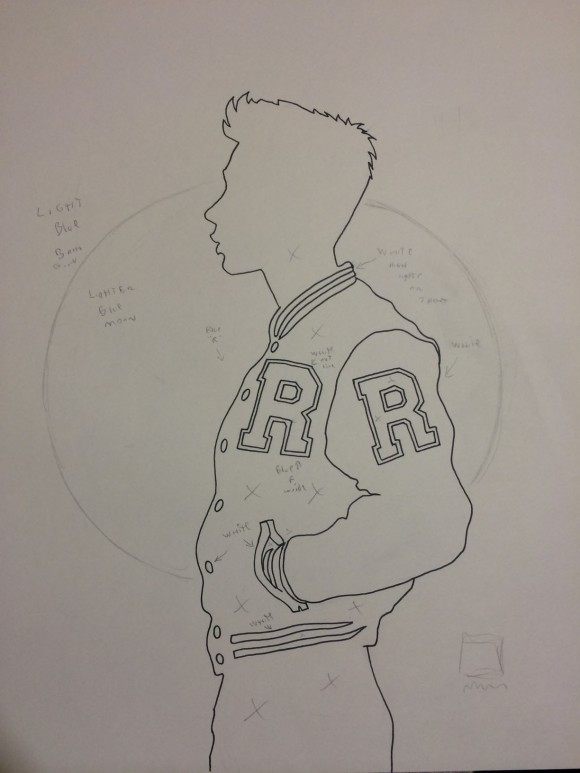
EXCLUSIVE ART! One of our favorite artists joins us in our weeklong series featuring some of the best Archie #1 variants coming in July.
We’re into variants in these parts, so when Archie Comics took a Star Wars-sized splash in the pool for their historic 7/8 relaunch by Mark Waid and Fiona Staples, we decided to get in on the Riverdale action. We asked a number of top artists in the business how they came up with their image.
First, Colleen Coover took you behind the scenes.
Today: David Mack, frequently seen in our own weekly Best VARIANTS! wrap-up.
—
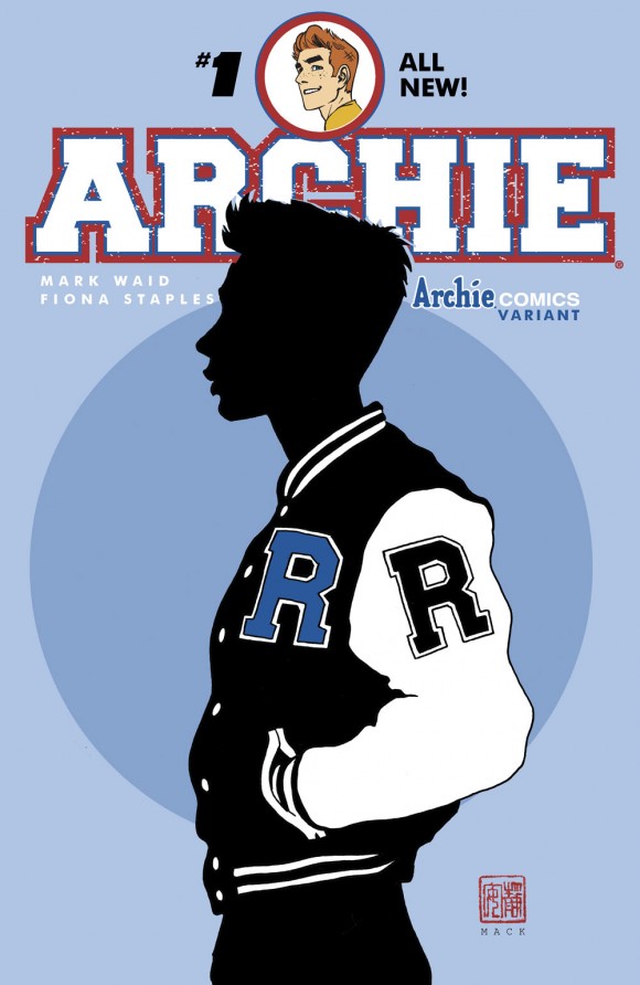
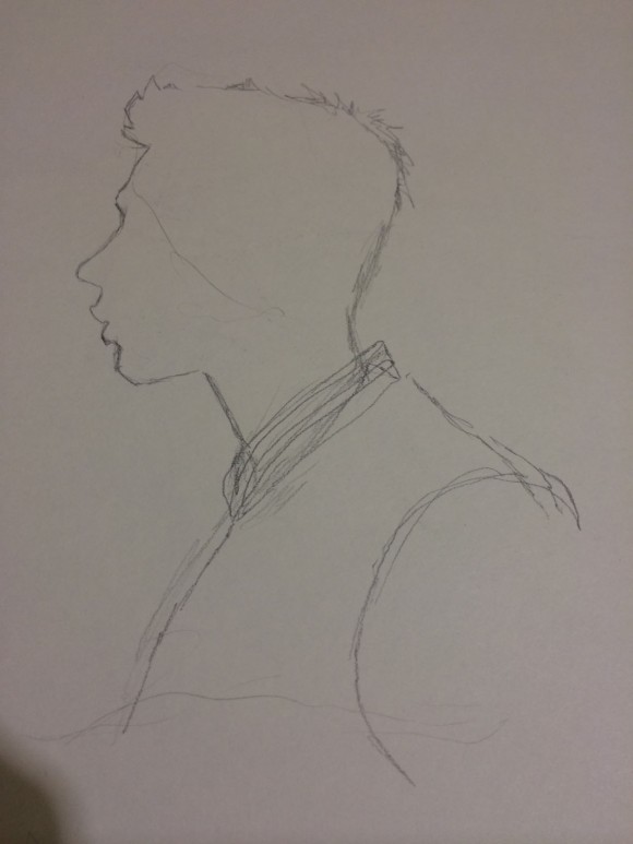
Since this was a new series with a new look for Archie and the book, I thought to use a silhouette of the main character.
I thought that would hint at the new look to the character but present some mystery about it, and what will be on the inside of the book.
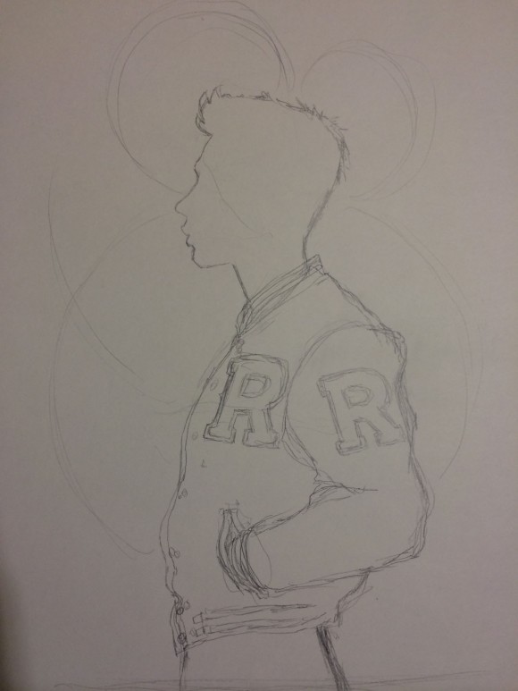
For the shape of the figure I wanted it to suggest a young student that would be relatable to contemporary readers but still have a continuity to what was timeless about the character and story.
The R on the letterman’s jacket would suggest the school and city of the character but the profile of the character in shadow would let you see the character in a new way.
— David Mack

