
This one is right on target…
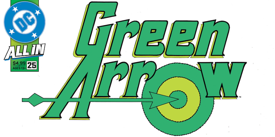
It’s fun just happening on things. Like this upcoming sketch-variant cover for Green Arrow #25, due June 25:
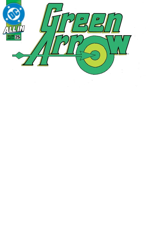
Lists for $4.99
As you almost certainly recall — and maybe if you don’t — this logo debuted with GA’s first solo title, a 1983 miniseries by Mike W. Barr, Trevor Von Eeden and Dick Giordano:
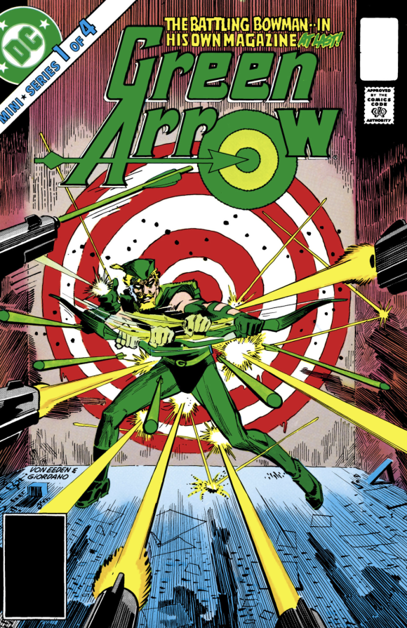
Here’s the background on the logo, courtesy of letterer extraordinaire Todd Klein’s indispensable website:
“Another terrific logo by Gaspar Saladino. This time Gaspar had plenty of room, and went all out, adding not only a fine stylized arrow making the horizontal stroke of the A, but a large bullseye forming the O. The letterforms are upper and lower case block letters with tiny pointed serifs and curved arms on the R’s and E’s. The G and A are joined to form a sort of monogram.
“The only thing that seems off to me is the W, which Gaspar forgot to italicize like the rest of the letters. The fact that I never noticed this until now points out how strong and attractive the logo is overall. And a narrow open drop shadow helps separate it from the background art. I love this logo, it’s Gaspar at his best, in my opinion.”
’Tis a nice one, for sure.
It’s not clear whether this is a one-off. The rest of the covers for Issue #25 — including the George Perez ’80s postcard variant — sport the current logo. But it’d be neat if DC did this sort of thing on the regular — retro logo sketch covers for current comics, beyond Facsimile Editions. It’s happened in the past but not with any consistency that I can recall.
—
MORE
— Dig DC’s GEORGE PEREZ ’80s Postcard Variant Covers — Now With FULL TRADE DRESS. Click here.
— Your FIRST LOOK at the New BATMAN Logo on September’s ISSUE #1. Click here.
June 1, 2025
>>> “The only thing that seems off to me is the W…..
>>>
I guess I don’t see it seeing as how each side of the “W” is already slanted in opposite directions. If you slant or exaggerate only one side, it takes away from the others I fear. But, yes, a great logo. I remember this run when it came out. I wasn’t a fan of the later “raw” GA stuff in the ‘80s. But I do remember this run.