
Modern, with a touch of history…
You mighta noticed Tuesday the new Batlogo on the Batman/Deadpool and Deadpool/Batman covers for this autumn’s one-shots.
But what you may not have realized is that the logo is the official banner that will adorn the new Batman series by Matt Fraction and Jorge Jiménez that’s launching in September.
The Batman #1 cover hasn’t officially been solicited, but here is your FIRST LOOK at the cover art DC showed off in February, now with the new logo. DC is using this as a placeholder image for the eventual Batman Vol. 1 collection by Fraction and Jiménez that will be released in the book market.
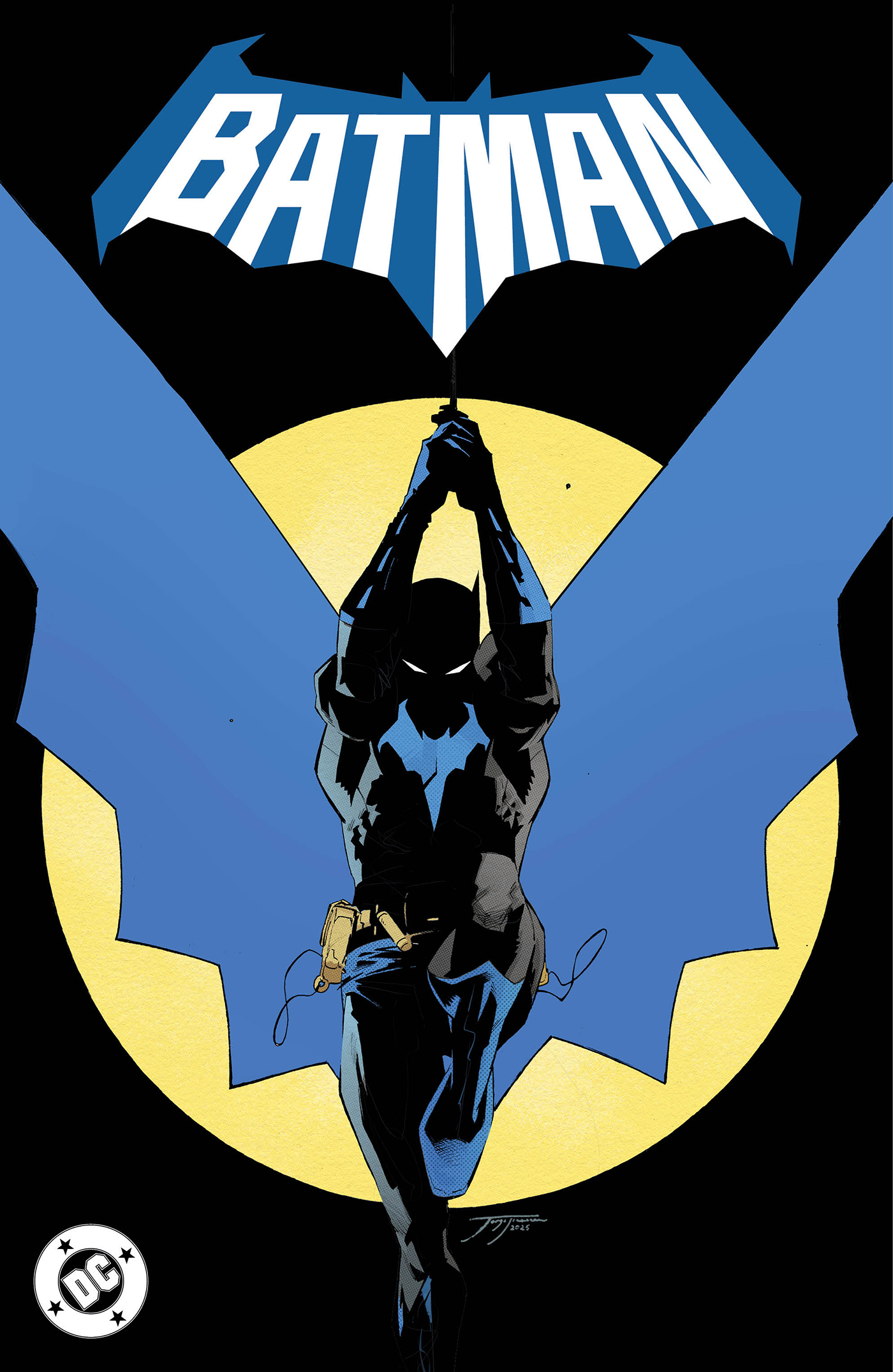
The shape of the bat mirrors the one that will be on the Dark Knight’s chest and the lettering recalls fan-favorite designs from the early 1970s and the 1966 Batman TV show but with a foreshortened perspective.
Looking forward to seeing it in other contexts — and the final Issue #1 cover.
—
MORE
— The 13 Greatest BATMAN Logos — RANKED. Click here.
— 13 DC COMICS Emblems — RANKED. Click here.
May 28, 2025
Hmmm. Okay. Not bad. It doesn’t bowl me over. But it’s fine.. But I’m an old guy. Nothing beats the logo of my youth that began in 1972 with Batman # 241 (with that iconic Neal Adams cover of Bats traversing the rooftops–without a seeming batrope), which ran to 1986 with Batman # 399. That Bat silhouette with that tall rectangular, or block-ish, sans-serif lettering is a great design. I mean, there’s a reason why it endured like it did. And I never minded the splitting of the word “Batman,” even if it seemed to irritate Dan off and on.
The 1970 to 1983 “Brave and the Bold” logo was great too–though I liked it better on B&B where it seemed to work better graphically by pairing it with another contrasting superhero logo, rather than its singular and central use for the later Batman title.
So logos 5 and 6 from the Aug. 31, 2019 article. Gee, I guess the 1970s (esp.) Bronze age rules . . .
June 2, 2025
Agreed!
May 28, 2025
Urk.
May 28, 2025
I think the art form of the cover with trade dress is truly a lost art. But I realize I’m also not the market demographic either.
May 28, 2025
It’s…okay…but the 72-86 logo remains the champ.
May 28, 2025
Not really digging the rumpled tin foil look of the bat (on the logo or chest emblem), but it’s not horrible either. At least it has a bat shape around it.
May 28, 2025
Looks like a modified version of “The Next Batman” logo that was used in Future State in 2020-21. Comparing them, the older one looks better to me–the word itself is in a rough bat-shape. This newer design is just a bat-shape with the name, in a similar font, stamped in there.
May 28, 2025
I like it.
May 29, 2025
Yeah, that chorus singing just the name “Bat-Maaaaaan!” the moment before the action began in every episode popped through my mind when I saw this new logo. Nice!
May 29, 2025
Sorry… I just threw up in my mouth a little.
May 29, 2025
I think I like it. If the visuals are any indicator, we are in for a different Batman than the one we have been getting.
June 1, 2025
That is not a nice looking logo. Far too uneven for my liking, especially the bottom right connection of the ‘N’ looks completely out of proportion compared to the other letters and especially when compared to the ‘M’