
A pattern is emerging…
Hey, remember about 10 years ago when DC did Neal Adams Month? When they asked the artist to redo a whole load of his famous covers (but recast the characters)?
That was cool.
Well, it looks like something kinda, sorta, similar-ish is happening with Frank Miller’s Dark Knight Returns Facsimile Edition variant covers.
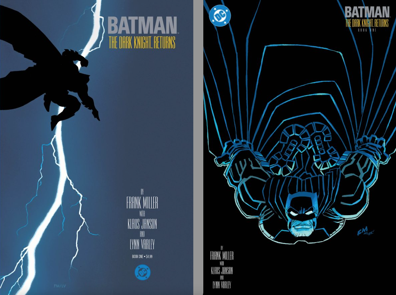
Check his original 1986 Issue #1 cover and the new variant…
… and his original Issue #2 cover and its new variant (out March 25):
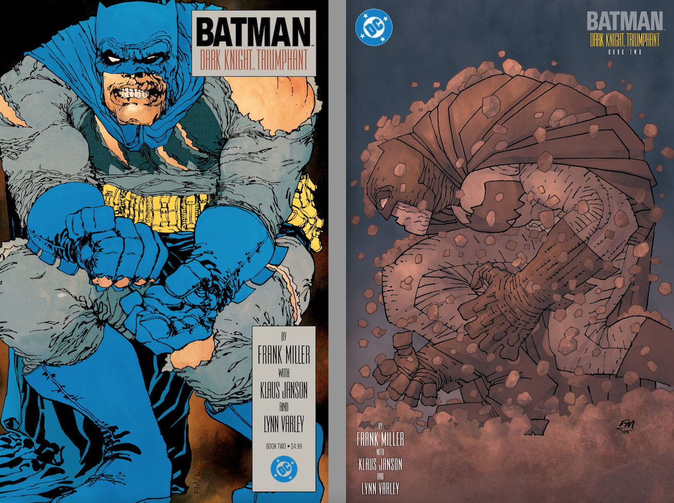
It appears that Miller’s taking the concepts of the originals and reimagining them in his current illustrative style. Dunno whose idea it was to do this and don’t much care. No matter what, I think it’s an interesting way for him to revisit the iconography that’s helped to define comic books for the last 40 years.
Now, to see what he’s got coming for April’s Issue #3…
—
MORE
— BATMAN: DC Sets Dates for April DARK KNIGHT and YEAR TWO Facsimiles. Click here.
— BATMAN: DARK KNIGHT RETURNS #4 Facsimile Edition to Get SUPER POWERS Variant Cover. Click here.
March 14, 2026
Ahhhhhh! Very cool!!
Thank you for pointing this out. Think I’ll also have to get one of each of these Miller variants while issue one is still available for retail price.
March 14, 2026
Miller has entered his “1970s Kirby” phase, e.g., making his work more graphic and abstract. I liked ’70s Kirby and I like what Miller is doing now.
March 15, 2026
Don’t like #1. #2 is okay, although not a fan of the all brown look, but the original #2 was terrible to begin with. I’m sticking with the foil variants 🙂 .
March 19, 2026
I do like Miller’s current work…..But those boots in issue 1 make no sense to me lol
He looks more like a 300lbs flying Grayson than he does a geriatric Batman. Just my opinion.
March 20, 2026
And wouldn’t his cape be blocking visibility of his back, legs, and boots?