
A BIRTHDAY SALUTE…
By CHRIS FRANKLIN
Carmine Infantino (May 24, 1925 – April 4, 2013) wore many hats during his long and illustrious comics career, mostly at DC. From the Golden Age to the early 2000s, at various times he was an artist, plotter, cover designer, editorial director and publisher. His influence in the industry in all these roles should never be overlooked. But it was his eye for design that separated him from many of his peers. Not only the attention-grabbing layout of a page or a cover, but the sprawling, somewhat abstract cityscapes behind the heroes and villains, and their physical appearances as well. Infantino had a knack for creating bold and interesting characters, many of which still look relatively unchanged today.
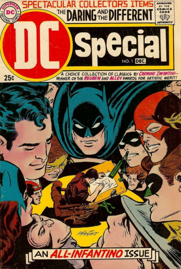
Cover to DC Special #1 (Oct./Nov. 1968) by Carmine Infantino
The comics titan was born 101 years ago. To celebrate, here’s a ranking of the TOP 13 DESIGNS that sprang from the amazing mind and pencil of Carmine Infantino. (Including original publication dates.):
—
13. Detective Chimp – Debuted in Adventures of Rex the Wonder Dog #4 (July–August 1952). OK, this one may be pushing “design” a bit, but Infantino, along with writer John Broome, co-created Bobo, aka Detective Chimp, for a back-up strip in The Adventures of Rex the Wonder Dog, which ran throughout the 1950s. Infantino initially drew him as a fairly realistic looking chimpanzee, but eventually began to make him look like a very stylized animated character, despite the cast around him looking like typical comics-style humans. He wore a variety of human clothes, but the Sherlock Holmes-like deerstalker cap is the visual that stuck. In recent decades, Detective Chimp has become a fan favorite thanks to his appearances in series like Shadowpact and Justice League Dark, but it all began with Broome and Infantino.
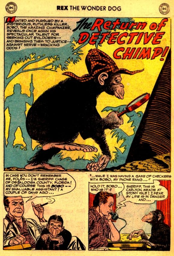
Page from The Adventures of Rex The Wonder Dog #6 (Nov./Dec. 1952) – Story John Broome, pencils by Carmine Infantino, inks by Joe Giella
—
12. Brothers Grimm – Debuted in Spider-Woman #3 (June 1978). The backstory of these characters is so convoluted, I’ll spare you the details. Let’s just concentrate on the visuals, introduced in Issue #3 of the original Spider-Woman title under writer Marv Wolfman, and of course, Carmine Infantino. There may be a slight bit of Infantino’s earlier Deadman here (more on him later), with the high collar, and the death face, or course. But that skull design is menacing, and the red and blue colors striking, making for a great opponent for any superhero, even if their motivations are murky at best!
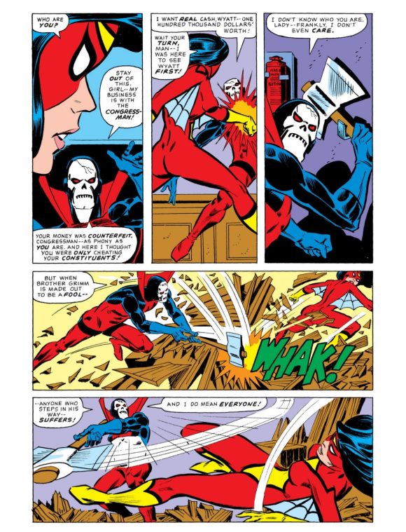
Page from Spider-Woman #3 (June 1978) – Story by Marv Wolfman, pencils by Infantino, inks by Tony DeZuniga
—
11. Cluemaster – Debuted in Detective Comics #351 (May 1966). Cluemaster was one of those characters with a better design than he probably deserved. Essentially a second-rate Riddler, Infantino bestowed upon him a unique look that made him seem more dangerous and formidable than his schtick could back up. The neckerchief and exposed upper face recalled wild west outlaws of old, while the capsules festooned on his torso made him look tech-forward. In his one-and-only solo appearance in the Silver Age, Robin called him a “walking Utility Belt”! The visual stuck in the minds of later creators like writer Chuck Dixon, who introduced him as the father of the heroic Stephanie Brown, later to fill the roles of Spoiler, Robin and Batgirl.
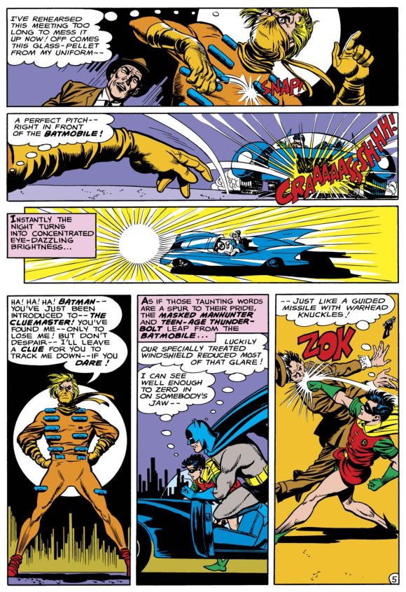
Page from Detective Comics #351 (May 1966) – Story by Gardner Fox, pencils by Infantino, inks by Sid Greene
—
10. Super-Chief – Debuted in All-Star Western #117 (Feb./March 1961). With superheroes returning to prominence in the early ’60s, Gardner Fox and Infantino snuck a costumed hero into the waning All-Star Western (which at one time had been All-Star Comics, home to the Justice Society of America). Super-Chief was an Iroquois warrior named Flying Stag who was given special abilities by a radioactive meteorite, sent (at least in his mind) by his god Manitou. A piece of the meteorite he wore gave him the powers of super strength, speed and flight for an hour a day. The character only made three Silver Age appearances before All-Star Western was cancelled with Issue #119 (June/July 1961), but the visual is hard to forget. The buffalo-head mask and bare chest adorned with the glowing amulet give him a unique look among DC’s pantheon.
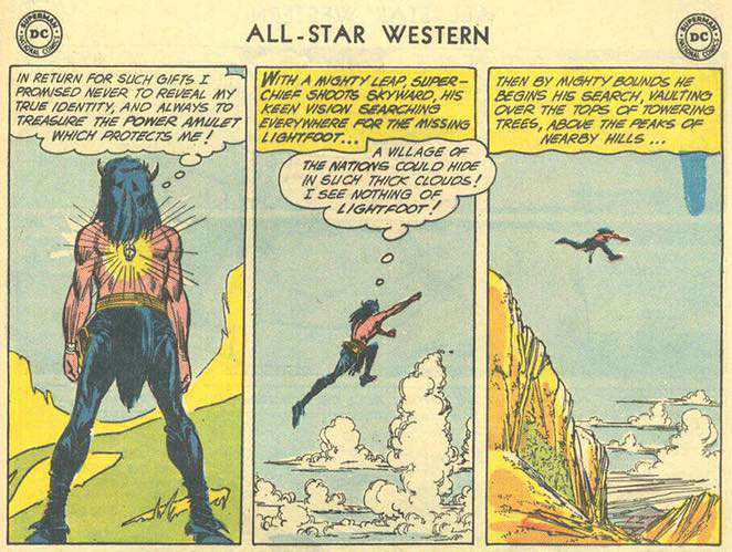
Panels from All-Star Western #117 (Feb./March 1961) – Story by Gardner Fox, pencils and inks by Infantino
—
9. Mirror Master – Debuted in Flash #105 (Feb./March 1959). If you were told to design a villain called “the Mirror Master,” you’d probably have some kind of reflective gimmick to their costume, right? Maybe some colors that would translate to comics well, but speak to that gimmick: white, blue, gray, etc. Not if you’re Carmine Infantino. He envisioned the Flash foe in the complimentary (but rarely used in comics) colors of light orange and green. The very distinctive cowl with its almost headphone-like design also became a trademark of this Flash rogue. Co-created by John Broome for the first issue of the Silver Age Flash’s ongoing title, Mirror Master’s look has remained basically the same for almost 70 years. Upon reflection, Infantino made a wise design choice.
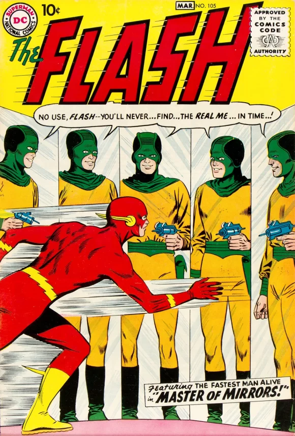
Cover to The Flash #105 (Feb./March 1959) –Pencils by Infantino, inks by Joe Giella
—
8. Captain Boomerang – Debuted in The Flash #117 (Dec. 1960). Although created by John Broome and Infantino, in-universe, Captain Boomerang’s look came from a toy company! Yes, Australian criminal and boomerang master Digger Harkness was hired by the Wiggins Game Company to promote their new line of kid-marketed boomerangs as the fictional Captain Boomerang. So, the over-the-top costume of the military-style blue cap, and tunic covered with stylized boomerang shapes does make sense. The long flowing white scarf shows motion, as do Digger’s curly locks, sticking from the side of his head like an evil Larry Fine. Forgoing the stereotypical “outback” look, Infantino went outside the box, with memorable results.
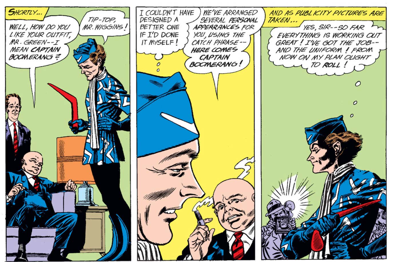
Panels from The Flash #117 (Dec. 1960) –Story by John Broome, pencils by Infantino, inks by Murphy Anderson
—
7. The Trickster – Debuted in The Flash #113 (June/July 1960). The Trickster, co-created by John Broome, is one of those characters whose name and costume don’t exactly match his main gimmick, which is his air shoes. These allowed former circus aerialist James Jesse to conquer his fear of heights. He then decided to emulate his reversed namesake Jesse James and turn to crime, as you do. But the visual of him walking on air was perfectly captured by Infantino. You couldn’t take your eyes off him, thanks in part to the garish harlequin-like costume. Orange-and-blue striped tunic, yellow-and-black striped shorts and orange-and-black striped leggings SHOULDN’T work, yet they do. Add in a high-collared black cape lined with orange, a domino mask, and of course those ubiquitous blue air shoes, and you have a unique design that sets him apart even among Flash’s other colorful rogues.
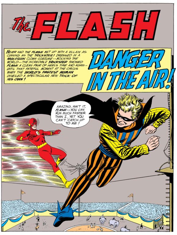
Splash page from The Flash #113 (June/July 1960) –Story by John Broome, pencils by Infantino, inks by Joe Giella
—
6. Captain Cold – Debuted in The Flash #114 (Aug. 1960). Captain Cold’s design isn’t just ingenious, it’s practical. If you had a cold gun that generated ice and froze everything around you, you would very likely get chilly. So Infantino designed a blue-and-white parka-like costume for him, complete with fur-lined hood, gloves and boots. But to put across the theme even more, he gave him an icicle-fringed shawl over his shoulders. This and the tip of his hood gave Infantino elements to convey movement with, important when he’s going up against the Flash. Even the holster for his cold gun looks frozen! Add in the splash of color with the Batman-like belt, and those slitted blue shades, and you have one cool customer. Mr. Freeze (who debuted later) may be more famous, but Captain Cold started out with a much better look, and it has endured.
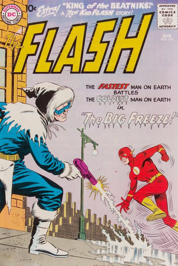
Cover to The Flash #114 (Aug. 1960) – Pencils by Infantino, inks by Joe Giella
—
5. Deadman – Debuted in Strange Adventures #205 (Oct. 1967). Co-creator Arnold Drake proposed a skull-face for Boston Brand’s alter-ego, but Infantino felt that would limit the range of emotion he needed to convey. So instead, he came up with a ghoulish mask to cover Brand’s face… which become his definitive look once he was indeed dead! The red bodysuit with a “D” on it may be a BIT like a certain Man Without Fear across town, but the addition of the high collar makes it look very showbiz, and an apt costume for a circus aerialist. It also adds a somewhat sinister, ethereal flare when Brand is leaping into the bodies he possesses. Infantino drew the character’s introduction in Strange Adventures #205, but with the very next issue, Neal Adams took over, making the character his own. But Infantino created the look, and despite some fairly drastic artistic reinterpretations over the decades, it’s remained essentially unchanged.
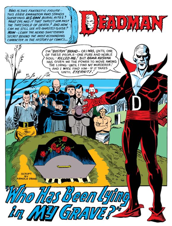
Splash page from Strange Adventures #205 (Oct. 1967) – Story by Arnold Drake, pencils by Infantino, inks by George Roussos
—
4. Black Canary – Debuted in Flash Comics #86 (Aug. 1947). Infantino and writer Robert Kanigher introduced Black Canary as a foil for Johnny Thunder in Flash Comics #86. By Issue #92, she had taken over the strip wholesale — and his spot in the Justice Society of America in All-Star Comics. But it’s no wonder, really. Canary was a late Golden Age hero who stood out from the crowd, a typical crime noir femme fatale but on the side of the angels, somewhat in the mold of Harvey Comics’ popular Black Cat.
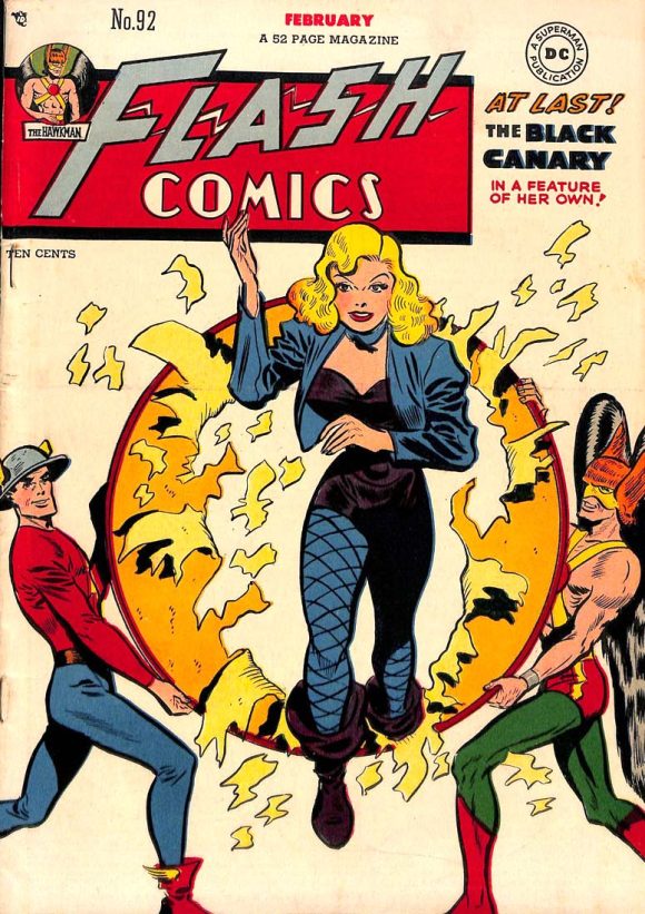
Cover to Flash Comics #86 (Aug. 1947) – Pencils and Inks by Infantino
Canary’s look was the real grabber. Flowing blond hair (a wig over Dinah Drake’s natural black locks), blue bolero jacket over a black bustier, pirate boots, and of course fishnet stockings. It’s a look that could easily have read villainess instead of hero, and that hint of danger and undeniable sex appeal carried her through the JSA’s last hurrah in 1950. When the Golden Age heroes were revived, Canary was the one who was plucked from their ranks and brought into the current Justice League of America. Redesigns have come and gone, but eventually some aspect of Infantino’s original look returns, usually the jacket or those famous fishnets.
—
3. Batgirl – Debuted in Detective Comics #359 (Jan.1967). When Batman TV series producer William Dozier told comics editor Julius Schwartz that he wanted a new Batgirl created so he could add her to the show, Schwartz turned to his lead Batman artist, Infantino. Eschewing any connection to the previous Batwoman and Bat-Girl (Kathy and Betty Kane), Infantino went with a female Batman look, with several twists. Most striking was the choice of making her bodysuit jet black, using gray sparingly to show highlights. This was unfortunately abandoned by later artists and made Barbara Gordon’s now-gray uniform look more like a straight Batman copy. In the age of Batmania, with Bat-branding EVERYWHERE, Infantino gave Babs no less than SIX bat-shapes on her costume: her cowl; the chest emblem; her belt buckle; her two boots; and her purse/utility bag!
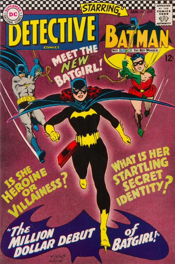
Cover to Detective Comics #359 (Jan.1967) – Pencils by Infantino, inks by Murphy Anderson
He and co-creator/writer Gardner Fox even came up with a neat gimmick where Babs’ street clothes convert into her costume. It’s a timeless look that has influenced every Batgirl redesign that has followed, and in my opinion, none have ever bettered it.
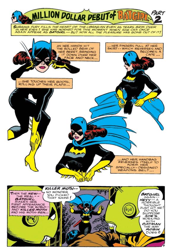
Page from Detective Comics #359 (Jan.1967) – Story by Gardner Fox, pencils by Infantino, inks by Sid Greene
—
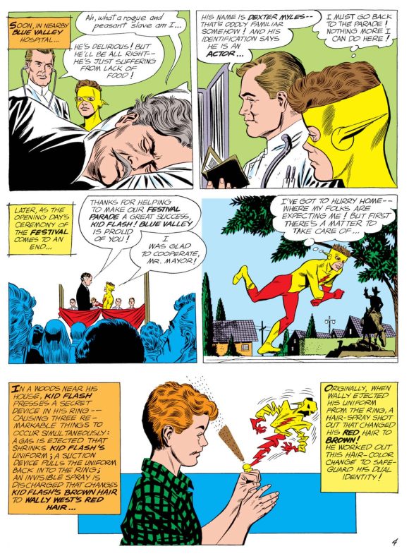
2. Kid Flash – Debuted in The Flash #135 (Mar. 1963). Created by writer John Broome and Infantino for The Flash #110 (Dec./Jan. 1959), Wally West began his career in an exact replica of Barry Allen’s Flash costume. It was a cute notion, but uninspired, and made it hard for readers to know which hero they were looking at, despite the height difference. In Issue #135, Infantino solved this problem by giving Wally one of the most striking costumes in comics. Everything from the waist up was radically different, swapping the red shirt for yellow and giving him red gloves and lightning bolt chest emblem. The kicker was the cowl, leaving the top open so Wally’s hair could flow in the wind as he sped along. A few issues later, Broome even devised a gimmick to disguise Wally’s exposed red hair, making it brown when he’s Kid Flash!
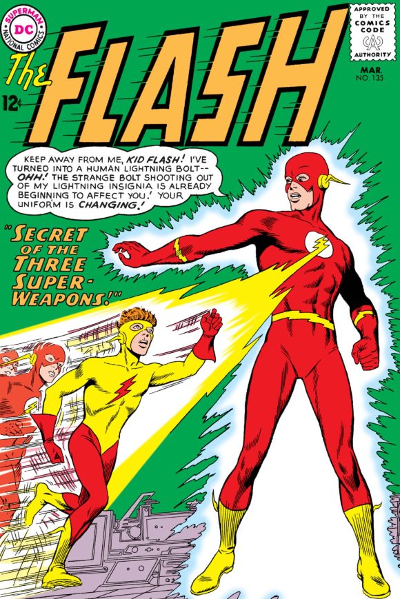
Cover to The Flash #135 (Mar. 1963) – Pencils by Infantino, inks by Murphy Anderson
The result was a look that some may think outdoes the original Infantino Flash design. There are days I question it myself! Despite Wally graduating to the Flash mantle four decades ago (!), the look has been adopted by later Kid Flashes and never tends to stay gone for long. It’s just too good to leave laying around.
Page from The Flash #138 (Aug. 1963) – Story by John Broome, pencils by Infantino, inks by Joe Giella
—
1. The Flash – Debuted in Showcase #4 (Sept./Oct. 1956). Of course, our No. 1 pick must be the redesign that launched a whole new age of superhero comics. Infantino was no stranger to the Flash, having drawn many adventures of the Golden Age speedster, Jay Garrick. But Jay was now just a fictional idol of police scientist Barry Allen, and Infantino, editor Schwartz and writer Robert Kanigher envisioned a sleek jet age look. Infantino delivered with a visual that just reads “speed.” Borrowing the red bodysuit and yellow boots from another lighting-emblazoned hero (Captain Marvel), he added a winged cowl and lightning accents at the forearms and waist, which gave him elements to play with when displaying the Flash’s powers. They even gave him one of the best costume-change elements in comics, with his suit hidden in his ring.
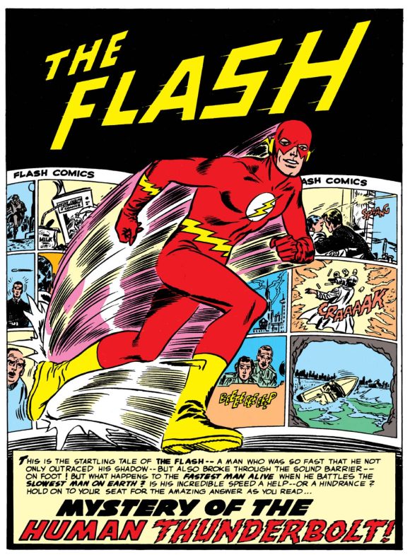
Splash page from Showcase #4 (Sept./Oct. 1956) – Story by Robert Kanigher, pencils by Infantino, inks by Joe Kubert
The unencumbered, streamlined look set the standard for the Silver Age that the character kicked off in his debut in Showcase #4. Every Flash costume that has followed has been heavily based on Infantino’s design, including all his media interpretations. This side of Superman, Batman, Robin and Wonder Woman, it’s easily the most iconic look of any DC character.
Page from Showcase #4
—
MORE
— It’s… 1966 BATMAN PINUPALOOZA! Click here.
— The Golden Age of CARMINE INFANTINO. Click here.
—
13th Dimension contributor Chris Franklin is a graphic designer, illustrator, writer, and podcaster, who co-hosts and produces several shows on the Fire and Water Podcast Network, including Batman: Knightcast with Ryan Daly. Check out his illustrative and design work at chrisfranklincreative.com.
May 24, 2026
I know this is about Infantino’s character/costume designs, but he was amazing (particularly on The Flash through the mid-1960s) as a page designer. 70 years later, I think Showcase 4 is a masterclass in visual storytelling and graphic design. I know that Kirby gets the lion’s share of the credit as the pre-eminent ’60s era Silver Age artist, but I always found his page designs to be pretty pedantic. Whereas Infantino’s page layouts were incredibly dynamic.
May 24, 2026
Memories! Pressed between the comic book pages of my mind!!!!
May 24, 2026
Memories! Pressed between the comic book pages of my mind!!
May 24, 2026
In the early 2000s I met Carmine Infantino at a comic con. His table was one of the first tables you passed as you entered. He was sitting behind a table with several copies of a book he had written. A much younger man informing people of he was as they walked in. I was amazed at how many people just passed by and I wondered if they understood just how important this man was to the history of comics. I’m normally not into getting autographs but in this case I couldn’t resist. I was able to talk with him for a few moments. We saw other celebrities that day – both from television and movies. But Carmine was certainly the most important one in my mind.
May 24, 2026
Terrific piece, Chris. I’m embarrassed to say that in decades of reading about him, I never noticed that Captain Cold’s holster was icicle influenced.