
EXCLUSIVE! It’s BATMAN ’66 WEEK! One of our fave artists shows you how he put together an awesome page for DC‘s Batman ’66 comic!
The story Dave’s writing about will be available in December‘s print Issue #18. And you can get it now digitally (Issue #39) via the DC Comics App, Readdcentertainment.com, comiXology.com, Google Play, Kindle Store, Nook Store, and iBooks.
—
By DAVE BULLOCK
This is my first stab at a digital comic for any publisher and DC was very helpful with supplying all sorts of reference information showing what looks good on the tablet device for readers and giving information on how they like to lay out their pages these days with the digital process in mind.
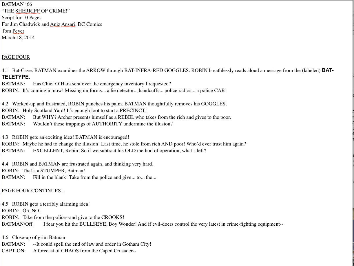
Basically what they’re doing is taking the standard 11 x 17″ page and almost chopping it right in half in the middle, horizontally, so you end up with two sort of square boxes and that’s your format for the digital tablet these days. With that in mind, Tom Peyer has written a fun script and he breaks each page down.
For the first half of it, it’ll just say Page 4, for instance. We’re looking at Page 4 here. And then the second half of it will say page 4 Continues. That’s his way of letting me know that that’s the second block at the bottom of the page and that’s how he wants to break it up.
So for the most part I stuck with all the panel breakdowns that Tom had given me. There are a couple cases where maybe I switched things around that you feel like as a storyteller will read a little bit clearer. Once in a blue moon I’ll combine a couple of ideas. I feel like I can get two ideas across in one panel as opposed to the way he’d broken it down. Of course, Tom is an old pro obviously so he knew what he was doing here. There was no real confusion on anybody’s part.
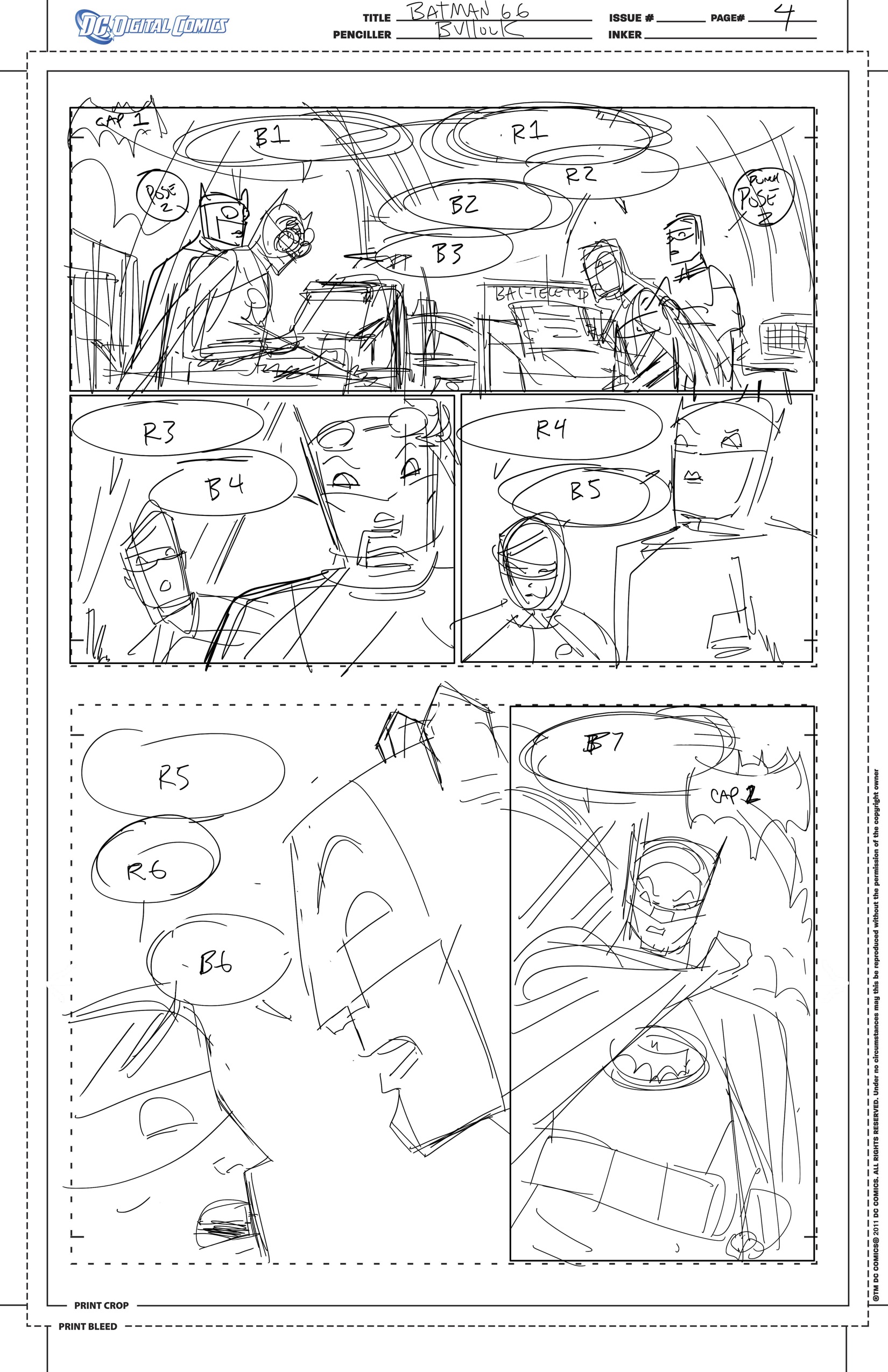
So I’ll get a script and keeping in mind the layout I’ll start roughing out things and for this project I roughed it out on a Cintiq tablet so I’m working digitally for this part of the phase. I’ll do my rough layout and try to block in different ideas for multiple poses at times so that I can show my editor, Jim Chadwick, and his assistant Aniz Ansari, and I can give them an idea of what I’m thinking for maybe two poses for the digital experience.
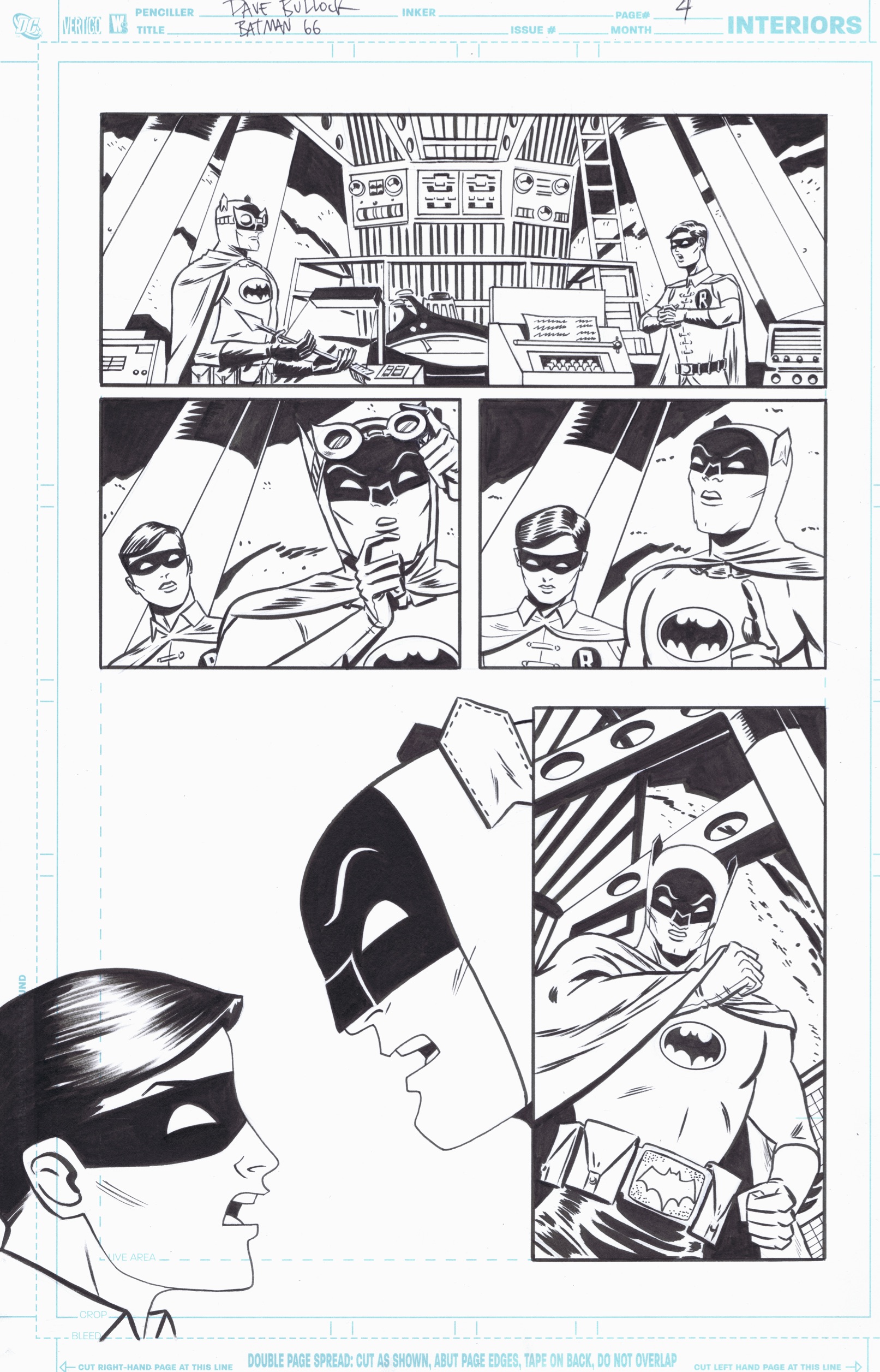
As the reader is tapping that right arrow, they’re going to see that the character may be moved from pose A to pose B or have a guy like the Archer pull back or something like that. I’ll block that in and all that will be in the layout. So if you guys are looking at the layout on Page 4, the very top tier has two poses of Batman and Robin in it real rough at this point, just blocking in composition and letting my editor know where I think we can put the word balloons and things like that.
Step 1
I actually tried to call back a little bit to the old Adam West TV series here with that profile shot on the bottom panel. There’s something in the opening title sequence where Batman and Robin turn to each other right before they shake hands and the camera pulls out. I was trying to be reminiscent of that with this bottom left profile shot.
From there, I’ll turn this in and then Jim will have different ideas. I think it was his idea to have — actually I know it was his idea — in Panel 2 to have Batman start with the goggles down and then raise them up in a second pose. Aside from that, I think it was just the poses in the top panel. So he had all these poses broken down to separate layers once I went into the next step.
Actually, let me back up a tiny bit. So Jim’ll approve this and give me any notes for multiple poses or composition for poses and things. Then I’ll take this comp and I’ll print it out on 11 x 17 paper on my trusty Brother, which does a great job.
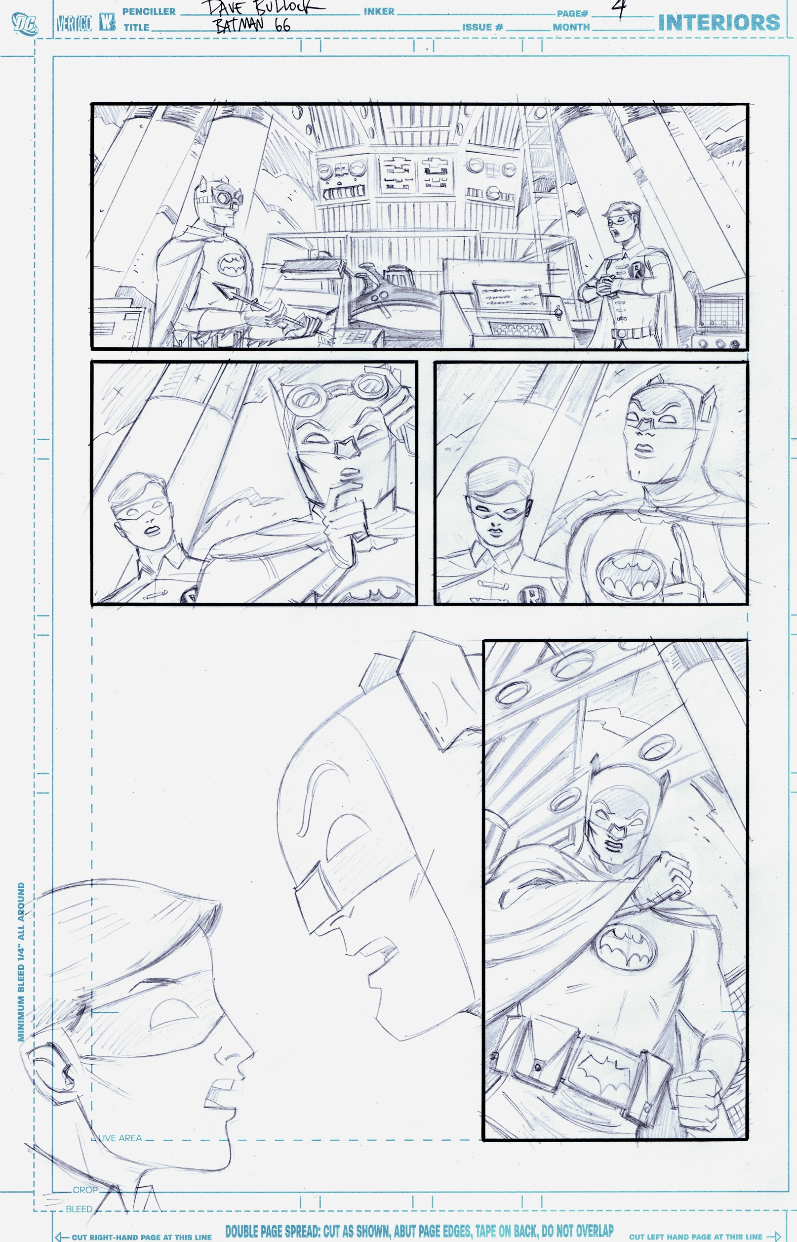
I’ll lightbox that for penciling. I’m a kind of guy that really likes to work with my hands. I like to work on paper with ink so I went to the drawing board at this stage, light boxed it, penciled the whole thing in and then that would be our pencil page.
Step 2
For the multiple poses, I’ll just pick whichever one I want to be on the final, what I’m thinking of as being sort of the master art board. I just went with the B poses in Panel 1 where Batman and Robin are sort of looking at each other and I went with the B pose on Batman lifting his goggles up over his forehead there. I’ll pencil that guy up and ink it.
Step 3
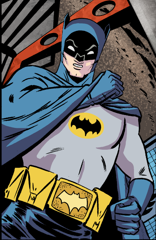
For me the process entailed then taking another sheet of Bristol board and lightboxing over the top of my inked page and drawing in the secondary poses, or in this case the A poses, and filling in some of the parts of Batman that weren’t in that bottom profile shot. Then I pencil those in and ink those in on another, separate piece if art board and then I merged those two things together in Photoshop so that I could register all the actions on top of each other so characters weren’t sort of sliding around and things like that.
I take those pieces of art together and sort of chop it up a little bit. I’ll cut all those panels up off of the background so that they are individual layers. That way, again, for the digital experience as the reader taps that right arrow, each new panel or pose will sort of pop on, also just a way of reading through and, of course, the word balloons pop on in sequence as do the captions. That’s the process I went through.

Step 4 — The bonus art
Once I got my initial inks through, I scanned everything and sent it over to the editors. While I was working on the bonus poses, they put it through the lettering process. Here’s it’s Wes Abbott.

Step 5
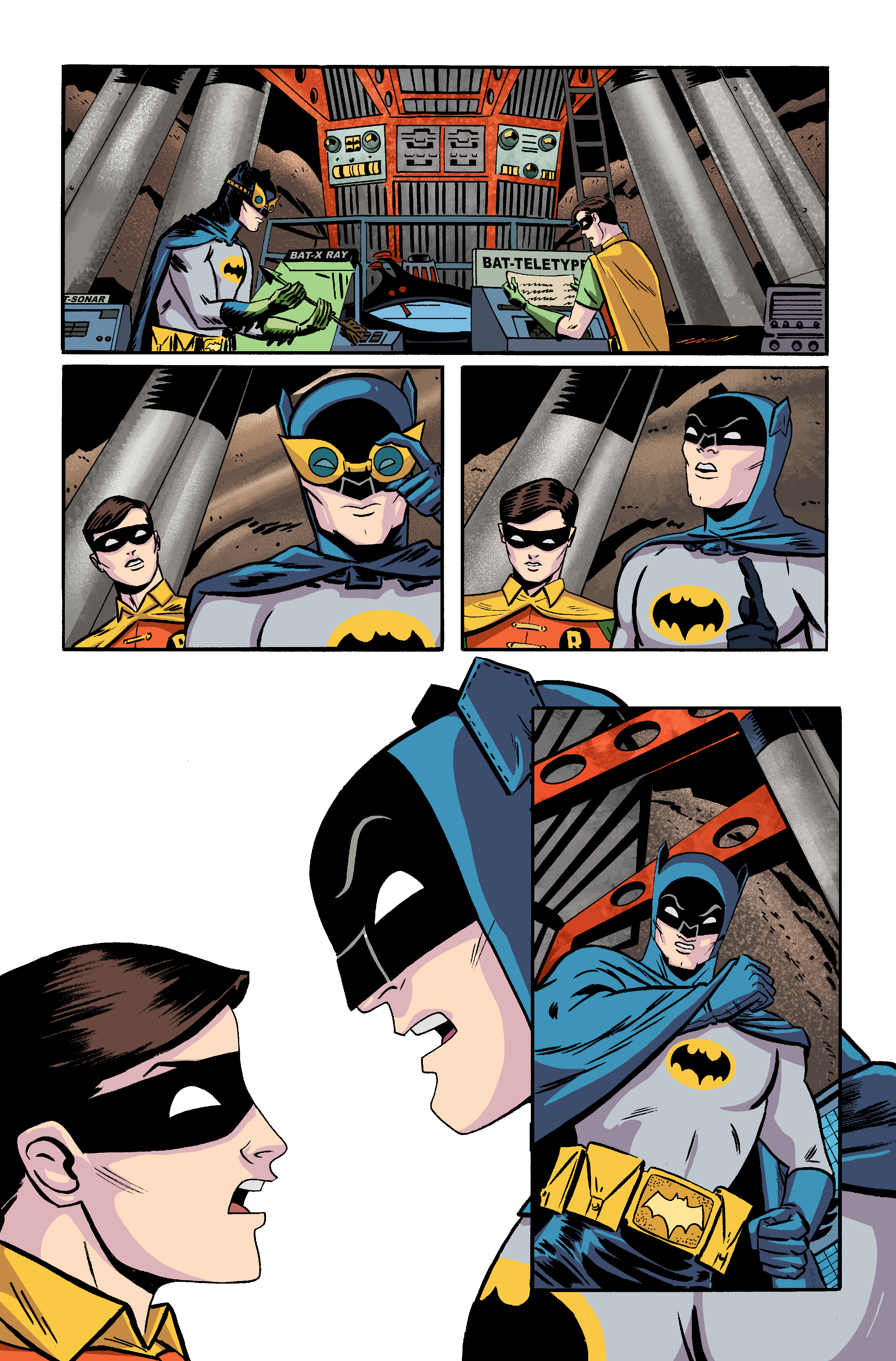
Wes starts plugging in his ideas for where all the lettering will go and once they get the secondary poses they sort of have to have figure out exactly where which bits are gonna pop on at what time. From there, the artwork gets sent over to our color artist, Tony Avina.
Tony was real patient with me. He did a great job. My main notes were I wanted to make sure Robin’s hair was brown as opposed to the blue that you see in Silver Age comics. And I asked him if he could drop out the outline around Batman’s chest symbol so that you didn’t see a black outline around that yellow circle. I just think the outline took away from the look of the Batman ’66 costume. He was great with that. He went with some really great, bright colors here, sort of kid-friendly and vibrant.
Step 6
And then we’d had a discussion at one point of how we could maybe make this look a little bit more animation-like. We came up with the idea to go with a little bit of a texture look in the background. In that way it helps sort of pop the characters off of the background a little bit so you almost end up with a cel-shaded look on the characters and then a painterly texture on the backgrounds. You see that in the reactor here in the Batcave behind Batman and Robin.
And then of course, the letterer adds in little touches like the lettering on the Bat-equipment — Bat Sonar, Bat X-Ray, Bat-Teletype. I know I plugged some of that in but for whatever reason they had the letterer redo it. I’m not sure at what point. Maybe I got it to them later in the process or something. Tony colors it up. It went through a couple of revisions.
I know this particular story was only 10 pages but part of the deal with DC Comics is they have to be sort of production-friendly. I know they had another story that was running a little bit behind so they asked to speed this one up. Most of that speed-up fell on Tony Avino. He did a great job getting it together. I think he probably had somebody help him with some flatting but he did a great job.
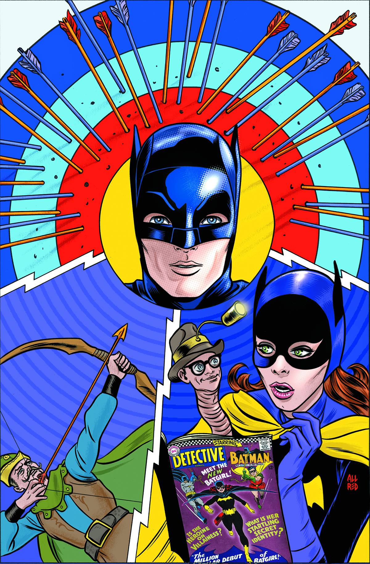
The Mike Allred cover to Batman ’66 #18 — the print edition due in December.
I feel grateful to be working with other talented professionals, you know? We all make each other look good at the end of the day. Then Tom Peyer’s script gets plugged on top of it with all that lettering so everything gets merged together. Again, that’s all broken up on separate layers for the digital experience.
So there you go. That’s sort of my process with one of the pages of the 10-page story. You go from getting a layout approved to penciling and inking your master page and then sort of popping in your bonus art — as DC likes to refer to it — putting into layers and then merge it together.
Part of the idea there, too, is that they like to, again, think of it in animation terms, that you almost could draw a clean background and then do your characters separately and then put them on top almost like an animation cel.
But I chose to have it all inked on one board at least for what I considered to be the primary poses because, being an old-school guy, I like to have a nice finished page of artwork in my hands and then give them the bonus poses on a separate page as opposed to just looking at a finished piece of art with just the Batcave there and no characters in it. That would be kind of boring to have hanging on your wall at the end of the day, right?
All in all, you should probably be spending maybe two days on something like this as an artist if you’re going to make any kind of a living at it. I was grateful, too, that Jim was real good about getting right back to me in terms of any notes or comments on my layouts. Sometimes, Editorial is real busy with different things and it can take them a few days so you get a little bit held up in there. But he was great, got it all turned around real quick and had some smart suggestions. So yeah, it was a good working experience. We all had a good time with it.