Holy Infantino! Holy Anderson!

One of the things I dig about the fan-driven Batman Meets Godzilla miniseries is the way writer Eric Elliott and the Batzilla gang have promoted their passion project. There have been t-shirts and stickers and all sorts of funky promo imagery.
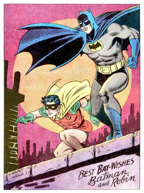
Well, the best yet (in fact the best thing I’ve seen anywhere in awhile) is a faux ’60s house ad that riffs on one of the most famous images of the Dynamic Duo: the Carmine Infantino/Murphy Anderson pin-up of Batman and Robin getting ready for action on a Gotham City rooftop:

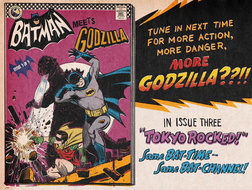
Check this out:

That’s… that’s just brilliant.
Who’s the artist? None other than graphic artist Matthew Dunn, whom you may recall was one of the major champions of The Bat Swings, a fabulous tribute to the music of Batman ’66 by the University of Central Florida’s The Flying Horse Big Band.
“I reached out to Eric in May, because I wanted to make something light-hearted and fun, and I’d been itching to try out some digital illustration tools,” Matt said. “Some of the vintage comic coloring tools have gotten really good and easy to use. So far, my personal favorite is Retro Supply’s ColorLab kit. Great stuff.”
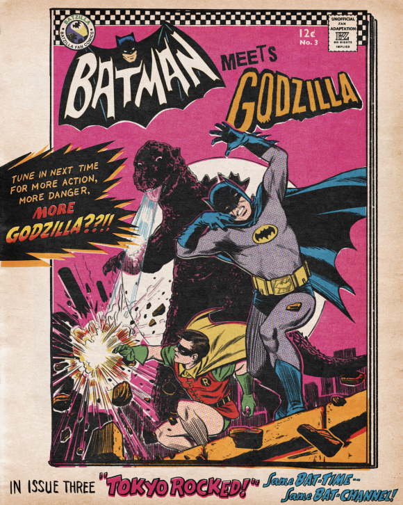
The third issue of the three-parter — based on an unfilmed Batman ’66 Meets Godzilla treatment — is coming soon and will actually have a different cover. But this concept blew my mind the second I saw it. Here’s another version:

“My obvious approach was to create a comic cover as if this adaptation reached newsstands in 1967 or so,” Matt explained. “I wanted to bridge the mid-’60s Batman comics, TV’s Dynamic Duo (even though their likeness almost never showed up on merchandise at the time), and Godzilla. The first item in that list puts Carmen Infantino with Murphy Anderson or Joe Giella at the top of my mind (and surely every other longtime Bat-fan, no?). The pose was a no-brainer as well, because it’s so recognizable and linked to the period. Given the massive scale difference between the Caped Crusaders and the King of the Monsters, the pose and rooftop setting worked well for incorporating Godzilla.”

To me, it’s not just the cover that makes this sing, it’s the addition of the classic DC house-ad trappings.
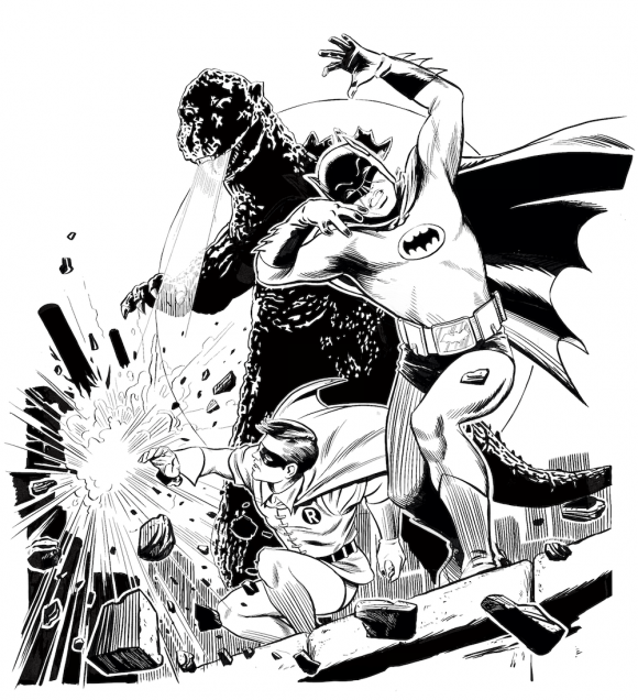
Take a gander at this process video:
“I was most interested in mimicking the newsprint interior of vintage comics, so I added a little more nostalgia by dressing it up as a Silver Age DC house ad,” Matt said. “I plan to revisit the art and make it look like a true, outer cover on glossy paper stock with a little more coloring detail.”
You can check out Issues #1 and #2 of Batman Meets Godzilla by clicking here. Since it’s all unofficial and made by a team of fans, no money changes hands. It’s free, free free.
Far out.
—
MORE
— BATMAN ’66 MEETS GODZILLA: Now You Can Finally Check Out the Lost Project. Click here.
— THE BAT SWINGS! The Coolest Tribute to the Music of BATMAN ’66. Click here.

December 5, 2020
I dig that awesome vintage-style cover. 🙂
December 6, 2020
Love the inclusion of the “Go-Go” checks!
December 7, 2020
Wow, that is impressive. It actually LOOKS vintage. So many try to achieve this look, and while I applaud the effort, never quite get there. This…this could actually fool someone it was scanned out of a 1966 comic!!!