
A JACK KIRBY Birthday Salute by the superstar creator of Fantastic Four: Full Circle…
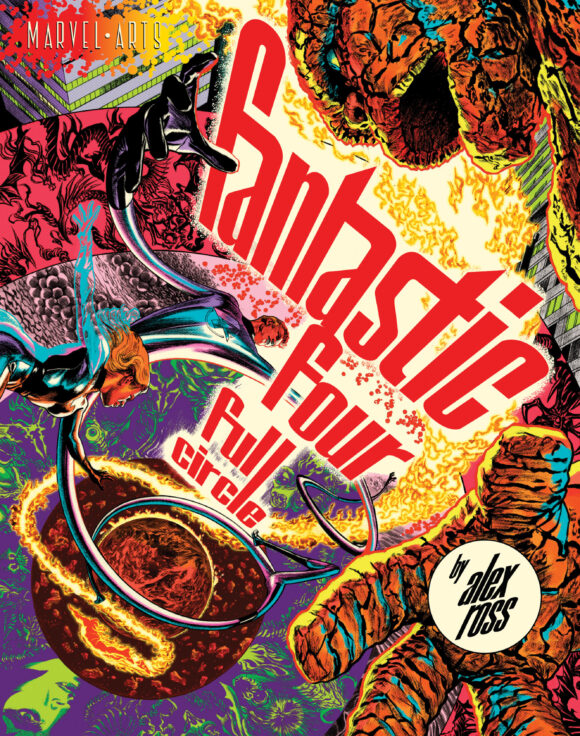
Probably the year’s most anticipated book — Fantastic Four: Full Circle, written and illustrated by megastar Alex Ross — is hitting comic shops Aug. 31 and booksellers Sept. 6, a joint publishing project by Marvel and Abrams ComicArts. It’s Ross’ homage to not just the team that launched the Marvel Age but to the spectacular creativity of Jack Kirby, who was born 105 years ago on Aug. 28, 1917.
So it seemed only fitting that we invite Ross to head up our annual Kirby birthday salute and the artist agreed to go out on a limb and rank his TOP 13 Kirby Fantastic Four covers.
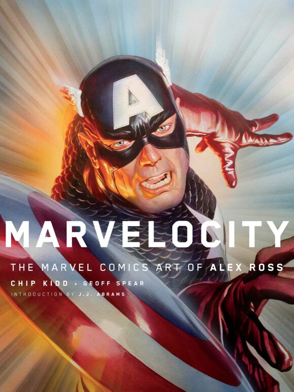
It’s fitting for another reason too: Back in 2018, we broke the story of how Ross had wanted to reboot the Fantastic Four but Marvel declined his pitch. You can click here to check out the details, which Ross discussed in his art book Marvelocity.
We’re especially proud, then, to complete the connection by publishing this guest column.
I guess you could say we’ve come full circle.
Dig it.
By ALEX ROSS
As an all-around fan of Jack Kirby’s body of work, I don’t often think of just his covers or of him as a cover artist. Kirby did this job as well as any other he put his time to; it’s just that when I think of him, it is as the overall force of creation and storytelling that he is to comics. Still, the incredibly striking pieces he did to grab the readers’ attention on covers is certainly worth talking about. In the early ‘60s, Jack Kirby was the preeminent graphic identity of Marvel, where he was used on every book they published, or at least as much as editor Stan Lee could fit into Jack’s schedule. The Fantastic Four book was the rock upon which they built the Marvel kingdom, and it is where their creative synergy most excelled.
Here are, in altogether subjective order, my 13 favorite Kirby FF covers. (Dates are pub dates):
—
13. Fantastic Four #26 (May 1964). Here I am not citing this cover for its dynamic style but for the opposite — for its flatness and distance from the action. In what was a culmination of the first great comic book crossover in history, where the classic squaring off of the Hulk vs. the Thing brings both the FF and the Avengers into the story, the cover design here shows all of the character pieces laid out on a comic panel-like unfinished building structure where the figures all lead to the Hulk on the top. Simple, primitive, and, in its own way for comics history, revolutionary.
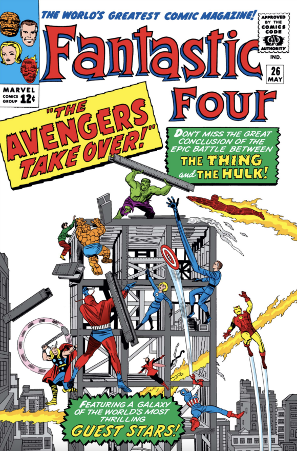
Sol Brodsky inks
—
12. Fantastic Four #7 (Oct. 1962). Now I want to be clear: I don’t love this cover for its composition, but for what it reveals. I, and many others, believe Jack Kirby was always subconsciously drawing himself as Reed Richards/Mister Fantastic. His face, on this wanted poster of team portraits, strikingly resembles Jack’s, with his real-life hairstyle, and a softened, idealized presentation of his features. Most readers associate Kirby’s personal character as being represented by Thing, and I would agree, but despite the common conclusion that Reed is Stan Lee, I would argue that Jack was reflexively instilling himself in Mister Fantastic even more so.
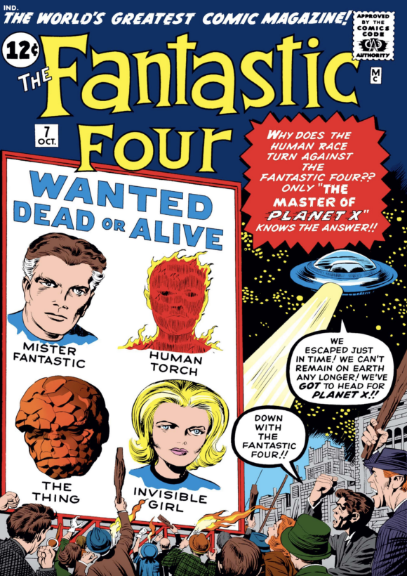
Kirby pencils and inks
—
11. Fantastic Four Annual #6 (Nov. 1968). This one is more personally important to me as a strong inspiration for my Fantastic Four: Full Circle cover, as well as the fact that my book is largely a follow-up to the storyline in this Annual. The cover’s descending spiral is key to what my design replicates, and the location of the Negative Zone is my story’s ultimate destination. The hope with a layout like this one is to suck the viewer into the image and the adventure.
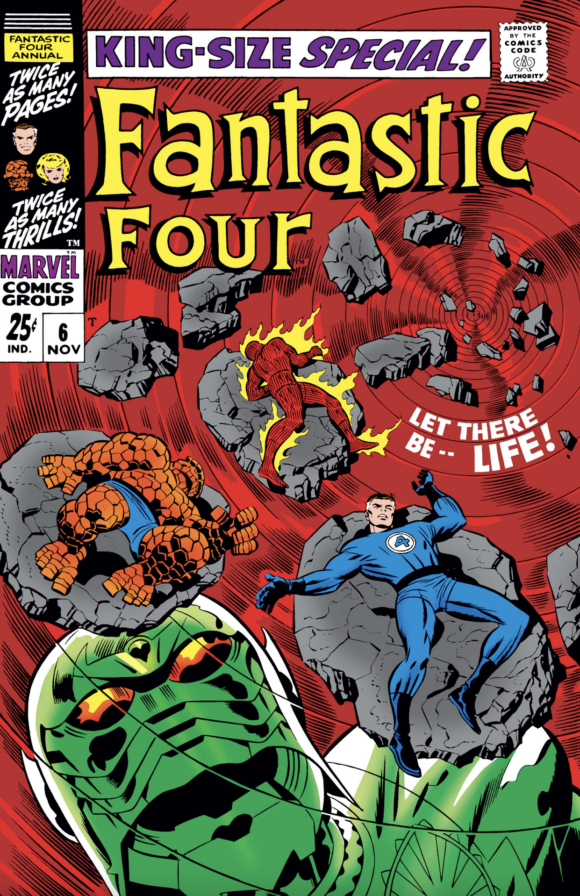
Joe Sinnott inks
—
10. Fantastic Four #100 (July 1970). I can’t make the case that this is a flawless or overly dynamic piece, but simply for the kid I was when I bought it, it’s everything you want to read in a comic. I’ve read withering critiques of this book for how it may or may not fully pay off the extensive conflicts portrayed, but the raw impression of this single image has inspired others like Arthur Adams and me to replicate it in our own manner to channel the joy it brought us.
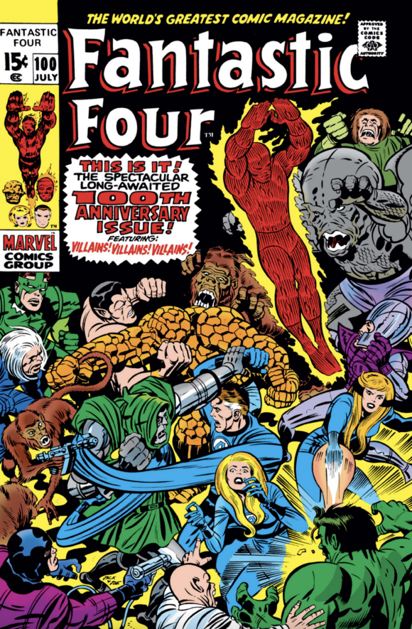
Sinnott inks
—
9. The Amazing Spider-Man #1. Not a Fantastic Four cover, you say? It depends on how you define it. Once Spidey made his first appearance in Amazing Fantasy #15, under a similar Kirby cover with inking by Steve Ditko, he was launched into his own series with that same cover team and the dramatic addition of the Fantastic Four. As a design it’s fairly simple, but please respect the context of history where right out of the gate in his own book, Spider-Man was part of a fully interactive universe. The Marvel Universe was just beginning then, but comics publishers did not regularly overlap their properties as much as what Marvel would make a regular feature. This is what would hold readers captive for ages to come — that these fictional worlds would be flowing into each other and building up a shared mythology.
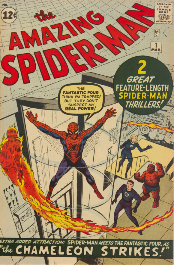
Steve Ditko inks
—
8. Fantastic Four #73 (April 1968). This might seem somewhat arbitrary, but the teams-facing-off cover schtick wasn’t done much before this one. The mishmash of Daredevil, Thor and Spider-Man (much touched-up by John Romita) against three of the FF precedes the John Buscema Avengers #53 cover where they face off against the X-Men, and I would guess most of the others like this. This is just another one of those images that grabs the reader by screaming “event.”
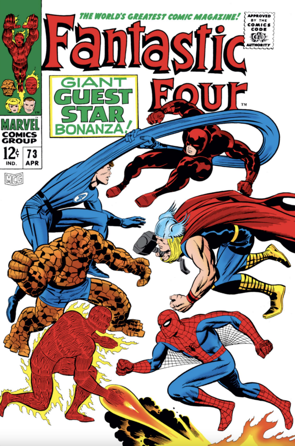
Sinnott inks
—
7. Fantastic Four #54 (Sept. 1966). Of the many pivotal covers in this progression of issues, I picked this one for the star-turn presentation of the Human Torch and for the frame of recently added heroes, borne from this series. The shot of the Human Torch would later get repurposed as a portfolio plate in Marvel merchandise of the late ‘60s. The frame of concerned reaction faces of the book’s extended cast might just precede the frame type used on various team books like the Justice League of America.
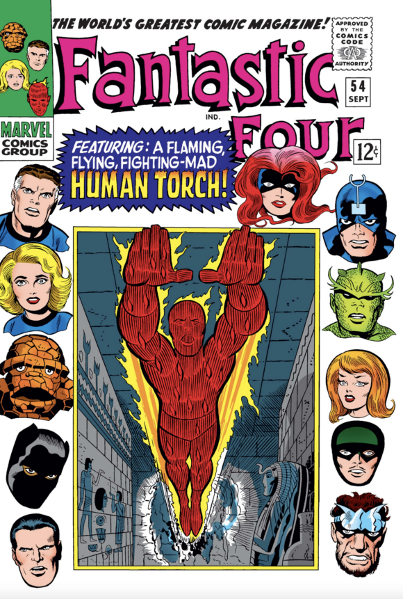
Sinnott inks
—
6. Fantastic Four #4 (May 1962). When I first saw this story in the Fireside book collection of FF material put out in the early ‘80s, I was delighted to be experiencing the purity of how the series began. This was before Kirby would push the physicality of enhancing musculature and amplifying forced perspective as his style evolved, but here it wasn’t needed, and it affected me just fine. Jack Kirby’s visual language exaggerated and retracted as he evolved as an artist. I do believe that in that late-‘50s to mid-‘60s period of his evolution, he may have been in his most pure and balanced state. I also really love me some Namor.
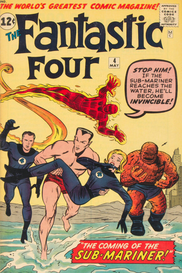
Brodsky inks
—
5. Fantastic Four #200 (Nov. 1978). A peak to Jack Kirby’s return to Marvel in the ‘70s was his final cover to the Fantastic Four. This climactic fight between Reed and Dr. Doom is a high point in the history of the book, and getting Jack to do the cover was a triumphant note to hit Issue #200 with. This image, among many others on my list, is a cover I’ve deliberately re-created or paid homage to in my cover work.
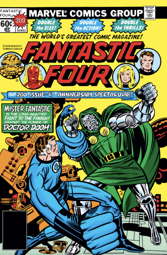
Sinnott inks
—
4. Fantastic Four #49 (April 1966). This is probably one of the most famous covers that would be expected on lists like this. This isn’t the first giant-figure-looming-over-the-group shots that Kirby did, but it’s likely the most remembered. The Galactus storyline is considered the most pivotal in FF history, if not in Marvel history as well. I had the good fortune to spend some time in this space, re-creating extensive images from the story when Kurt Busiek and I made it the focus of Marvels #3.
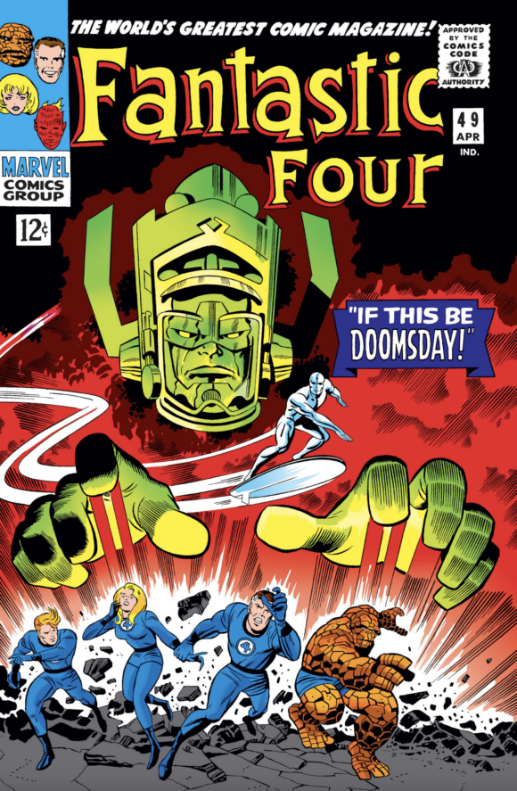
Sinnott inks
—
3. Fantastic Four #72 (March 1968). From the simple rules of beautiful Kirby figure drawing, I hold this cover in high esteem. Arguably it’s not as famous as the Issue #50 Silver Surfer-focused cover, but it strikes me as an excellent example of dynamic figures in the foreground and background. Jack’s depiction of Uatu never looked cooler than this.
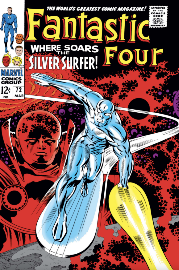
Sinnott inks
—
2. Fantastic Four Annual #11 (June 1976). From that same period where Kirby returned to do a cover run for Marvel in the ‘70s, he did this cover to one of my absolute favorite comics of my childhood (and lifetime). Is this too subjective a choice to rate so highly? Sure, but that’s the point, isn’t it? I loved reading about the original ‘40s characters when I was just learning about everyone in comics, so the Invaders were one of my favorite groups (and comics). To put the FF back in the past to meet them so that the two Human Torches could collide was heaven for the 6-year-old me that got this in 1976. Even as Jack’s work became more designed by committee (or Al Milgrom) and seemingly flatter to the figure positioning, I still adore it the same as I did then — pure Kirby at his abstract best.
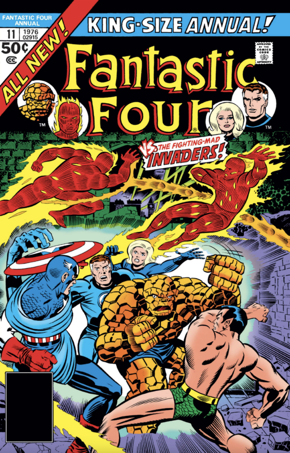
Sinnott inks
—
1. Fantastic Four #82 (Jan. 1969). It’s one of the best comics covers ever. The storyline within isn’t pivotal and the context isn’t entirely clear. The gorgeous design of Black Bolt’s costume and his masterful glide over us screams Kirby elegance. The strength applied to Ben and Reed’s forms, as well as Reed’s pointing hand, is taking us upward and outward, exemplifying the energy Jack Kirby harnessed like no other artist before him. Top that.
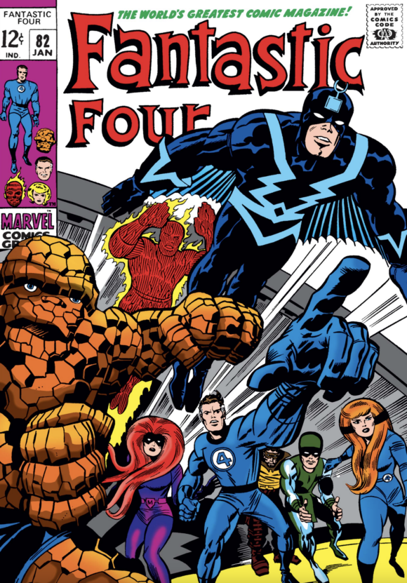
Sinnott inks
—
Alex Ross’ Fantastic Four: Full Circle is due in comics shops Aug. 31. It’s due at booksellers Sept. 6. The 64-page, oversize hardcover lists for $24.99.
—
MORE
— INSIDE LOOK: How ALEX ROSS Wanted to Reboot FANTASTIC FOUR. Click here.
— 13 GREAT ILLUSTRATIONS: The FANTASTIC FOUR of ALEX ROSS. Click here.
August 28, 2022
FF Annual #11, and the continuation of the story in Marvel Two In One Annual #1 and MTIO #20, always bring me back to the summer of ’76. I recall the candy store where I picked up the comics, the beach chair where I read them over and over, and the satisfaction of tracking down all three issues in the story arc — an outcome that was far from guaranteed in the era before specialty shops.
The FF Annual was my introduction to the original Human Torch and Toro and to Dr. Doom’s time machine (and the handy duplicate Reed had built at the Baxter Building). It was also the first story I read in which Bucky wasn’t just a tragic memory. Writer Roy Thomas didn’t free him from his death-trip altogether, however: The time-traveling FF had to struggle to hide their knowledge of Bucky’s imminent demise, lest the fabric of time unravel.
The patriotic WWII heroes of the Liberty Legion (featured in the MTIO sequels to the FF tale) were weak sauce compared with the Invaders, but they were well-suited to that Bicentennial summer. Great fun.
August 28, 2022
I have Alex Ross’ book pre-ordered. I enjoyed his selection and take on covers here; he passed over some of the usual suspects that would typically score a place on a list like this, and surprised with several of his choices, which have inspired me to pull them out and read them.
August 28, 2022
Wonderful list, and it just so happens FF #82 is my favorite Kirby cover as well, for all the reasons you stated. Looking forward to your new FF project!
August 28, 2022
FF. #48 for me
January 15, 2023
It’s .. a fine list, thank you Alex Ross, but FF #51, #60, Annual #3 and FF #27 covers should be on from a pure storytelling, and, arresting visuals, standpoint. It’s Kirby. The choices are. ..pretty endless. Cheers
August 28, 2022
This article is most definitely a fantastic one. ^-^
August 29, 2022
Oddly, Alex’s list mixes some of my personal favorites with some I don’t care for at all. Issue 54 was my very first FF and still my favorite cover. Eventually I would have all of the first 400 issues before economic conditions forced me to sell.
I recently reviewed Alex’s new graphic novel from an ARC. My review has yet to be posted on my column at Forces of Geek but I’ll say here it’s the best FF story and art I’ve seen in about 30 years!
September 14, 2025
I had not much knowledge of later FF issues in the Kirby/Lee run and just saw #82 about a week ago for the first time. I know nothing of the issue, but that is possibly my favorite cover. The depth and low “camera” angle are astounding.