It’s RALPH BAKSHI’s birthday: Veteran animator J.J. Sedelmaier pays homage to the swingingest cartoon of the ’60s…
—
UPDATED 10/29/19: Ralph Bakshi turns 81! Perfect time to re-present animator J.J. Sedelmaier’s look at the landmark 1967 Spider-Man series. J.J. wrote this for our 2014 SPIDER-MAN WEEK but it’s as relevant now as it was then. Dig it. — Dan
—
By J.J. SEDELMAIER
I have to believe that the flood of comic-book superhero TV shows of the mid-’60s was triggered by the Batman live-action series that aired on ABC starting in January 1966. Prior to this, superhero TV programs were considered a “kids only” product, but with the success of Batmania and its campy execution, this realm had infiltrated the mainstream as well. Both animated and live-action programming took advantage of the door that was now flung wide open.
ABC’s Saturday morning Spider-Man series was just one of these programs that crossed this threshold. And I’ve come to realize that I owe a lot to the Spider-Man cartoons that aired from 1967-70.
As hokey and limited in their animation as they were, it was really the first time that I was consciously becoming aware of how animated cartoons were produced. There were other superhero cartoon series produced during this period like Grantray-Lawrence’s Marvel Super Heroes (is it actually possible to consider these “animation”?) and The New Adventures of Superman (Filmation’s very first cartoon superhero series), but the Spidey show seemed to curiously reveal to me just how the “craft” of limited animation worked. Even though I was only 11 years old in 1967, I watched a LOT of TV as a kid and anything to do with comics and superheroes always grabbed 100 percent of my attention, so I sat riveted when these shows aired!
At first glance, they appeared sloppy and inconsistent — both in terms of animation and design quality. For instance, here are two scenes from the opening of the show.
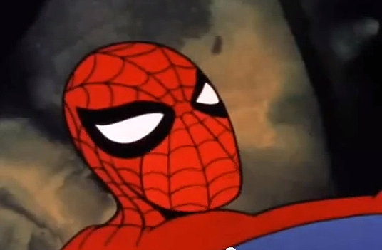
It appears that someone has corrected the spelling of “Jewelry” between the cuts. Spidey’s proportions often bounced all over the place. Sometimes it looked like the artists had pulled drawings/poses directly from the page of a Steve Ditko story, and other times it feels as though they neglected to follow any model sheets whatsoever.
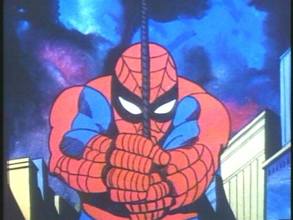
And the first thing you notice about Spidey’s design in these cartoons is the strategic lack of webbing lines on his torso. Rather than having to animate this complicated design trait, they simply dumped it.
But there are really tasty tidbits of nicely done animation in there! Spidey leaping and grasping the flagpole, flipping over to an upright position, and then launching off it toward the camera has always remained in my animation DNA.
And as is usually the case in limited animation series, much of the higher quality scenes were used over and over again — often recruited to title sequences. As a kid, I noticed these production approaches for the first time while watching Spidey.
There was also a transition that the series went through when Grantray-Lawrence gave up the reins to Krantz Films about halfway through the series. This change brought in Ralph Bakshi as head honcho.
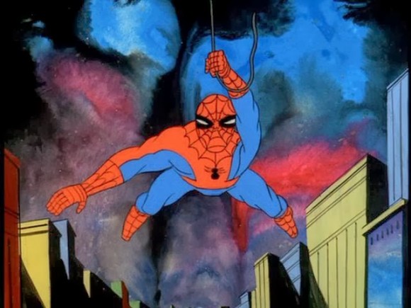
Suddenly the character drawing became better and the backgrounds were now rendered in a dark, moody and abstract watercolor technique. This was the first time I remember recognizing Bakshi’s name and he was already an animation industry journeyman having spent years at the Terrytoons helm — and he wasn’t even 30 years old!
Watch how Spidey swings around over the meteorological skies and see if you don’t feel as though there’s a strange juxtaposition between background and character foreground. The cartoons feel as though they’re struggling to break out of the conventional kiddy fare. Bakshi’s notorious for adding an edge to projects he’s involved in so this makes perfect sense. . .
I curated an exhibit a couple years ago called “It All Started Here” that focused on the history of animation from the standpoint of having begun in the New York area.
I included the Spidey series because although it began in Canada, the Bakshi period saw the production moved to NYC, and names like Cosmo Anzilotti (assistant director), George Cannata, Doug Crane, Johnny “Gent” Gentilella, Marty Taras, Nick Tafuri (animators) and Johnny Vita (backgrounds), are evidence of it taking advantage of Gotham’s animation community.
I was lucky enough to have crossed paths with George, Doug, Marty and Johnny when I was starting out. I wish I had asked them about their Spider-Man duties. I’m convinced that the combination of Bakshi and New York talent elevated the Spider-Man cartoons above its prior level.
Finally, as a tribute to the Spidey cartoons, one of our Saturday Night Live TV Funhouse cartoons used inspiration from the series – watercolor backgrounds and all ! Hete-Roy needs little explanation …
So the next time you see one of these Spidey cartoons — whether or not they’re fodder from your own personal stable of nostalgia — see if you can find some of the redeeming aspects of this strangely unique member of the Saturday Morning Cartoon Club!
And who can ever forget that groovy theme song?!
—
J.J. Sedelmaier is the co-creator of some of Saturday Night Live‘s most famous cartoons, including The Ambiguously Gay Duo. He’s also well known for working with Stephen Colbert on Tek Jansen, as well as Harvey Birdman, Attorney at Law. Hit up his website.
—
MORE
— 13 GREAT THINGS About the 1967 SPIDER-MAN Cartoon. Click here.
— Dig These Groovy SPIDER-MAN ’67 Cartoon Action Figure Designs. Click here.


April 29, 2014
Swinging Sixties. That series used jazz, stock music, and pacing to set the mood. New appreciation for watercolors and sloppy edits, but reusing and mixing aerial; gymnastics was tolerated in part because kids knew Spiderman had to traverse the city’s zillions of rooftops and flagpole to ‘arrive just in time’. Parodied a million times because it’s epically minimalist.
July 13, 2014
Cozmo Anzilotti came to my school in 1968 his niece Patti was in my class and Cozmo did a show and tell with some spiderman cells.School was Cunningham Park Elementary in Vienna ,Va
August 17, 2019
Ted Lee, What a SMALL WORLD. My dad, Doug Crane, also worked on SpiderMan with these other great animators and is friends with Coz Anzilotti. The ‘small world’ part comes in because I moved from our family home in New Rochelle, NY and live less than 10 minutes away from Cunningham Park Elementary school in Vienna, VA and I pass it a few times a week.
October 31, 2018
The most irritating thing I found in the cartoons was the overuse of the “swish” sound when Spider-man would swing. It seems that it was tremendously overused in the later episodes. Sometimes in early episodes he would swing and there would be no sound. In the latter ones, the sound effect would be used when he appeared in frame and then when he left. Since there could be three or four swinging scenes run back to back you would hear this sound effect sometimes a half dozen times in a row. It was almost comical but mainly irritating.
January 23, 2019
I love in 67 when I was a boy wow those were days kids today have no clue about the struggle black n white tv along with gigantor