
There have been so many covers, it’s easy to forget a lot of the great ones…
Earlier this month, I posted 13 UNDERRATED DETECTIVE COMICS COVERS to mark the occasion of Detective Comics #1027. (Click here.) Naturally, that got me to thinking of Batman covers that generally don’t get the spotlight they should.
Now, as it happens, I’m deep into an epic Silver and Bronze Age Batman/Detective re-read (it’s almost 1974) and as I’ve been thumbing through back issues, I’ve been struck by how many covers in the 1980s just never seem to get their due.
So here are 13 UNDERRATED BATMAN COVERS — all from the ’80s. Just for fun — and in no specific order.
Rad.
—
Batman #339. Poison Ivy returned after a long absence. She’s pretty much been A-List since. Either way, I dig the montage composition, especially with the Wayne Foundation so prominent. It wouldn’t be long before the Darknight Detective would make his way back to Wayne Manor.
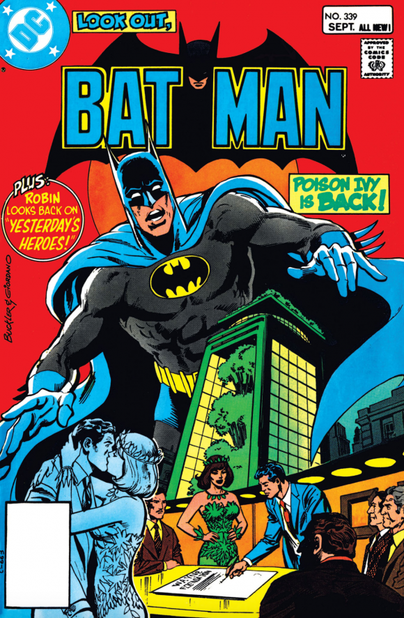
Rich Buckler pencils, Dick Giordano inks
—
Batman #348. Case in point. Great upward angle, with a terrifying Man-Bat ready to pounce.
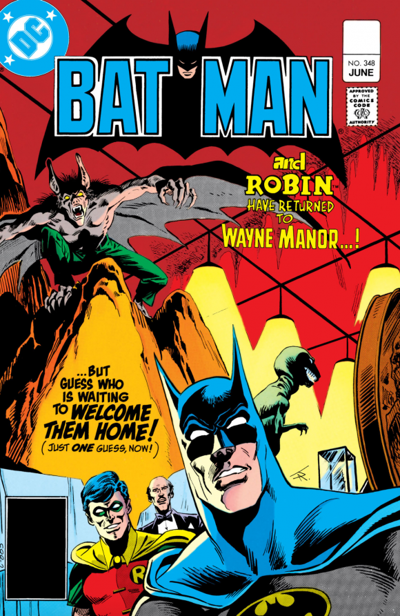
Jim Aparo
—
Batman #370. As you’ll see, Ed Hannigan liked to pull the Will Eisner trick of working the title into the image itself.
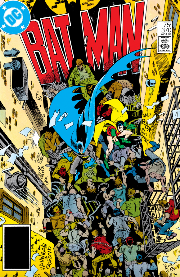
Ed Hannigan pencils, Giordano inks
—
Batman #369. See what I mean?
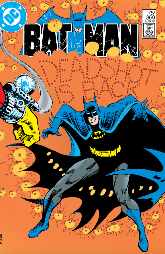
Hannigan and Giordano
—
Batman #371. Really, I mean it.
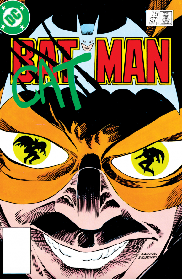
Hannigan and Giordano
—
Batman #356. Reflective eyes were also a thing.
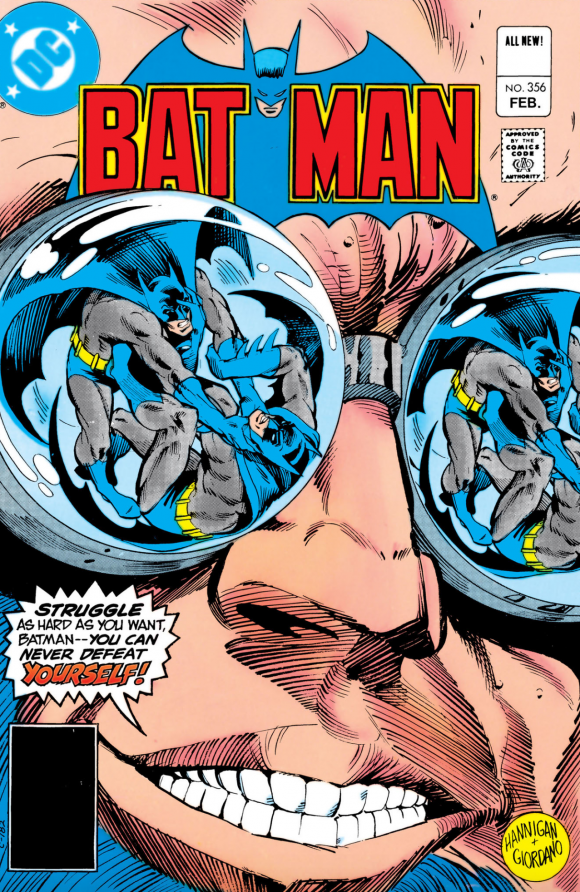
Hannigan and Giordano
—
Batman #354. Keith Giffen liked to screw with convention too. He didn’t do many Bat-covers (is this the only one?) but this one is a killer.
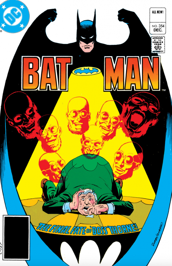
Keith Giffen pencils, Giordano inks
—
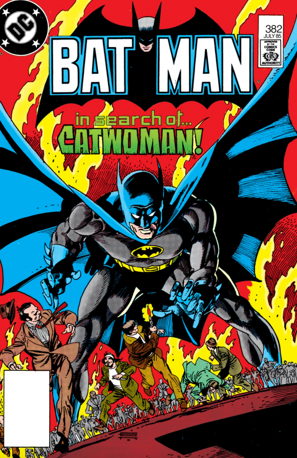
Batman #382. Gil Kane just never did enough Batman. Wouldn’t you have loved to see a full-on run? Not an arc, but like a two-year jaunt in Gotham. Well, I guess we couldn’t have everything.
—
Batman #336. But at least we got plenty of Aparo — and this has always been one of my faves.
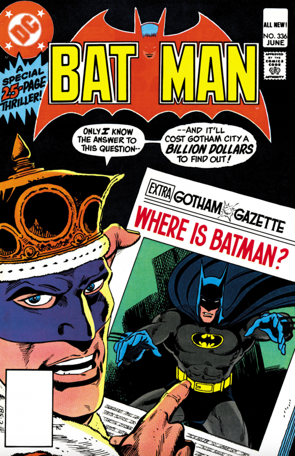
Aparo
—
Batman #345. Gene Colan usually went dark and shadowy. Love the unexpected brightness of this one.
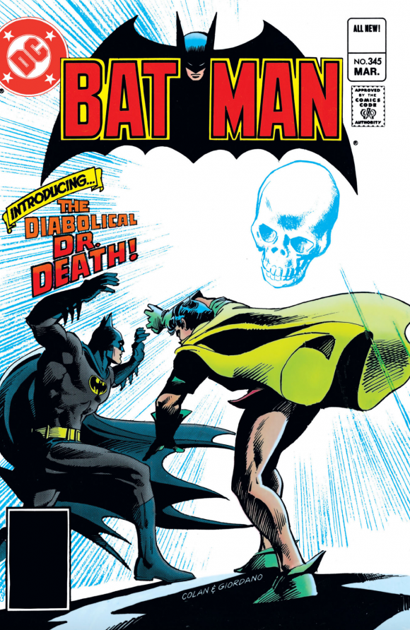
Gene Colan pencils, Giordano inks
—
Batman #352. I don’t think Aparo gets enough credit for playing around with angles and perspectives.
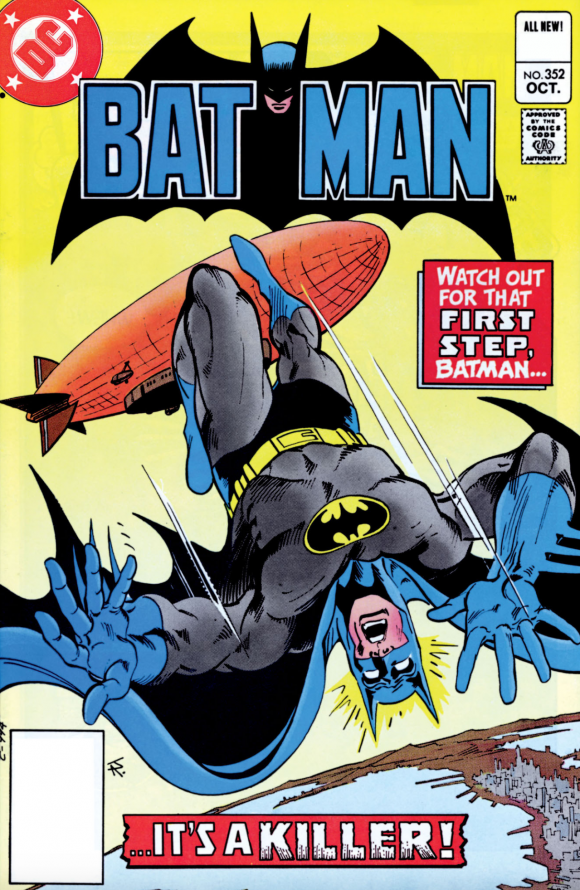
Aparo
—
Batman #329. But even his relatively straight-up covers pack a punch.
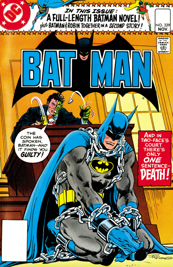
—
Batman #385. In a few years, every Bat-artist would follow Tim Burton’s lead and make Gotham this fantastical metropolis. I still prefer the days when Batman’s hometown looked like its inspiration — New York City. It’s always made Batman feel more real to me. Here, the Caped Crusader looks like he’s in the Village — and I’m right OK with that.
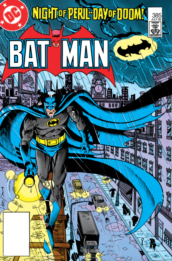
Paris Cullins pencils, Bob Smith inks.
—
MORE
— 13 Underrated DETECTIVE COMICS Covers. Click here.
— 13 Top Artists Pick Their Favorite BATMAN Covers. Click here.
September 28, 2020
Thank you so much for shining the light on these underrated “Batman” covers.
September 28, 2020
I think each decade or group of new artists’ take brings with it a very unique to the times style. And, I could not agree more about your other observations. Thank goodness for all that Aparo work and wished there was more Gil Kane.
September 28, 2020
Wow! That Batman 370 cover is a real tour de force! That’s the kind of cover I would have bought the book for, even if the story itself didn’t thrill me. It’s a work of art!
September 28, 2020
These would have all been ones I bought off the spinner rack and I can think of some great ones that you missed.b Still, a very nice selection.
BTW, Batman 336, the Monarch of Menace issue, has interiors by Jose Luis Garcia Lopez. Aparo on the outside plus JLGL on the inside = all kinds of awesome.
September 29, 2020
That issue feels to me it would have fitted in nicely with the covers of the mid-60s with a checkered top banner. It’s the whole turning to talk to the readers.
September 29, 2020
Why are the prices whited out?
September 29, 2020
DC’s app does that. It’s strange but they generally have the highest quality scans, so we use them.
September 30, 2020
Seeing Batman 356 gives me an idea. How about a feature where you present covers that feature multiple Batmans. I know there have been a ton.
September 30, 2020
Great idea, Randall! Thanks!
October 14, 2020
Batman #336. Great art by Jose as well the cover by Aparo.
Plus it was treat to seeing The Monarch of Menace, The Bouncer, Cluemaster, and the Spellbinder all back in action.