
These are all superior to what the studios churned out…
If you’re anything like Karl Heitmueller Jr. — artist, bon vivant and occasional 13th Dimension contributor – bad Blu-ray or DVD art on your fave flicks will make you nuts.
I mean, pretty much only the Criterion Collection gets it right every time. So Karl has done what any artistic mind might – create covers that are soooooo much better than the ones foisted upon the public by the studios.
So, here’s Karl with 13 REVAMPED BLU-RAY COVERS THAT ARE BETTER THAN THE ORIGINALS — accompanied by before-and-after images:
—
By KARL HEITMUELLER JR.
As a rule, comic book collectors of a certain age are wedded to hard media. We aren’t content to just read a comic on an iPad screen. We want to hold the thing in our hands, to feel its weight, to page back and forth, to have the full experience of not just READING a comic, but of HAVING it. For many of us with this preference, the same feeling holds true with other media that the general public is now content to merely stream, including video.
I’m a firm believer in owning your media (I’ve tried to make #ownyourmedia a thing, but it ain’t taking hold). My apartment is loaded with books, comics, records, CDs, and, yes, DVDs and Blu-rays. But my video collection has one distinct difference from the rest of my media: Aside from a few exceptions (some special editions, all Criterion Collection releases), I’ve redone covers and packaging for almost all of my videos.
My reasons are threefold: First, I utilize a slimline case (half the thickness) so that my collection takes up half as much space; Secondly, the graphics on most commercial video releases are almost always awful (appealing to the lowest common denominator or intentionally misleading ill-informed consumers into thinking vintage content is contemporary); and finally, they are often missing what I consider important information such as original airdates, length of programs, and more.
Below are 13 examples of my redux video covers with notes as to just how re-done they were. (There are different levels of makeovers — hey, just like with human beings!).
—
Barbarella (1968)
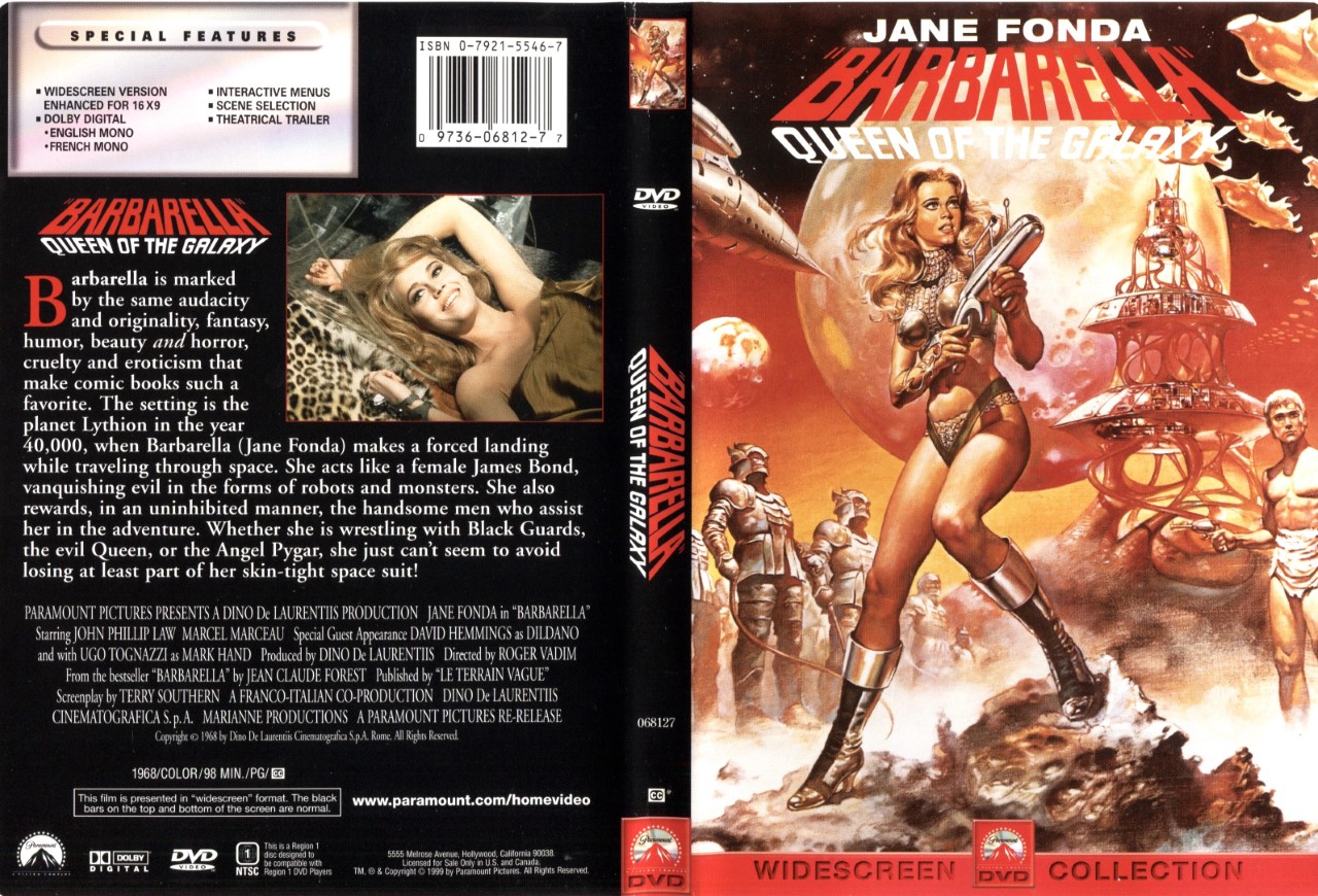
Before
Paramount’s official cover for their 1999 DVD wasn’t bad (using a detail from Boris Vallejo’s painting for one of the film’s posters), but the back cover featured a typically insipid synopsis and an even more typical clunky design. I went for a more 1960s vibe with my redux, albeit using Greg and Tim Hildebrandt’s poster art for the film’s 1979 re-release along with logos made using House Industries fonts.
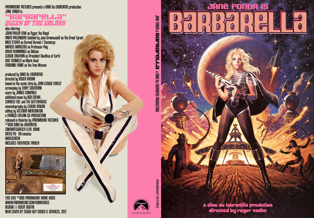
After
—
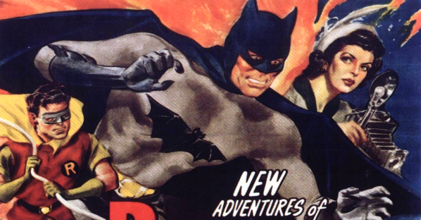
Batman and Robin (1949 Columbia Pictures serial)
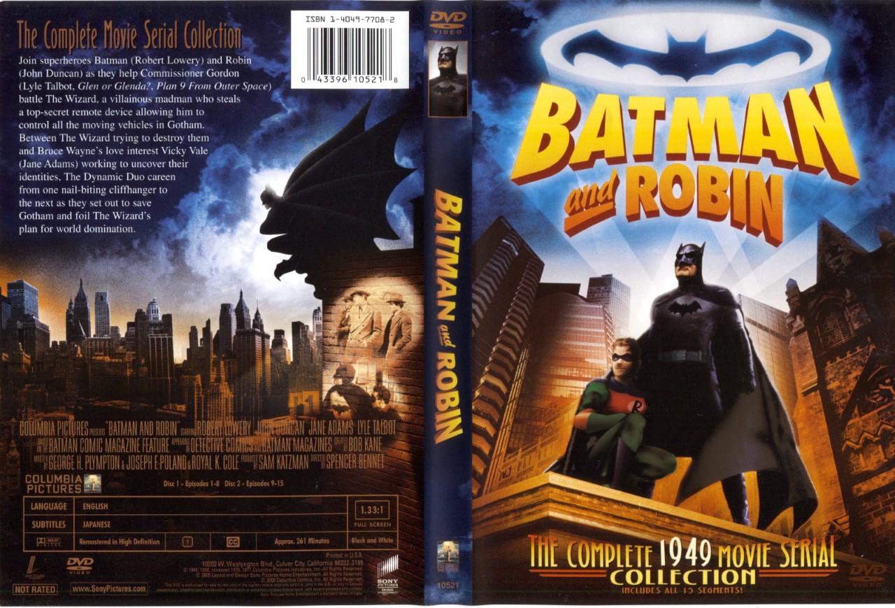
Before
There may be no more insidious examples of misleading DVD covers than Sony’s for both 1940s Batman serials. Utilizing modern artwork (in the case of this one, even going so far as to put Robin in his animated series costume) and a description that belies the low-budget silliness of the 15-part series, both of these releases begged for a more honest visual representation.
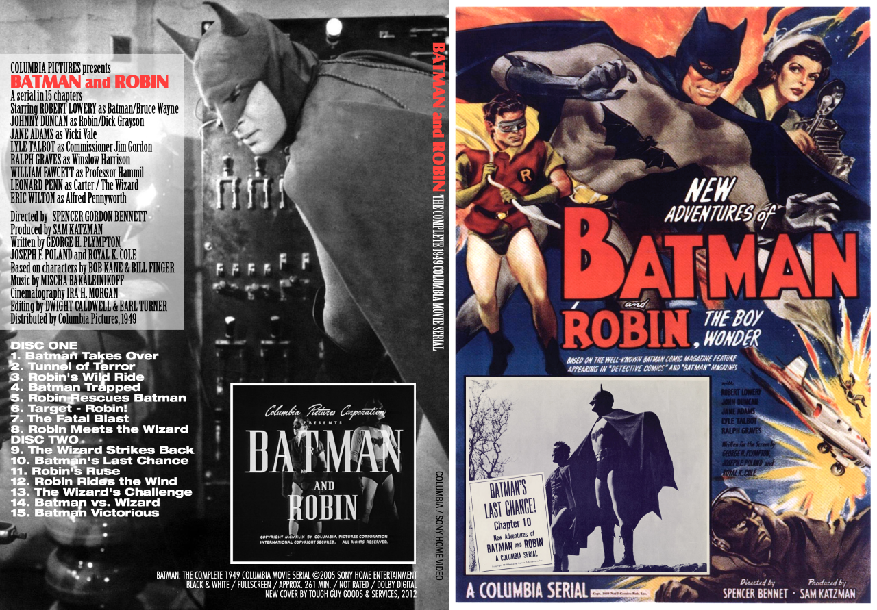
After
—
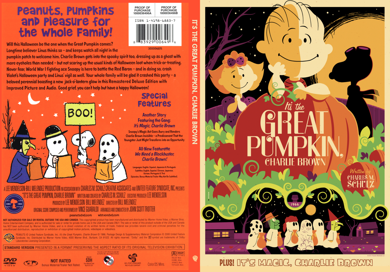
It’s the Great Pumpkin, Charlie Brown (1966)
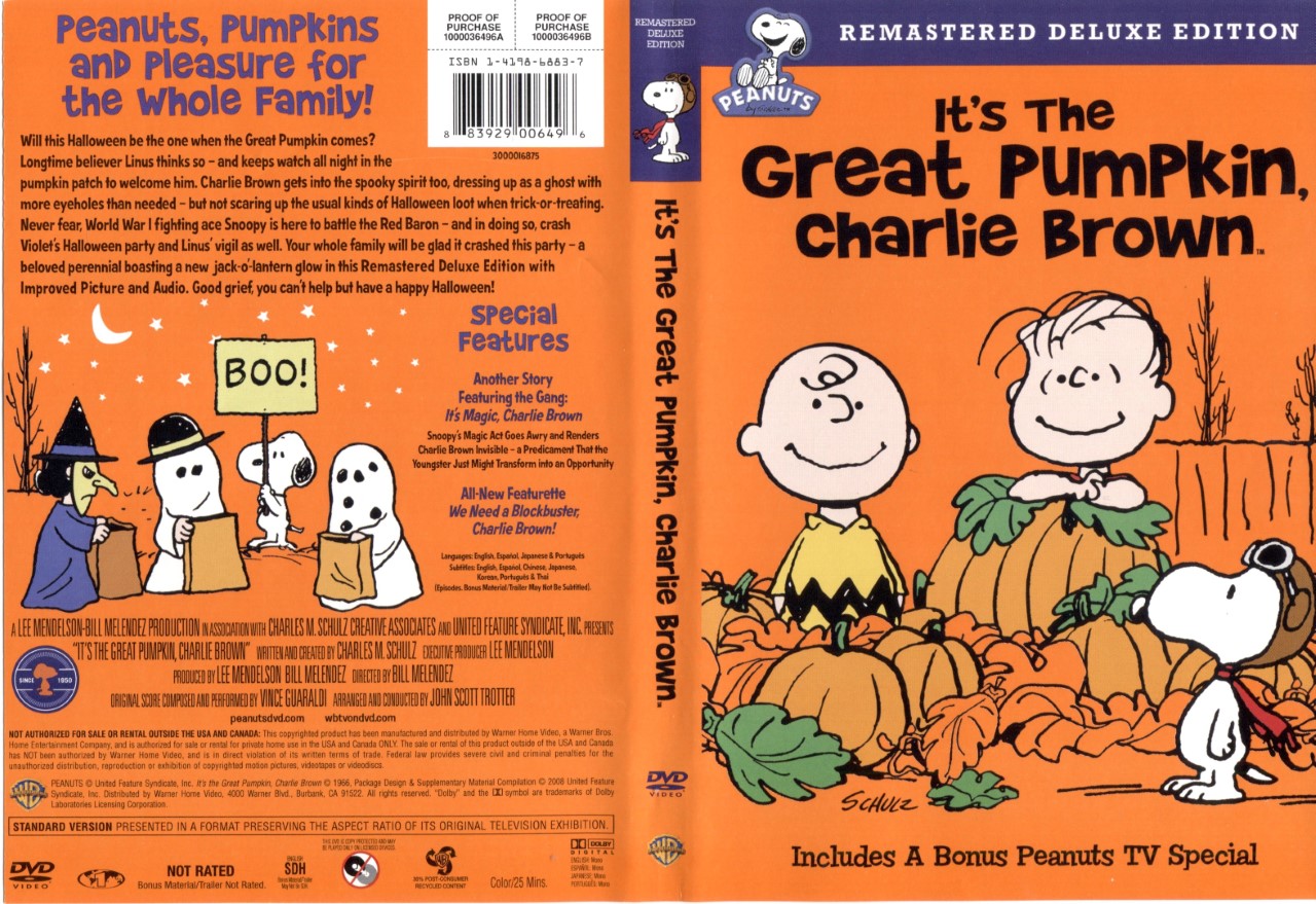
Before
Do not get me started on the Peanuts specials DVD releases, as I consider each and every one a massive missed opportunity. They continue to be marketed exclusively as children’s products, ignoring the massive community of adult fans (a half a century’s worth!) who would pony up for a true special edition with deserving bonus features (I’ve been whining about this for years, as this blog post shows: http://archive.popsgustav.com/2010/09/dear-santa-claus.html). While I can’t do anything about the content of the video, I can at least fix the kiddie-oriented covers of the specials I own, including the amazing Halloween episode. For the front, I used Tom Whalen’s spectacular 2011 poster, one of a series of Charlie Brown special posters the artist has done (look them up, they’re all amazing).
After
—
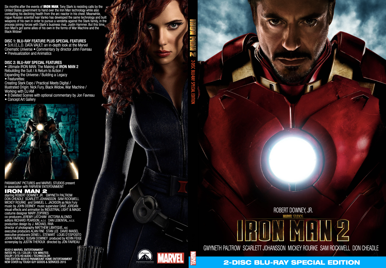
Iron Man 2 (2010)
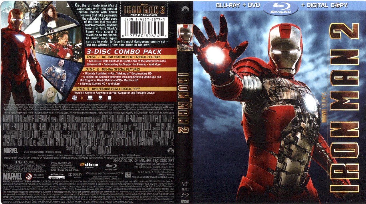
Before
Do not get me started on the Marvel Studios Blu-ray covers. Practically every single one is a visual travesty, with the typical Photoshop montage front cover, and a back cover so crammed with text (most of it technical specs, much of it superfluous) that it leaves practically no room for any graphics. A lot of fans who do their own cover remakes include details such as UPC symbols and every bit of information on the original packaging, which I don’t get. If you’re redesigning a cover and it’s not going to be used commercially, why not just follow your own design aesthetic? For the (unfairly maligned, IMHO) Iron Man sequel, I felt that Scarlett Johansson’s Black Widow deserved a more prominent placement. Note that while this is a Blu-ray redux, the artwork mimics DVD specs, a choice I made so that it could fit on the shelf neatly alongside the first Iron Man special edition (whose packaging was the rare nice job that I did not redo).
After
—
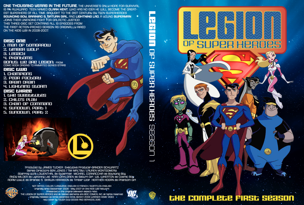
Legion of Super-Heroes, Season 1 (2006)
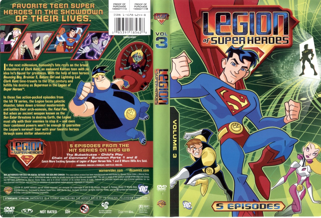
Before
Sometimes with TV DVDs, unnecessary bulky packaging is replaced with slimmer packaging that also contains more historical information such as original airdates. The first season of the Kids’ WB’s great LOSH animated series was released in three separate sets that I combined into one case, necessitating a complete cover remake. As this show never really caught fire, the amount of hi-res imagery online was sparse, so I had to make do. I recreated an approximation of the logo myself in Illustrator. And I’m still waiting for the second (and final) season to be released!
After
—
Li’l Abner (1940/1959)
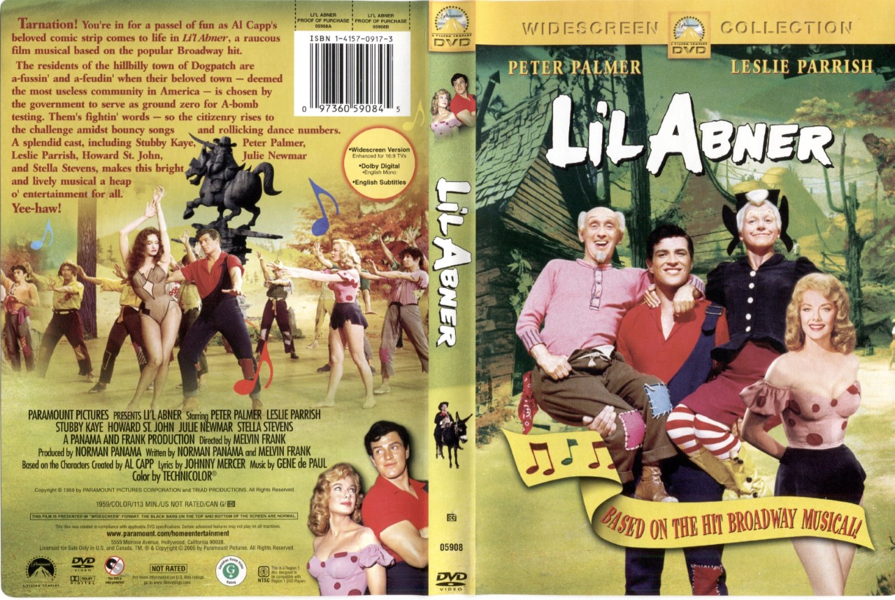
Before
Paramount’s 2005 release of the musical adaptation of Al Capp’s classic comic strip featured a predictably meh cover, but with my redux, I took the opportunity to add the first film version — the mostly forgettable 1940 movie, one of those public-domain films that’s released by a dozen fly-by-night video companies who put about as much effort into their packaging as a street hot dog vendor.
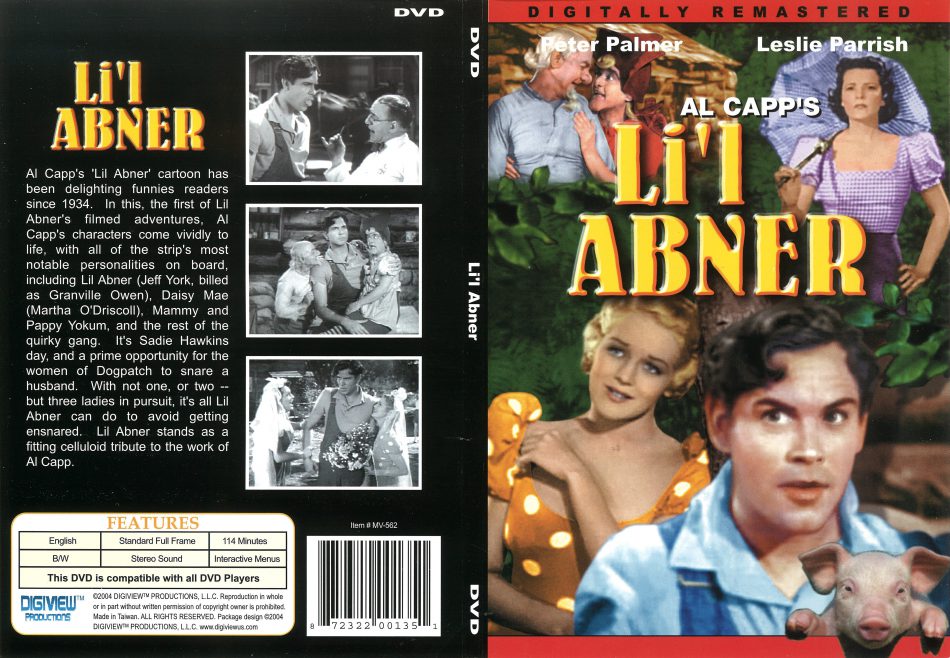
1940 version
Adding that disc to a double slimline case allowed me to include it almost as an afterthought on this package. Plus, I put a tiny Julie Newmar (as Stupefyin’ Jones) on the spine!
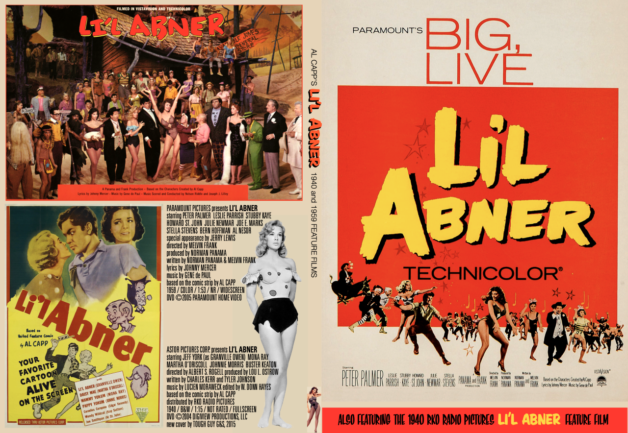
After
—
On Her Majesty’s Secret Service (1969)
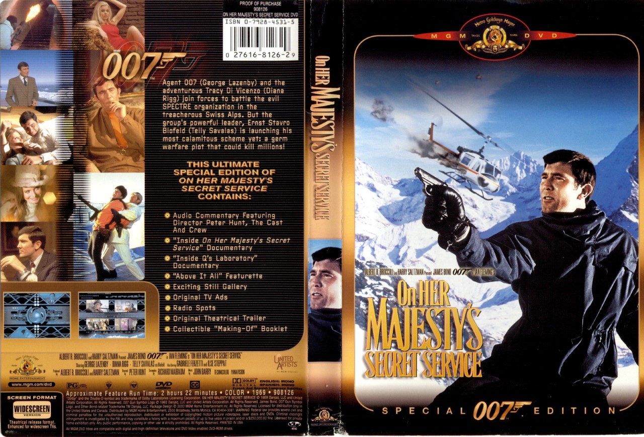
Before
Completists will feel my pain when I report that I own every James Bond film, including the ones that I really don’t like. This installment (George Lazenby’s sole outing) is not one of them, however: It’s actually one of my faves. But while the back covers of MGM’s 007 Special Editions were perfectly fine, the fronts were across-the-board horrendous, using a Photoshopped combination of stills with a newly worked logo, trying to avoid using what some might consider dated poster imagery that could put off consumers who don’t like “old” movies. The Bond series was an easy fix, I simply scanned the back covers, downloaded and pasted in hi-res versions of the original one-sheet from each movie, and did an approximation of the film’s logo in Illustrator for the spines. I also listed the actor playing Bond and (perhaps most importantly) numbered them at the bottom of the spine for easy replacement on the shelf!
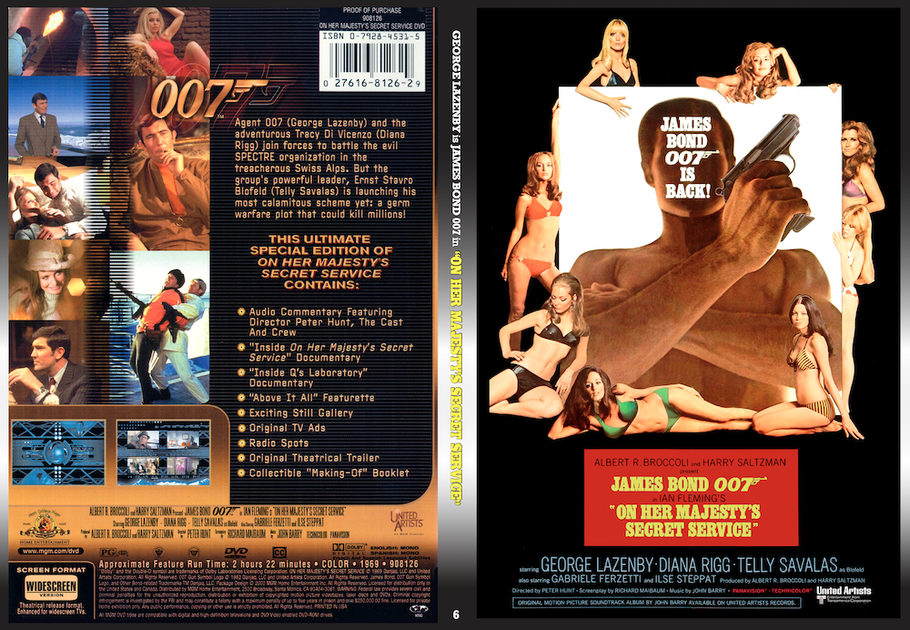
After
—
Superman (1978)
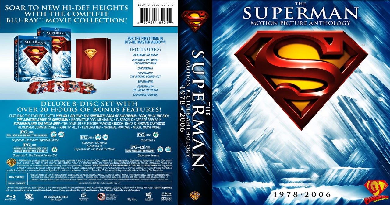
Before
Box sets of movie series are (like their television counterparts) usually bulky and graphically tend to lean toward the generic. Warner’s 2011 eight-disc set, The Superman Motion Picture Anthology 1978-2006 is astoundingly great in terms of content, but the discs just screamed for individual attention (particularly with a surplus of bonus content that needed to be listed on each case). Plus, I’ll take any opportunity to work on a Superman-related project (see next cover).
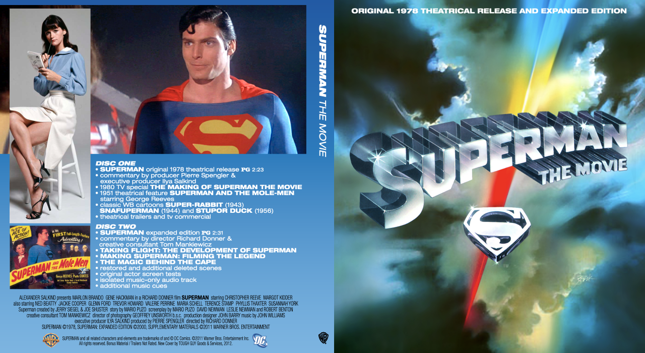
After
—
Ruby-Spears Superman (1988)
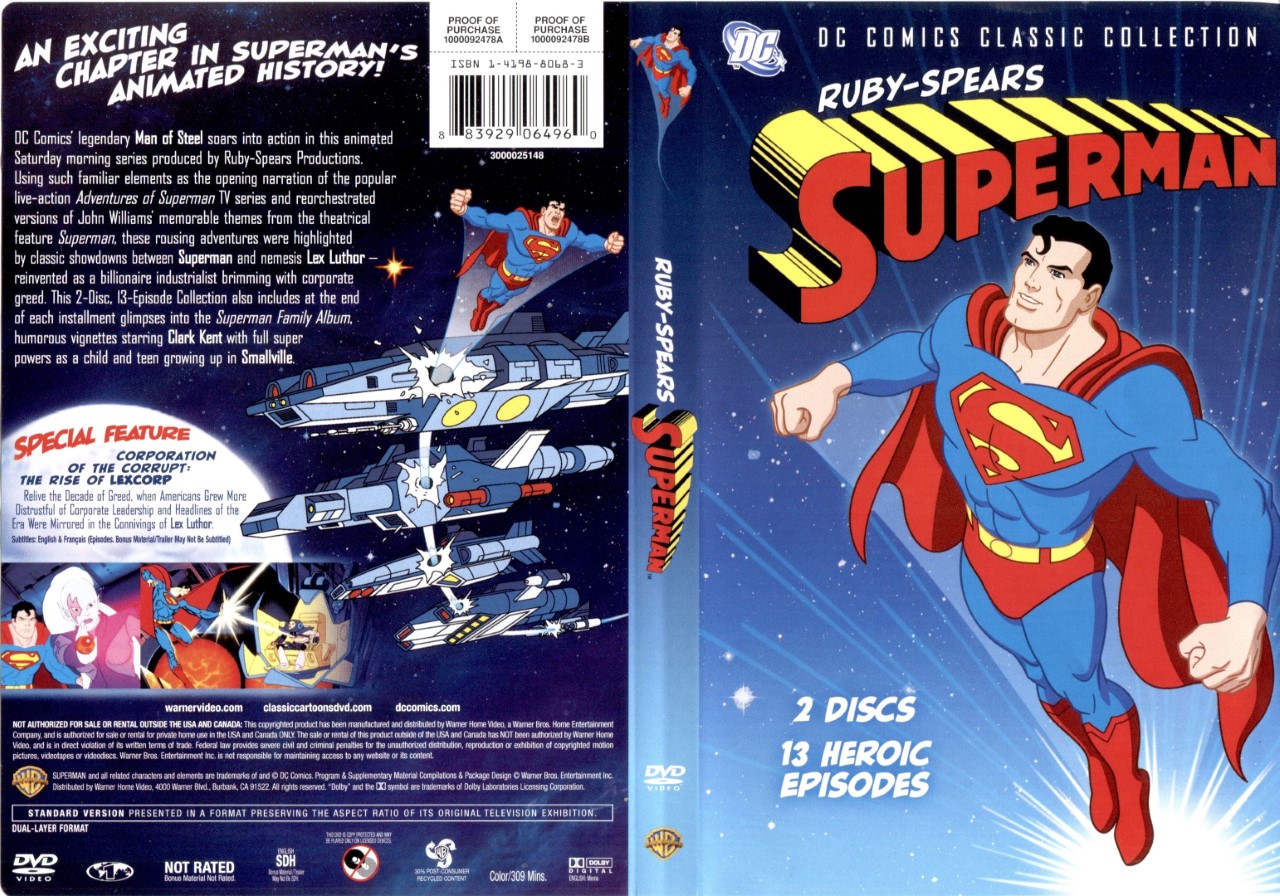
Before
Again, DVDs of animated series rarely bother to include any kind of contextual information anywhere in the packaging beyond a simple title listing, and often (when it comes to superhero shows) use artwork that has nothing to do with the animation within. Such is the case with this two-disc set of the short-lived CBS Saturday morning cartoon. Warner’s original set features a redrawing of the figure of Superman from the final page of the first issue of John Byrne’s 1986 The Man of Steel reboot. As the character designs for the show were done by comic book artist Gil Kane, I thought it only fitting to use a panel detail from his run on Action Comics as the cover image. The back adds full episode lists, original airdates, the voice cast, and an edited cribbed summary of the show’s history.
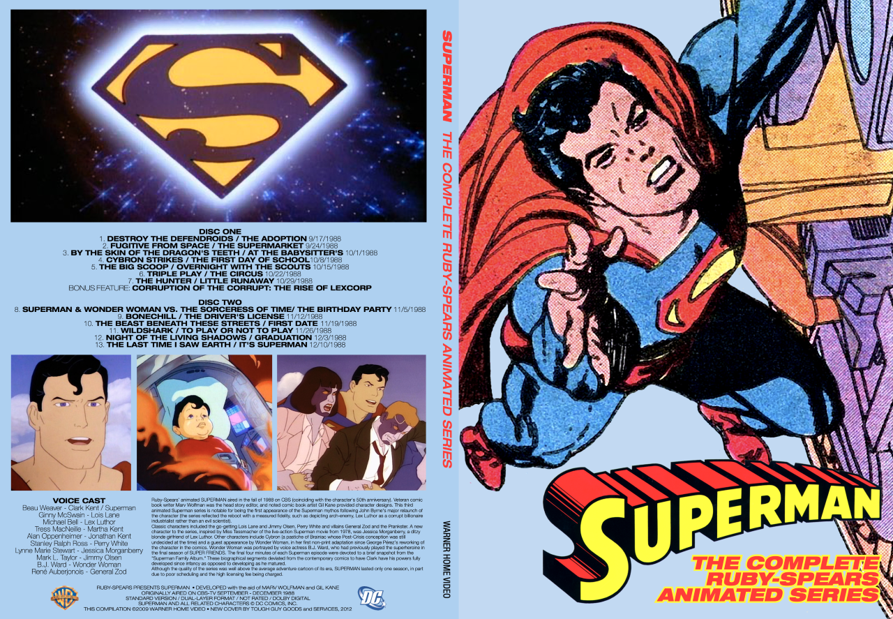
After
—
Tales From the Crypt/The Vault of Horror (1972-73)
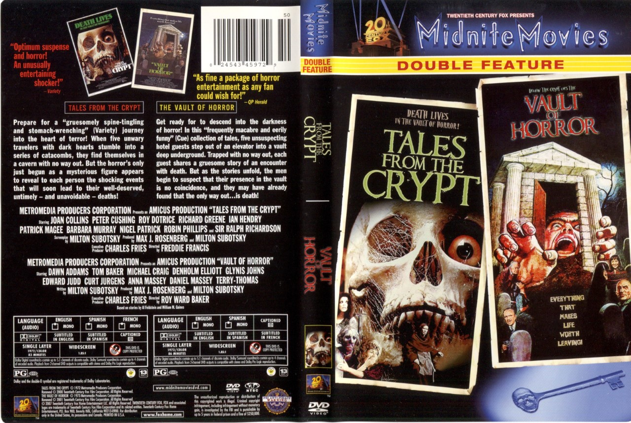
Before
Older cult horror films often suffer from lazy design work on their video releases, and 20th Century Fox’s “Midnite Movies Double Feature” DVD cover is no exception. Retaining the informational part of the back cover, I just used the poster for the Tales movie and a horizontal one-sheet for Vault on the back (covering the perfunctory descriptions of each movie).
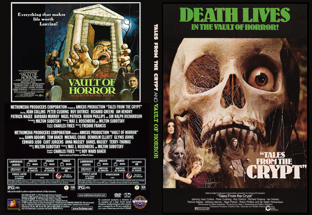
After
—
The Wolverine (2013)
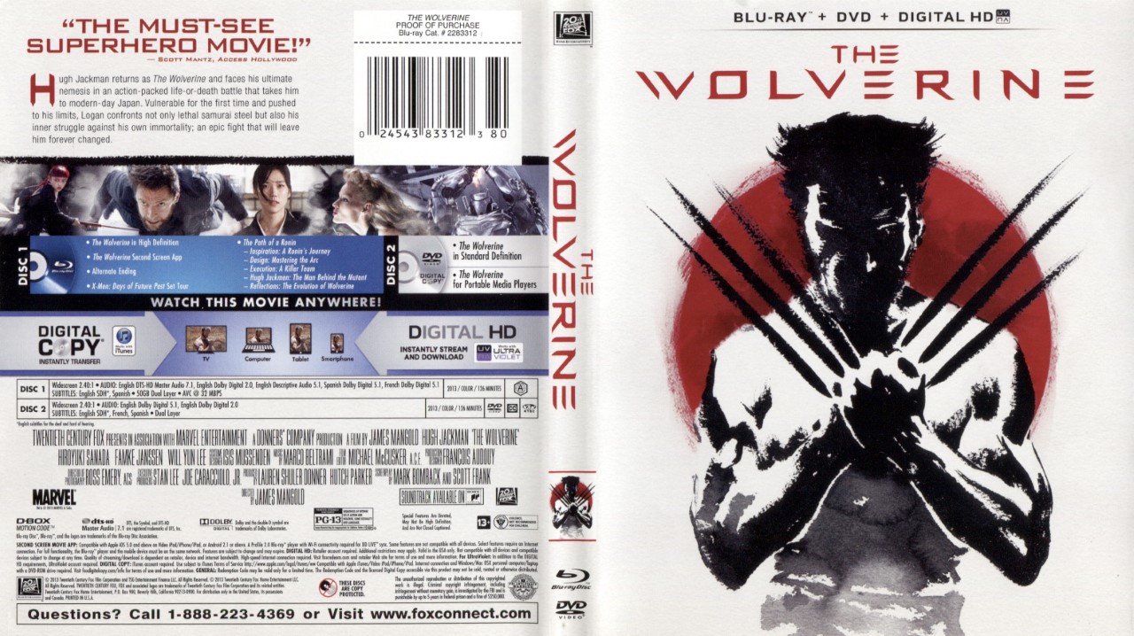
Before
Front cover: Amazing. Back: 90 percent text, including those damn instructions on how to watch your digital copy/stream and download. Seriously, who needs that much information on this stuff anymore (or even seven years ago?). This redux was a no-brainer: Use another of Fox’s Japanese watercolor styled posters (of Yukio, of course), a small photo of the two stars and the pertinent information (not including how to watch the disc). That’s David Mack’s Wolverine. Not sure if it’s Mack’s Yukio — but if you know for sure, say so in the comments!
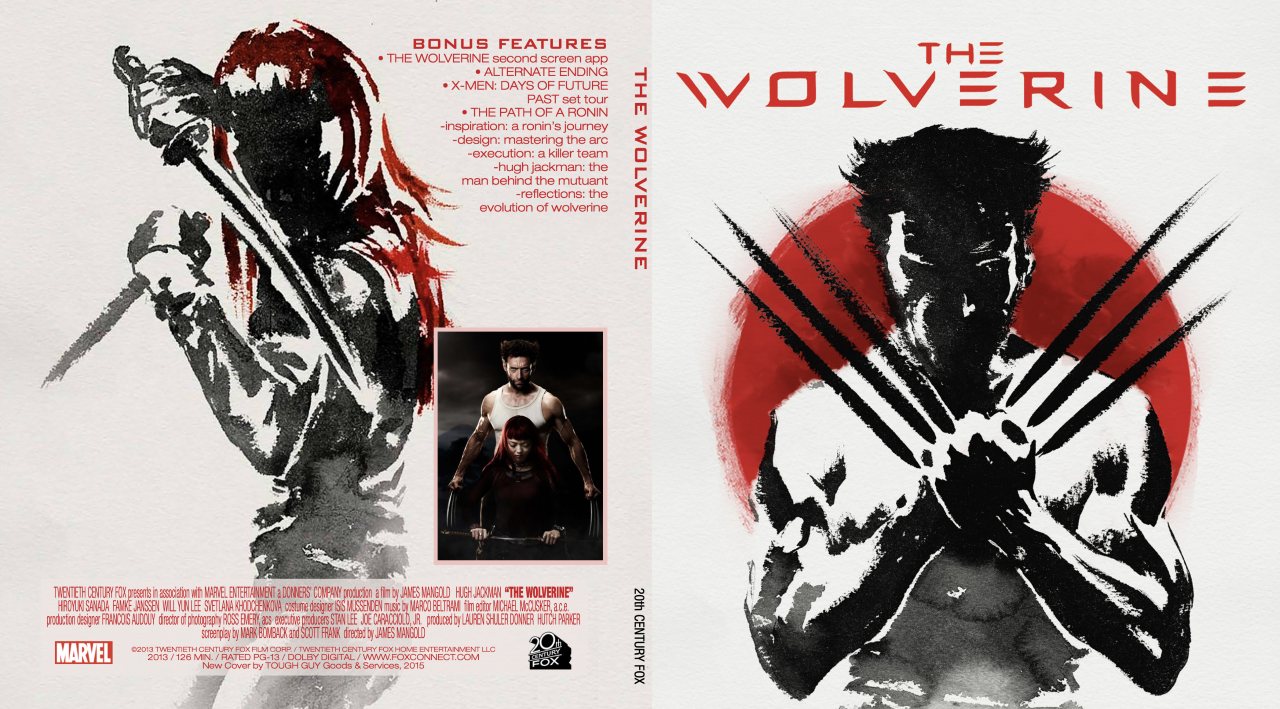
After
—
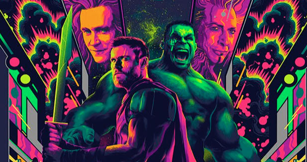
Thor: Ragnarok (2017)
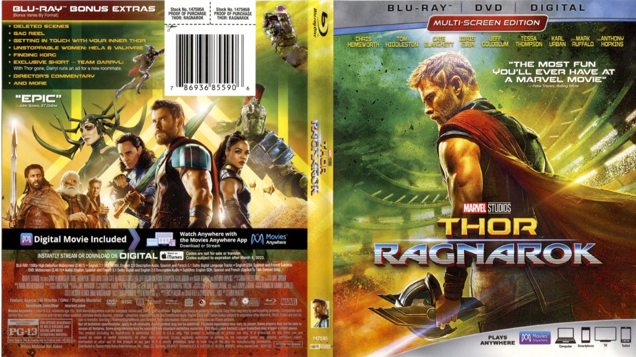
Before
Omigod, seriously, the actual Blu-ray packaging for Taika Waititi’s super-fun Thor movie might be the busiest, ugliest packaging in the history of home video. I can’t… I can’t even… Anyway, for the front, I used Matt Taylor’s amazing Mondo image (sadly truncated by the Blu-ray dimensions), and on the back I highlighted Cate Blanchett’s Hela (for my money, the best villain the MCU has given us yet. Sorry, Thanos!).
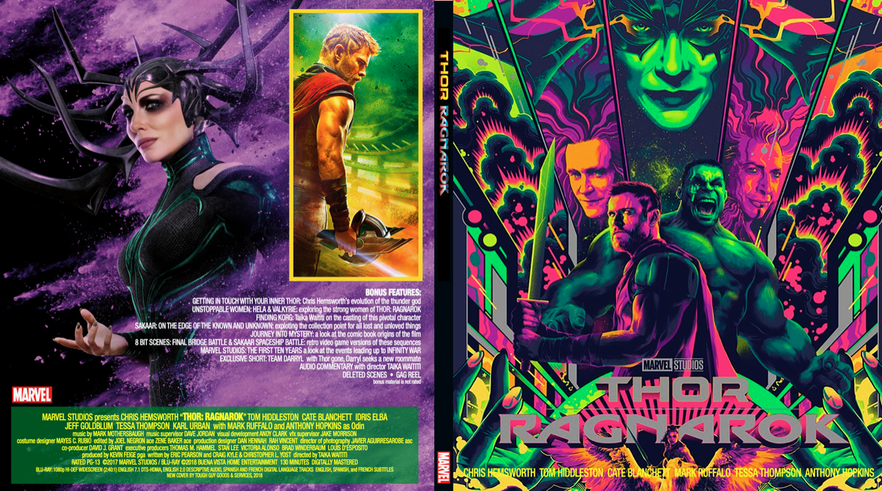
After
—
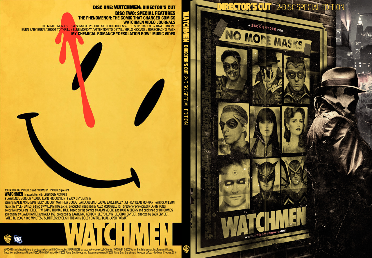
Watchmen Director’s Cut 2-Disc Special Edition
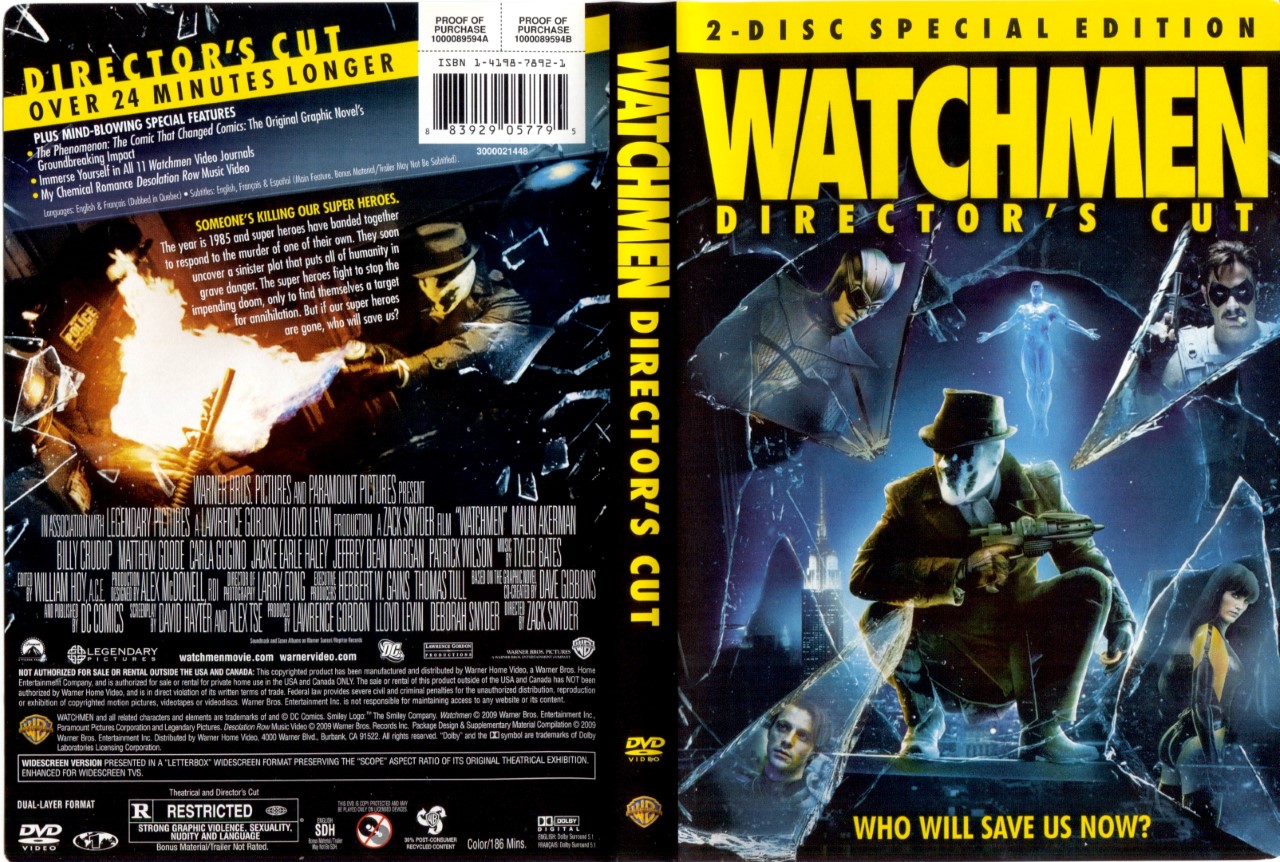
Before
Say what you will about Zack Snyder’s adaptation of Alan Moore and Dave Gibbons’ legendary tale, they put out some absolutely astounding marketing imagery, none of which (of course) was utilized for any home video version. The starkness of the covers for the original comic book series served as inspiration for the back cover. I’ll admit, not all of my redux covers are great, some of them are more utilitarian than aesthetic improvements, but this one makes me happy.
After
—
MORE
— One of the Grooviest SUPERMAN Collections You’ll Ever See, by KARL HEITMUELLER JR. Click here.
— MEGOs Weren’t Perfect — But They Were What We Had, by KARL HEITMUELLER JR. Click here.
May 15, 2020
Those revamped Blu-ray covers are pretty cool!
May 15, 2020
Particularly like the Watchman one. But the 1949 Batman and Robin sleeve has Lewis Wilson from the 1943 serial on the back side instead of Robert Lowery. Was that intentional? The costume was rather different looking.
May 15, 2020
Ellsworth, thanks for pointing that out. That was not intentional. Great, now I have to do a redux of my redux!!!
May 15, 2020
These are amazing. Do you ever share these files? I am not a designer myself, but I would love to do what you did. Also, do print them professionally with a gloss or do you have a printer at home?
May 16, 2020
Travis, these are just for my own personal use. I print them at home on my Canon Pixma printer. They take a lot of ink!