
The Bullet is back — but where does it land…?
If you made this, let me know and I’ll credit you!
—
UPDATED 7/27/24: Didja hear? The DC Bullet is back! It’s the centerpiece of the new DC Studios logo (below) — and will be coming to comics and merch in October. Neat! Perfect time to reprint this piece from May 2016, when DC last changed its emblem. Wouldn’t change a thing in the ranking. Dig it! — Dan
—
![]()
My lord, isn’t it kind of stupid how we can all get excited — or exercised — over some company’s logo? I mean, it’s really dopey and yet when it comes to something like comics, it’s not. There are aesthetics involved and no small amount of nostalgia tied to what we like and don’t.
Me? I really dig the new DC logo unveiled today (click here). So cool, so retro. The company’s definitely trying to get us to think that they’re listening to fans’ beefs about ignoring the past. Whether this is just superficial tinkering or a meaningful harbinger, time will tell.
In any event, I like making lists — especially lists of 13 — and I love logos, so here we go. (Forgive the varying qualities and sizes of the logos. That’s the internet for you.)
—
13. The New Coke of DC logos. I don’t even want to talk about this.
![]()
—
12. This was the 1987 prototype logo. No mention of DC? No.
—
11. There’s a better version of this ’70s logo farther down.
—
10. I know Superman was The Guy for such a long time, but I just never cottoned to the idea that his name should be in the logo for all the titles. This was the main logo in the ’40s.

—
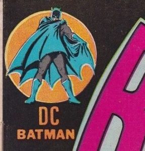
9. This is the logo that dominated the Silver Age and while I appreciate the added color, it still has that Superman thing going on. (Look, I like Superman fine, but I just felt it made Batman the undercard.) Check out the National Comics reference.

—
8. A lot of people thought this was the worst until that travesty at #13 came along. It never bugged me all that much. It’s OK enough I guess.
![]()
—
7. The improvement on #11. DC just says “bullet” to me. I will almost always err toward the circle. Some of my favorite comics have this logo on it. Doesn’t make it a great logo, but I do like it fine.
—
6. Simple, though maybe a little too simple. This concept — straight from the Golden Age — is used by DC now to market its more retro merchandise and I think that’s cool. I’d like this one a little more if it had that splash of color in #9.
![]()
—
5. I do miss little characters in the upper left hand corner. It’s such a neat thing and screams early Bronze Age to me, which, of course, is because this is from the early Bronze Age. But DC is buried in the design and I have my limits. There are slightly different versions DC also used at the time, but I’m not inclined to hunt them all down.
—
4. Yeah, I know it’s a little bland but it still speaks to me. That’s an age thing, I’m sure. I’m the Bronze Age generation.
![]()
—
3. I know this is a hokier version of #4, but I just like it better. It’s more exciting, with just enough goofiness to make me grin, which is what I’m doing as I type this.
![]()
—
2. This is a great logo. Almost perfect and I’m sure we’ll see different colors when it’s put into action. (By the way, I’m patting myself on the back for predicting the return of the bullet, here.) I would have gone with an outline around the letters and the circle itself. If they’d done that, I’d be breaking open a bottle right now.
![]()
—
1. C’mon, you think I was going to pick anything else? It may not be the most aesthetically pleasing of them all — hell, I remember being a little put out by it when I first saw it as a kid — but this logo said DC for such a long part of my formative years that it wins almost by default.
—
MORE
— THE 13 GREATEST BATMAN LOGOS — RANKED. Click here.
May 18, 2016
To me #8 was the best logo because of its (underutilized as it turned out) potential for animation. It also evoked the Daily Planet.
You were kidding about #2, right?
May 18, 2016
Totally not kidding.
August 2, 2016
Dan, thanks for a fun discussion. Adopting here your numbering for the sake of discussion, not your preferential order.
First off, pretty much everyone is kidding about #2, right? Ak. (I identify four visual infelicities at first glance.)
It’s like anyone with eyes saw the horror of #13 (that’s all I care to say about that one, lest a tome result), and so DC decided to prove they could do worse.
Here’s what I mean.
As essentially bland (easily readable, identifiable) as are the early DC logos (#s 11-9, 7-3), they are quick, clean, clear (that is, you know, easily readable, identifiable).
With #s 7, 4, 3, DC took off its fedora and even let the Vitalis out of its hair — evidently pondering that “the wet-head is dead” (no offense, Arthur Curry).
And with #3 they added a bit of flair (or what passed for flair along the stodgy establishment corridors of National Periodical Publications). And it worked. Not “better” than its predecessors, it amped them up and grabbed the eye. Fair enough. In fact, among all these “logos” we’re really talking about >versions< of an evolving logo.
Now, with #1, DC decided to add volume to the amperage, yet needed someone "outside the box" (or, you know, beyond the stodgy corridor) to think it through — without being *too* excitable in (wait for it) "updating" the feel of the books with a "bold, new" bullet.
Milton Glaser's version worked. Though a little too "college football" for me at its inception (and its tilt seems still a bit compensatory), #1 held the space with amperage, volume, and, yeah, a bit of élan. In its day. For its time.
Which élan #8 brought into the digital age, without being *too* excitable. Indeed, the result both demonstrates staid (a bit airier than stodgy) tradition and indicates fresh (as fresh as formula allows) approach. For the most part.
That is, it works, capturing the essence of the evolving tradition (read: continuity) of DC while brightening it up with a quick, clean, clear (you know, easily readable, identifiable) image.
As DC's tradition (read: continuity) and its (more feared than fatal) appearance of, well, stodginess, became and remains an "issue" within the comics industry at least since CoIE, the logo has become a hot potato — sorry, I mean, visible mechanism — for addressing that appearance and reputation.
Hence #13, a mawkish attempt to inadvisedly "break" with tradition / reputation / appearance and leap into — AK. Who knows? "The Digital Age"? Slavishness to "out of the box" (that is, sometimes, clueless) marketing consultants?
Never Mind. Already said what I want to say about #13 (read: AK!).
So, while I found and loved DC Comics of the #s 11, 7, 5-3, 1 era, and delighted in hunting and finding what I could of the #s 10, 9 (great version), 6 eras, for me #8 culminated a movement, an evolution, and suggested a momentum conscious of tradition (read: continuity) without dismissing (in fact, evidently retrieving) it. Roll with it, in eternally springing hope.
All of which seemed to me thrown away with #13 (AK!!), and which DC now appears intent on rectifying / reversing / rebirthing…
¡¡ AK !! indeed.
May 18, 2016
Great logo #2? That logo is a mess. Someone please check Dan’s eyes.
May 18, 2016
Heh
July 27, 2024
To me, #9 will always be the “DC bullet”
May 25, 2016
My personal favorite is #3, but DC should just go back to the bullet logo (#1). I do like the new one much better than the peel and the toilet swirl, though.
December 4, 2017
A quick comment about #3 … Former DC Woodchuck, DC writer, and Batman movie producer, Michael Uslan claims to have come up with that version of the logo.
From page 155 of his book, “The Boy Who Loved Batman: A Memoir”…
“Another thing I suggested to Sol [Harrison] was a new DC logo that would evoke the familiar one I grew up with, but would tout DC’s new slogan, “The Line of Super-Stars.” So I drew the classic concentric circles every fan knew with the initials DC in the center circle. Instead of dots on each side, I put little stars. Then I replaced the word Superman in the top arc with the words “The Line of” and replaced the words National Comics in the bottom arc with the words Super-Stars. Sol polished it up and it became DC’s new logo, and I was as proud as I could be!”
June 5, 2018
I guess the problem I have with #13 is that it never lived up to the promise. When it was introduced, it was supposed to be a “window”, that would change color or have a character peeking through depending on the book cover. I may be mistaken about that, but that’s what I (mis)remember. Except for rare occasions, the logo never changed color on any of the books it was on. Again, maybe I’m mis-remembering. #8 was not a bad logo. I believe that we have all been so attached to the DC Bullet that any logo change would have been hard to accept.
June 5, 2018
I have to agree with the concensus and disagree with Dan, #2 is horrible. The explanation why it was introduced was the various angles represented their key characters. I still don’t see it but the angles make for misshapen letters and is just plain ugly. Prefer #1 with the stars, but that is qualified. I’ve dealt with logo designs over the years and the key for a good design is it should represent the product. None of them do that. #13 actually comes the closest inasmuch as it symbolizes a page turning, but I always thought it was straining to make the analogy and dropping character images in the background was kinda cutesy. The swoosh in #8 was justified at the time as being easy to animate since they were gettng into movies and TV. I suppose it was a logical genesis from #1 but never worked for me.
July 22, 2023
#8 looks like it could be the logo for some sort of household electric appliance. #3 is pretty good. #1 IS INDEED THE #1 CHOICE! More than just a simple logo. It looked more like a stamp of excellence, a symbol of quality that I often looked out for at the newsstands back in the day!
Designed by the GENIUS Milton Glaser, it NEVER got any better than that! C’mon DC, BRING BACK THE BULLET!!
July 27, 2024
That Milton Glaser-designed DC Comics logo is a true favorite of mine. It certainly withstood the test of time.
July 27, 2024
I’m pretty much in agreement with you on the rankings, though I think some of them are so close together, I don’t really see them as separate logos. But then how would you get to 13? Use the Tangent logo?
But I am actually torn about returning to the Bullet.
Don’t get me wrong: I LOVE it. It’s the logo I grew up with. It’s the logo that was used the longest by DC. And there is just something so wonderful about it. Milton Glazer (a designer I pray at the alter of) killed it with this design.
BUT… Is it too old fashioned? And not in a cool retro way. As a graphic designer, I look at it and think, “will it resonate in the current market places?” If they were just using it for comics – great. American comics are a pretty insular medium (unfortunately). But this logo is going to be used for movies, tv, video games, Webtoons, apps, etc. Will it work with the current trend of minimalist logos that are instantly recognizable at the smallest sizes (think the favicon)?
I was really happy with the 2016 logo. It was a fresh take, with nods to a lot of the best of the old logs (especially the Milton Glazer Bullet). But it was streamlined for modern market sensibilities. By eliminating the “noise” of the earlier logos (i.e. extra lines, stars) it presented itself as an indication of acknowledging DC’s past but ready for the 2030’s and beyond.
So, yes I am happy the DC Bullet is returning. I just hope they know how to make it work in a society the increasingly wants things sleeker, smaller, and easily identifiable.
(P.S. You should do an Top 13 of the various DC imprint logos. Zuda, Helix, Vertigo, Piranha Press, Minx, Wildstorm, Tangent, All-Star, DC Black Label, DC Zoom, DC Ink, Johnny DC, Earth One, Paradox Press, Milestone ((does that count as DC?)), Elseworlds, Impact, CMX, DC Focus, DC Kids, First Wave, Hill House, Young Animal, Wonder Comics, New Age of Heroes, The Sandman Universe, We are Legends… I’m sure there are others that aren’t coming to me right now. Would be a fun list!)
July 27, 2024
I like the idea of a Top 13 DC imprint like!
July 27, 2024
And with the return of the bullet, DC would do well to also return all of their continuities to the Bronze Age. Just sayin’.
July 27, 2024
I’d go wit #3 and #9 for nostalgia’s sake (I remember a lot of these on comics I had!) But I’ll also always like #5.
July 27, 2024
I grew up with #8 and I like it, but I will admit #3-1 are superior designs.
July 27, 2024
So in reviewing our list here of 12 great logos, my go to will always be the red #4. That screams Bronze Age and many, many childhood memories.
July 27, 2024
Okay, Dan, I designed #3. When I did so, I was still a college student. Comparing my talent and experience designing logos to Milton Glaser would be like comparing the artwork of Paul Reinman to Alex Raymond. That said, although with prejudice I would have voted for mine as number two, I sincerely appreciate coming in third. And I did like the fact that Milton at least kept my stars.
July 28, 2024
Ha! Thanks for stopping by, Michael! I love that logo! Great job by a kid — or anyone!