
BRONZE AGE BONANZA: John Romita and Gil Kane lead the pack! PLUS: Aparo! Morrow! Kubert! MORE!

—
Welcome to BRONZE AGE BONANZA — our monthly series that looks at the greatest covers of the Bronze Age — exactly 50 years later. For more info on this feature, click here.
—
Excellent month for John Romita and Gil Kane — Romita especially. Two of his most memorable covers out at the same time. But there’s a lot of funk elsewhere too.
Dig the TOP 13 COVERS OF SEPTEMBER 1974 — RANKED:
—
13. Detective Comics #444. Freely admitting my Batman bias here: This is a memorable cover to me because the “Bat-Murderer” storyline was, for a time, considered a high-water mark in the Darknight Detective’s oeuvre. Not that it’s not still well regarded but it’s largely forgotten. Anyway, it’s a solid Aparo cover and it has shock value but I may be ranking it more for personal reasons than strictly aesthetic ones. Thoughts, folks?
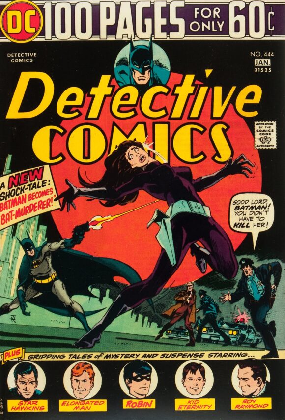
Jim Aparo
—
12. FOOM #7, Marvel. The only thing holding it this low is the intentionally cheap, limited color palette. Great cover by John Buscema, otherwise.
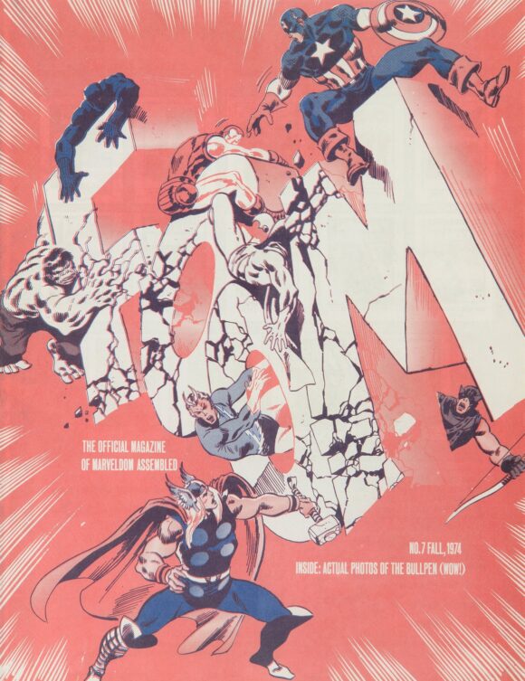
John Buscema pencils (and possibly inks)
—
11. Giant-Size Dracula #3, Marvel. Some covers will make this list because of a specific detail. Here’s an example: This is pretty much your standard Dracula cover. So why is it here? Because dig that life-of-its-own cape by Kane and Palmer! Eat your heart out, Todd McFarlane!
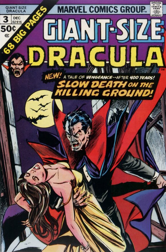
Gil Kane pencils, Tom Palmer inks
—
10. Archie’s Girls Betty and Veronica #227, Archie. As you know, I’m a total sucker for ’70s fashions as brought to you by Archie. Archie Editor-in-Chief Mike Pellerito says that whenever you saw Betty and Veronica in terrific outfits by Dan DeCarlo, chances are it was his wife Josie who pointed them out to him from some fashion mag or catalogue. Nice job, Josie!
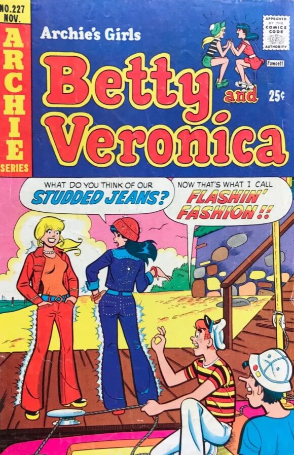
Dan DeCarlo
—
9. Creepy #66, Warren. Is there something wrong with me that I find this cover hilarious? I think I need help. Also: What do they have against Elton John?

Ken Kelly
—
8. Limited Collectors’ Edition #C-32, DC. Great use of negative space by Nick Cardy (though perhaps Carmine Infantino designed it). Anyway, one of the most memorable DC horror covers of the ’70s, in part because the ad for it was everywhere, it seemed. Very basic but very effective, especially in the larger treasury size.
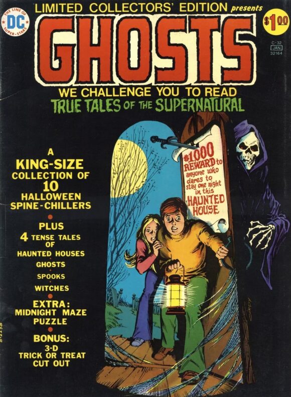
Nick Cardy
—
7. Origins of Marvel Comics, Fireside/Simon & Schuster. Classic John Romita work but I just can’t put it higher because of the Lee credit. I know I shouldn’t hold that against the cover — and I actually think Stan often gets a ludicrously raw deal from fans — but this is just such a blatant credit grab, I can’t go any higher. It is a classic, though.
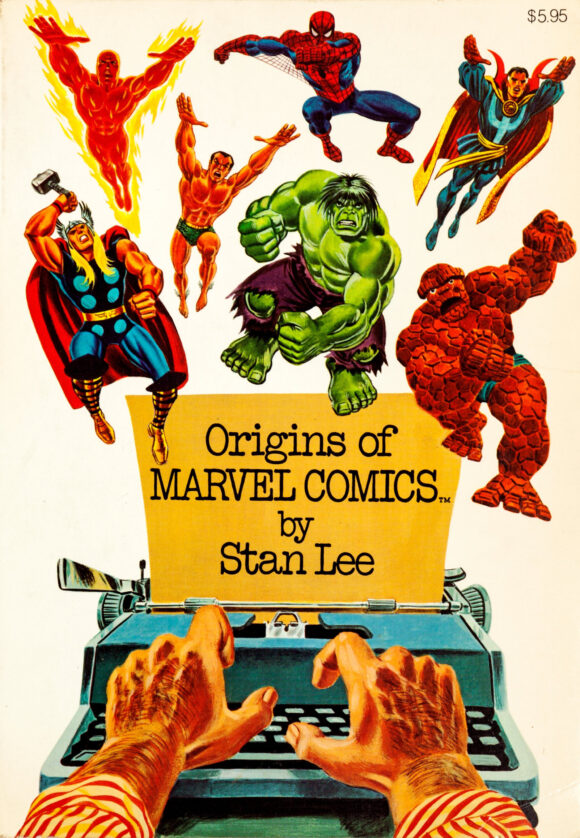
John Romita
—
6. Mad House #96, Red Circle/Archie. I love it when companies other than the Big Two give us something really striking, and this is a pretty daring cover for an Archie imprint. They really let Gray Morrow get away with a lot here, especially when you notice that the Comics Code Authority went along with it. If the alluring topless girl takes one step to her left, you’re going to get an eyeful of demon pecker. Anyway, really strong construction and a great color scheme. Very nice work, right down to the pattern on the sorceress’ schmatte.

Gray Morrow
—
5. Haunted Love #7, Charlton. This and No. 6 can be swapped if you like. My feelings won’t be hurt. They are very, very different — Mad House #96 is detailed and gothic while Enrique Nieto’s Haunted Love #7 is abstract and psychedelic — yet they offer similar cosntructions and color schemes. Both are fab and invite you to stare. Can’t go wrong either way.
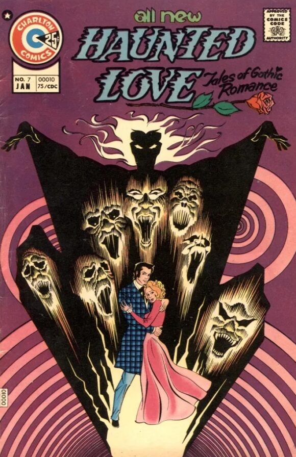
Enrique Nieto
—
4. Tarzan #234, DC. A running theme this year is how different editors handled DC’s 100-page packaging. Archie Goodwin (No. 13’s Detective #444) went with big images and floating heads. Editor/artist Joe Kubert takes a very different approach here, using the title character himself to hold three vignettes together. Terrific.
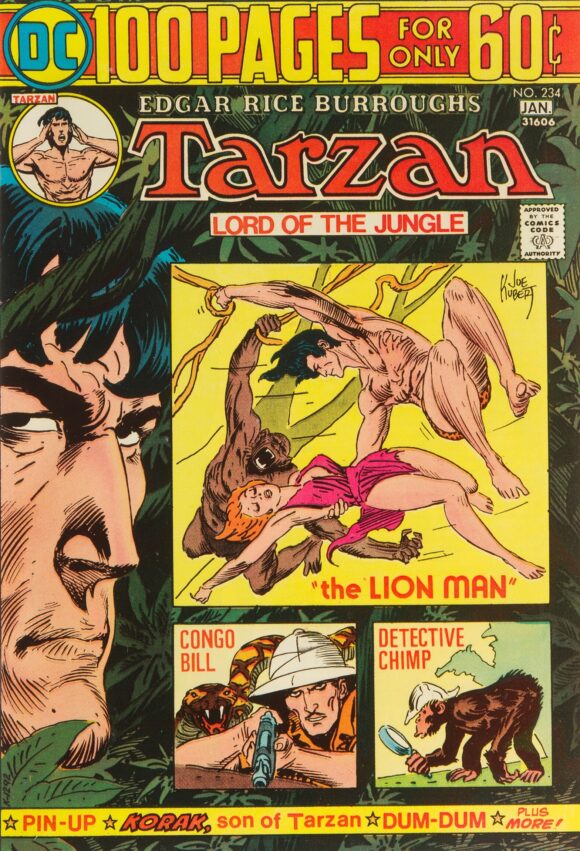
Joe Kubert
—
3. House of Mystery #228, DC. Editor Joe Orlando, on the other hand, goes for a sort of split decision, with Frank Robbins’ primary image getting integrated with the trade dress while Luis Dominguez’s vignettes are woven into the image by having them “underground.” It’s a neat trick but the real star here is colorist Tatjana Wood, who tied it up with a gorgeous palette. (By the way, I imagine I might get a note from Paul Levitz, who was the assistant editor, gently schooling me on my assumptions about this cover. Bring it, Paul!)
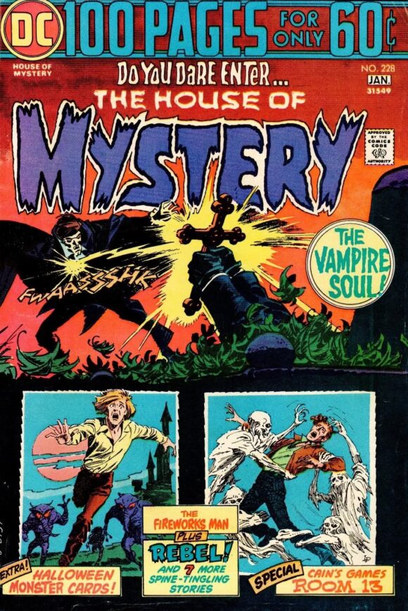
Main image: Frank Robbins. Vignettes: Luis Dominguez.
—
2. Captain America #180, Marvel. Brilliant way to introduce Steve Rogers’ new costumed identity. I never thought of Rogers as having Flash-like super-speed but no matter: Gil Kane deserved the license to do anything he wanted and it’s a really striking way of bringing Nomad to the fore. One of the best Cap covers of the era and one that really grabbed my attention when it came out. (Also: I love Nomad’s sumptuous, Redford-like hair.) This almost topped the list, but…
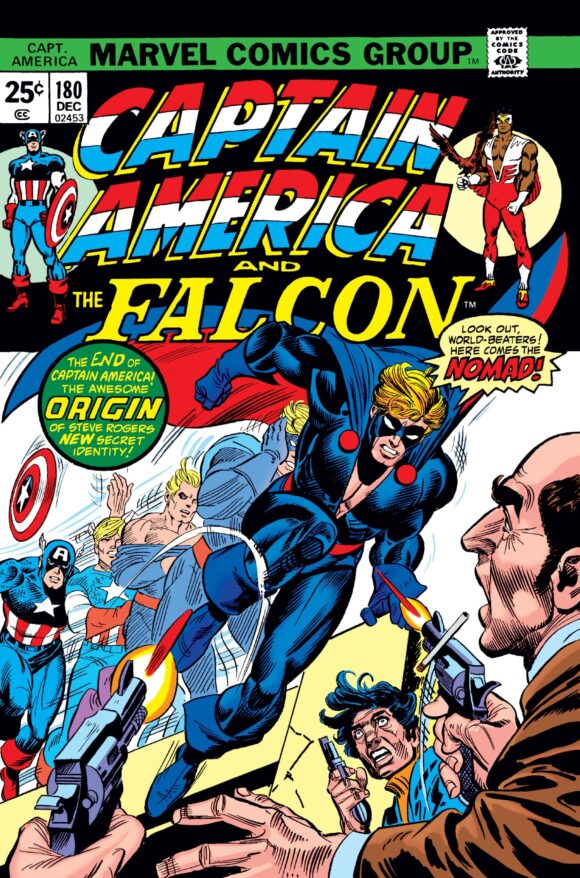
Kane pencils. Possible combination of Mike Esposito and Frank Giacoia on inks.
—
1. Marvel Treasury Edition #2, Marvel. You can’t deny the iconography of Marvel Treasury Edition #2. Like he did with Spider-Man on the cover of Marvel Treasury Edition #1, John Romita gives us an image of the Fantastic Four that was an instant benchmark. In other words, this is one of the most famous images of the FF ever — and rightly so. Simple, clear, potent, as your eye follows the circular pattern of the illustration. Superb.
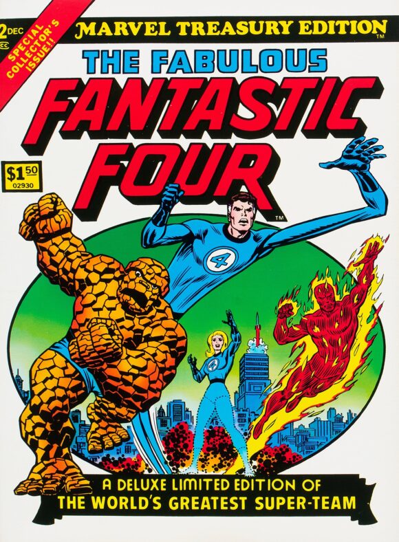
Romita
—
MORE
— The TOP 13 COVERS of AUGUST 1974 — RANKED. Click here.
— BRONZE AGE BONANZA: The 1974 INDEX. Click here.
—
Comics sources: Mike’s Amazing World of Comics and the Grand Comics Database.
September 15, 2024
Oh I remember rushing to my local drugstore (or other venue) to get the latest installment of the “Bat-Murderer” saga! Thanks for remembering! I also remember studded jeans (Betty & Veronica) but I think they were not fun to sit on a wooden school desk chair in! Never paid attention to Tarzan, but I wish I’d seen this issue—I missed a Detective Chimp story! (I’ve never read one!) Thanks again for this feature!
September 15, 2024
Thanks, Jeff. I love doing it!
September 16, 2024
🙂
September 16, 2024
100 pages for only 60¢ was a remarkable era. From the splashy eye-catching covers to the deep dives into Golden Age stories – 100 pagers were worth more than they charged. Is it possible to pick ONLY 13 favorite covers??? I doubt it.
September 17, 2024
Picking only 13 covers is the challenge!
September 15, 2024
That HoM vampire cover was in a house and or two back then and based on the cover I always wanted to read the story.
September 15, 2024
Hey, Marvel! Where’s are facsimile copies of “Marvel Treasury Edition #2”?!! I read my copy cover-to-cover, over and over. Made me a fan of the FF and Kirby for sure.
Not sure I get the issue with the tagline on “Marvel Origins”. I always read the “by Stan Lee” as if it went with that edition not that he claimed credit for every character. Guess I need to revisit the pages in between.
September 15, 2024
Hey Dan,
RE: Detective Comics # 444: I may be ranking it more for personal reasons than strictly aesthetic ones.
Aesthetic ones work amazingly well. That’s a striking image of Talia there that Mr. Aparo gives us there (even if ignoring that she’s being shot in the back). I was somewhat disappointed by the Bat-Murderer story esp. as Aparo only worked on three issues of five, the final two illustrated by Ernie Chan, even if it was one of Chan’s somewhat better efforts (helped by the always superb Dick Giordano inking) before Bats was rendered as far too steroidally muscle-bound with that awful squishy-wimpy bat insignia on his chest Chan seemed to have a lazy penchant for.
And, to express a personal opinion, I still prefer Mr. Goodwin’s cover sense for the 100-pagers over anyone else, including the talented Mr. Kubert in this case: y’know, that striking image of Talia that Mr. Aparo gives us there–and made so by its dominance on the cover.
September 17, 2024
I’m glad someone else is as unimpressed with Chan’s post Bat-murderer Batman as I. Great Conan artist, though.
September 15, 2024
I love that FF treasury edition… but WHO is flying the rocket!?
September 15, 2024
Autopilot!
September 15, 2024
Herbie!
September 17, 2024
Franklin…that kid gets into EVERYTHING!
September 15, 2024
I’ve never read Limited Edition C-32, but I remember the in-house ads. Scary! As a kid I assumed that if you were able to stay in the haunted house overnight you’d break some evil curse. I’ll have to track it down someday and find out.
September 15, 2024
I would have tossed Weird Western Tales #24 somewhere in the middles of the list.