BRONZE AGE BONANZA: Ron Wilson has a big month! PLUS: Adams! Kirby! Buckler! MORE!
—
Welcome to BRONZE AGE BONANZA — our monthly series that looks at the greatest covers of the Bronze Age — exactly 50 years later. For more info on this feature, click here.
—
It was uncommonly tough distinguishing this month’s covers. Would love to hear your opinions!
Dig the TOP 13 COVERS OF AUGUST 1974 — RANKED:
—
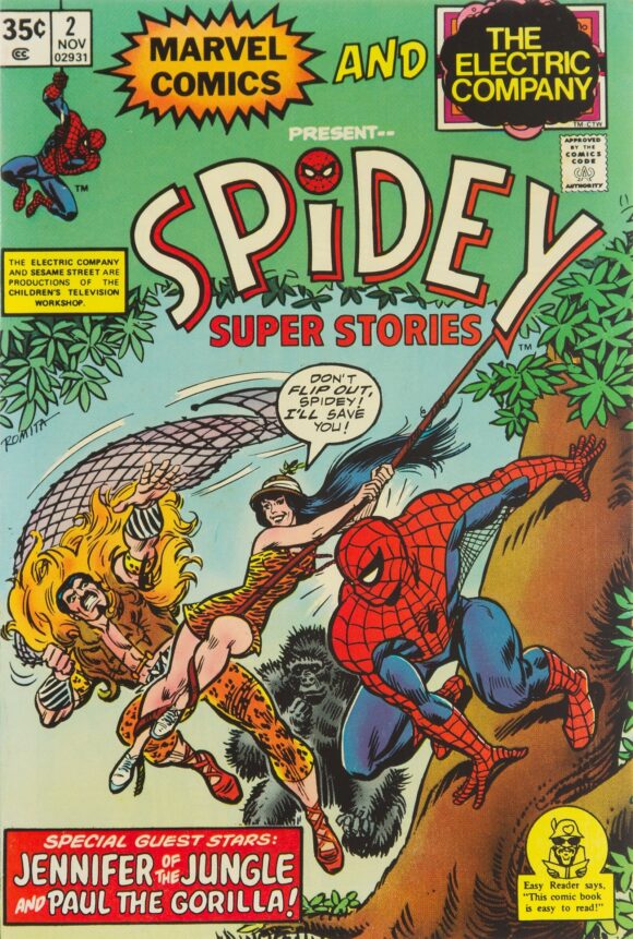
13. Spidey Super Stories #2, Marvel. Y’know what was great about this series? That it could plausibly merge the worlds of The Electric Company and the Marvel Universe. I mean, besides the fact this is a really well-constructed cover by John Romita, it’s charming and funny. (Hey, is Paul just floating in the air there?)
John Romita
—
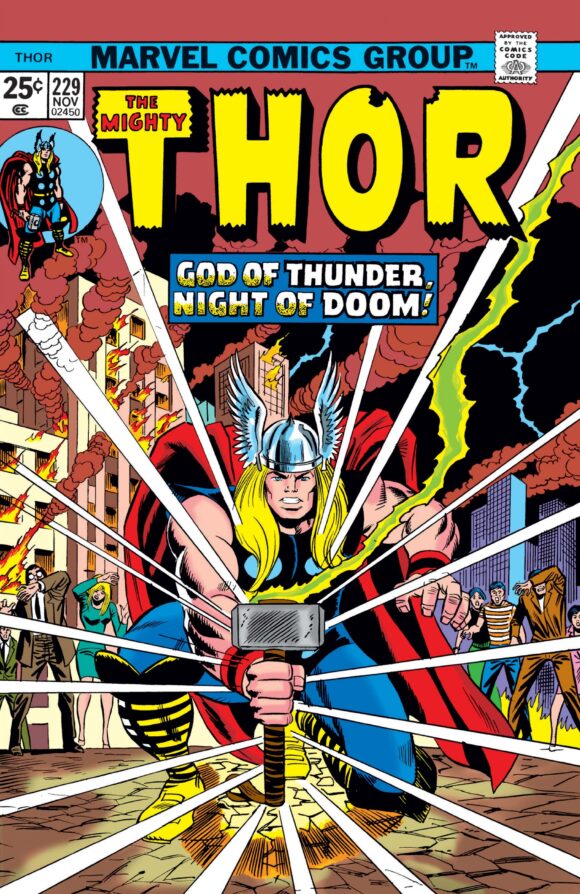
12. Thor #229, Marvel. Usually, I’m able to make distinct choices when putting BRONZE AGE BONANZA together. This month it’s particularly difficult because the vast majority of covers on this list are pretty much in the same good-but-not-great category, so where they end up may come down to something pretty specific. This is a good example: solid, poster-like cover by Ron Wilson and Mike Esposito that could have been magic but is completely undercut by the brown background. If only it were red…
Ron Wilson pencils, Mike Esposito inks
—
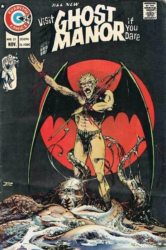
11. Ghost Manor #21, Charlton. Charlton was doing some seriously eerie covers at this time. Just look at the eyes on that… thing at Horned Bat Guy’s feet. I can’t tell if that’s the creature’s eyes or the eyes of somebody it just consumed. Urk.
Sanho Kim
—
10. Conan the Barbarian #44, Marvel. Just a reminder that even someone as great as John Buscema can have an off day. This is a perfectly good cover, but something about it feels rushed. You put Conan and Red Sonja together and you should feel the earth move. Another good-but-not-great entry.
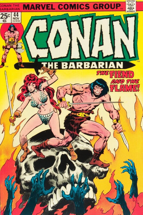
John Buscema
—
9. Captain America #179, Marvel. What do you do when your main character gives up being the title hero? You have said character loom ethereally over the scene. This was one of the first Cap comics I ever got and it didn’t occur to me that Golden Archer (actually Hawkeye) was a satire of Green Arrow.
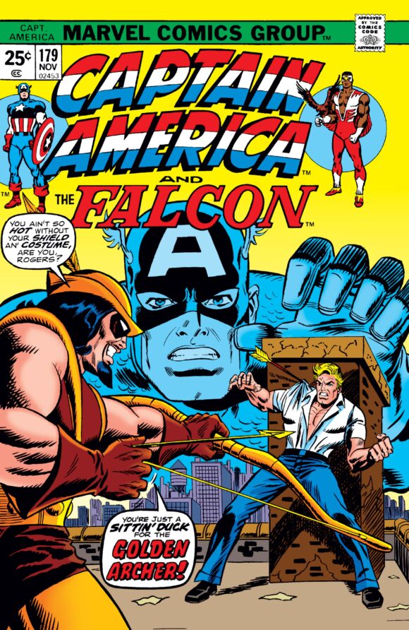
Wilson pencils, Frank Giacoia inks
—
8. Giant-Size Avengers #2, Marvel. I want to put this cover higher but I just can’t for some reason. I know I’m being uncharacteristically wishy-washy this month but hey, you pays your money, you takes your chances. I know it’s considered a classic and it is good, but it’s another one that just seems to be missing something extra. What do you think?
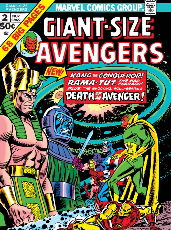
Wilson pencils, Giacoia inks
—
7. Iron Man #71, Marvel. Very good poster-ish cover, with strong, if not particularly inventive construction. I think the blue mutes it somehow.
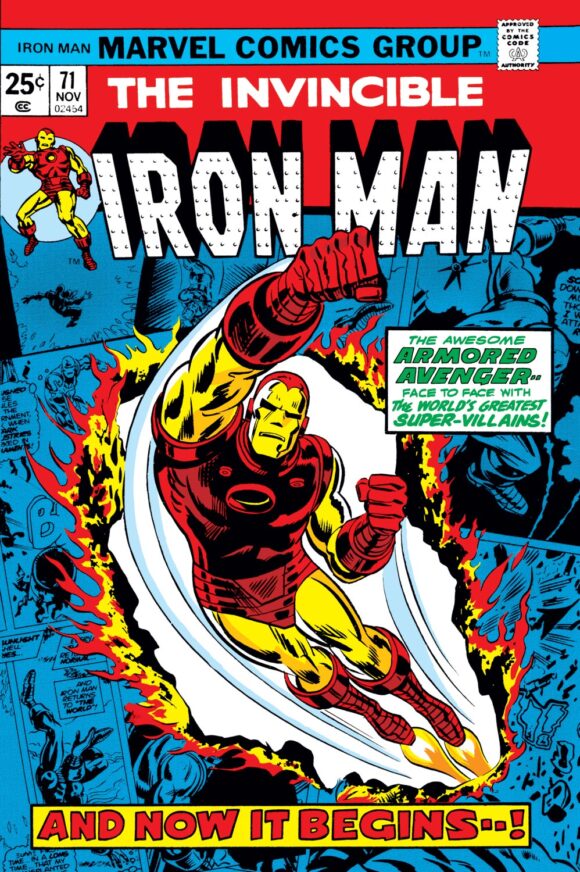
Wilson and Esposito
—
6. Kamandi #23, DC. Hey, DC makes the list! Wouldn’t Jaws have been even more fun if the shark talked? “I’m coming to get ya, Quint, ya bastard!” This is all Kirby attitude and I really dig it, even if the shark (or killer whale?) itself is really oddly proportioned. But that was a hallmark of the King, so who am I to question it?
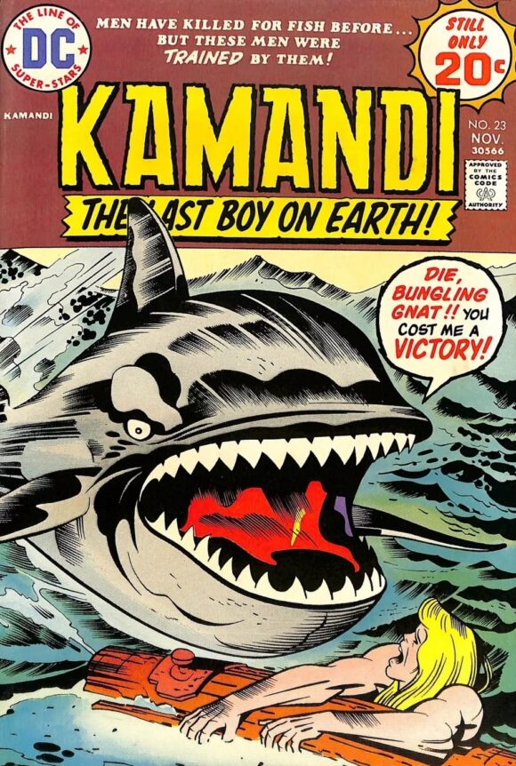
Jack Kirby pencils, D. Bruce Berry inks
—
5. Superman #281, DC. I know a lot of you are saying, “Dan, how the hell can you put this cover above most of these others? It’s ludicrous!” Precisely. It’s ludicrous. Hilariously so.
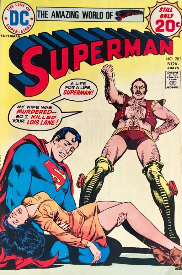
Nick Cardy
—
4. The Amazing Spider-Man #138, Marvel. Look, I know people hate the Mindworm, but I really don’t know why. He was a really creepy villain and perfectly suited to the mid-’70s. And this Kane-Romita cover is a, no pun intended, mind-blower.
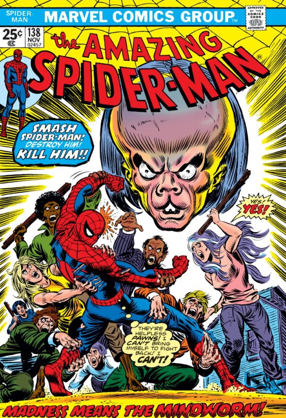
Gil Kane pencils, Romita inks
—
3. Red Circle Sorcery #9, Red Circle. I love big eyes and looming hands. It’s a well-worn trope that can come off as cliched, but I really dig what Gray Morrow’s done here. Plus, the main image is suitably startling, with the horse’s fiery eyes and nose. (No ears, of course.) Works especially well with the trade dress. Not sure the light blue is as effective as it should be, but this is a groovy cover.
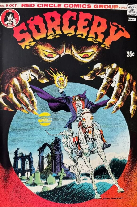
Gray Morrow
—
2. Jungle Action #12, Marvel. Look, I’ll just come out and say it: Rich Buckler is doing Neal Adams here — but he’s doing it well. Great, close-up action and the Panther’s eyes add a lot. But I think what really makes it work is that deep purple background by whomever the colorist was.
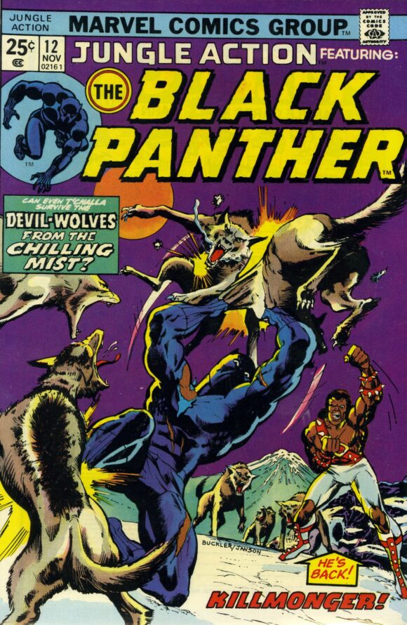
Rich Buckler pencils, Klaus Janson inks
—
1. The Deadly Hands of Kung Fu #4, Marvel. And speaking of Adams, here’s the master himself. Adams was born to draw the martial arts and what’s clever about this cover is that the guy on the left just got a kick to the face and we’re catching Caine spinning to meet his next attacker — you.
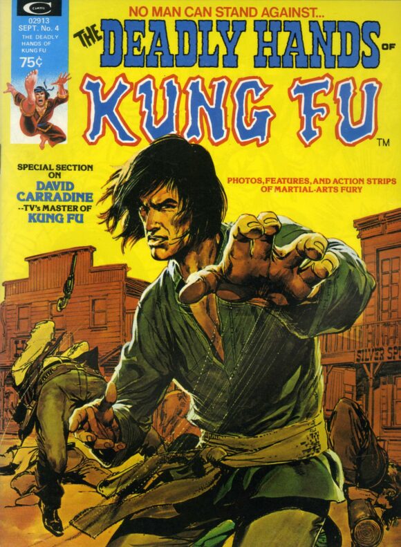
Neal Adams
—
MORE
— The TOP 13 COVERS of JULY 1974 — RANKED. Click here.
— BRONZE AGE BONANZA: The 1974 INDEX. Click here.
—
Comics sources: Mike’s Amazing World of Comics and the Grand Comics Database.

August 11, 2024
I love the Mindworm, Spider-Man 138 is a great issue .
August 11, 2024
Peter and Flash becoming roommates and finding out they actually liked each other was a great moment
August 11, 2024
Ah, Vartox. Superman #281 was one of the first comics I bought.
August 11, 2024
I have deep memories reading Nick’s Superman so maybe not fair to list higher. But I definitely list that Thor closer to the top. That is A+ cover grab work for the spinner rack.
August 11, 2024
Thor 229 was the cover Mead used for their notebook and binders back in the day…meaning that cover was seen by a lot of people who didn’t collect comics.
August 12, 2024
You left out Shazam # 15, the first meeting of Luthor and Mr. Mind. “You’re my kind of man -er, worm, Mr Mind”. Hilarious line.
August 12, 2024
Oh yes! That was funny! I’d forgotten that!
August 12, 2024
Somehow I managed to see that Kamandi cover a lot! I think it was in an ad in a lot of the comics back then! Again, thanks for the trip back; yes, I remember 1974!