
I blame Francis Manapul.
—
Welcome back to our recurring miniseries Comics: Italian Style. Why Italy? Because I just traveled there and there’s plenty to say comicswise! This is the finale, by the way. Godere! — Dan
Part 1: The Italian Voice of DC Comics — Translator Francesco Vanagolli
Part 2: What DC and Marvel Can Learn From Italian Publishers
Part 3: Why was Batman red? Who was the Kryptonian called Nembo Kid?
Part 4: The Venice of Corto Maltese
—
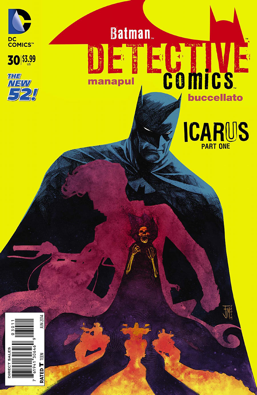
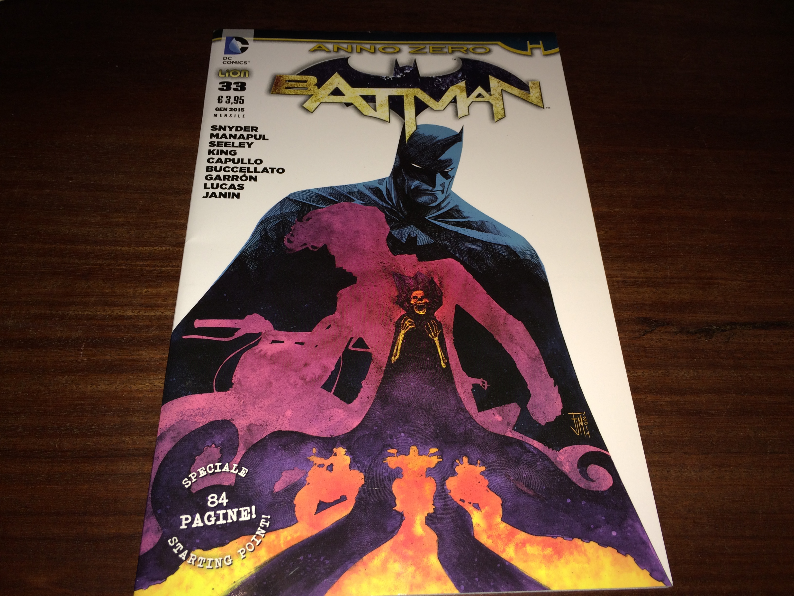
Last year, I interviewed Francis Manapul, the top-flight artist who was taking over Detective Comics. One of the things that jumped out at me was the cover of his first issue — a striking image featuring a bright yellow backdrop.
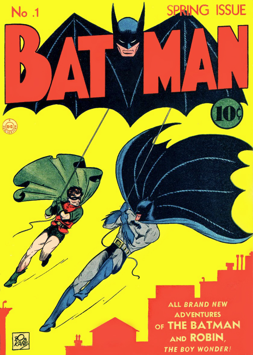
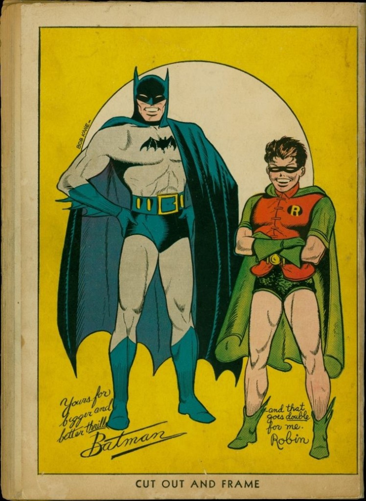
It had occurred to me just how much I love old Golden and Silver Age Batman covers that feature bright red and yellow backgrounds. They work so well as contrast points to Batman‘s black, blue and gray and play off Robin in a really striking fashion.
I mean, just check out Batman #1 — and its back cover (more on that very soon).
I asked Manapul about it, assuming that’s what he was going for. Instead, it turned out his inspiration was a continent away, in Italy:
“A writer friend of mine by the name of Anthony Falcone told me about the “giallo” genre in Italian fiction. It literally means yellow in English. Back in the ’30s, Mondadori translated British and American mystery novels in Italian and donned yellow covers. Their popularity soared and imitators followed suit with the subject matter along with the yellow covers. The genre of mystery and crime fiction eventually became known as ‘giallo.’ After hearing that, it was a no-brainer to me what I had to do.” (Read the whole thing here.)
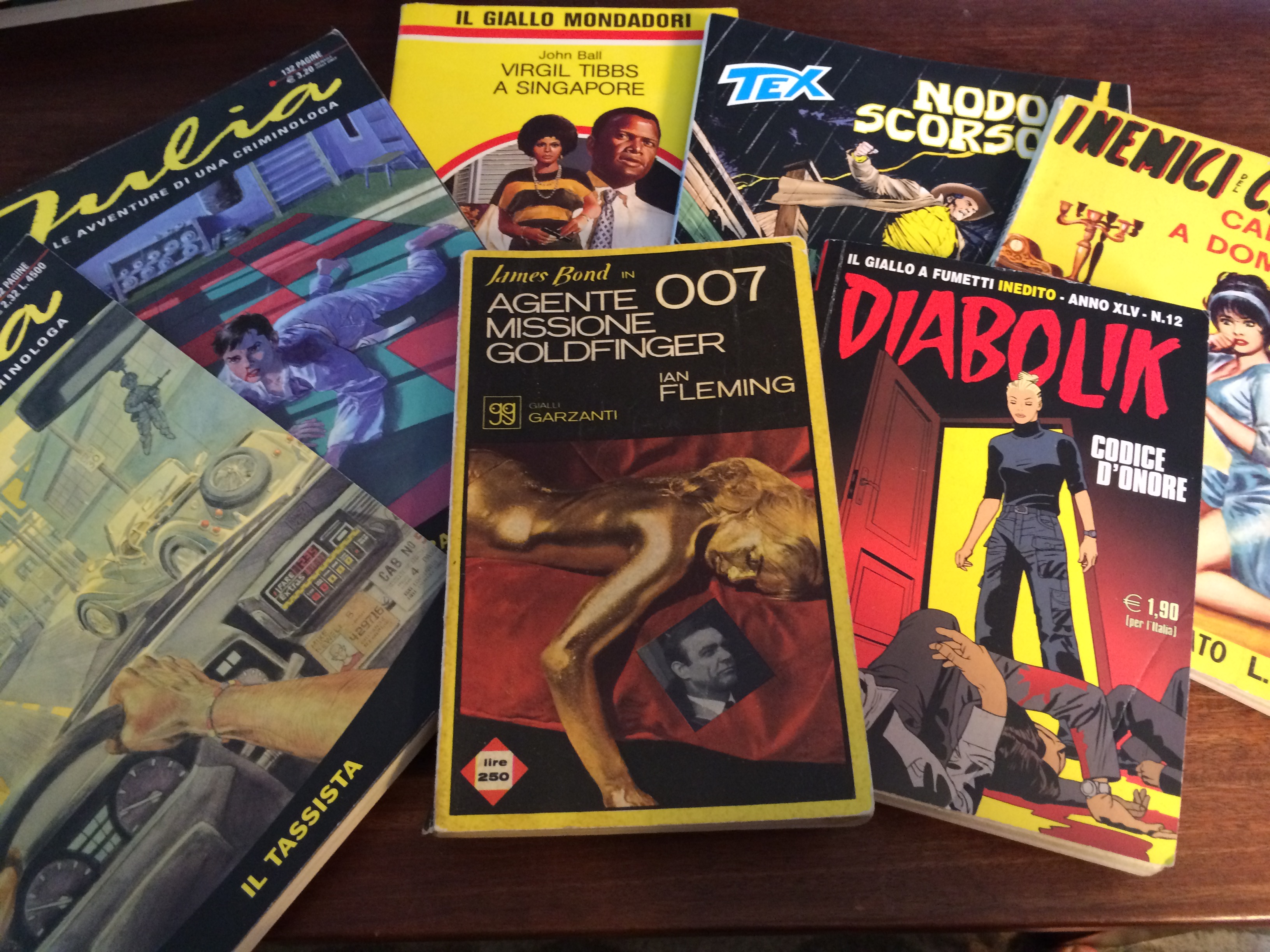
So, of course I had to check out some of these covers on my own. And my lord, did those covers knock me out. Here are just a couple examples:
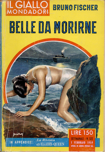

So of course when I went to Italy recently, I spent a decent amount of time looking for old Giallo books, even if I couldn’t read a lick of Italian. Didn’t matter. It was all about the aesthetic.
What I found was just how much yellow plays into the Italian literary zeitgeist. Sure, you can easily find the old paperbacks, like this bit of awesome …
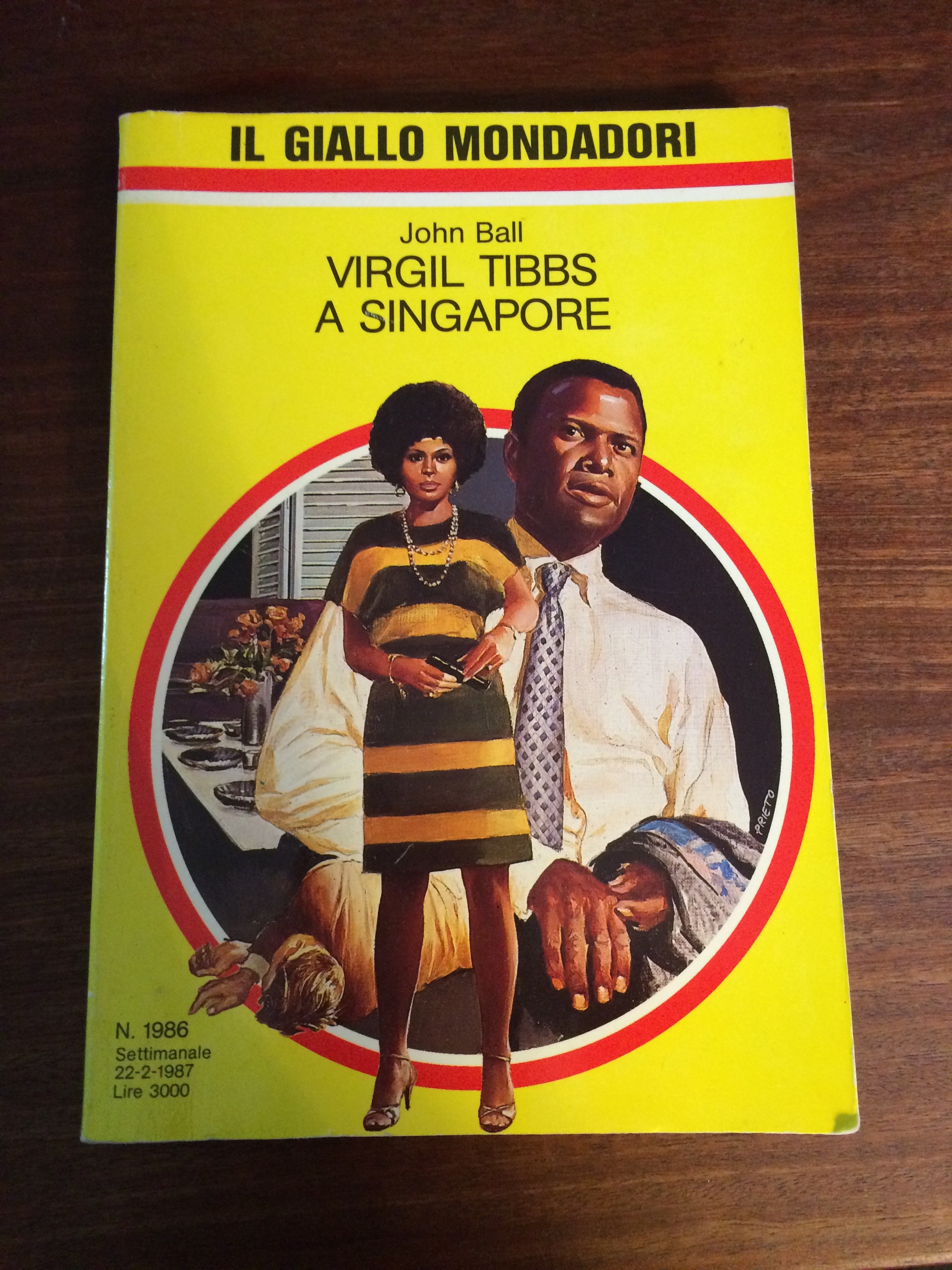
“Lo chiamavano Signore Tibbs!”
… but there are Giallo sections in new bookstores — and even books that don’t fit the mold often feature that bold, canary color in some fashion. Yellow is frequently used in a range of advertising, as well. Comics too.
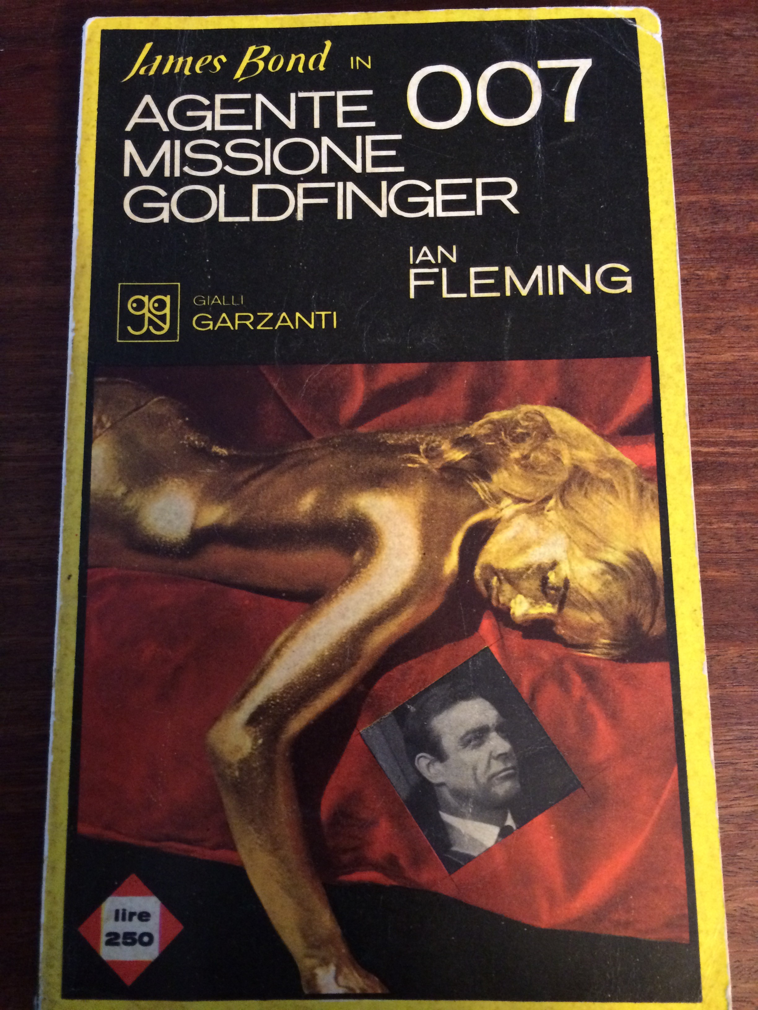
I tried to find James Bond Gialli and I hit the jackpot: A 1964 vintage paperback of … yes … Goldfinger.
Anyway, there’s a funny irony to all this. In my Italian comics-shop travels I found that very Manapul cover that sent me down this yellow brick road.
Only, it turns out the Italian publisher used white instead. Mamma mia!
They used the Digital Pack version!
August 2, 2015
Ahaha, doesn’t that just figure (about Manapul’s cover having the white background? Very fun article!