
A huge salute to the heroes of the Microverse, by guest columnist Chris Ryall…
By CHRIS RYALL
With Marvel’s announcement earlier this week about the coming Rom Omnibus series, fans of Marvel’s other big “toy-based, never-collected comic series written by Bill Mantlo,” Micronauts, expected similar news to follow shortly. At the same time, no one wanted to get their hopes up after all this time only to see them dashed on Microverse rocks.
But their optimism (and extreme patience) was awarded by similar, and similarly welcome, news in the form of Marvel’s announcement that yes, indeed, omnibus collections of Micronauts are also on the way.
Which means it’s time to follow the announcement news with a look at 13 of the best covers the series put forth.
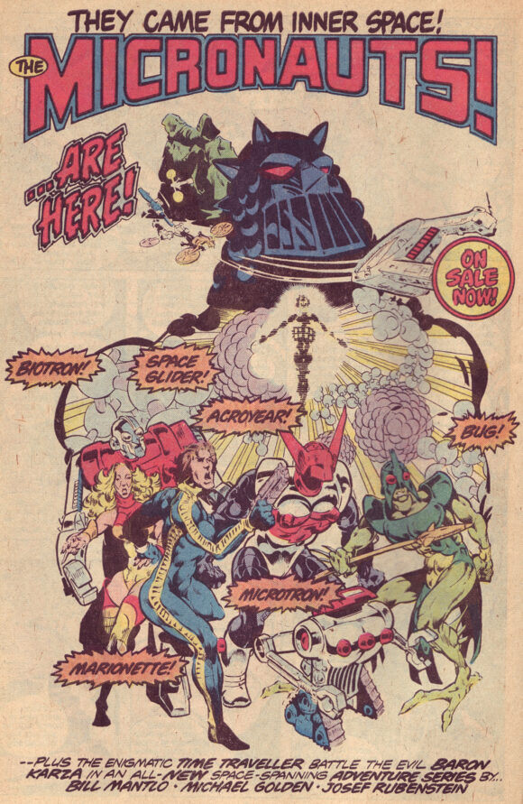
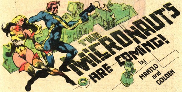
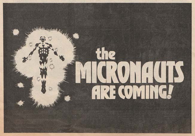
Ad heralding the new series
Like my piece detailing 13 FAR-OUT ROM COVERS, it’s a challenging task to narrow the list to only 13. This is, after all, the series that was drawn first by Michael Golden at his peak, and then followed with issues by Pat Broderick, Gil Kane, Butch Guice, and Kelley Jones, among other esteemed artists.
The omnibus collections will be the place to find all the covers, which include series Volume 1’s 59 regular issues and two annuals; Volume 2’s 20 issues; and a 4-issue X-Men/Micronauts miniseries, too. I selected my 13 not only from all three series but also chose a couple additional standout covers, too.
And much like with Rom, it’s a struggle not to pick every Michael Golden cover. They’re all so good. But I wanted to spread the choices around a bit (but just a bit) so I went with some that, while maybe not better or more memorable than Golden’s covers, they at least stand out for different reasons. So let’s get started:
—
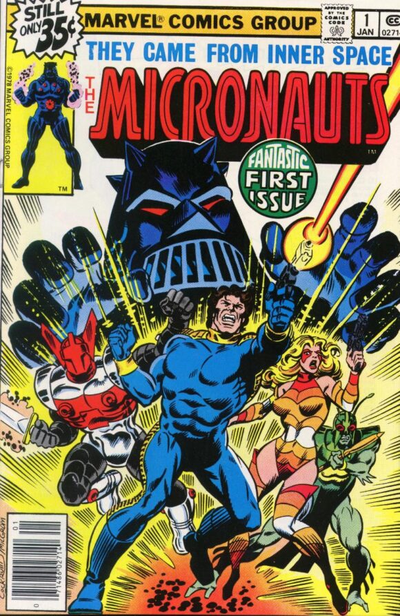
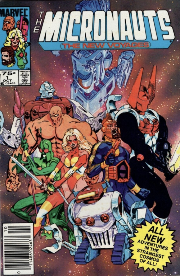
Micronauts #1. It would feel wrong to start with anything other than the first issue in the series. While it’s not my favorite, it’s pretty hard to deny the power this Dave Cockrum image held over any kid who saw it. Because chances are that kid, even if they weren’t aware of the toys, had Star Wars fresh in the head: Star Wars debuted only a year before Micronauts, and it’s undeniable how Darth Vader-like Baron Karza appears on this cover.
—
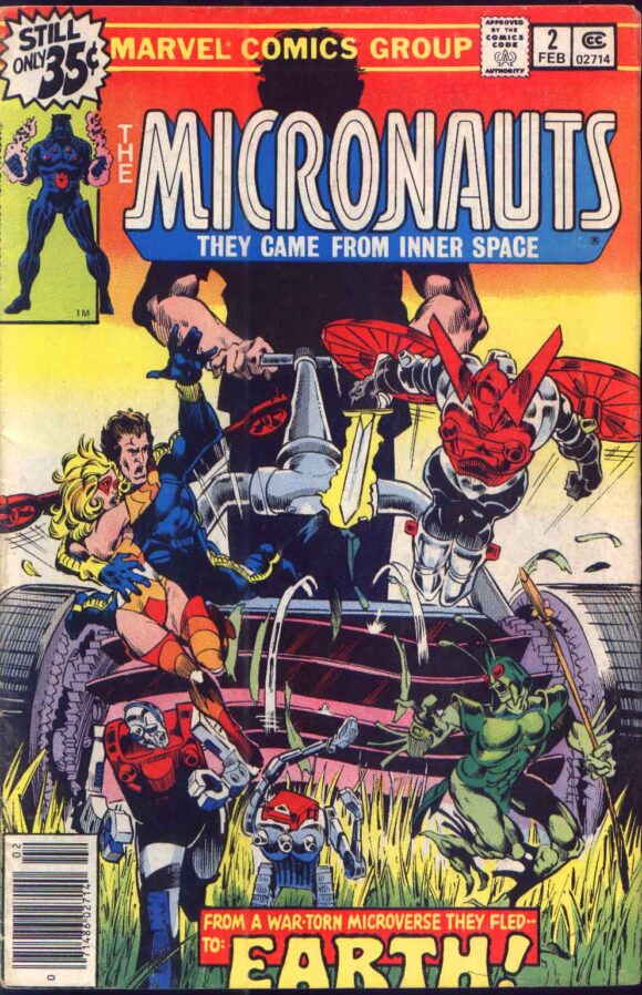
Micronauts #2. This cover, far more than Issue #1’s cover art, immediately conveys the toys’ conceit – these cool, bad-ass-looking characters are nevertheless so small in our world that even something as mundane as a lawnmower is a huge menace to them. The first of many amazing Michael Golden covers.
—
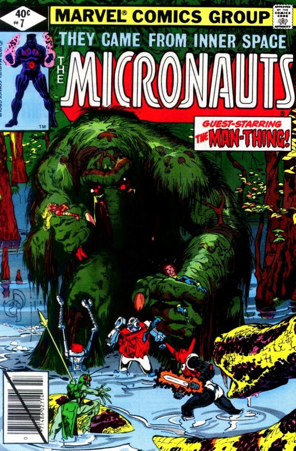
Micronauts #7. If a lawnmower is a problem, then how much worse is a bog-monster like Man-Thing? Any Man-Thing cover holds a giant-size place in my heart but even amid other great covers featuring old carrot-nose, this one is a standout.
—
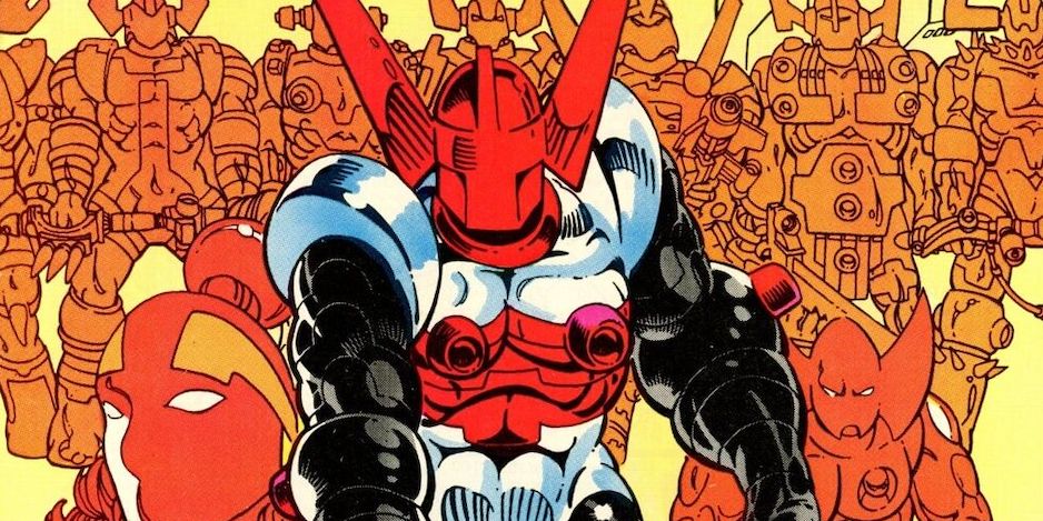
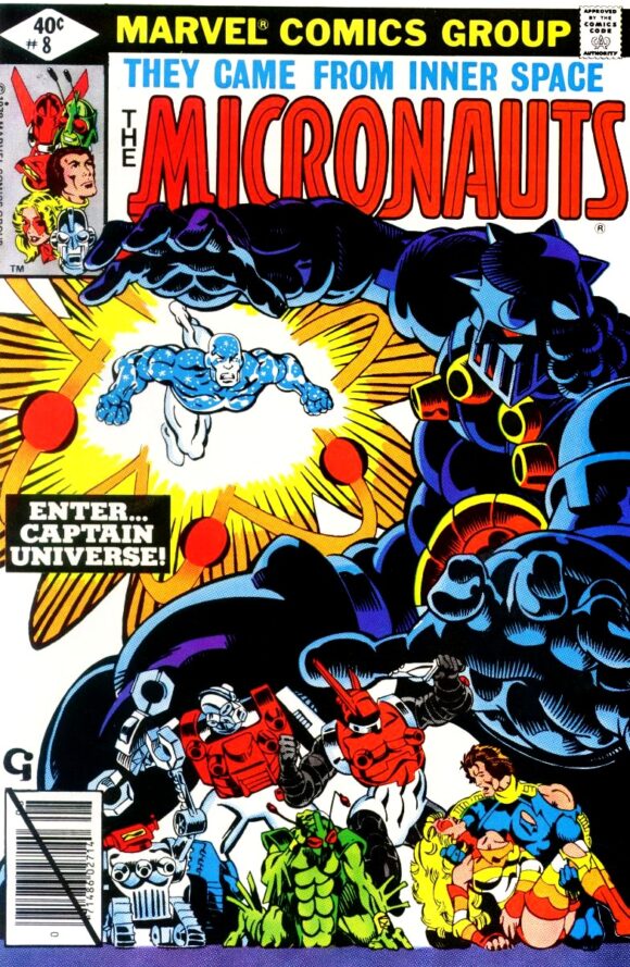
Micronauts #8. Michael Golden covers often featured characters in dynamic poses, and the character action and movement on this one is especially good. Bonus points for the Ditko-like energy burst surrounding Captain Universe, a Ditko co-creation.
—
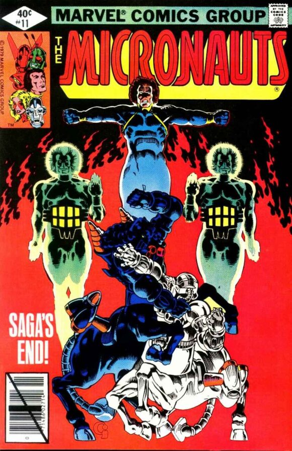
Micronauts #11. The wonderfully symmetrical image, with its stark red flames in the background, plus the cover copy promising “SAGA’S END!” makes this one irresistible. How could you pass up finding out how this part of the saga ends? I sure couldn’t.
—
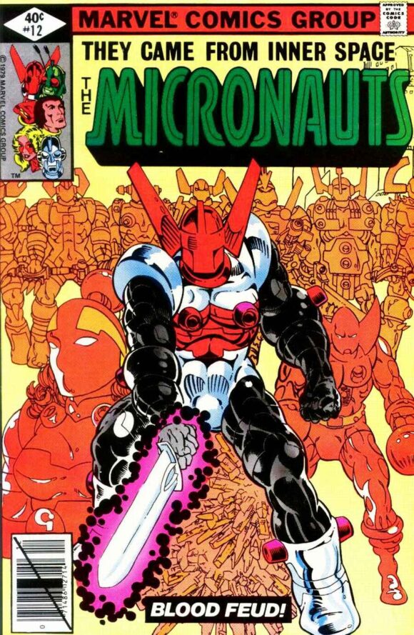
Micronauts #12. A number of Golden’s covers feature a full color Micronaut in a dynamic pose overlaying a background full of monochrome characters. This one is a standout example of that approach, but I could’ve picked any similar cover from this series and said the same thing.
—
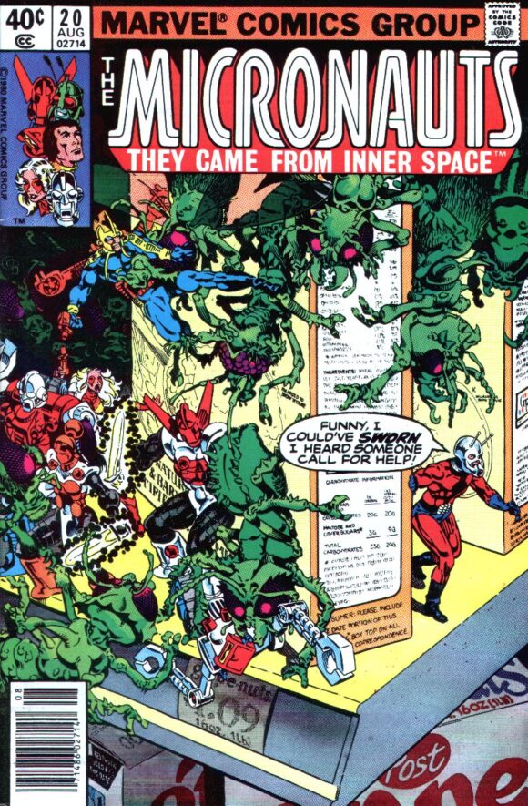
Micronauts #20. You drop the Micronauts into any normal Earth setting, especially one that includes some weird menacing creatures crawling around cereal boxes (a common problem I remember from my own household back then), and I’m in. Toss in Ant-Man and I’m even more on board.
—
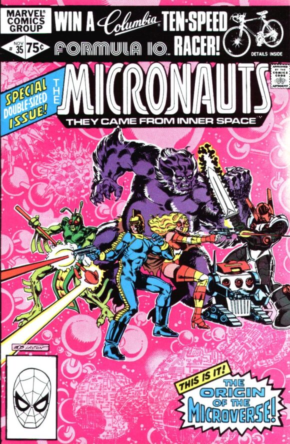
Micronauts #35. Here’s artist Bob Layton borrowing an approach that Golden employed often on this series, and doing it very well. The stark pinks of the microverse background really helps convey the “micro” in the title.
—
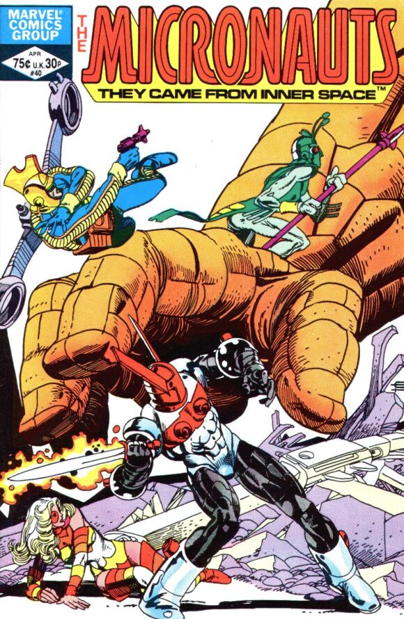
Micronauts #40. It’s hard not to pick artist Gil Kane’s cover for #41 since it features both Dr. Doom and the ever-fun “floating heads” approach, but this one stands out even more. Typically interesting and cool character poses? Check. That great Gil Kane musculature he emphasized so well whenever he inked his own pencils? Yep. A giant stone hand reaching for our heroes? Oh yes. Kane delivered it all here. And you know if the camera panned up far enough to see the stone giant’s face, we also would’ve been treated to a classic Kane nasal upshot, too. Love it.
—
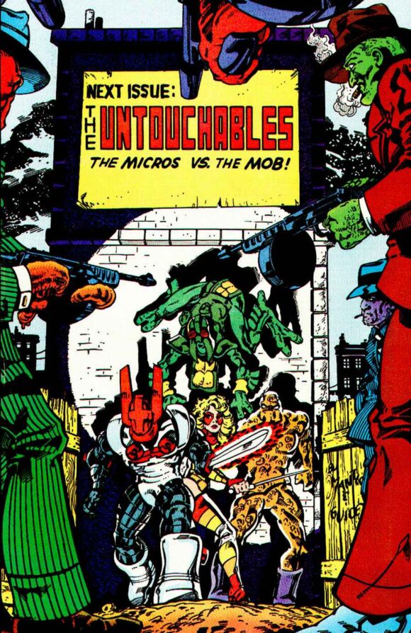
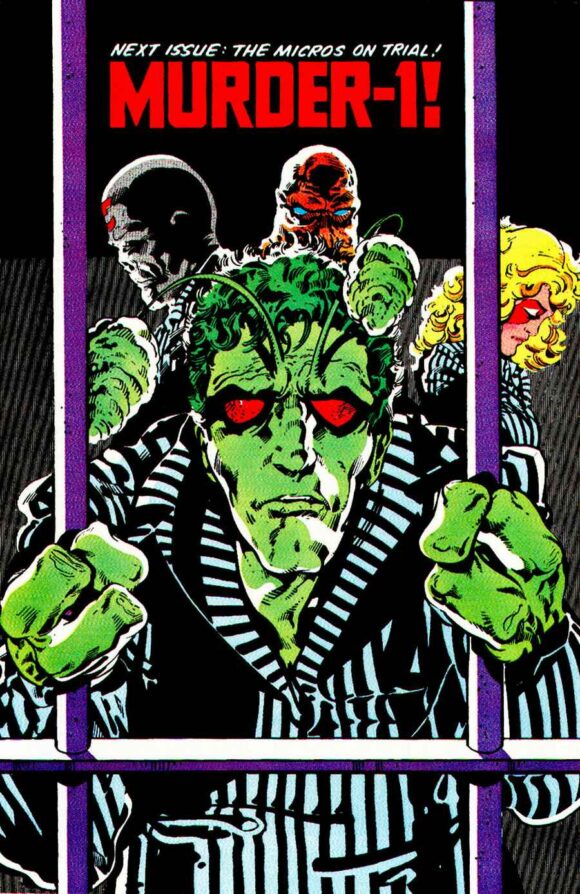
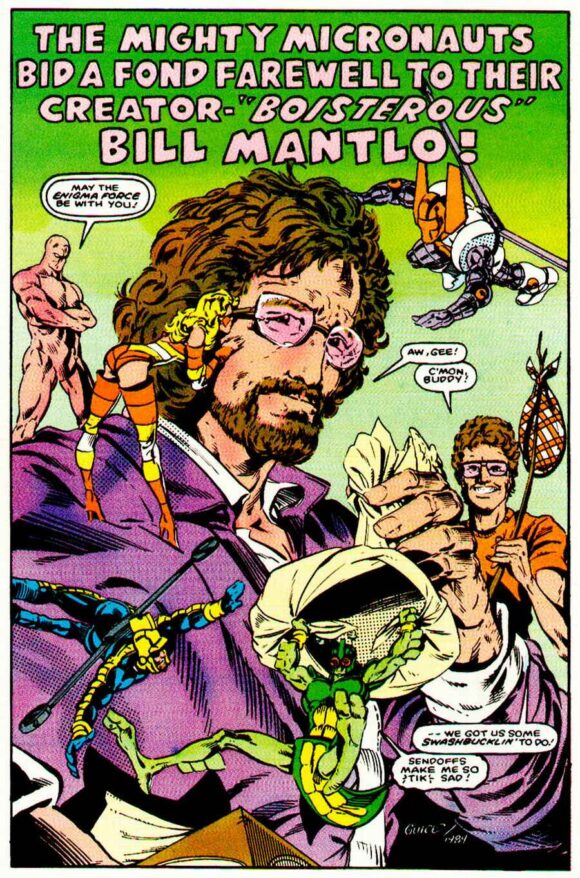
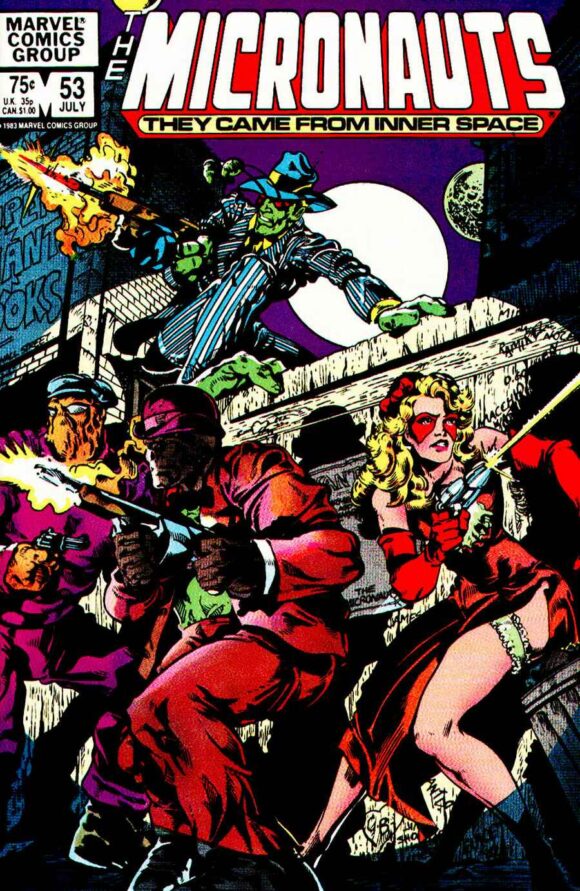
Micronauts #53. After the (relative) doldrums of this book’s middle period, Butch Guice’s arrival on the series gave it a massive burst of enthusiasm that were apparent on its covers (Issues #49 and #50 were both great wraparounds). It’s a real challenge to not only load up on Guice covers here, but also to fill some of the 13 spots with the back covers he provided after Issue #50, too. He contributed back cover images that in today’s world would have been re-used as the cover for the next issue (and they were all good enough to deserve that) but instead, they were just a great bonus for fans who read cover to cover. Especially sweet is the back cover of Issue #58, which features the Micronauts surrounding (or standing on) departing writer Bill Mantlo. I’ve included some those as bonus images.
Issue #51 back cover
Issue #52 back cover
Issue #53 back cover
Issue #58 back cover
But the main pick I went with here is maybe not as striking as the #49 cover wrap, yet it’s more memorable to me. In part because this was the issue that fully brought me back into the fold after my attention started to flag a bit. But even more than that, it’s because it features the characters dressed like 1920s Chicago gangsters — a move that works for me pretty much every time, no matter the property (see also: Giant-Size Fantastic Four #2, Star Trek: TOS’s “A Piece of the Action”). Guice, the most Golden-like of any artist that followed Michael’s run on the series, here gave us Bug in a pin-striped suit and firing a tommy gun, and even better, Bug is flanked by a moll-like Marionette and other Micro-gangsters.
—
Micronauts (Vol. 2) #1. The first series concluded with a couple striking Guice images—one featuring Karza with a sword buried deep in his exposed chest—but this Michael Golden cover was more of a grabber. Especially since there didn’t seem to be a hugely compelling reason for this second series to exist, especially without writer Bill Mantlo involved. Writer Peter B. Gillis and artist Kelley Jones both did a fine job, and I stuck with them til the end, but the Micronauts in a post-Karza world just felt a bit aimless.
—
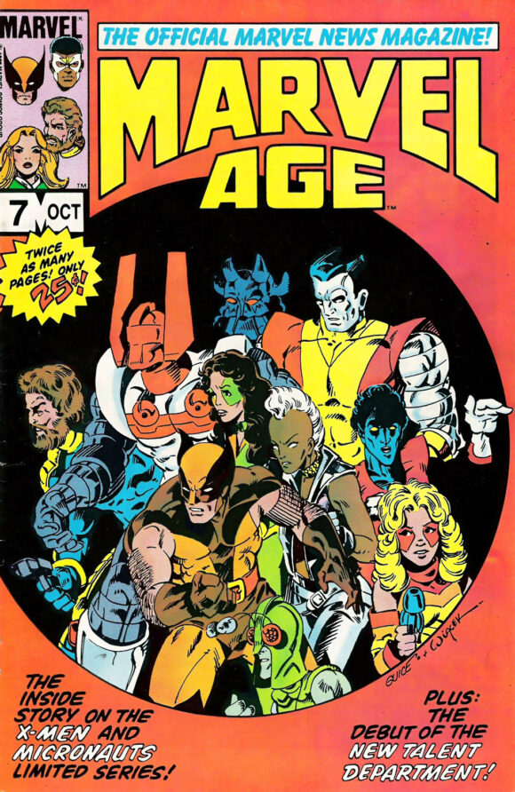
Marvel Age #7. Let’s be honest about something: As much as we all got excited about an X-Men/Micronauts miniseries, especially one created by Chris Claremont, Bill Mantlo, and Butch Guice, it was deeply weird. And a bit unsettling in some of the goings-on with Kitty Pryde. That doesn’t mean I don’t want it reprinted as part of these new omnibus collections—I do. But they’re weird. And the covers aren’t all that great. So this one still stands out to me more – the Butch Guice cover that announced the crossover details in the pages of Marvel’s promo mag, Marvel Age. It was an exciting image, just seeing all those characters on one cover. And it only cost a quarter, too!
—
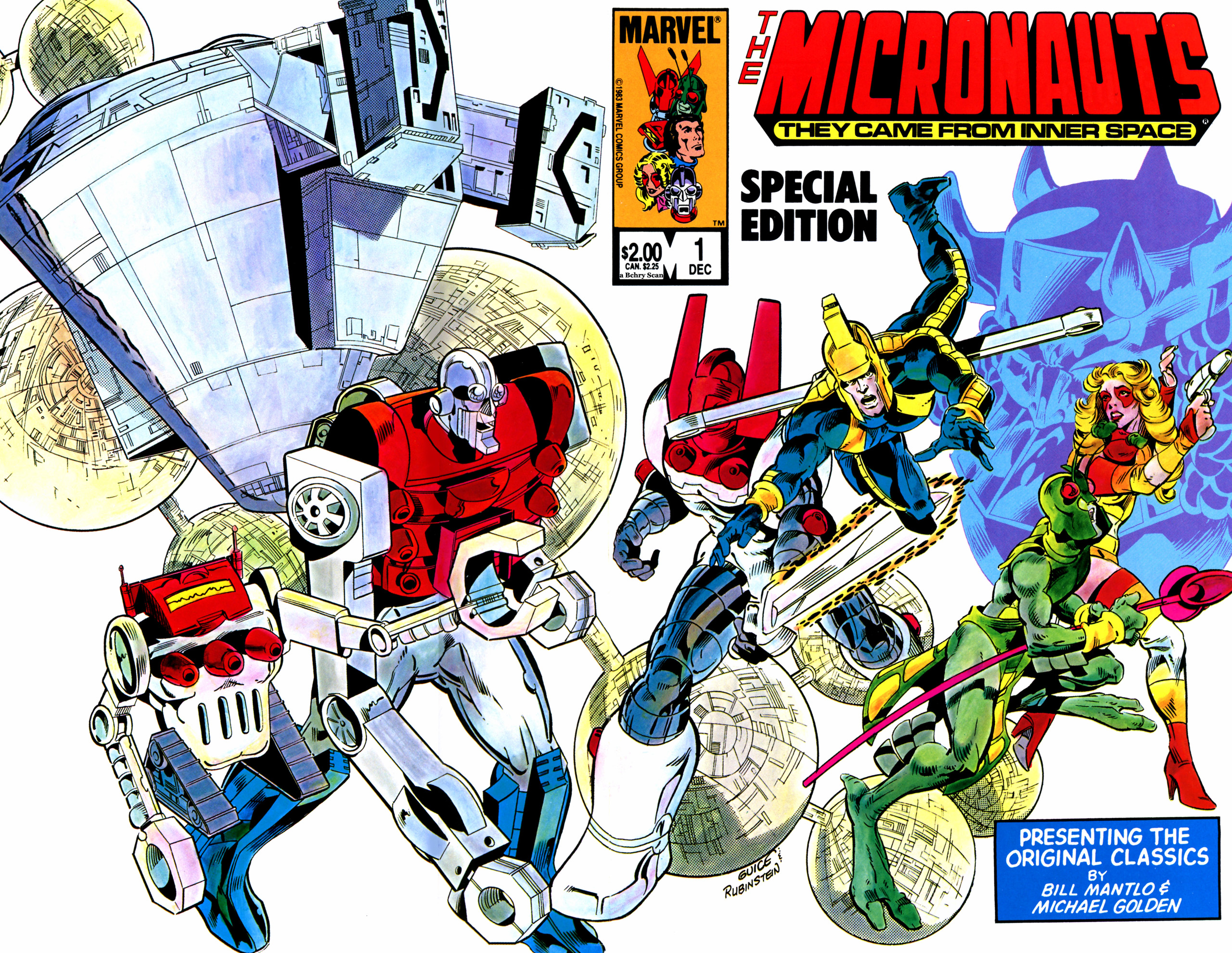
Micronauts Special Edition #1. It’s cheating a bit since this is a reprint comic but the covers are undeniably great. These Special Editions were deluxe mid-’80s comics that Marvel used to re-present a number of classic comics on the newly used, slicker “Baxter” paper. The interiors are a bit too slick and gaudy but this cover is a Guice Micronauts highlight for sure.
—
Finally, as a little bonus, these aren’t covers but the Micronauts ads that heralded the series’ arrival sure were striking, too. The Golden-drawn full-page ad was a good enough image to be a cover of its own. Which is what makes these ads so special, that they were all-new, non-cover art.
Like I say, I could’ve easily included more Golden and Guice covers here. And Pat Broderick did some really nice covers, too. I mean, Frank Miller did a cover for the series and it didn’t make the cut, either, which is another sign of how many great covers this series had. (It’s a fine image, but it too features a giant hand and of the two “giant-hand” covers on this series, the Gil Kane image wins out.
Finally, while I didn’t really love his work on the Annuals, it was still fun to see Steve Ditko draw the characters in those issues. His cover for the first annual almost made the cut for the novelty of it all but I was already having a hard enough time cutting down my longer list to just 13 covers.
Either way, all of these covers are going to be worth a look when these books come out. I know we might disagree on which 13 covers are the best but surely excitement over these books coming at long last is something we can all agree on.
—
MORE
— First ROM, Now MICRONAUTS Is Getting MARVEL OMNIBUS Collections. Click here.
— Classic ROM Returns to MARVEL With OMNIBUS Collections and Facsimile Edition. Click here.
—
Chris Ryall is the co-owner/publisher/editor of Image imprint Syzygy and was the co-writer and driving force of the ROM comic revival in 2017. Click here for his fab Substack.
May 27, 2023
This article is absolutely micro-cool!
May 27, 2023
Next year can’t get here soon enough!
May 27, 2023
Glad you showed some of the Butch Guice back covers, they are really nice and mostly have been forgotten. Really like his run on Micronauts too.
May 27, 2023
I don’t think Steve Ditko was involved in the creation of Captain Universe. He drew those Marvel Spotlight solo issues after this initial appearance. But this was all Mantlo and Golden.
I know Chaykin didn’t do any covers on his handful of issues of interiors but did you leave his name out of the article on purpose? They’re not that bad! LOL
June 7, 2023
no one does a nasal upshot like Gil Kane – they’re hard to draw!