
A 60TH ANNIVERSARY celebration…
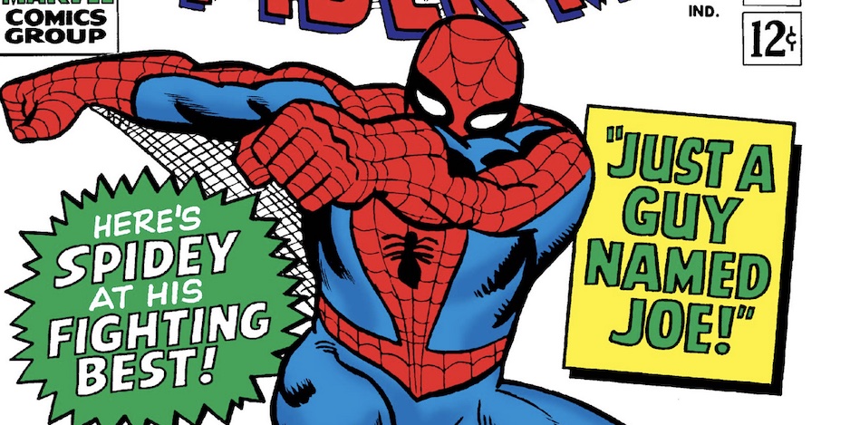
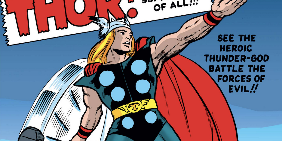
What a crazy day in Marvel history: On June 5, 1962, three comics were released that would have a spectacularly enduring impact on pop culture history: Amazing Fantasy #15, Journey Into Mystery #83 and Tales to Astonish #35, giving us Spider-Man, Thor and Ant-Man, respectively.
That’s according to Library of Congress copyright info — thank you Mike’s Amazing World of Comics — so I’m sure that given the vagaries of newsstand distribution, they actually hit stands at slightly different times. Nevertheless, it’s nothing short of extraordinary that these characters co-created by Stan Lee, Jack Kirby, Steve Ditko and Larry Lieber would all be birthed together.
Naturally, each has fared differently in the decades since: Spider-Man has been a global comics phenomenon for decades while Thor and Ant-Man emerged into the general public consciousness thanks to the Marvel Cinematic Universe.
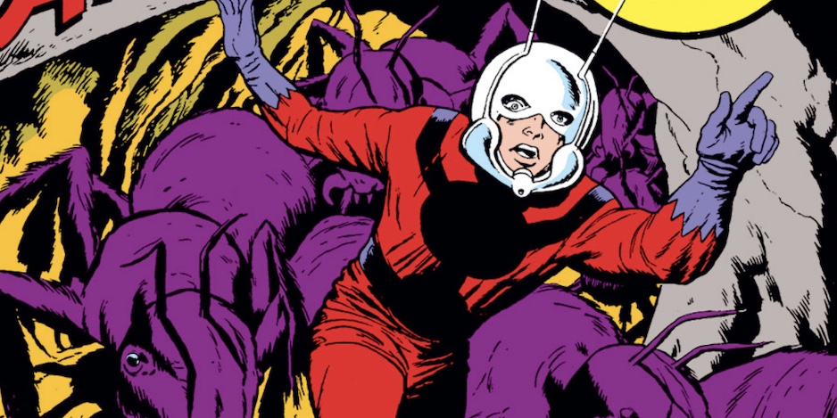
In any event, we’re having a three-pronged celebration: this 13 COVERS salute to Steve Ditko’s Spidey, Scott Tipton’s WHY ANT-MAN IS MY FAVORITE SUPERHERO — FOR REAL and 13 COVERS: A THOR 60TH ANNIVERSARY SALUTE.
So sit back and enjoy this celebration of the profound creativity of the House of Ideas.
—
OK, I’m going out on a real limb here. I am not a Ditko expert and Ditko has one of the most passionate fan bases in all of comics. But go big or go home, right?
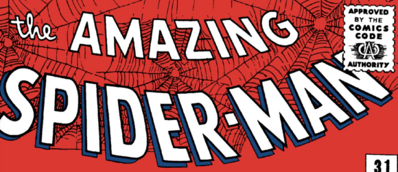
Anyway, in pulling together THE TOP 13 STEVE DITKO SPIDER-MAN COVERS — RANKED, I went with my gut and overall aesthetic appeal, as opposed to leaning on historic issues featuring characters’ first appearances and whatnot. I also intentionally left out Amazing Fantasy #15 and The Amazing Spider-Man #1 since they were pencilled by Jack Kirby.
Let’s swing!
—
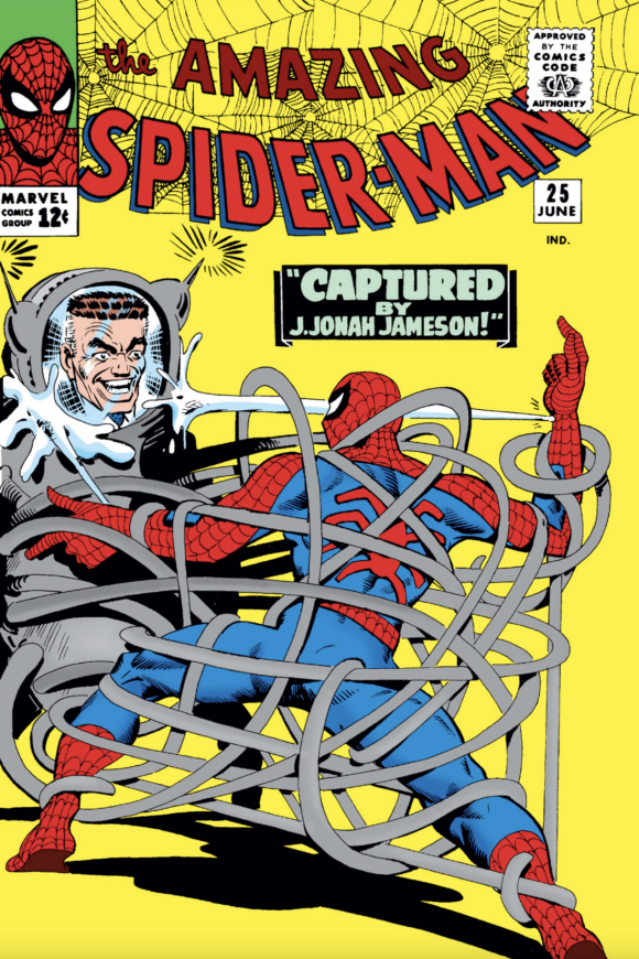
13. The Amazing Spider-Man #25. The whole Jameson/Spider-Slayer thing is kinda comical but I can’t stop looking at the mechanical tendrils that have Spidey tied up: Ditko takes care to give their movement a general logic and you can spend an hour trying to untangle how all the loops tie together. Oddly mesmerizing.
—
12. The Amazing Spider-Man #13. A lot of early Marvel covers were jammed with panels and insets; Stan Lee and co. really wanted you to know these issues were packed. In retrospect, though, the end result can sometimes detract from the main image. In this case, the Spider-Man vs. Mysterio tableau is too small for my liking but the villain presents such a striking image. And seeing the wall-crawler’s web dissipate so easily ties it up with eerie menace.

—
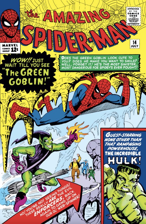
11. The Amazing Spider-Man #14. There’s a lot going on here and it’s a little disjointed but the Goblin is groovy and I dig how precariously Spider-Man is perched — just by his fingers and toes. The real artistry is in the details, though: how Ditko draws Spider-Man’s head so it is clear that he is looking down right at the advancing villain. That’s a damn fine illusion when you step back and consider that you cannot actually see Spider-Man’s face; it’s all about the line work and angles.
—
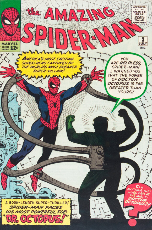
10. The Amazing Spider-Man #3. A crafty design choice: Doc Ock makes his first appearance in mysterious shadow while his arms show you what you really need to know — that this guy is exceptionally dangerous and just might be able to rip our hero apart, limb by limb.
—
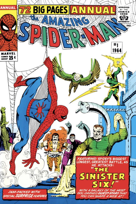
9. The Amazing Spider-Man Annual #1. I’m sure there are those among you who would rank this a lot higher. Fair enough. To me, the perspective feels just slightly off and the end result is that the Sinister Six isn’t quite as scary as they could be. Nevertheless, it’s a groovy cover and conveys just how quickly Spider-Man built up a Class A rogue’s gallery.
—
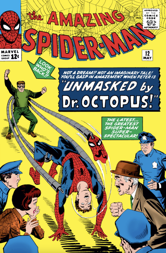
8. The Amazing Spider-Man #12. NOT A DREAM!! NOT AN IMAGINARY TALE! A classic, how-the-hell-will-the-hero-get-out-of-this-one cover. I love just how stunned JJJ and Betty Brant are to find out that Spider-Man is that Parker kid. Best part, though? Doctor Octopus’ prematurely triumphant “I’ve done it!” body language. Going in, you know Spider-Man will get out of it but the big question is how — and this image makes you want to find out immediately. That’s a cover’s job, innit?
—
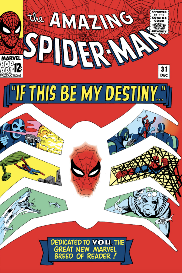
7. The Amazing Spider-Man #31. Using a spider shape to show off a bunch of vignettes is a cover-design staple now, but Ditko created the model here. It’s not quite as effective as later versions — there’s a bit too much white space and the scenes are a little small — but Ditko’s design moxie is evident. I don’t know who decided to set it off in red but it’s a fabulous, eye-popping choice. (Stan Goldberg did the colors, by the way.)
—
6. The Amazing Spider-Man #24. Ditko shows off his surrealism chops to spectacular effect. When you’re done looking at the ghostly images and topsy-turvy architecture, focus on Spider-Man’s body language. Rarely have you seen any hero in such distress — and you can’t even see his face. Brilliant.

—
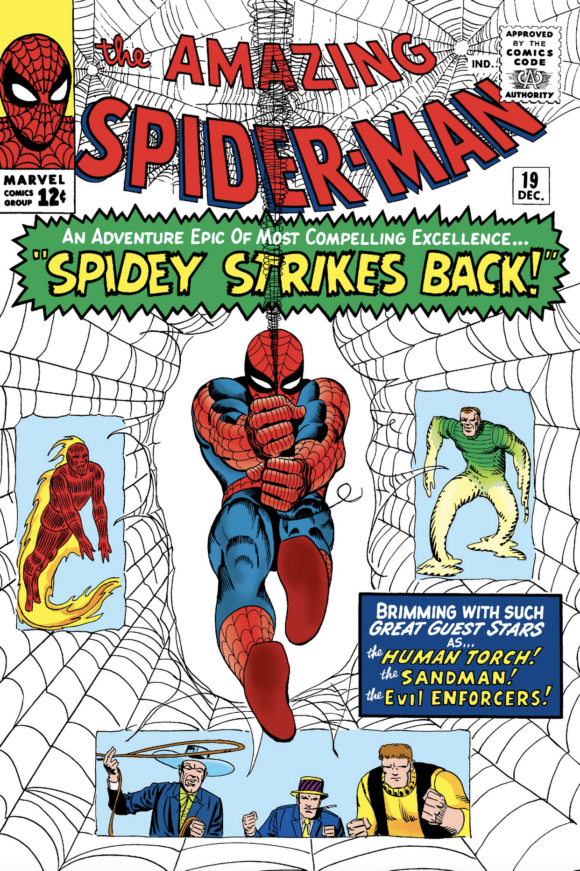
5. The Amazing Spider-Man #19. One of the most iconic Spider-Man images, made even more famous thanks to its repeated use in the 1967-70 cartoon series. Classic.
—
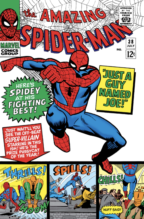
4. The Amazing Spider-Man #38. Ditko’s final issue also featured a bold image of Spider-Man comin’ atcha. Not as famous as the shot above but it’s even more powerful. Ditko went out on top.
—
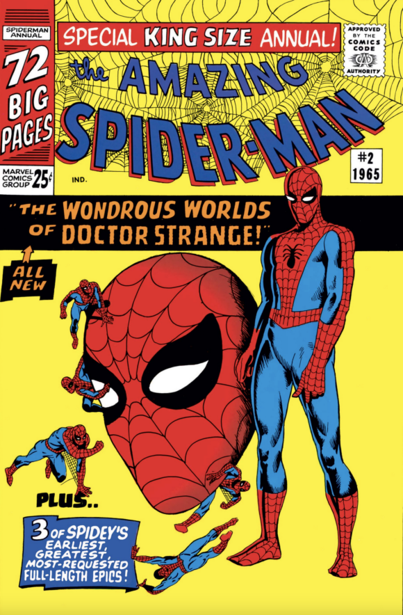
3. The Amazing Spider-Man Annual #2. A straight up array of fabulous Spider-Man imagery backed by a brilliant yellow background. This is all pop and all primary colors. (Again Goldberg, according to the Grand Comics Database.) No wonder Marvel used this for the cover of the massive Ditko Is… Amazing hardcover collection.
—
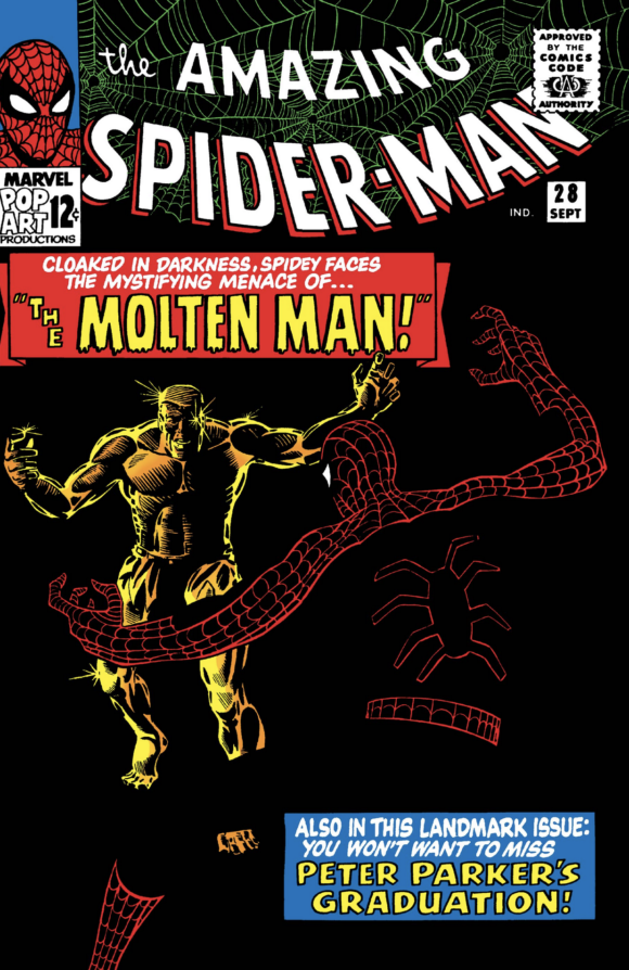
2. The Amazing Spider-Man #28. Genius use of negative space. One of the most inventive and striking Spider-Man covers ever. Argue against it. Go ahead. Just try.
—
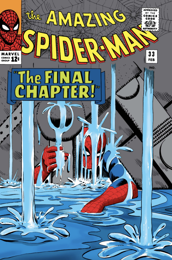
1. The Amazing Spider-Man #33. But you didn’t think any other cover would top this list, did you?
—
MORE
— 13 COVERS: A THOR 60th Anniversary Salute. Click here.
— Why ANT-MAN Is My Favorite Superhero – For Real, by SCOTT TIPTON. Click here.
June 5, 2022
My list would include issues 7, 17, 18 and 29 at the expense of 13, 31, 38 and Annual 2.
June 5, 2022
You don’t have to be a Ditko “expert” to appreciate his amazing work! And it’s hard to go wrong with 13, since minus the 3 Kirby covers (AF #15, #1 & #10) and including annuals, Ditko only ever drew 38 Spidey covers. And #38 almost doesn’t count, since Ditko was out the door at that point, resulting in this paste-up from interior art. Pretty good, considering! But I’d replace it with #23 (Gobby battle scene with cooler design/poses than #14) or #29 (2nd Scorpion appearance, with a dynamic half in/out water battle oft imitated by Gil Kane).
June 5, 2022
That second Scorpion appearance just missed the cut for me but I love it!
June 5, 2022
I definitely would have had #29 on my list too, and highly ranked to boot!
June 6, 2022
These are pretty epic covers in their own right, and they do the “Spider-Man” universe so much justice.
June 7, 2022
I love some of the choices, some of the others? Head scratchers. BUT there is no right or wrong answer here! This is classic stuff. Having said that, since I have such a different list I thought I’d take this idea and do a list of my own. https://babylon5alliance.boards.net/thread/80/amazing-spider-covers-steve-ditko