
Why 1977? Why not!
![]()
Some months ago, our pal Walt Grogan told me that he had a surprise for me and asked for my address. We’ve never met in person, but since I live in New York and he lives in Chicago, I figured it wasn’t likely that he was going to show up on my doorstep with a torch and pitchfork.
So, I sent him my address. And waited. Then I forgot he asked.
One day, there was a manila envelope in the mail and it took me a beat or two before it hit me that it was from Walt. I opened the packet and inside was thick pamphlet stuffed with entries on every logo that DC Comics published in 1977. Every one. New ones, old ones, it didn’t matter: If DC published it in 1977, it was in there. He noted each creator (when known), when the logo first appeared, what 1977 issues they appeared on, and so forth.
![]()
Great, great stuff.
“I’ve always been a big fan of logos, especially comic book logos,” Walt told me later. “It’s an intersection of art, commerce, and marketing like no other. And its impact is not elevated enough. Like most art, I think it engages the viewer to think about the choices made. But sometimes, it’s just a nostalgic rush.
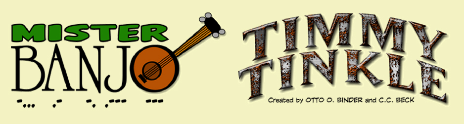
“I also like to create logos, although I’m just an uneducated hobbyist in that regard. Back when I was actively updating the Marvel Family Web, which is almost 30 years old, by the way, I would create logos for characters that never had one, like Mr. Banjo and Timmy Tinkle! And it was a surprising treat when my Mr. Banjo logo showed up on the Robot Chicken DC Comics Special!”
Walt sees art as a source of relaxation, whether’s he’s coloring or making a booklet like this.
“I like to look at art like this in printed form and I find that tactile flipping back and forth between pages mentally soothing,” he said. “It’s also a great way to compare and contrast what logos looked like back then and see how the artist was trying to convey the look of a book.”
Naturally, he’s a big fan of newly minted Eisner Hall of Famer Todd Klein, a letterer whose comprehensive study of DC Comics logos is one of the best resources on the web. Much of Klein’s focus is on the best: Ira Schnapp and Gaspar Saladino.

“Over the years, I would collect logos. Some I would scan from covers and drop the color. But it’s time consuming!” Walt said. “Two things really helped: One was the Heritage Auctions website and the other was master letterer Todd Klein! Heritage Auctions has a cornucopia of original art scans on their site, which makes it somewhat easy to find cover art and therefore, logos.
“Todd posts a Logo of the Day on his Facebook page and where possible identifies the letterer. It is a wonderful early morning treat to see a new logo and discuss it! And don’t miss out on Alex Jay’s blog.”
Why 1977?
“It was a bit arbitrary,” he said. “It was the year before the DC Implosion but it was also the year that DC switched from the Michael Uslan DC Bullet to the Milton Glaser design! It also has a lot of new logos like Black Lightning and Shade, two of my faves!”
(SIDE NOTE: This week’s RETRO HOT PICKS is from 1977. Check it out!)
Uslan’s symbol on the left, Glaser’s on the right.
Walt’s booklet is 80 pages, at 5.5″ x 8.5″. He’s undecided about whether he’ll do another but noted, “I like doing it as it’s a very calming way to end the day or wile away a weekend. I get real joy seeing the logos of the past and how they have influenced today’s designers.”
If you want to get your hands on this, send a note to Walt on Messenger or email him at marvelfamilyweb@gmail.com.
“I’ll see if there is any interest and if so, I’ll have to get my act together,” he laughed.
Now here’s Walt with his TOP 13, in no particular order.
—
By WALT GROGAN
Here are my 13 favorite logos of 1977. Sure, some debuted earlier but as 1977 goes, these are my faves! Thanks again to Todd Klein for the designer identification! (First-appearance publication dates in parentheses.)
—
Secret Society of Super-Villains #5 (March-April 1977), John Workman. This one is great because it looks like a formal invitation or a nicely done business card, which for someone like Funky Flashman, would be perfect! This logo went through several slight deviations and I like this one the best with the added hyphen to join the compound words.
![]()
—
5 Star Super-Hero Spectacular (DC Special Series #1, [Sept] 1977), designer unknown. This logo has an offbeat, oddball design and it only appeared once. It would have been interesting to see how it would have been handled had it appeared again!
![]()
—
Kobra #5 (Nov.-Dec. 1976), Gaspar Saladino, possibly from a design by Marty Pasko. Although it takes up a lot of cover space, I really dig this design, especially the cobra sitting on the globe; it really gives a good idea of what this book is about — a fear-inducing worldwide criminal organization!
![]()
—
Danger: Dinosaurs at Large! (DC Special #27, April-May 1977), Gaspar Saladino. This one is great! From the shock-burst of “Danger” to the cragginess of “Dinosaurs,” it’s a shame that this was only used once!
![]()
—
Earth Shattering Disasters! (DC Special #28, July 1977), Gaspar Saladino. Here’s another one that disappointingly only appeared once! The beveling on “Earth” is great and I love the dip, cragginess, and interior texture on “Shattering.” It really gives off an earthquake-like vibe!
![]()
—
Ragman #1 (Aug.-Sept. 1976), Gaspar Saladino, Jack Adler and Joe Kubert. Wow! Just Wow! This logo has so much going for it! And it’s so cool how it was put together! Todd Klein revealed that it started as a design by Joe Kubert. Then lots of different clothing material was brought to the DC office and after determining a good line-up, Jack Adler photographed it, and finally Gaspar did the lettering on an acetate overlay! Check out Todd’s article for a more detailed description of this amazing logo!
![]()
—
Black Lightning #1 (April 1977), Gaspar Saladino. Here’s another great one! It gives off a sports vibe but the part I find interesting is the overlay of the “L” in Lightning on the bevel of the “B” in Black! It’s very M.C. Escher-ish! I remember excitedly leaving high school on new comic book day to take the bus to Dietz and Goff Comic Book Emporium on the South Side of Chicago to pick up the first issue! I was not disappointed!
![]()
—
Hercules Unbound #1 (Oct.-Nov. 1975), Gaspar Saladino. This is one of my all time favorites and what a series! Gaspar really goes all out here! I love the dip and the arc, and the addition of the chain links really sells this one! There was a promised collected edition a few years back; I hope it comes to fruition!
![]()
—
Shade, the Changing Man #1 (June-July 1977), Gaspar Saladino with Bill Morse. There’s a lot of neat stuff going on in this one, which seems especially suited to it! There are letterform changes as well as beveling, shadowing and telescoping! It’s Shade, the Changing Logo!
![]()
—
Batman #241 (May 1972), Gaspar Saladino. I’ve always liked this one with the possible exception of splitting Batman into two words! It has one of the best Bat-Silhouettes and I love Batman’s face. A slight variation of this logo was created for the August 1977 issue (#290), which pushed the letterforms up while burying Batman’s face between the letters. I think this one works better!
![]()
—
Justice Society of America (All-Star Comics #66, May-June 1977), Joe Staton. I’ve been a big fan of the Justice Society ever since I was introduced to them in 1963’s Justice League of America #21! But I feel that it wasn’t until 1977 that they were given a logo that really suited them! Joe Staton’s design is all about strength and stability, plus it exudes a vintage feel that’s perfect for the JSA!
![]()
—
Challengers of the Unknown #81 (June-July 1977), designer unknown. While it takes up a LOT of room with its telescoping, I like that it keeps elements of its prior logos. I really dig the hourglass in the “O”!
![]()
—
The New Doom Patrol (Showcase #94, Aug.-Sept. 1977), John Workman. One of the things I look for in a new Doom Patrol logo is how the designer tackles the word, “Doom.” John Workman does a really good job with it here. The outline services it well by following the rough edges at the top before transitioning into straight lines down along the sides and bottom to highlight “Patrol.”
![]()
—
MORE
— RETRO HOT PICKS! On Sale This Week — in 1977! Click here.
— PAUL KUPPERBERG: My 13 Favorite Silver Age IRA SCHNAPP DC COMICS Logos. Click here.
August 13, 2025
Oh I love these! Thank you for the nostalgia trip! I think the “Ragman” logo may be one of the best ever!!
August 13, 2025
Jeff! Indeed! That Ragman logo is awesome!
August 13, 2025
I love this article. I can get lost Todd Klien’s page- the combination of history and graphic design makes for amazing reading. Thank you Walt Grogan for putting this together- and for vindication of the greatest Batman logo of all time- the one I grew up with 🙂
August 13, 2025
I will never not love that Batman logo…still my all time favorite.
As I mentioned before, my mom started getting comics for me in the Fall 0f 1976. The first four I got had the Michael Uslan DC Bullet…then the next batch had the Milton Glaser Bullet. The Milton Glaser is still my DC logo of choice. Nostalgia is a power force!
August 13, 2025
Readers don’t often ponder the subtle (or not-so-subtle) influence that a logo has on a book. In addition to enticing somebody’s eye, it’s also a reinforcement of the book’s subject and “theme,” if you will. Excellent work collecting and commenting on these!
August 13, 2025
Don’t know if it has anything to do with Neal Adams and Mike (Nasser) Netzer drawing the respective covers, but the 5-Star Superhero Spectacular and Challengers of the Unknown logos both feel like they’re crafted by Continuity Associates.
August 15, 2025
So many great logos, the most impressive masthead is definitely Ragman, but my favourite is the JSA one… the revived All-Star Comics had tried a few different treatments but this is where everything came together. Cheers Walt!