
BRONZE AGE BONANZA: Double APARO! Double KIRBY! Double KUBERT! Double KANE!
—
Welcome to BRONZE AGE BONANZA — our monthly series that looks at the greatest covers of the Bronze Age — exactly 50 years later. For more info on this feature, click here.
—
Four artists hit the jackpot twice, with five others making their mark.
Double APARO! Double KIRBY! Double KUBERT! Double KANE! WHAT DOES IT MEAN?!
Dig the TOP 13 COVERS OF NOVEMBER 1976 — RANKED:
—
13. Isis #3, DC. Made the list because of the idea more than the execution. That ethereal, Pharaoh-y monster thingy in negative against the cosmos is a great design concept, but the actual draftsmanship doesn’t fire. You can jump in with the knee-jerk criticism of Vince Colletta if you want to, but who knows?
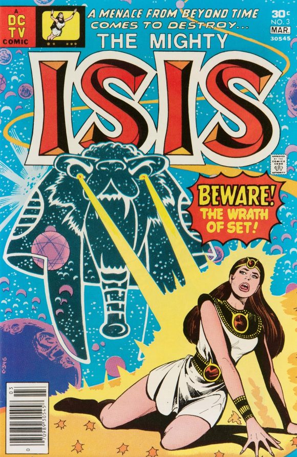
Mike Vosburg pencils, Vince Colletta inks
—
12. Batman #284, DC. Jim Aparo takes over cover duties from Ernie Chan, and boy what a difference. Not knocking Chan, but he was no Aparo. Great colors by Tatjana Wood. SIDE NOTE #1: Issues like this put Batman on his sliding scale of belief: He encounters the occult routinely elsewhere, but when it happens in his solo stories, he’s all, “This cannot be real! There’s no such thing as magic or demons!” SIDE NOTE #2: I’m not supposed to like Dr. Tzin-Tzin but I do.
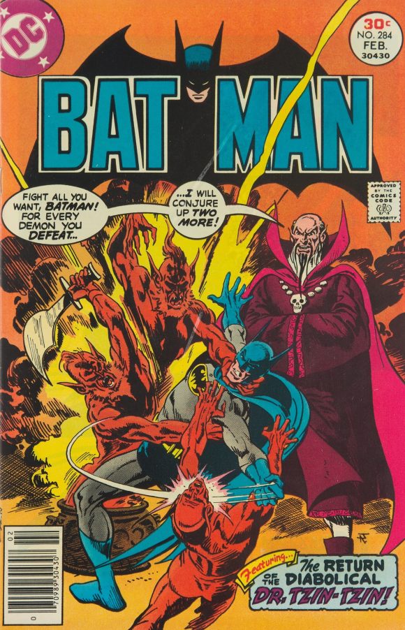
Jim Aparo
—
11. Super-Villain Team-Up #10, Marvel. This is why I love comics: Red Skull with one eye popping makes no sense at all but it works. It’s simultaneously hilarious, gross, and scary.
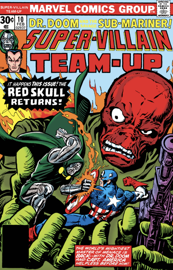
Gil Kane pencils, Ernie Chan inks, John Romita alterations
—
10. Tragg and the Sky Gods #8, Gold Key. What’s more terrifying that a Tyrannosaurus Rex? A zombie Tyrannosaurus Rex!
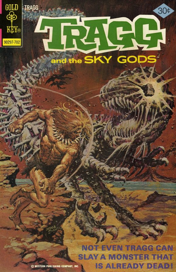
Jesse Santos
—
9. Ragman #4, DC. Not a new idea at all, but that’s fine: Joe Kubert sells it because he was one of the best ever. Great framing and execution. Just as important is the terrific integration of color by the unknown colorist. The red makes it pop but the overall effect is enhanced greatly where Ragman’s hole-filled, tattered cape is set against it, and the illustration segues into the black, giving you a subliminal message of bloodshed.
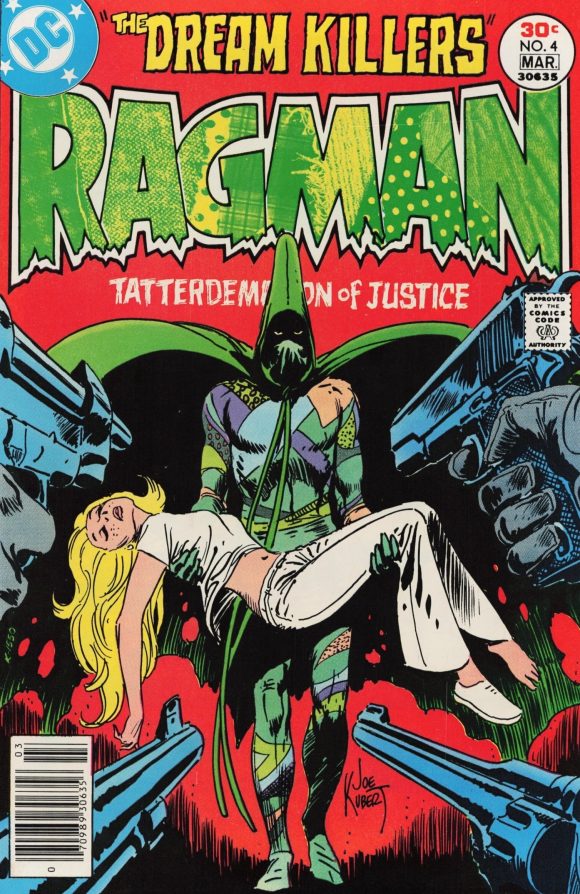
Joe Kubert
—
8. Star Trek #42, Gold Key. Kiddie Spock and Kirk are fun BUT GOOD LORD THAT GIANT BABY HEAD! We all know George Wilson’s art was unhinged, but that is the ugliest, most frightening newborn I think I’ve ever seen.
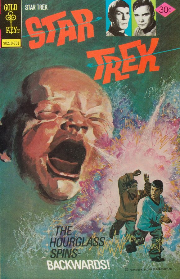
George Wilson
—
7. The Brave and the Bold #132, DC. A fairly routine cover except this is a prime, Grade-A example of Aparo showing the full force of a Batman punch. Tremendous body language. Richard Dragon looks kind of dorky until you realize he’s using the crane technique eight years before Mr. Miyagi taught it to Daniel Russo.
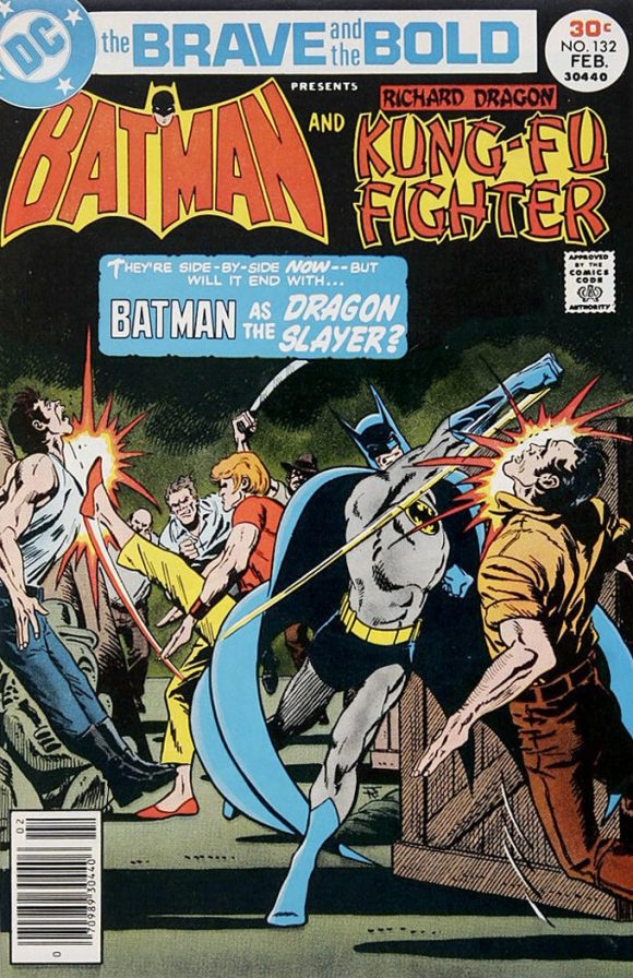
Aparo
—
6. 2001: A Space Odyssey #3, Marvel. Nothing remotely like this happens in the movie. This is just Kirby being Kirby, and we’re thankful for it.
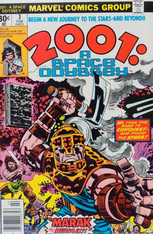
Jack Kirby pencils, John Verpoorten inks
—
5. Kamandi #49, DC. Speaking of Kirby, Kamandi was a BRONZE AGE BONANZA staple when the King was on the book. After that, the covers were really hit or miss. This one, by Ernie Chan, measures up really well. Again with the red or orange background this month.
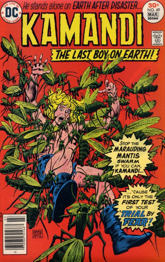
Chan
—
4. Captain America #206, Marvel. A master class in design. The Swine, front and center, under the arch, with his shoulder and right arm completing the circle. The bars giving way to the tortured, hanging bodies. The way the victim’s face on the bottom right plays off the Cap and Falcon GIANT FLOATING HEADS, again leading your eye to the Swine. Very impressive, your highness.
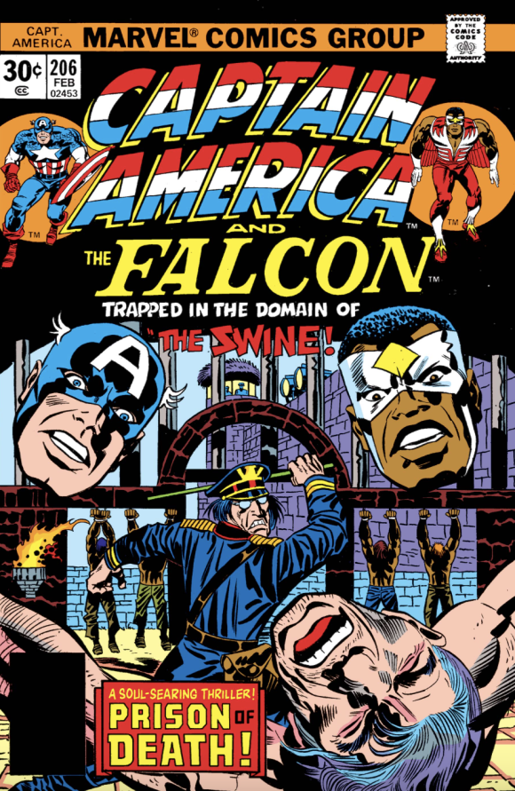
Kirby pencils, Frank Giacoia inks
—
3. Marvel Treasury Edition #13, Marvel. Just a fun wintry, holiday tableau perfect for this time of year. But what makes it is the flying, smiling Hulk pressed into Rudolph duty. The only thing missing is the red nose.
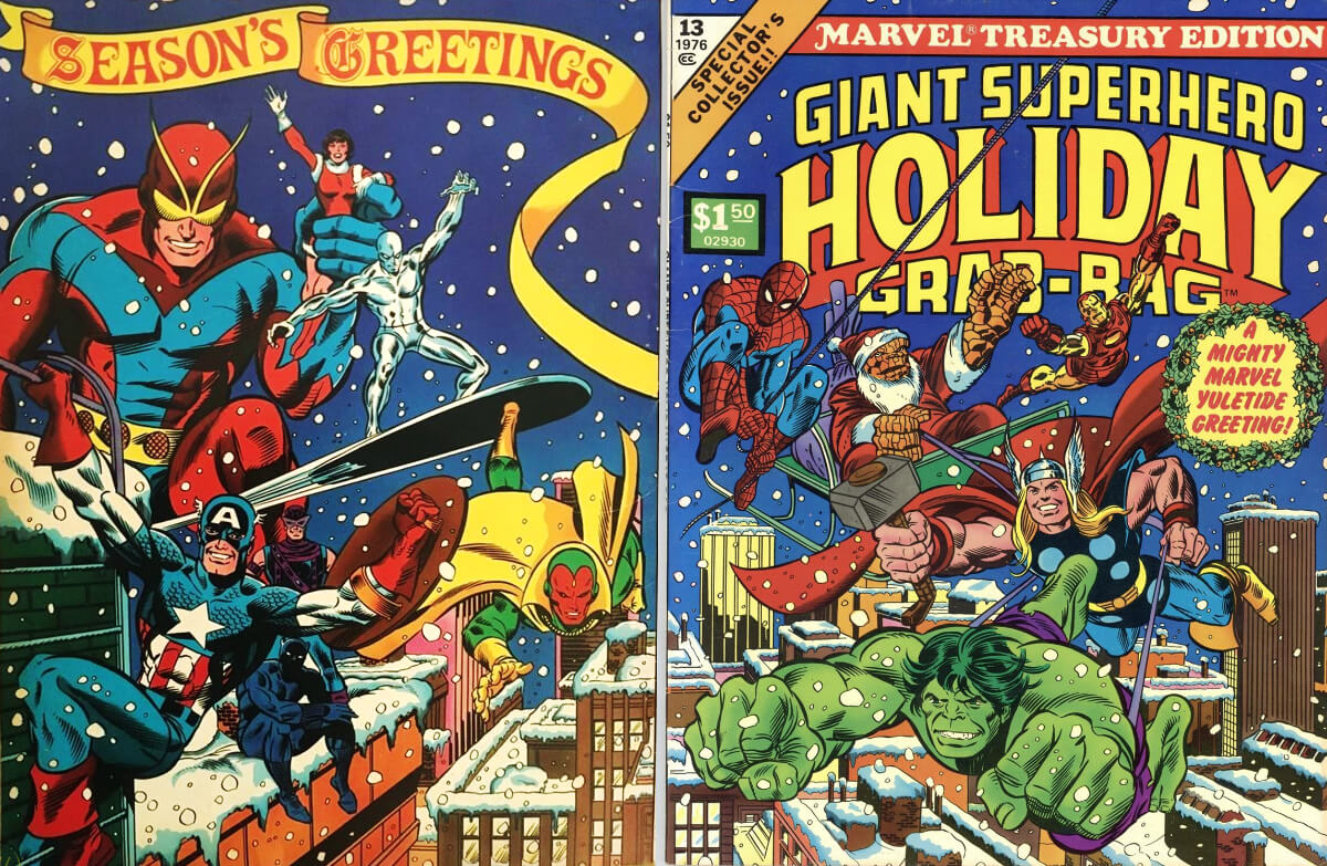
Kane and Sinnott, with Romita alterations
—
2. DC Special #26, DC. The only thing keeping this Joe Kubert masterpiece out of the top spot — and I mean the only thing — is that it borrows too heavily from 1965’s classic Showcase #57. It improves upon it, but still.
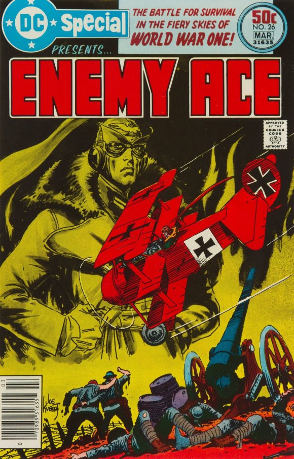
Kubert
—
1. What If? #1, Marvel. Such a clever way to introduce this series. John Buscema, Joe Sinnott and John Romita could have presented a simple action scene, or the heroes standing there looking bold and whatnot, but instead Marvel chose the meta route, by having the Fantastic Five burst out of the pages showing Spider-Man’s first encounter with Reed Richards and co. (It’s actually a retelling — written by Roy Thomas, and illustrated by penciller Jim Craig and inker Pablo Marcos — from inside the ish. You could argue they should have used Steve Ditko’s art from The Amazing Spider-Man #1, but it works either way.) A memorable approach that makes you want to pick the issue up and read what’s inside — which is the whole point.
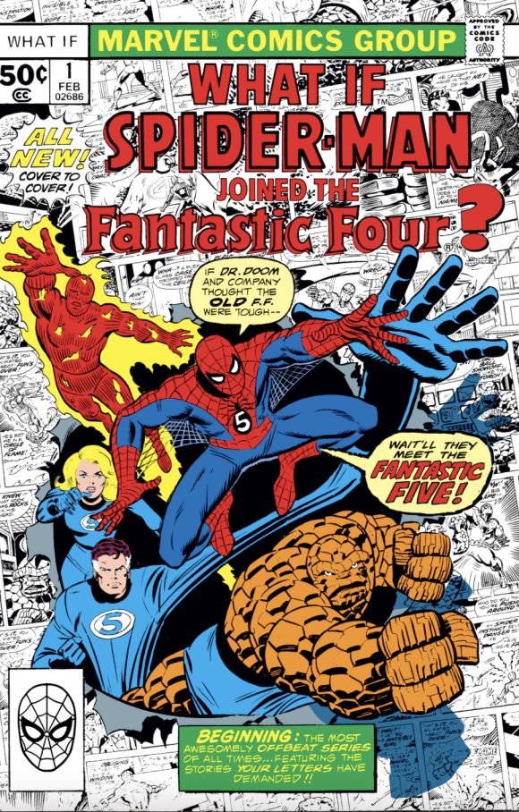
John Buscema pencils, Sinnott inks, Romita alterations
—
MORE
— The TOP 13 COVERS of OCTOBER 1976 — RANKED. Click here.
— BRONZE AGE BONANZA: The 1976 INDEX. Click here.
—
Comics sources: Mike’s Amazing World of Comics and the Grand Comics Database.

