
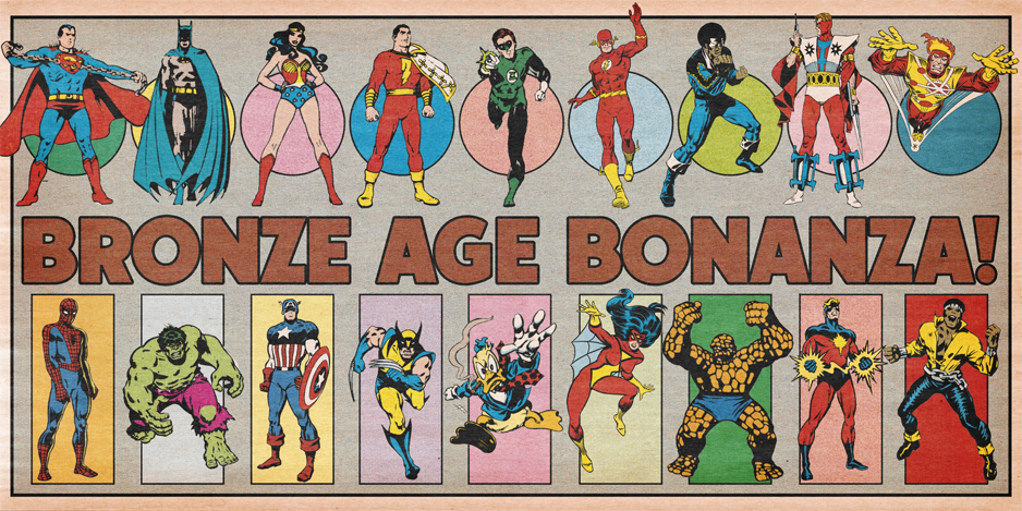
BRONZE AGE BONANZA: A Warren kind of month, plus Adams, Kirby, Perez and MORE!
—
Welcome to BRONZE AGE BONANZA — our monthly series that looks at the greatest covers of the Bronze Age — exactly 50 years later. For more info on this feature, click here.
—
You got sharks, the Bicentennial, and a lot of anniversaries!
Dig the TOP 13 COVERS OF MAY 1976 — RANKED:
—
13. Ka-Zar #17, Marvel. This month’s requisite Jawsmania cover.
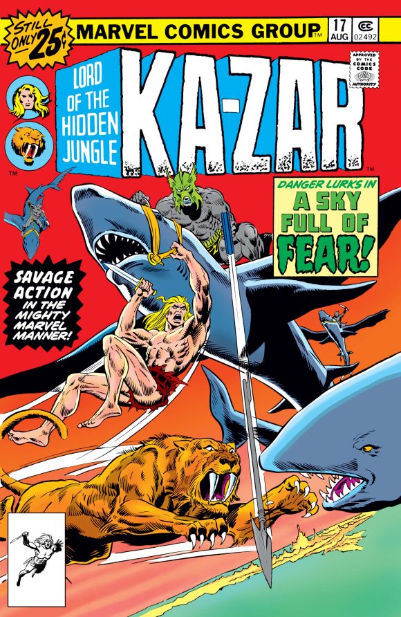
Rich Buckler pencils, Frank Giacoia inks
—
12. Archie’s Pals ‘n’ Gals #107, Archie. You remember it as well as I do. This is exactly how high-school girls dressed in 1976. Exactly. I just don’t know who’s carrying the weed apple — Betty or Veronica.
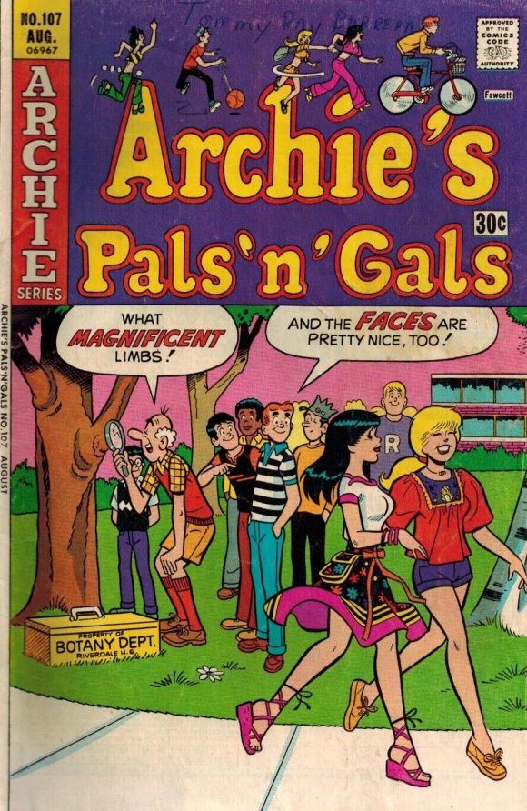
Dan DeCarlo pencils, Rudy Lapick inks
—
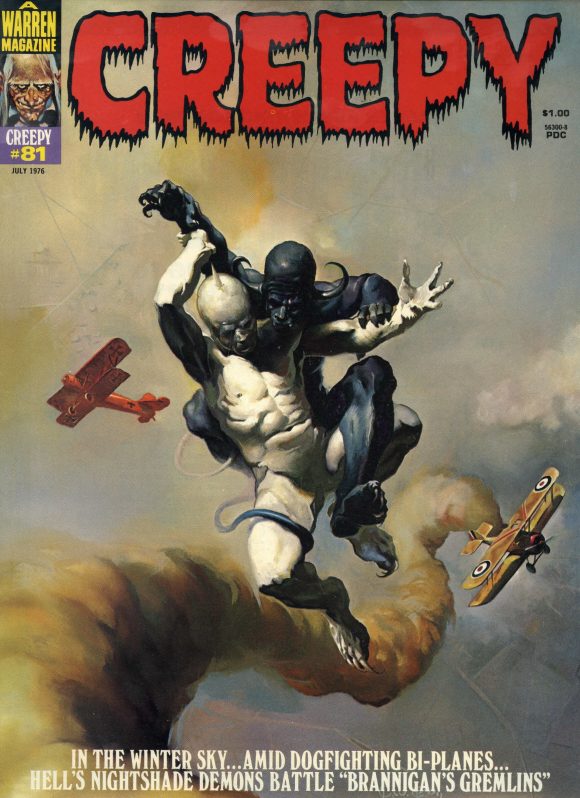
11. Creepy #81, Warren. The most demented Spy vs. Spy strip ever.
—
10. Iron Fist #6, Marvel. I dig all the crazy, intersecting lines and angles by Gil Kane and Frank Giacoia, and I love the Yu-Ti’s bemused hand gesture over his hood. But the real star is the unnamed colorist who brought just about the whole spectrum with them.
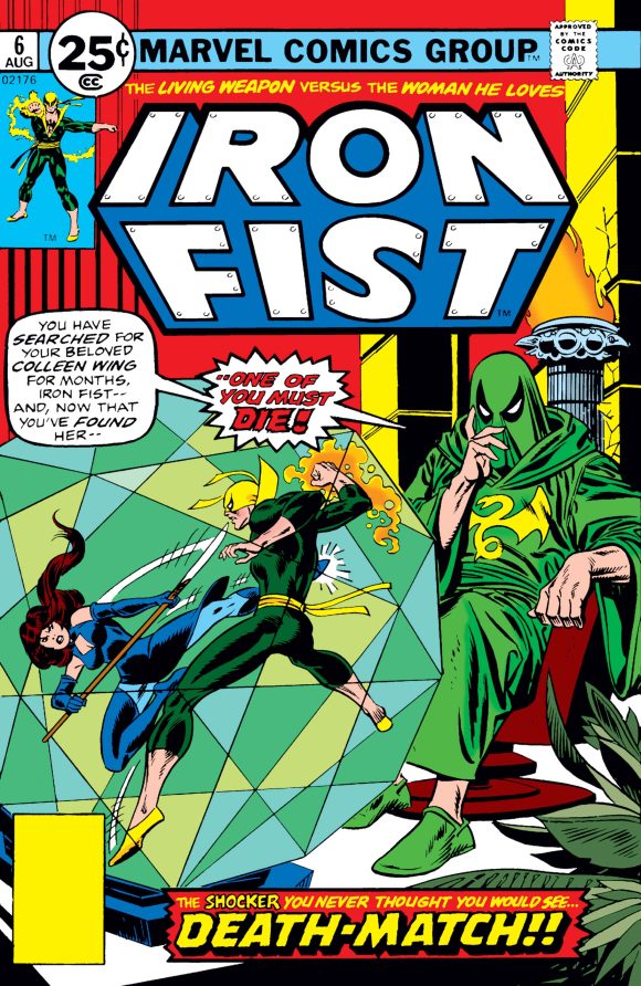
Gil Kane pencils, Giacoia inks
—
9. Emergency! #2, Charlton. Eye-catching painted cover by Joe Staton. Again with the color! The Randolph Mantooth corner logo should be on a T-shirt.
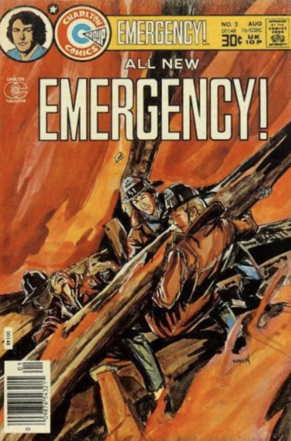
Joe Staton
—
8. House of Mystery #244, DC. Horror covers were a dime a dozen, so to find one that is actually bona fide terrifying is really special. I’m a big fan of Luis Dominguez anyway, but this really taps into that ’70s cult-panic zeitgeist. Superb colors by the late Tatjana Wood, whose starkly red demon plays off the ghostly acolytes so well. Dynamite.
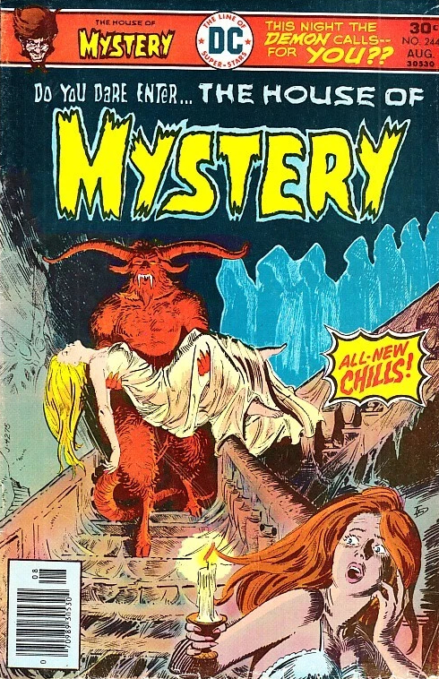
Luis Dominguez
—
7. Ragman #1, DC. Ragman was such an odd idea. Nice, unorthodox panel cover by Joe Kubert. I’m betting this was also Wood colors. Oh, and “tatterdemalion” literally means “ragged or disreputable in appearance.”
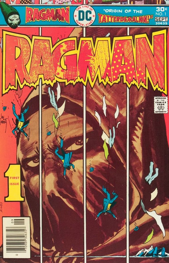
Joe Kubert
—
6. Green Lantern #90, DC. The triumphant return of Green Lantern/Green Arrow! Mike Grell is second only to Neal Adams as far as GL/GA goes, even if Hal Jordan’s pose is on the wooden side here. It’s a very popular cover but it’s that detail that takes points off for me.
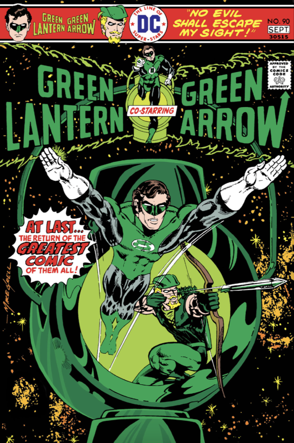
Mike Grell
—
5. The X-Men #100, Marvel. One of the seminal X-covers of the Bronze Age and, like GL/GA above, I’m sure a number of you would top the list with it. But heroes running at each other on a cover — while extremely well executed here — was a bit of a cliche at this point.
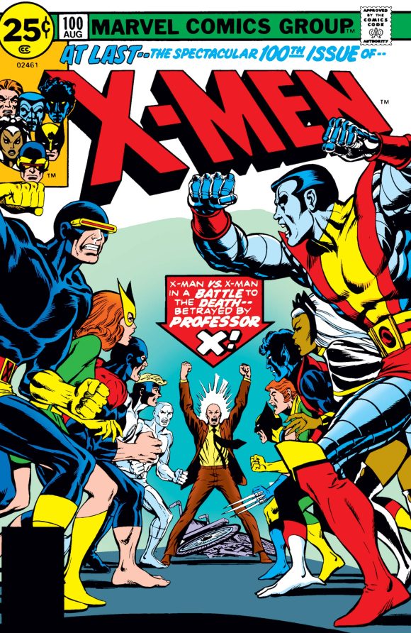
Dave Cockrum
—
4. The Avengers #150, Marvel. Another “anniversary” issue! Avengers covers that tease a new line-up are always a kick and this one’s elevated by the question-mark schtick and the black background. A cool approach to a superhero group shot.
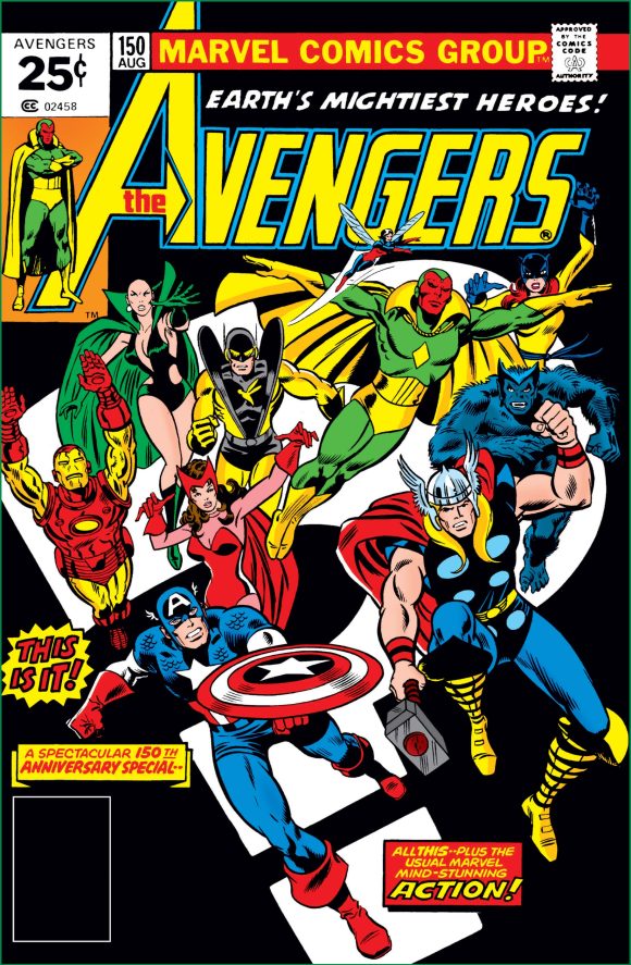
George Perez, Dan Adkins and John Romita evidently
—
3. Captain America #200, Marvel. Yet another “anniversary” issue. I don’t know if it was classic ’70s paranoia creeping into Jack Kirby’s work but he frequently drew Cap like he was in an unhinged panic. Still striking though. Kirby’s Cap has made BRONZE AGE BONANZA every month this year, so far.
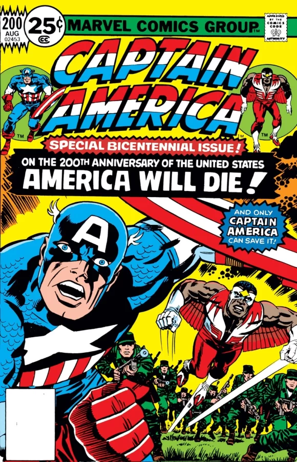
Jack Kirby pencils, Giacoia inks
—
2. Limited Collectors’ Edition #C-46, DC. A classic cover and one that I would ordinarily put at the top. Neal Adams and Dick Giordano give us the Platonic ideal of how the 1970s Justice League of America should look. Thing is, this image was repurposed from the back cover of DC’s 1976 calendar, so I can’t in good conscience lead the list with it. Aquaman replaced Captain Marvel for this cover, by the way. (A great candidate for a Facsimile Edition, if you ask me.)
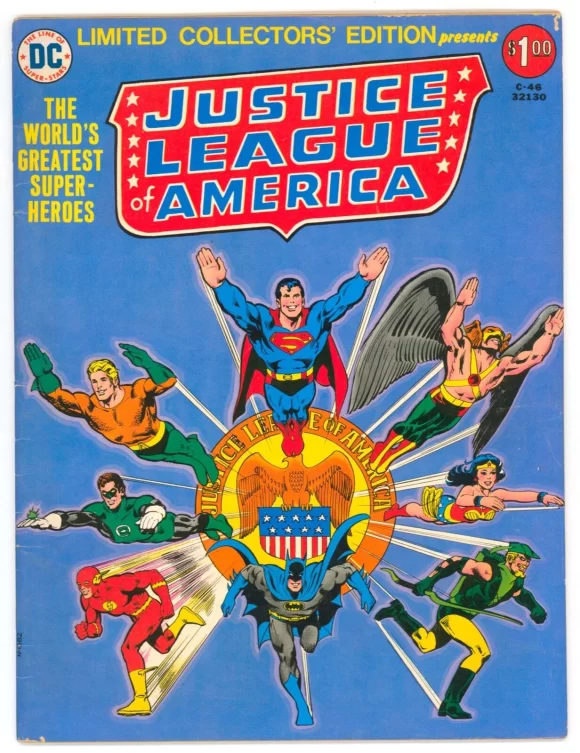
Neal Adams pencils, Dick Giordano inks.
—
1. Vampirella #52, Warren. Perhaps the most lascivious of all the Vampirella covers, but you still have to admire Enrich Torres’ in-your-face artistry. It does give rise to the argument over whether it’s fair to compare painted magazine covers with standard comics, but there’s no question this is the boldest image on this list — and a superbly rendered one at that.
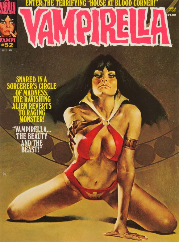
Enrich Torres
—
MORE
— The TOP 13 COVERS of APRIL 1976 — RANKED. Click here.
— BRONZE AGE BONANZA: The 1976 INDEX. Click here.
—
Comics sources: Mike’s Amazing World of Comics and the Grand Comics Database.
May 17, 2026
Great list, and I love the Marvel, Charlton and DC ones in particular, but #10 should be Iron Fist not Iron Man in the intro to the issue. Keep these coming. They are such a joy to behold.
May 17, 2026
That’s Iron FIST #6, not Iron Man
May 17, 2026
In my world, the magazine rack was no where near the spinner racks. So, I’m never much the fan of the mixed list. I’m less worried about the mixing of painted vs drawn. I can’t recall being called to pick up any painted cover in the day however. (Though I’ve learned to appreciate them as an older fan.) Cap #200 would have been my top picked if it was my list. Fun to discuss nevertheless.
May 17, 2026
It’s not so much painted as the extra space and lead time that gives me pause. But whether or not the racks were near each other (they were for me) it’s all comics, even if they were aimed at different age groups.
May 17, 2026
As one of my first comic books and having already been familiar w the SuperFriends, i was more fascinated by the backside of LCE C-46 and the mirror image Justice Society…
May 17, 2026
For a half-second, I considered entering the back cover instead. But that’s a bridge too far.
May 17, 2026
it was also puzzling to me b/c I didn’t really know who they were and they didn’t appear in that book…
May 17, 2026
Great batch of covers. The art from LCE C-46 was also lifted and redrawn for the opening of The Challenge of The Super Friends, replacing Green Arrow with Robin.
May 17, 2026
Dave Cockrum really had it in his head that Colossus was the mascot of the new X-Men. He gets centered in some way for all the issues up through #100. Probably because he’s the most traditionally heroic looking.
May 17, 2026
Yes, yes, yes. Iron Fist not Iron Man. Too many Irons in the fire!
May 17, 2026
The X-Men #100 was my first exposure to the team. It came in one of those plastic bags of comics you could buy in bookstores – the ones where the top of the cover had been cut off. I remember being very interested in the new team and I tried to glean whatever I could about each member based on this single issue. I remember really liking Wolverine’s appearance – especially his mask. But I didn’t care for him as a character and at that and wanted to see one of the other X-Men clean his clock (kind of like the time years later when Batman took out Guy Gardner with a single punch). Who knew Wolverine would soon be the most popular character of the franchise.
May 17, 2026
Hi Dan,
Yes. I have to agree on your take on the early Mike Grell for a certain kind of “woodenness” or static “frozenness” on portraying bodies in action.
In addition to the Green Lantern / Green Arrow here I esp. recall this from several Robin stories from back in the 100-Page Super Spectacular days and even including Batman Family # 1. And the early Warlord too, as dating from that same mid-70s period.
Wonderful poses in the abstract–but conveying more the idea of dynamism than a convincing look of dynamism. A too “tight” handling of the medium that needs a “looser” approach.
(I’m reminded art historically of the difference between Renaissance Mannerist paintings of the human figure compared to the later Baroque era, where the former’s tight draftsmanly way of painting could render bodies frozen but where the latter’s looser painterliness, as say in that master of the art, Peter Paul Rubens, made bodies exuberantly energetic).
But Grell did get better.
May 18, 2026
Love the Spy vs. Spy reference. Kubert, with his rough style, was a perfect choice for Ragman. Anyone surprised by the chutzpah of calling Green Lantern/Green Arrow “the greatest comic of all”? Not that I didn’t enjoy it, but It’s hard to believe the DC powers that be wouldn’t think of others, including Batman or flagship Superman, as earning that honor.
May 18, 2026
They were playing off the hoopla of the O’Neil/Adams run, which got a world of attention and acclaim. That was considered comics’ high point at the time.
May 18, 2026
Ragman #1 and X-Men #100 get my votes. And nothing against the lovely work of Enrich Torres (Vampirella) or Ken Kelly (Creepy), but that’s apples & oranges, so I stuck with pencil & ink. The Limited Collectors’ Edition #C-46 is also lovely, considering that we got both the JLA and the JSA, but X-Men and Ragman really stoke the core of my memory.
May 20, 2026
Some good choices, but come on! You left out Defenders #38 (Buckler) and Detective Comics #462 (Chan)! And to a lesser degree Hercules Unbound #6 (Gracia-Lopez) and Warlock #14 (Starlin) 🙂