
BRONZE AGE BONANZA: It’s a Romita kind of month, with appearances by Kane, Kirby, Cardy and MORE…

—
Welcome to BRONZE AGE BONANZA — our monthly series that looks at the greatest covers of the Bronze Age — exactly 50 years later. For more info on this feature, click here.
—
Jazzy John Romita had a hand in five of these beauts because, oh, I don’t know, he’s one of the greatest comics artists whoever walked the Earth. But he’s not alone! We got some Kirby, Cardy, Kaluta and more for ya!
Dig THE TOP 13 COVERS OF MAY 1973 — RANKED:
—
13. Eerie #49, Warren. Derivative? Yes and no. Enrich Torres’ cover — which really pops with that yellow background — plays off a feature inside by Al Milgrom and Esteban Maroto that’s a parody of Swamp Thing.
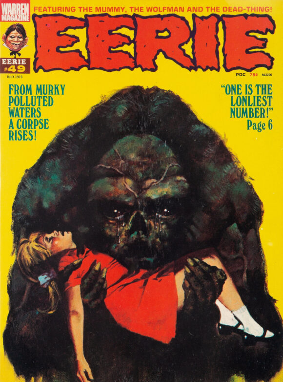
Enrich Torres
—
12. The Amazing Spider-Man #123, Marvel. The previous two issues — featuring the death of Gwen Stacy — topped March and April’s BRONZE AGE BONANZA lists. This one doesn’t have the historic impact of those but is a dandy cover just the same. Romita’s cityscape battles always have a great vibe, often jammed with New Yorkers actually surprised for once.
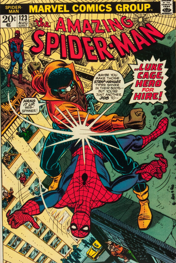
John Romita
—
11. House of Mystery #216, DC. Speaking of surprisingly surprised New Yorkers…
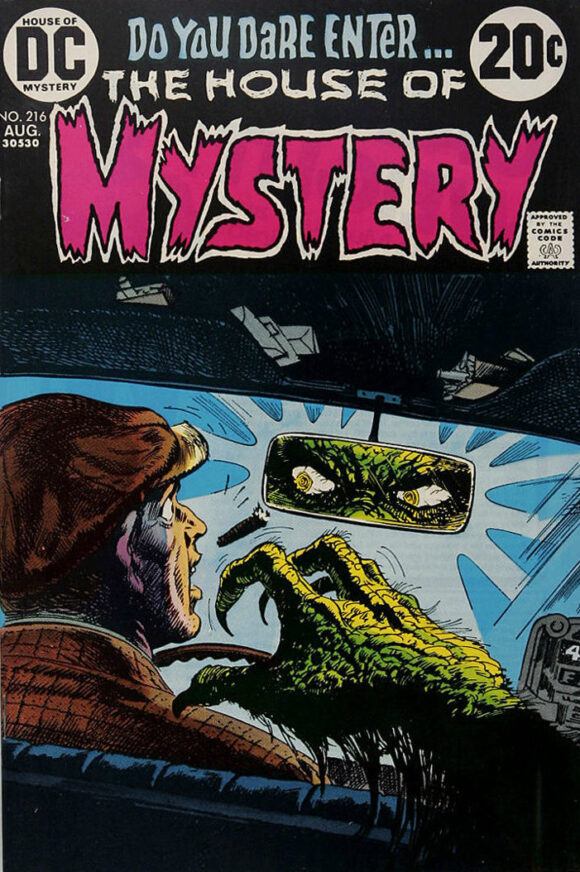
Luis Dominguez
—
10. The Phantom Stranger #26, DC. Two-thirds of a great cover. I really dig the scene by Mike Kaluta here, with it’s terrifying, sheer drop. But the blank pink space doesn’t really work for me. It feels like the deadline hit with the cover unfinished, so DC used some trickery to get it out the door. I don’t know if that’s what happened but that’s how it looks.
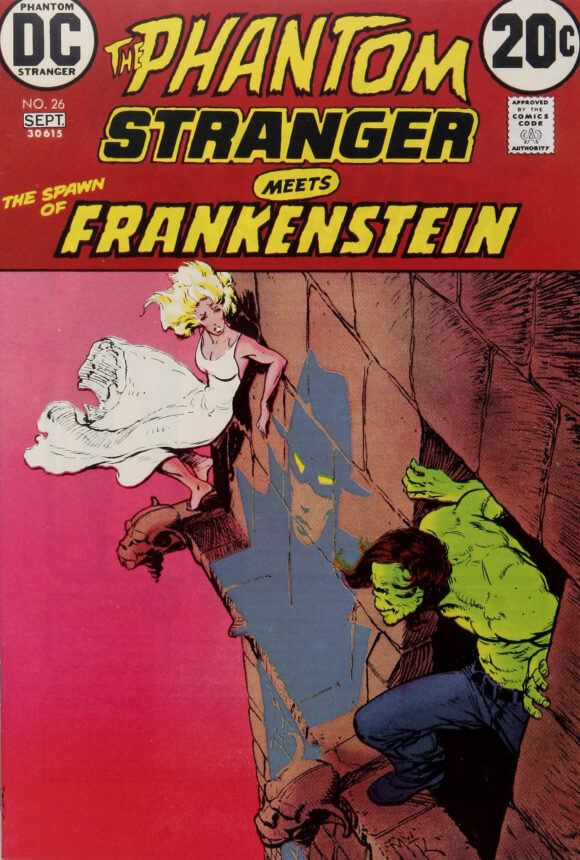
Michael Wm. Kaluta
—
9. Supernatural Thrillers #5, Marvel. I love mummies and I love this cover. Like the Eerie cover above, the yellow background puts the horror into sharper relief. Neat.
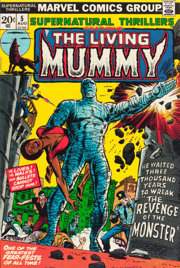
Credits vary: Either Rich Buckler pencils, Frank Giacoia inks with alterations by Romita, or George Tuska pencils and Romita inks. I think it’s the former but you may have other intel.
—
8. Captain America #164, Marvel. Again with the yellow and the horror. Works, though. And how badass is Nightshade’s look?
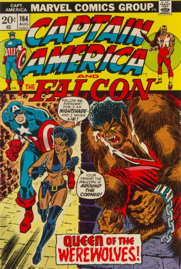
Romita
—
7. 100-Page Super Spectacular #DC-19, DC. I know others will disagree, but I still say that Joe Kubert drew the best Tarzan. He also was a master at the anthology cover: great main image, great vignettes, great color selection. (Jack Adler?)
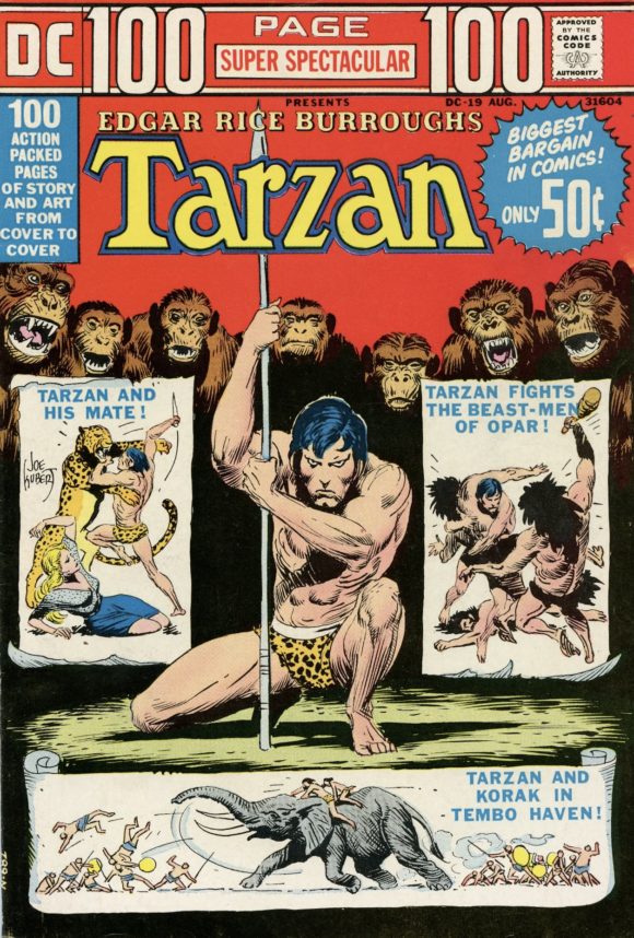
Joe Kubert
—
6. The Brave and the Bold #108, DC. There’s a lot to take in here and I don’t think it completely holds together. Nevertheless, this is one of the most memorable of Jim Aparo’s B&B covers, a frightening tableau featuring a presumed Satan, Batman running with a glowing cross and Sgt. Rock blasting away amid moldy Nazi weaponry. Certainly wants to make you find out what the hell is going on.
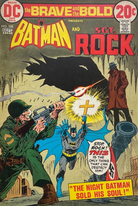
Jim Aparo
—
5. Marvel Team-Up #12, Marvel. At first glance, this is a fairly run-of-the-mill battle scene. Except that it’s not; it’s a lesson in dynamism and perspective by penciller Gil Kane. 1) Notice that Jack Russell is caught midleap, with nowhere to go but down. 2) Notice Spider-Man’s precarious footing, body language and sense of movement. 3) Notice the bridge and the way the suspension cables zoom up to your eye. 4) Notice all the building and car details. 5) Notice what a terrific cover this is.
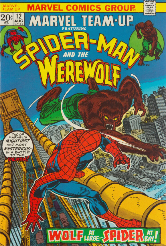
Gil Kane pencils, Romita inks
—
4. Limited Collectors’ Edition #C-21, DC. Notice how this is pretty much the opposite of Marvel Team-Up #12. It’s a relatively sparse, static shot by C.C. Beck but it’s also one of the most iconic Captain Marvel images ever. Fitting, since this was DC’s first superhero treasury edition. A classic.
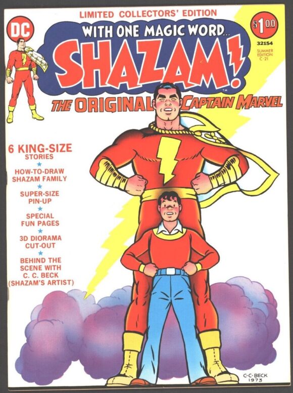
C.C. Beck
—
3. Kamandi #8, DC. You know what was a Great Disaster? Richard Nixon’s presidency. How he managed to get a big, Rushmore-esque carved bust is a matter for future historians to figure out. (I know, I know. This issue came out more than a year before he resigned. It’s a joke, folks.)
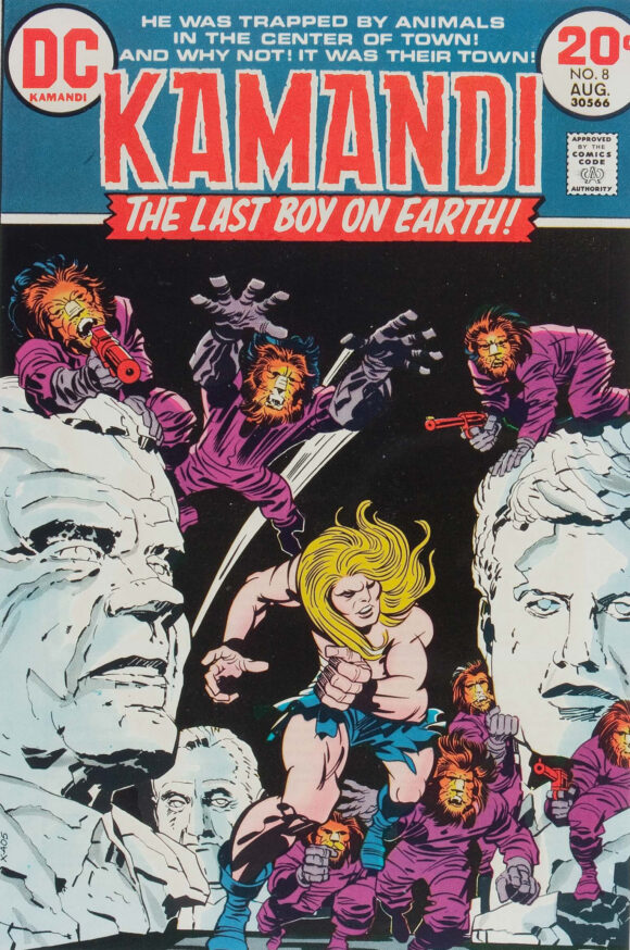
Jack Kirby pencils, Mike Royer inks
—
2. Marvel Tales #44, Marvel. It’s not just that this Romita cover is a vast improvement over the one he did for The Amazing Spider-Man #61 (the issue this story originally appeared in), it’s that the fab Spidey swing was repurposed into one of the webslinger’s most recognizable merch images of the time. From Colorforms to Slurpee cups, it made the rounds.
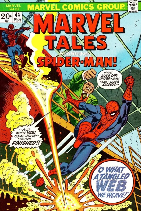
Romita
—
1. Action Comics #426, DC. The great Nick Cardy wasn’t the best Superman artist ever but this cover is a spectacular rendition of one of the Man of Steel’s most enduring tropes. Terrific execution that requires no further explanation.
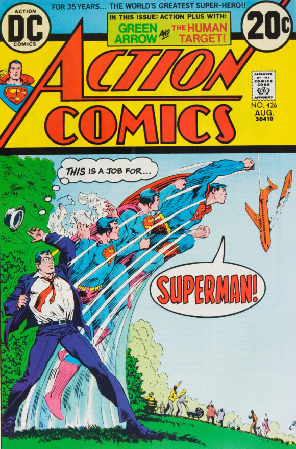
Nick Cardy
—
MORE
— The TOP 13 COVERS of APRIL 1973 — RANKED. Click here.
— BRONZE AGE BONANZA: The 1973 INDEX. Click here.
May 21, 2023
Two things:
1) The Kamandi cover was showing recent (to the reader) presidents, so that’s why Nixon was so prominent on the cover.
2) Back in the ’70s I used to think that printers would have special discount deals if you used a lot of a particular color that month, because in any particular month you’d see lots of covers on the newsstands using the same predominant background color, be it red, or (in this month’s case) yellow. Who knows if that were true, but it would explain some things.
May 21, 2023
The pink background works for me. Gives it a dream state feel. As for Cardy, some of my favorite SUPERMAN covers of the early ‘70s were his. I could say that about many of his covers.
May 21, 2023
I’m a huge Cardy fan. Huge. And he did some great Superman covers. (Last month included!) I just never think of him as a classic Superman artist, like Swan, Boring, or even Byrne. KnowhatImean?
May 21, 2023
Really cool list, Dan, and not just because you have an iconic Nick Cardy Action cover in the #1 spot! Your countdown includes not only super-hero biggies (like Superman, Batman & Spider-Man), but also covers with mystery/horror/supernatural elements. A few combine the two, B&B 108 (Bats vs. Devil), Marvel T-U #12 (Spidey & Werewolf), and Capt. America #164.
May 21, 2023
Thanks! I always try to mix things up.
May 21, 2023
I always look at these posts. Never knew that Spidey image came from that marvel tales issue. That image was everywhere! Also the Mummy cover and Nightshade. Thanks
May 21, 2023
Great covers. I agree , Kubert is my favorite Tarzan artist. Love the Nick Cardy cover, wish IDW would do a Artist Edition of Nick Cardy covers.
May 22, 2023
You can’t beat the Hand drawn typography, especially for the Titles.
The webbing around the Amazing Spiderman title makes me giggle with happiness every time I see it.