
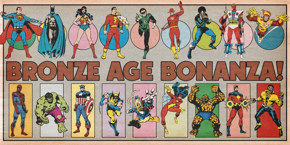
BRONZE AGE BONANZA: Kirby! Colan! An Oksner classic! MORE!
—
Welcome to BRONZE AGE BONANZA — our monthly series that looks at the greatest covers of the Bronze Age — exactly 50 years later. For more info on this feature, click here.
—
A three-way battle for the top!
Dig the TOP 13 COVERS OF MARCH 1976 — RANKED:
—
13. Richie Rich, Casper and Wendy: National League #1, Harvey. This just presses all the right buttons for me. I was as much a baseball fan as a comics fan as a kid and 1976 was a particularly memorable season, in part because it was the National League’s centennial. (Those pillbox hats!)
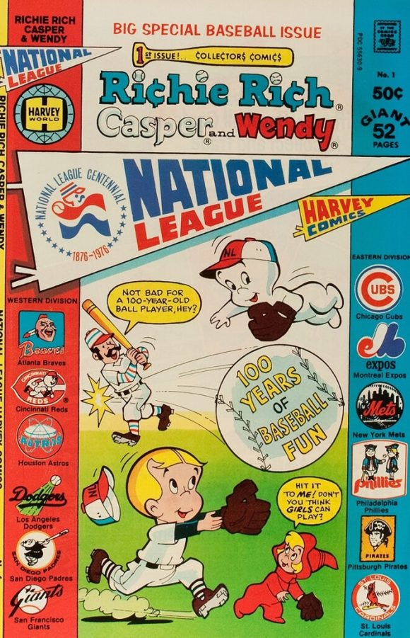
Unknown artist. Probably Warren Kremer.
This issue had multiple team-specific variants, but the real selling point is the floating-head-style NL logos down the sides, delineating the East and West divisions. Very much reminds me of the Mets program I got that year at Shea Stadium.
—
12. Weird Wonder Tales #16, Marvel. This month’s Jawsmania cover. They’re not even trying to be cute about it, either.
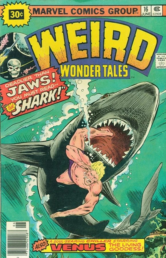
Rich Buckler pencils, Dan Adkins inks
—
11. I Love You #118, Charlton. Far be it from me to kink shame anyone, but Joe Namath could usually do a lot better than a blow-up sex doll.
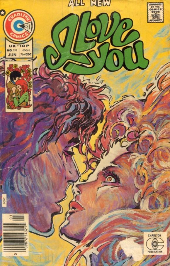
Tom Sutton
—
10. Captain America #198, Marvel. This can’t be the first time the target’s-face-is-in-the-scope thing was done, can it? No matter, its a really effective use of the device. That perspective on the gun barrel! The assassin’s hands and face! If only the Falcon didn’t look quite so awkward. But, hey, even the King wasn’t perfect.
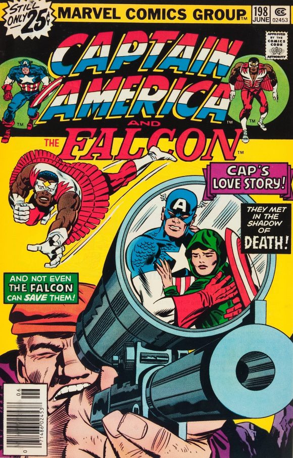
Jack Kirby pencils, Frank Giacoia inks.
—
9. Limited Collectors’ Edition #C-45, DC. A fun cover by Dick Giordano, though not as effective as its predecessor. But, like Limited Collectors’ Edition #C-39, it would make for a great Facsimile Edition.
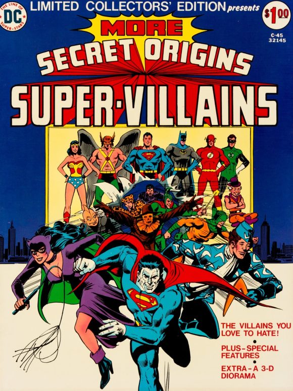
Dick Giordano
—
8. The Twilight Zone #80, Gold Key. That is a classic, George Wilson-style cover, only there’s no info out there I can find to identify it as such. The face isn’t quite as polished as Wilson would make it, so perhaps it was just someone aping his style. Either way, I dig it a lot, especially the way the dude is struggling to hold back the big hand from stabbing him in the throat. Also, any time you have surrealistic clock imagery in this context, it says “Twilight Zone.”
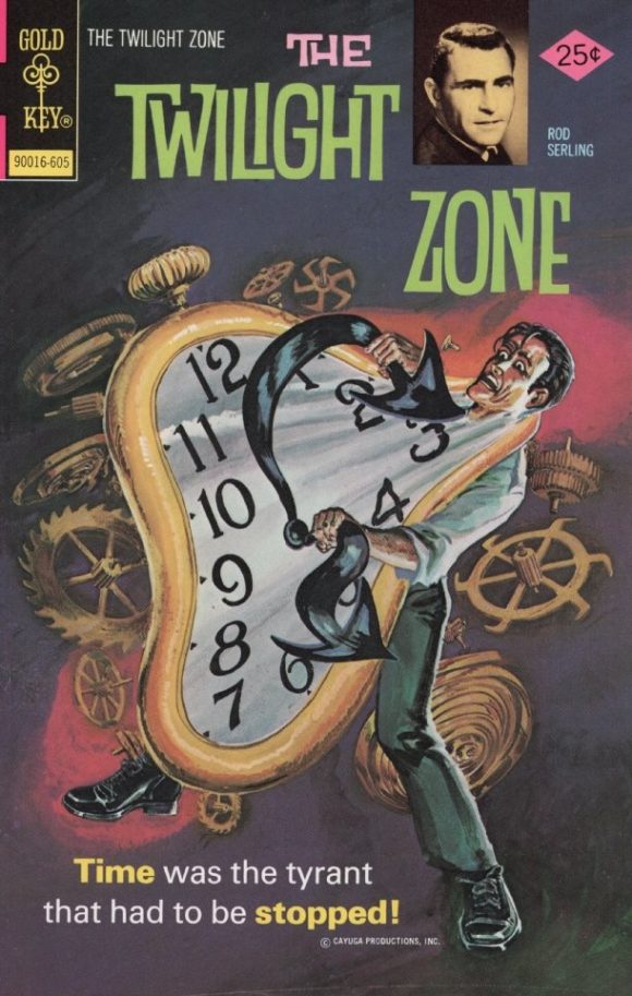
Unknown artist
—
7. Famous Monsters of Filmland #125, Warren. One of THE images of 1976, but the refined version was superior, so I’m putting this smack in the middle. (I had Dynamite magazine’s poster on my wall that year.)
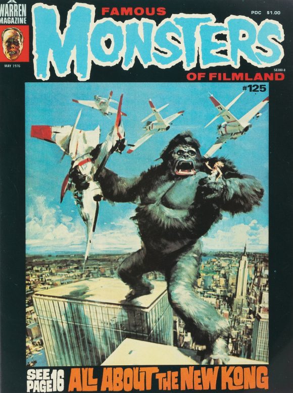
John Berkey
—
6. Marvel Premiere #30, Marvel. Brilliantly constructed, with the binocular-like portals framing the Invaders on screen and the recently minted Liberty Legion coming through the tunnel, while the Red Skull stands in a classic villain pose. The bright Liberty Legion logo stands out and adds an extra layer of pizzazz. There’s a lot going on here, but it really works.
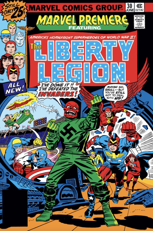
Jack Kirby pencils, Frank Giacoia inks
(Another baseball note: For those unfamiliar, that’s Yankee Stadium the Invaders are fighting in. It’s identifiable by the unique facade at the top of the grandstand.)
—
5. The Six Million Dollar Man, Charlton. This is the magazine, not to be confused with the Charlton comic that came out the same month. I look at this and wonder why Neal Adams didn’t do more movie posters.
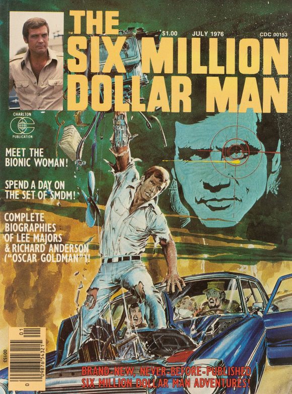
Neal Adams
—
4. Limited Collectors’ Edition #C-44, DC. Interesting one, this. Painter Wally Fax — who only did a couple of comics covers — takes Carmine Infantino and Murphy Anderson’s classic Batman image from 1966 and puts it in a 1970s Gotham City hellscape, complete with a spectacular Batsignal being shone from… a window? It works to the degree that’s obvious — DC would even recycle it for The Best of DC Digest #2 three years later — but it’s that very use of the Silver Age Batman that throws it off. It’s an image of the Caped Crusader that I absolutely love but it’s incongruous. In the end, I just can’t put it any higher.
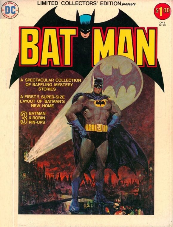
Wally Fax
—
3. Marvel Spotlight #28, Marvel. Terrific cover for Moon Knight’s first solo appearance. As I have said many times, I am a sucker for negative imagery (here, inverted from the inside of the issue), and its use in this case is a perfect choice because of how strongly it plays off Moon Knight’s white costume. More than that, the primary colors accented by black make the whole thing pop. Striking.
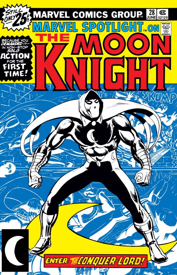
Don Perlin pencils, Klaus Janson inks. (Perlin background.)
—
2. Superman #300, DC. One of the most iconic Superman covers of the Bronze Age, by Bob Oksner. It’s not Superman #233, but then, what is?
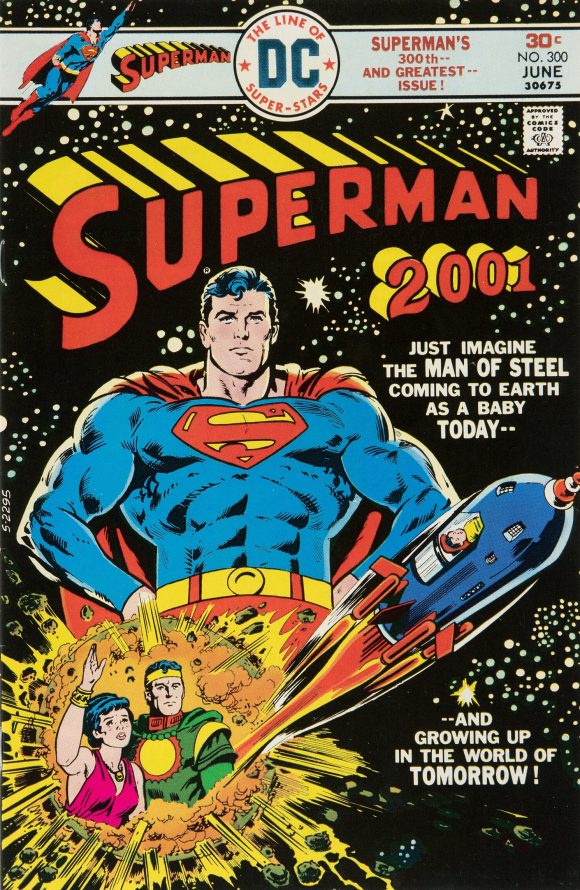
Bob Oksner
—
1. Tomb of Dracula #45, Marvel. You could make reasonable cases for putting Superman #300 or Marvel Spotlight #28 in the top slot, but in the end, I’m going with the dramatic artistry of Gene Colan and Tom Palmer. Colan steals a page from Neal Adams’ book with the spectral, monochromatic Dracula looming behind the more traditionally printed Blade vs. Hannibal King battle, but he pulls off the visual trick almost as well. The eyes have it.
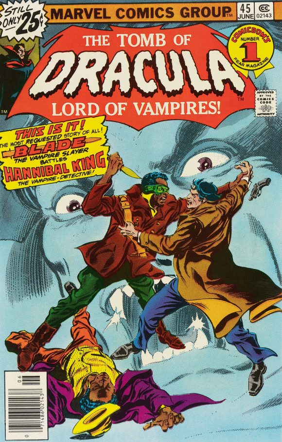
Gene Colan pencils, Tom Palmer inks
—
MORE
— The TOP 13 COVERS of FEBRUARY 1976 — RANKED. Click here.
— BRONZE AGE BONANZA: The 1976 INDEX. Click here.
—
Comics sources: Mike’s Amazing World of Comics and the Grand Comics Database.
March 22, 2026
Anyone else feeling pretty darn old looking at Superman 300/Superman 2001 right about now?
March 22, 2026
“feeling” doesn’t cover half of it.
March 22, 2026
Marvel Spotlight #28 and the BATMAN C-44 would have to be my top picks for that month. C-45 would round out the top 3. I was a huge Invaders fan. I couldn’t get enough of those characters.
March 22, 2026
I have kids party plates from the 70s with the Superman #300 image, and a modern T-shirt. It was also swiped for the 12″ Mego Superman movie figure packaging. So it’s my number one pick out of this bunch. Remove the blurbs and you have The Legend of Superman! But the Dracula cover is great too. The Silver Age Batman on a Bronze Age cover never bothered me, because 70s merch mixed both ages together so often.