
BRONZE AGE BONANZA: This one was a race for second, folks…

—
Welcome to BRONZE AGE BONANZA — our monthly series that looks at the greatest covers of the Bronze Age — exactly 50 years later. For more info on this feature, click here.
—
This is one of the few times when I knew going in which cover would top the list — and when you get there, you’ll understand. So this month’s BRONZE AGE BONANZA is basically a race for second — but a helluva race it is, with art by Bernie Wrightson, Nick Cardy, Jim Starlin and MORE.
Dig the TOP 13 COVERS OF MARCH 1973 — RANKED:
—
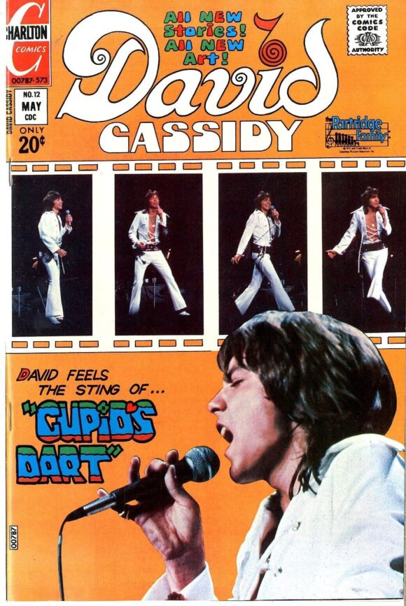
13. David Cassidy #12, Charlton. I think I love this cover. Solid framing, good use of color. But I will say this: Mr. Bell Bottom Jumpsuit, you’re no Elvis Presley.
—
12. Love Stories #150, DC. My lord were times different. Jay Scott Pike drew cheesecake about as well as anyone but what’s with the creepy dude who thinks kidnapping a woman on the beach is OK? This isn’t a “Love Story,” it’s a “Violent Felony Story.”
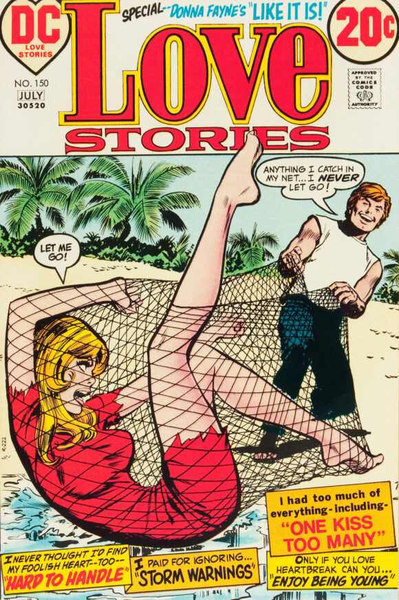
Jay Scott Pike
—
11. Famous Monsters of Filmland #98, Warren. Eek! A Saucer-Man!
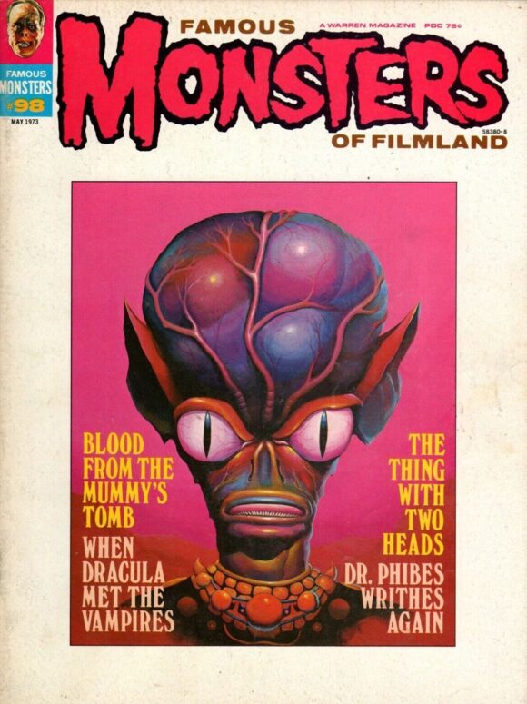
Randy Counts
—
10. Midnight Tales #3, Charlton. Wayne Howard had the chops. His comics career was fairly brief but his Wally Wood-influenced art was standout. Also, note the “Created by” credit on the cover: It may or may not have been the first such instance for a creator; either way, it was certainly an early example.
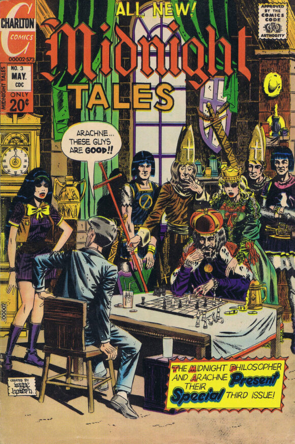
Wayne Howard
—
9. Superman #264, DC. This cover pops up a lot because of its inherent wackiness, so I felt compelled to include it. I will say, however, that the Phantom Quarterback’s uniform design is the worst in either NFL or NCAA history — real or pretend.
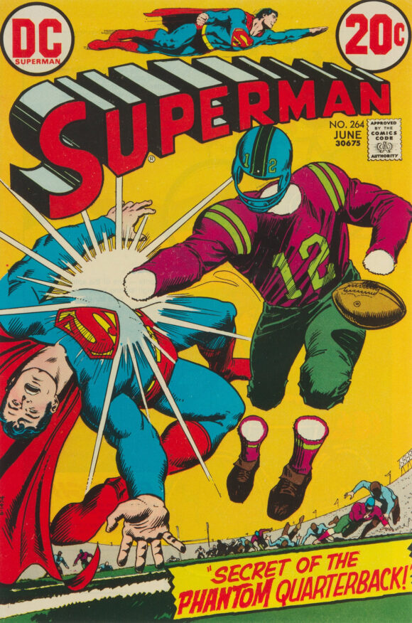
Nick Cardy
—
8. Daredevil #100, Marvel. Standard poster-style cover rendered oh-so-well by Rich Buckler and Frank Giacoia.
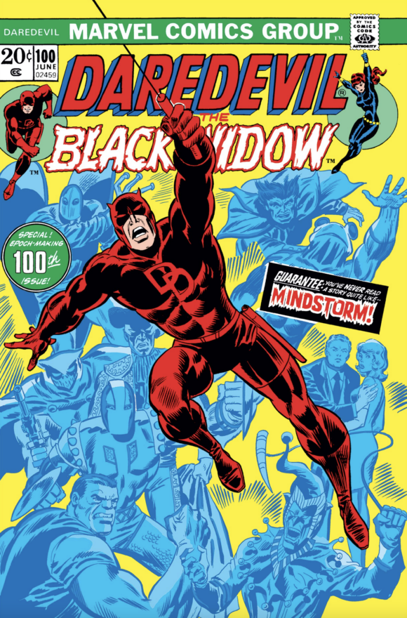
Rich Buckler pencils, Frank Giacoia inks
—
7. Captain America #162, Marvel. Giant floating heads means you make this list. That’s just a baseline standard. The bonus is the drooling dude at the bottom. I don’t know enough about Cap’s rogue’s gallery to know who that is but I love him!
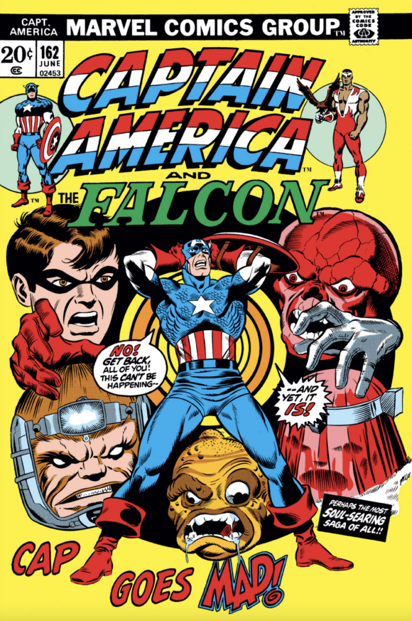
Jim Starlin pencils, Joe Sinnott inks
—
6. House of Secrets #108, DC. Jack Sparling’s been popping up here a bit lately, and no wonder given covers like this. I’m a sucker for a good mummy cover anyway, but I especially dig the lighting and the detailed linework. This is first-rate stuff. Plus, you have the requisite “DC-horror-book-children-in-peril” cover trope, as well.

Jack Sparling
—
5. Wonder Woman #206, DC. Wonder Woman was back in all her star-spangled glory and this showdown with Nubia made for one of the most memorable covers on the 1970s for the Amazing Amazon(s).
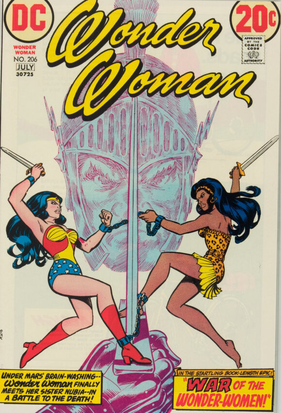
Cardy
—
4. G.I. Combat #161, DC. Joe Kubert’s forte was gritty humanism but man could he bring the supernatural when he needed to. A terrifying tableau made all the more, ahem, haunting by the odd-yet-effective color palette. (Jack Adler’s handiwork maybe?)
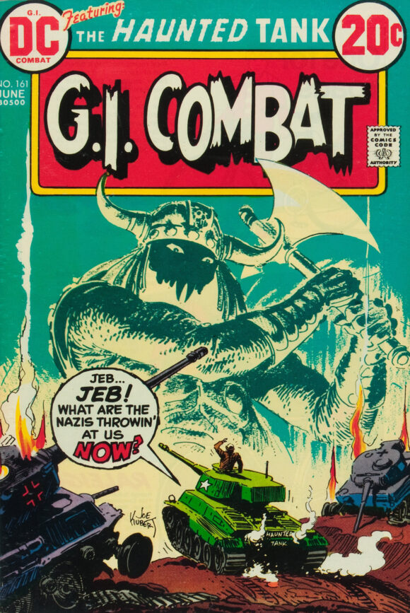
Joe Kubert
—
3. Shazam! #3, DC. For a title that’s often maligned by purists, Shazam! certainly boasted some great covers. This one is simple but the Marvel Family pops against the bright yellow thunderbolt and black background. This was my first Shazam! issue and I recall my Dad being somewhat tickled by it because Captain Marvel was his childhood favorite.
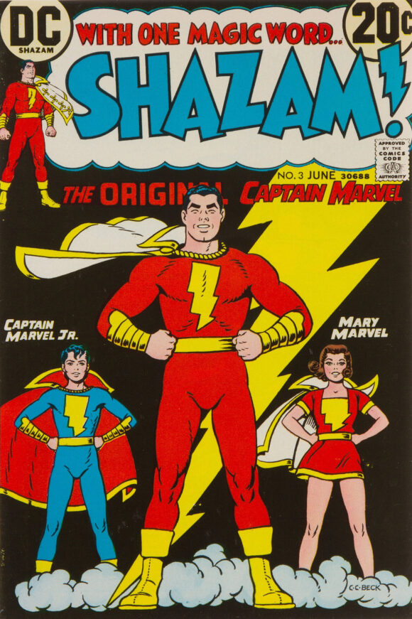
C.C. Beck
—
2. House of Mystery #214, DC. One of Bernie Wrightson’s all-time best covers and it would have been a strong contender for the top position if not for…
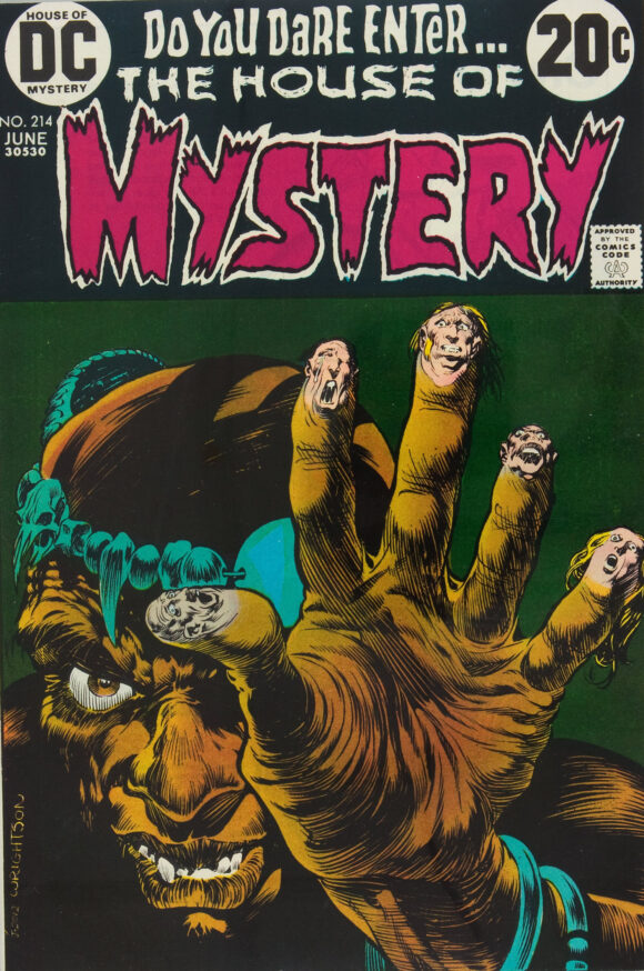
Bernie Wrightson
—
1. The Amazing Spider-Man #121, Marvel. The death of Gwen Stacy is not only one of comics’ seminal stories but John Romita’s bold cover is a Bronze Age landmark, as well. This cover is also why we’re running BRONZE AGE BONANZA on a Monday this month instead of the usual Sunday — because March 13 is the 50th anniversary of the book’s release. We’ve also got a full, whiz-bang tribute to Gwen Stacy, so click here to check it out. You’ll be very glad you did. Anyway, there’s no question that this cover is an early contender for best of the year — and an even earlier contender for best of the decade.
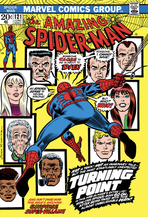
John Romita
—
MORE
— The TOP 13 COVERS of FEBRUARY 1973 — RANKED. Click here.
— BRONZE AGE BONANZA: The 1973 INDEX. Click here.
March 13, 2023
Superman 264 introduced Steve Lombard to the cast. And yes, that uniform is beyond hideous!
March 13, 2023
Standard DC coloring trope for decades: villains wear purple and / or green because it contrasts with the primary colors of the hero.
March 13, 2023
Good choices! March 1973 was one of the relatively rare months to include Batman, Detective, and B&B. They weren’t monthlies back then and they didn’t synch up very often. I’m a little surprised Dan (being the huge Batman fan that you are) that you came up with 13 covers to top whichever of the Bat covers you consider the best this month!
March 14, 2023
The worse thing about the football uniform is the helmet doesn’t match. SJG is right about the villains often being green and purple (Think Lex Luthor and Brainiac.). But it also applies to Spider-Man. Think of how many of his foes wore green, purple or both.
March 16, 2023
I still have my copy of Shazam! 3!