BRONZE AGE BONANZA: Marvel goes poster-style, classic Batman, a 1970s landmark — and MORE…
—
Welcome to BRONZE AGE BONANZA — our monthly series that looks at the greatest covers of the Bronze Age — exactly 50 years later. For more info on this feature, click here.
—
Interesting month, this one: Intentionally or not, Marvel produced a trio of “poster style” covers that are among the most popular of the era; one of the best-known Batman images debuted; and one of comics’ most important characters was introduced.
March 1972 was pretty groovy, I’d say. Here are the TOP 13 COVERS:
—
13. Blondie #198, Charlton. I couldn’t really tell you why — maybe it’s because I loved the show Pay Cards! when I was little — but I really dig imagery based on playing cards. It’s why the Royal Flush Gang rocks. (And the Joker too, natch.) Anyway, this is just a fun, inventive and colorful cover by Paul Fung Jr.
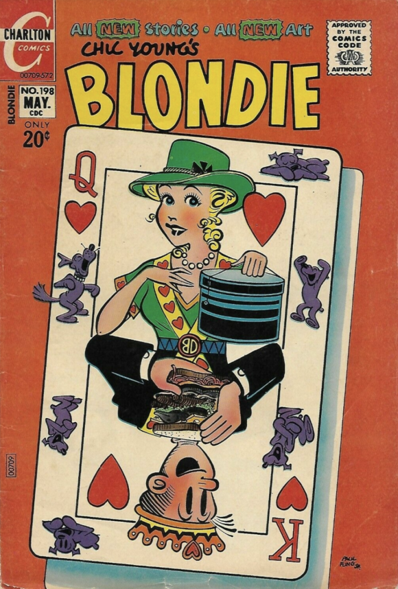
Paul Fung Jr.
—
12. Action Comics #412, DC. Don’t you want to believe that there really are subterranean civilizations with retro-futuristic architecture, a breathable atmosphere, a natural light source and a T. Rex? I do.
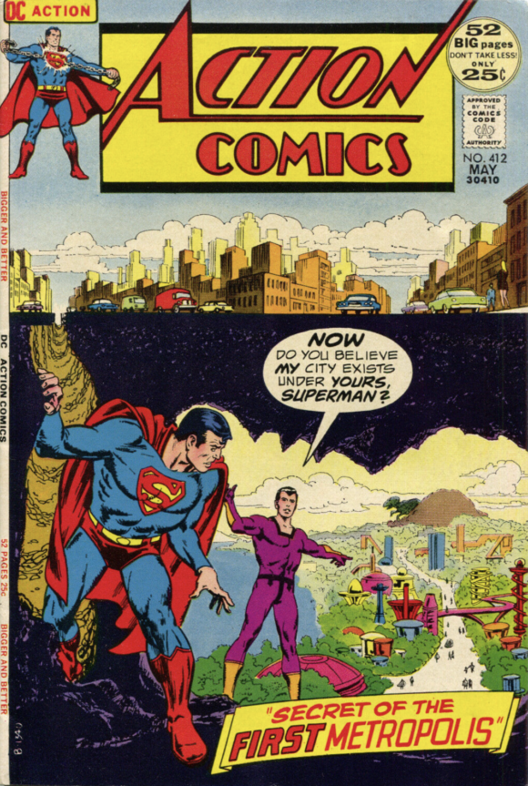
Nick Cardy
—
11. X-Men #76, Marvel. Nostalgia alert! Nostalgia alert! This was my first X-Men comic. I’d never heard of them before and this Gil Kane cover really creeped me out. I didn’t even know it was a reprint. (That was a new cover, though.)
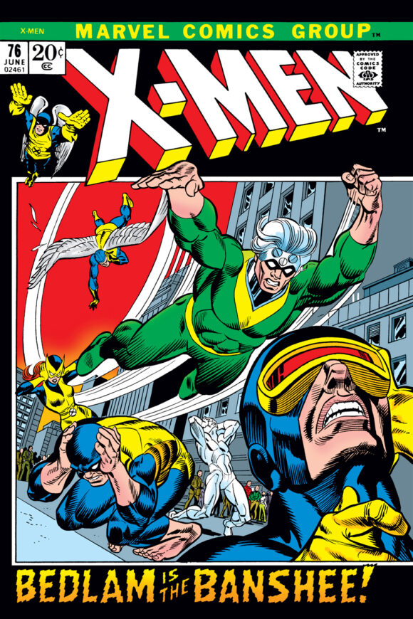
Gil Kane pencils, either Frank Giacoia or Mike Esposito inks
—
10. Marvel Tales #35, Marvel. Another new Gil Kane cover for another reprint book — and another one that Young Dan had in his collection. Great construction, great perspective and continued proof that nobody fared better with Marvel’s restrictive box format than Sugar Lips Kane.
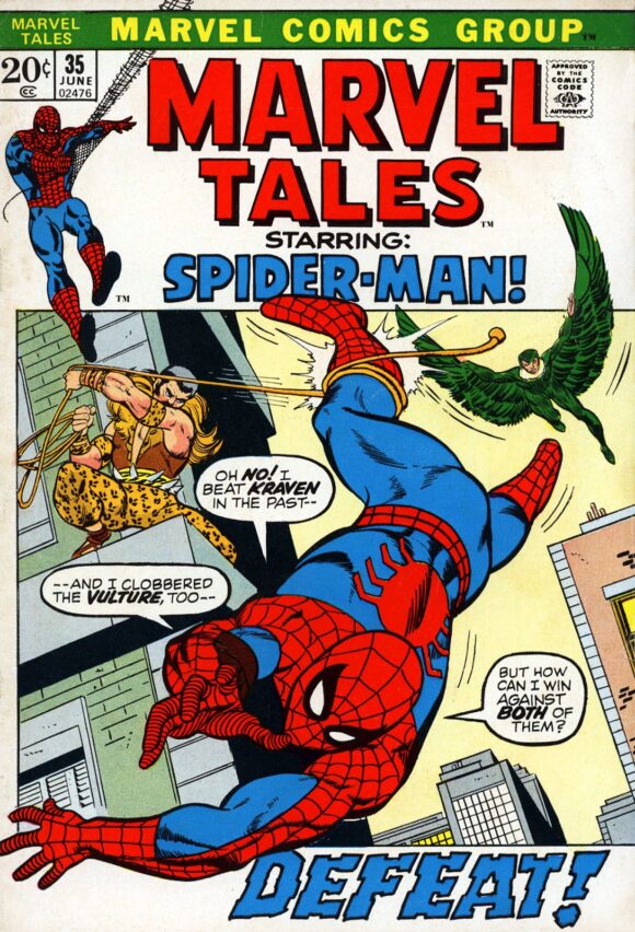
Kane pencils, Vince Colletta inks
—
9. The Twilight Zone #43, Gold Key. Anybody care to tell me how Mon-El ended up in the Twilight Zone?
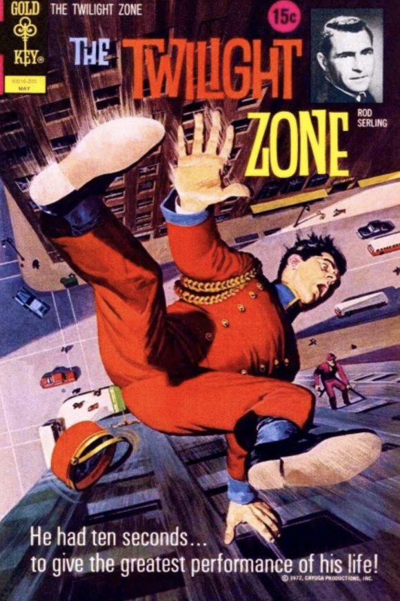
George Wilson
—
8. Young Romance #182, DC. If Jay Scott Pike drew what happened six seconds later, the Comics Code Authority would be all over that shit. (Can you resist? CAN YOU? No, you cannot!)
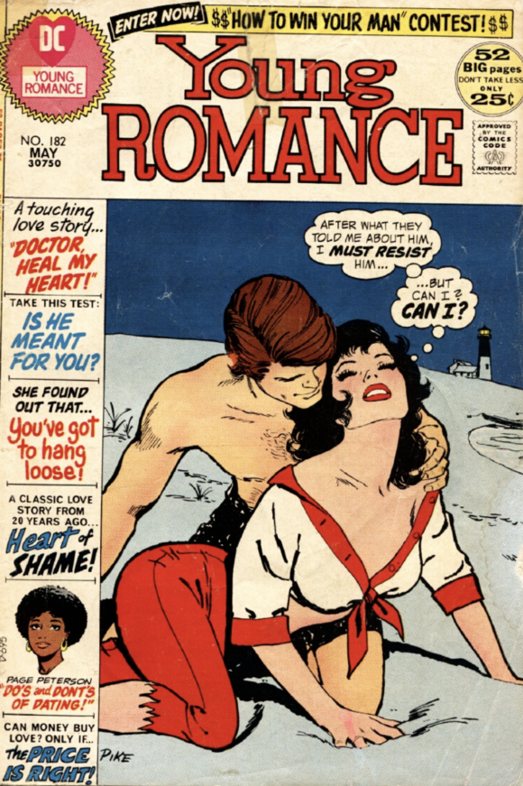
Jay Scott Pike
—
7. The Incredible Hulk #152, Marvel. The first of three “poster style” Marvel covers on this list. I wonder what was going on that month at the House of Ideas…
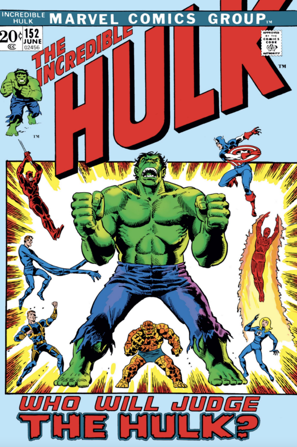
Herb Trimpe pencils, John Severin inks
—
6. House of Mystery #202, DC. Demonic offspring were all the rage back then — and who better than Mike Kaluta to depict such a profane ritual?
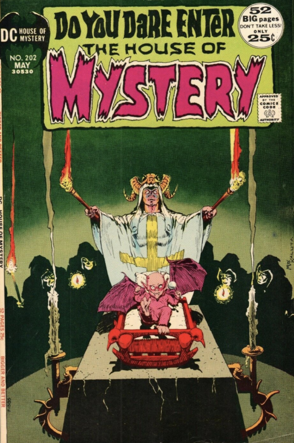
Michael Wm. Kaluta
—
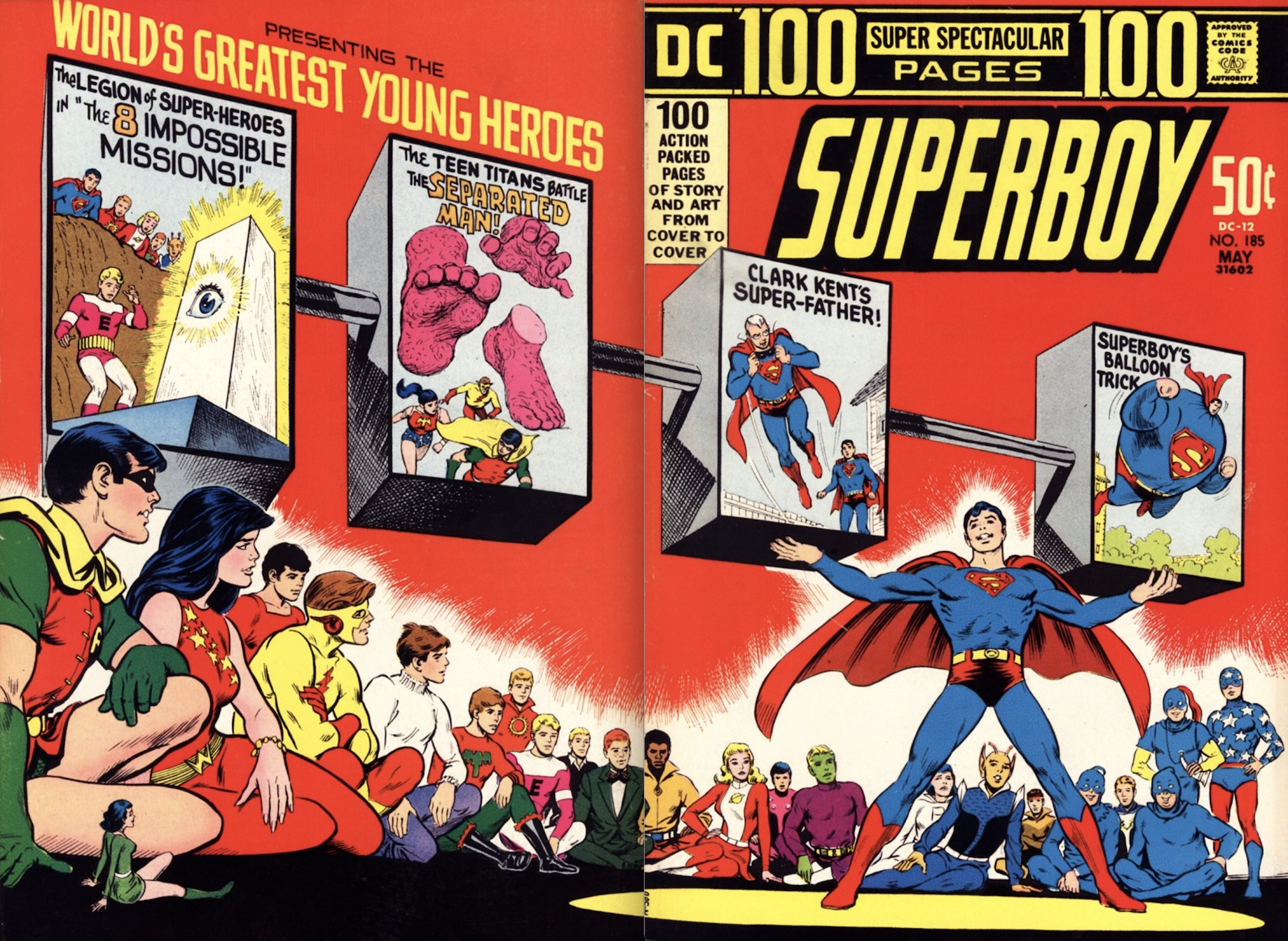
5. Superboy #185, DC. I’ve noted this before: Wraparound covers in this style have the advantage of added space but sometimes that extra room can backfire, leading to unbalanced, awkward compositions. This one’s a winner, if a little kooky: The red is brilliant, nobody at the time drew the Teen Titans better than Nick Cardy, and all the kids seem to be chilling at some hippie-dippie performance space. I mean, it looks like Superboy is the opening act for either Pippin or a traveling mime troupe.
—
4. Iron Man #47, Marvel. The second Marvel “poster” on this list — and a classic retelling of Iron Man’s origin.
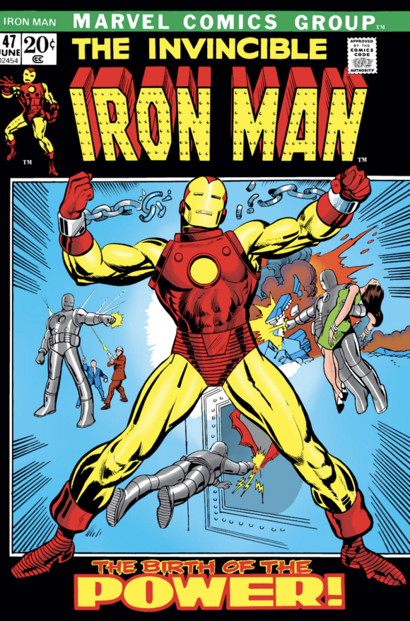
Kane and Colletta
—
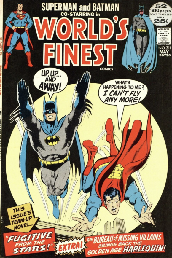
3. World’s Finest #211, DC. Big month for Young Dan because this is another one I had. I’m 90 percent sure I got it at a New Jersey flea market and I remember being so taken by the cover that I hung it on my bedroom wall. The whole notion of Batman and Superman switching powers really hooked me. But beyond all that, this is just a great Neal Adams piece. Very little background but terrific use of the spotlight silhouetted in black. (Tight deadline perhaps?) I also really dig the way the Superman and Batman images frame the title. Up to this point, such images were typically pretty small.
—
2. Batman #241, DC. One of the most famous Batman images of the Bronze Age and still used in merchandising today. (I have it on a ‘Toon Tumbler.) And it’s Neal Adams inked by Bernie Wrightson! That’s a powerhouse duo if ever there were one. Still, why is the Darknight Detective floating in midair? Or is he just about to land on a roof? You tell me!
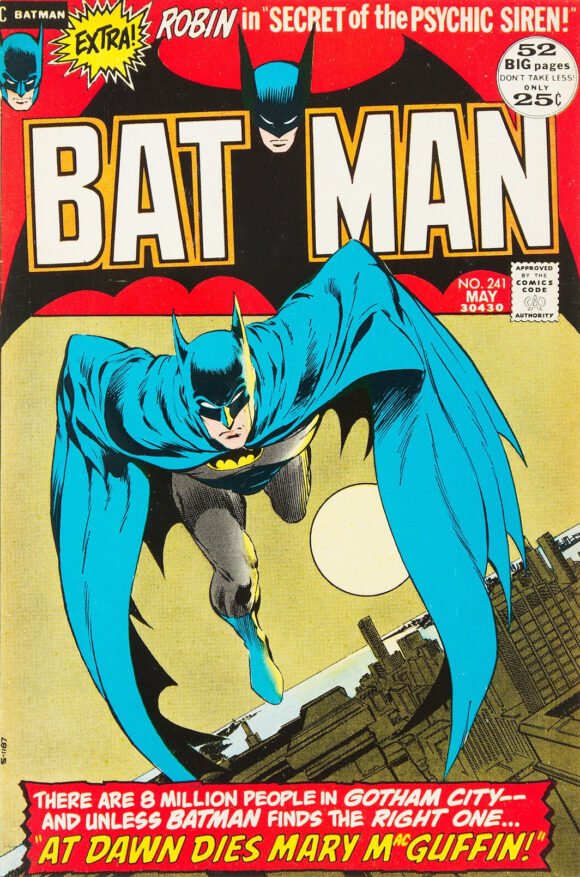
Adams pencils, Bernie Wrightson inks
—
1. Hero for Hire #1, Marvel. The third Marvel “poster” on the list — and one that actually would have worked as a movie one-sheet. Which makes sense because Marvel, with its collective finger on the pulse of the zeitgeist, was tapping into the Blaxpoitation craze. In any event, Luke Cage’s arrival was a huge, pioneering development in comics and one of the most important landmarks of the Bronze Age. John Romita absolutely nailed the vibe.
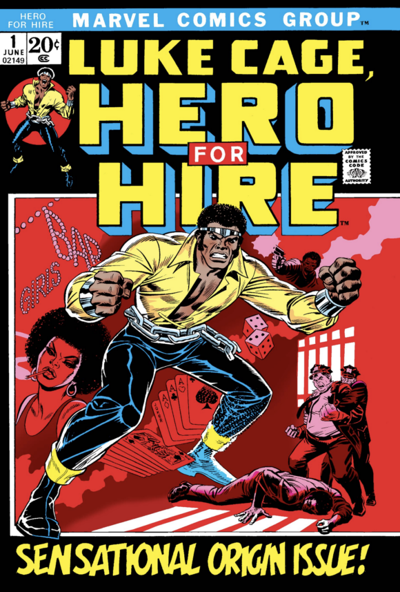
John Romita
—
MORE
— The TOP 13 COVERS of FEBRUARY 1972 — RANKED. Click here.
— BRONZE AGE BONANZA: The 1972 INDEX. Click here.

March 27, 2022
I can’t agree on the WF cover. I love Adam’s pencil but it seems rushed together, very last minute.
March 27, 2022
That Twilight Zone Tower of Terror cover makes a great tie-in to the TZ Tower of Terror at Disney World! No wonder the bellhops are creepy there!
March 28, 2022
Good list! I enjoy this feature every month. I’m surprised that the Neal Adams cover for Phantom Stranger #19 didn’t make your top 13. Also, no Avengers #100?
March 28, 2022
I’m with Buck on the Neal cover– he’s got some great covers in his career but not this one.
March 30, 2022
This is glorious! I can’t imagine being a kid at this time. The Batman and especially Luke Cage covers are just classic and legendary! How would you choose?!
April 22, 2022
That’s my era. I remember that Marvel Tales with Kraven and The Vulture. I had just started buying Spiderman stuff, my first Marvels. (I was a DC superhero comics kind of girl.) I remember buying that Superboy 100 pager, too… loved the Teen Titans and the Legion of Super Heroes back in my early teens. That red cover was certainly an eye-catcher. I didn’t quite know Cardy’s name yet back then, but I recognized his style as clearly as a Gil Kane’s or a Johnny Romita’s.
April 17, 2022
I never read the story in Action 412 but how did they get clouds in an underground city.