
BRONZE AGE BONANZA: Cardy! Aparo! Buckler! Kane! Plus, one of the most important comics of the entire era!

—
Welcome to BRONZE AGE BONANZA — our monthly series that looks at the greatest covers of the Bronze Age — exactly 50 years later. For more info on this feature, click here.
—
Lots of groovy stuff — and lots to debate this month!
Dig the TOP 13 COVERS OF JULY 1974 — RANKED:
—
13. Amazing World of DC Comics #1, DC. The limited color palette is a drawback, though it does have its charm. Really, I just dig Infantino’s gallery of favorites in their raw form. Reminds me of this.
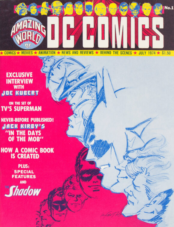
Carmine Infantino
—
12. The Brave and the Bold #115, DC. DC’s 100-Pagers were known to be more colorful, so using a white background actually makes this pop in its own way, especially with the color palette of the trade dress. (Love that light-blue-on-black Batman logo and the matching Atom emblem.) But you know what really brings it? The tiny, tiny detail of the Atom using Batman’s ear to keep his balance. By the way, this also happens to be my all-time favorite B&B story — Batman is shot dead and the Atom animates his body by jumping around his brain. Written by Bob Haney, it’s been homaged many times, including in the Batman: The Brave and the Bold TV series.
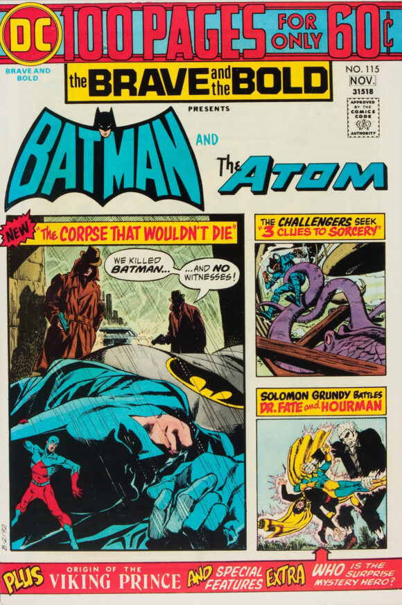
Jim Aparo main image. Vignettes by Bob Brown and Murphy Anderson.
—
11. Archie #238, Archie. One of the better known suggestive covers. Hell, even Jughead’s on board.
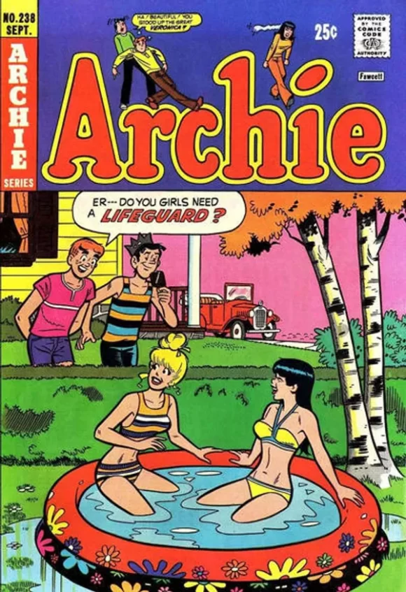
Dan DeCarlo pencils, Rudy Lapick inks
—
10. Haunted #18, Charlton. Y’know, Joe Staton seems like such a mild-mannered dude. What the hell, man?
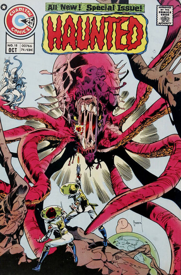
Joe Staton
—
9. Richie Rich and Dot #1, Harvey. I’m not 100 percent sure, but this might be the first time Richie Rich has popped up in this feature. Anyway, is it me or does this look like a scratch-off lottery ticket? By making that connection, does that make me a degenerate gambler? And why is it always “degenerate” gambler? I know plenty of degenerates who don’t gamble at all.
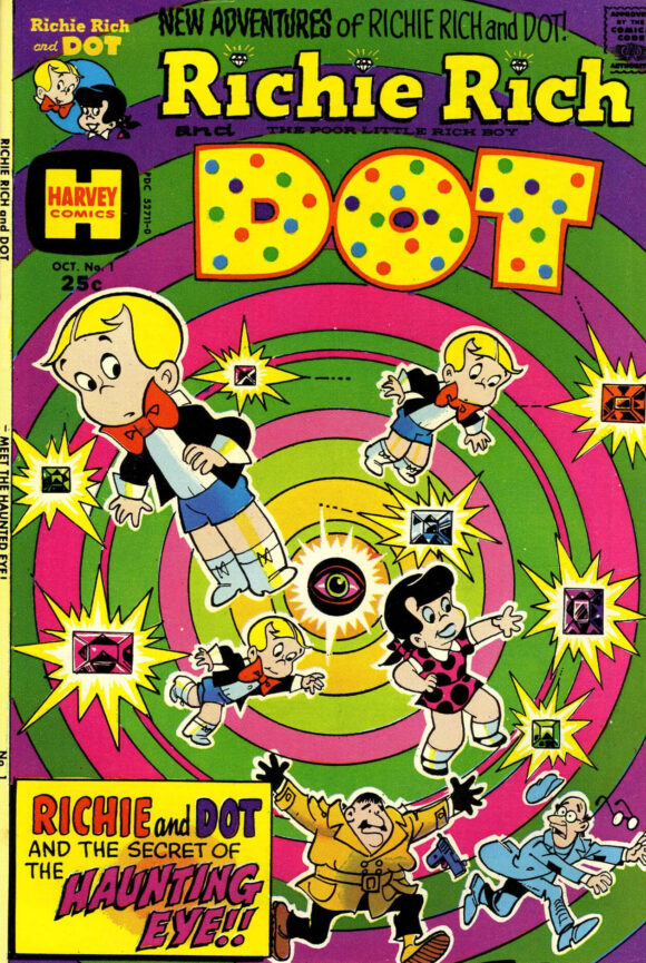
Artist unidentified
—
8. Secret Origins #7, DC. Cover artists for Secret Origins and Wanted had the unenviable task of taking disparate characters and stories, and making them mesh into a cohesive whole. This one, by Nick Cardy, is one of the best. Great red background, outstanding illustrations (the one on the left an obvious lift of Detective Comics #38) and the POV of each has the heroes pointed right at you. The placement of the character logos helps keep the balance, too. Plus, the fact that all three are members of the Super Friends probably helps to connect them, given the time period.
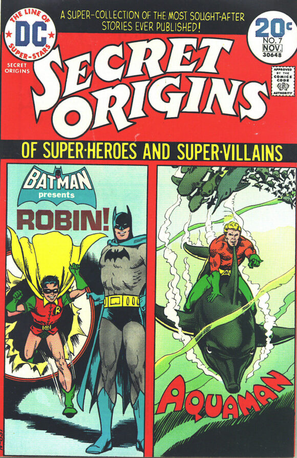
Nick Cardy
—
7. Scream #9, Skywald. I don’t think I ever noticed until now the “horror-mood” descriptor. How strange. In any event, had I seen this when I was 7, I would have run away like my hair was on fire. This cover is horror incarnate.
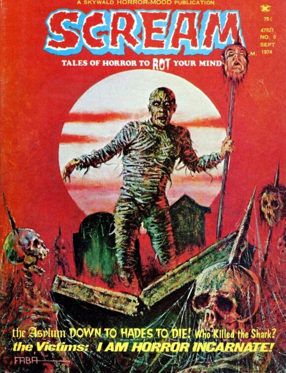
Salvador Faba
—
6. Action Comics #440, DC. A common theme in BRONZE AGE BONANZA is that Nick Cardy was a really versatile artist. Compare the atmosphere of this one to Secret Origins above. This cover powerfully conveys angst and shame, with a helping of horror thrown in. Superb color scheme by the great Tatjana Wood.
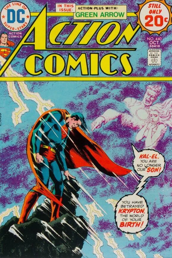
Cardy
—
5. The Amazing Spider-Man #137, Marvel. A solid follow-up to the classic ASM #136 but nowhere nearly as iconic. I only make that point because this is the second part of that story — the climactic battle between Spidey and Harry Osborn’s Green Goblin. I do dig the primary black background and how it sets off the trade dress, but Spidey’s head is a little wonky. Still, it’s one of the most memorable Spider-Man covers of the ’70s.
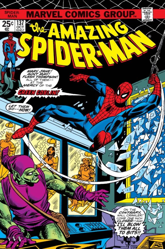
Gil Kane pencils, Frank Giacoia inks
—
4. The Incredible Hulk #181, Marvel. I guess we need to have a debate here: Should this cover be automatically No. 1 because of its historic status? Or should it be judged on its artistic merits? It’s a great cover — love the red background — but it owes its status to being the comic with Wolverine’s first full appearance. Swap in another foil and this is pretty much a typical “Hulk fights someone” cover. Generally speaking, BRONZE AGE BONANZA is about aesthetics, but historical impact definitely plays a role and sometimes is a decision-maker. Your (respectful) comments are invited.
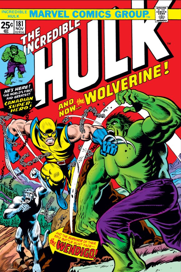
Herb Trimpe, with John Romita alterations
—
3. Astonishing Tales #26, Marvel. For example, from an impact standpoint, Hulk #181 has nothing on this cover by Rich Buckler. I’d also argue that this a superior cover to the previous issue, which featured Deathlok’s first appearance. The only drawback is that there’s a little too much white space, which loosens the feel.
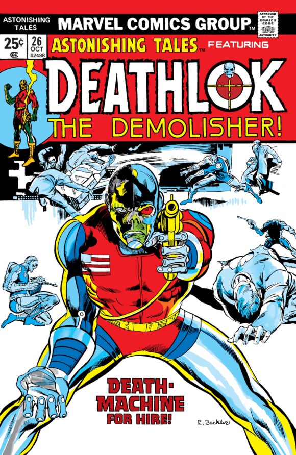
Rich Buckler
—
2. Doctor Strange #4, Marvel. Straight-up, fantastic and fantastical cover by Frank Brunner. Great construction, even better execution. Perfect colors by Glynis Oliver (aka Glynis Wein).
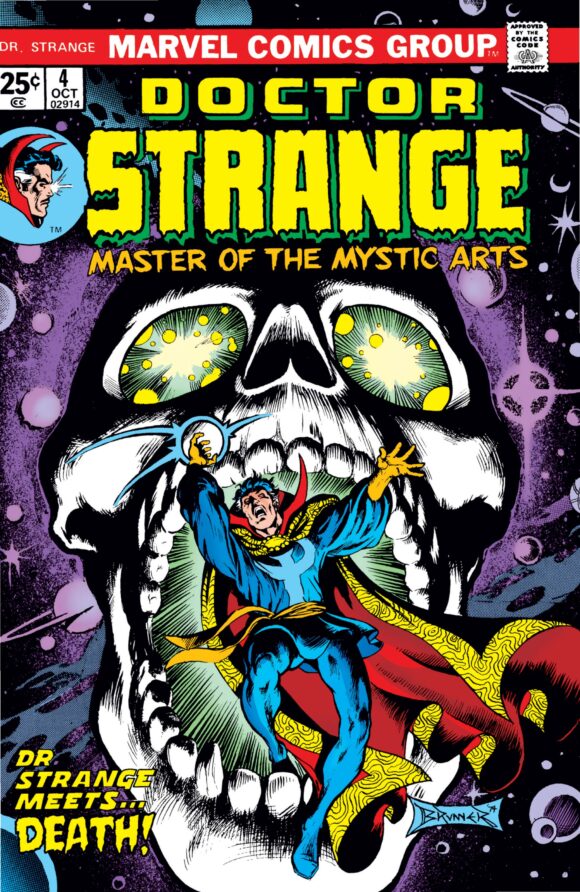
Frank Brunner
—
1. Limited Collectors’ Edition #C-31, DC. The painting — which has a really weird history — was done by HJ Ward in 1940 but wasn’t used in a comic until here. Should that disqualify it? No. No way. It was still an incredibly smart and sharp choice for Superman’s first treasury edition — he didn’t get one until the ninth of the series! — and the image is spectacular in its own right. Arguments can be made in either direction (again, respectfully) but to me, this is a no-brainer. It’s one of the most beloved images of the greatest superhero of them all.
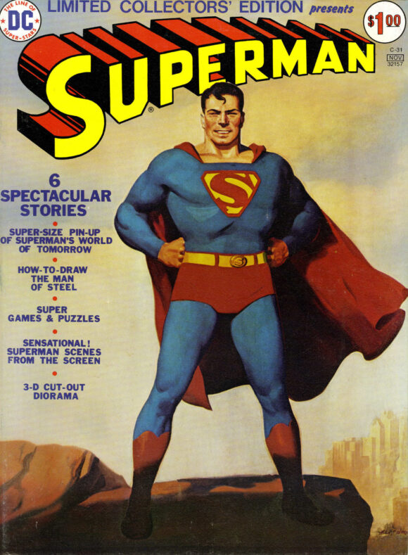
H.J. Ward
—
MORE
— The TOP 13 COVERS of JUNE 1974 — RANKED. Click here.
— BRONZE AGE BONANZA: The 1974 INDEX. Click here.
—
Comics sources: Mike’s Amazing World of Comics and the Grand Comics Database.
July 14, 2024
DC never used the term “Treasury” for their double sized comics. It was “tabloid”. Given I am pretty sure they came up with the idea for use with comics (in one of the Amazing World (IIRC) issues, they explained how Sol Harrison came up with the format,) it would be more historically accurate to use the term “tabloid” for the DC issues.
July 14, 2024
Yes, it would. But colloquially, the generic term “treasury” has stuck.
July 14, 2024
Going on artistic merit, that Hulk cover wouldn’t have made my top 13.
I had that Astonishing Tales issue, one of my favorites. I put Buckler’s interiors on this run as some of, if not, his best
July 15, 2024
Brave and Bold #115 is one of my very favorites! The Atom team-up and the Dr. Fate/Hourman story were worth the price of a dozen comics! Loved the whole issue; read it on a car trip through the southwest fifty years ago. By coincidence I drove the same route last month and flashed back to that comic! I still have it and the Action Comics issue somewhere but I don’t think I got that Secret Origins. And I hadn’t thought of Dot Polka (yes, that’s her name!) in over fifty years! Thanks for the nostalgia trip!