
BRONZE AGE BONANZA: Who knows which cover tops the list…

—
Welcome to BRONZE AGE BONANZA — our monthly series that looks at the greatest covers of the Bronze Age — exactly 50 years later. For more info on this feature, click here.
—
This is a pretty varied month, as months go. But the stars, the stars, they are steady: Kane, Kirby, Kaluta, Aparo, Romita and more!
Dig THE TOP 13 COVERS OF JULY 1973 — RANKED:
—
13. Famous Monsters of Filmland #101, Warren. It’s a collage with mostly reprinted art, except for the wonderful painted version of a Captain Marvel serial still. But what a great-looking collage with mostly reprinted art.
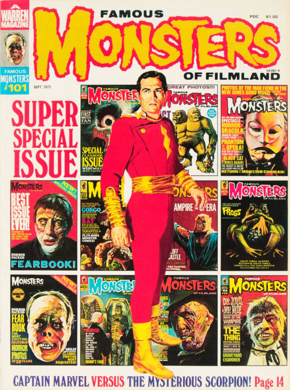
Unknown
—
12. Space Family Robinson #37, Gold Key. I looooove George Wilson, but this isn’t necessarily one of his standout covers. I picked it for sentimental reasons, however: I loved Lost in Space as a kid and I remember getting this at the Collingwood Auction, a flea market in New Jersey. Upon reading it, I was mystified (and disappointed) that it really had nothing to do with the show, but it still meant a lot to have it. (Hey, have you heard the news about the new Wilson book? Click here!)
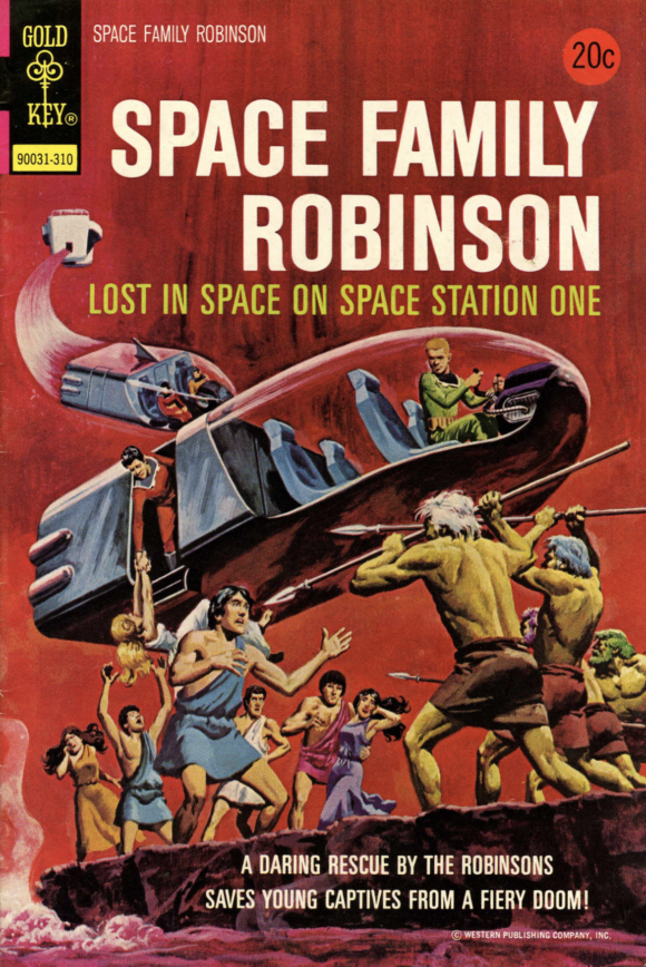
George Wilson
—
11. FOOM #2, Marvel. One of the most memorable FOOM covers. That is one sexy Hulk. Almost as sexy as Mark Ruffalo.
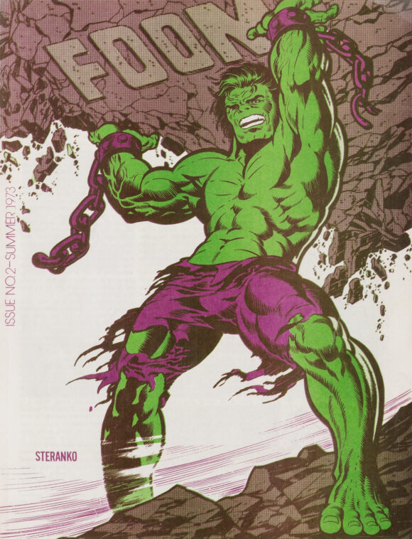
Jim Steranko
—
10. Reggie and Me #65, Archie. This is the one where Archie finally snaps and kills Reggie for being such a dick, buries him and makes the others swear a blood oath not to tell anyone what happened. Years later, because she’s the only one with a conscience, Betty confesses to the cops and brings down the Riverdale gang.
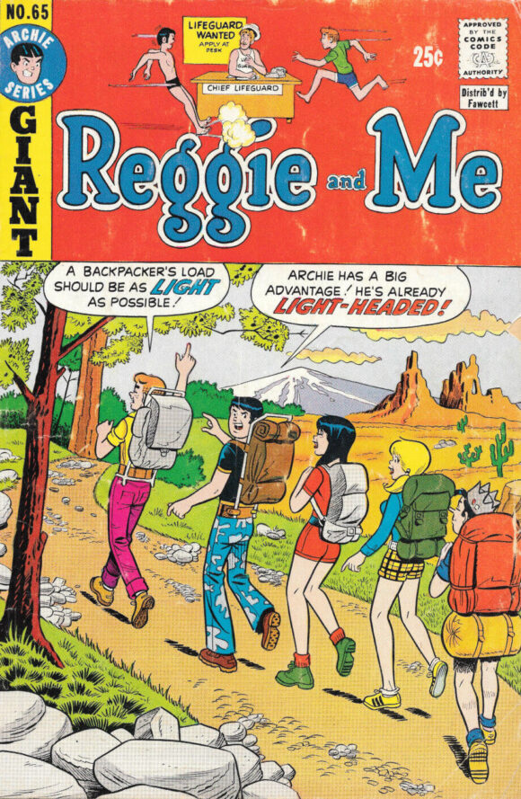
Unknown
—
9. Psycho #14, Skywald. Great merged floating-heads cover by Ken Kelly for cheesy (but lovable) Skywald. The black background is right on, but it would have worked just as well in red, don’tcha think?
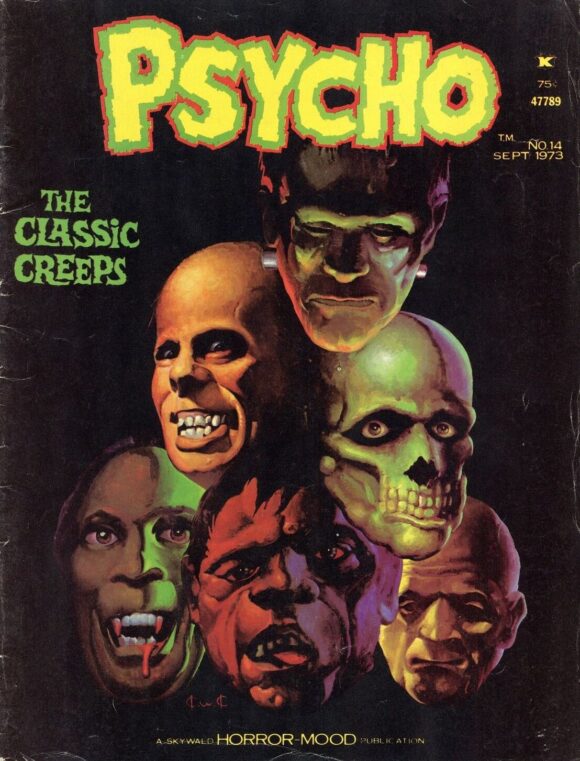
Ken Kelly
—
8. Falling in Love #143, DC. Fact 1: Jay Scott Pike could draw. Fact 2: Romance comics were filled with retrograde covers and stories that made women appear needy, crazy, or both. Fact 3: This cover is a well-executed example of Facts 1 and 2.
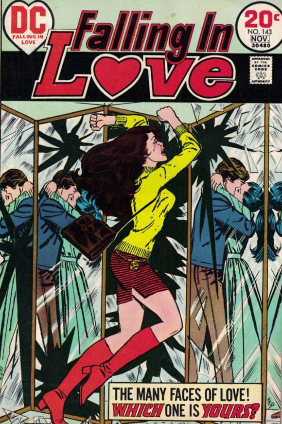
Jay Scott Pike
—
7. The Amazing Spider-Man #125, Marvel. Do you know why this cover stands out to me? Because whenever I go looking in Spidey back bins at shows and whatnot, this one always seems to be there. No idea why that is, because it’s got Man-Wolf in it and the Romita/Esposito cover rocks. Love the power in Man-Wolf’s swing.
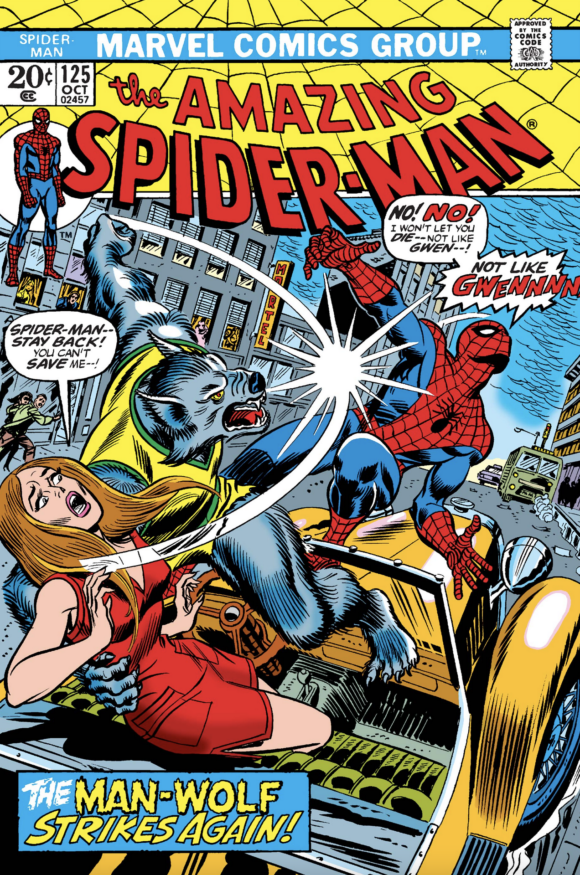
John Romita pencils, Mike Esposito inks
—
6. Marvel Team-Up #14, Marvel. Gil Kane was a master at the close-quarters battle and putting this one in the drink makes it that much more urgent for Spidey. Come to think of it, I can’t see how Petey could beat Namor in this situation: The Sub-Mariner’s got a damn impressive record on his home surf. Love the fading color of the sunset sky. (My guess, as always, is it’s the handiwork of Marie Severin.)
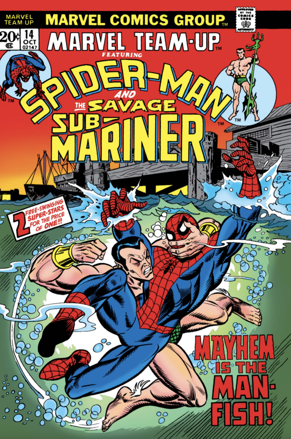
Gil Kane pencils, Frank Giacoia inks
—
5. Ghost Rider #2, Marvel. What does Satan look like? Well, it’d be cool as hell if he looked like this. The all-red, faceless figure deliniated by all those lines! And, damn, even Ghost Rider is freaked out. Kinda looks like an evil Black Panther right? Fine by me. Where’s the rest of his cape though? Anyway, extra credit to whoever wrote the hilarious dialogue.
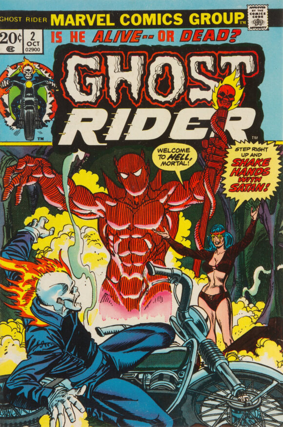
Kane pencils, Joe Sinnott inks
—
4. Mister Miracle #16, DC. I know Shilo Norman is the hero here, but looking at his (comparably) giant head pushing through the cavern makes him appear like he’s the monster. It’s such an unsettling image — his eyes! — that you absolutely have to see what this is about. And that, as we’ve said many times, is the point. (Side note: What’s with Mister Miracle’s mask over on the left?)
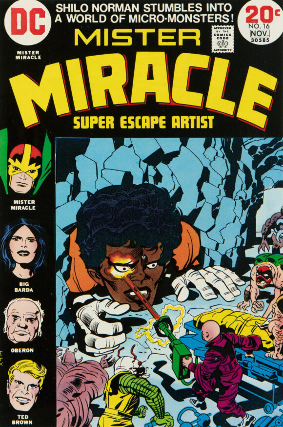
Jack Kirby pencils, Mike Royer inks
—
3. Our Army at War #261, DC. Joe Kubert, man. That guy made his characters act. Just look at the disgust on Rock’s face. And Bulldozer is ready to kill the commissioned officer who’s clearly done something really tasteless. Rough scene. Great artist.

—
2. Detective Comics #437, DC. Did you know that for a brief moment in time, Jim Aparo was supposed to be the regular artist on Detective Comics, under new editor Archie Goodwin? His tenure started with this issue but things changed quickly. I’m not sure why. In any event, Goodwin ended up rotating artists, including Sal Amendola, Howard Chaykin, Alex Toth and Walt Simonson. It was a great run but I can’t help but wonder what it would have been like having Aparo — who was at his self-inking peak — as the main Detective (or Batman) artist for a lengthy tenure in the ’70s. This captivating cover gives us a taste. Plus, let’s not ignore the return of the classic ‘Tec logo — which should still be in use today.
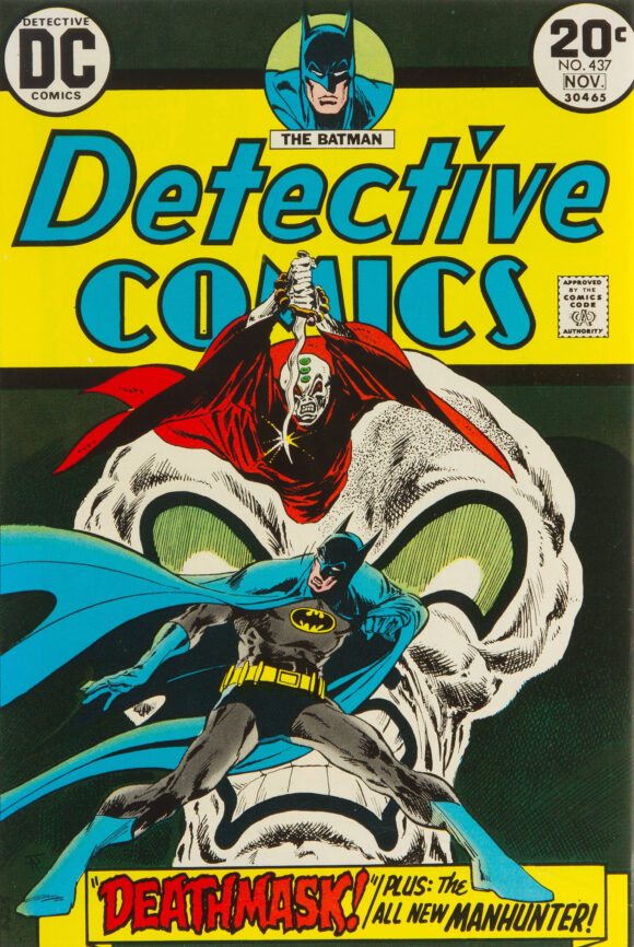
Jim Aparo
—
1. The Shadow #1, DC. Iconic is an overused word. I rarely indulge. But this is one of those cases where it’s merited. A masterpiece by Mike Kaluta and one of the greatest Shadow images ever.
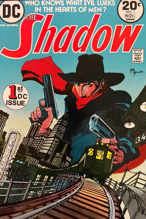
Mike Kaluta
—
MORE
— The TOP 13 COVERS of JUNE 1973 — RANKED. Click here.
— BRONZE AGE BONANZA: The 1973 INDEX. Click here.
July 17, 2023
If the design on those pants wouldn’t kill Reggie, nothing would!
July 19, 2023
Forgive my ignorance, but on the cover of ASM 125 is….was Man-Wolf driving a jalopy with Gwen and Spider-Man interrupted them? Did Man-Wolf have a dune buggy like Spidey did, too?
January 9, 2026
Hi, I know this is a couple years late, but the girl on the cover is actually of John Jameson’s (man-wolf) girlfriend, she is driving their car when he transforms (from a scene in the issue).