
BRONZE AGE BONANZA enters its third year!

—
Welcome to BRONZE AGE BONANZA — our monthly series that looks at the greatest covers of the Bronze Age — exactly 50 years later. For more info on this feature, click here.
—
Can I just say that as we enter the third year of BRONZE AGE BONANZA, just how much fun this is to do? You guys seem to dig it too, so merrily we roll along with the TOP 13 COVERS OF JANUARY 1972 — RANKED:
—
13. Blondie #196, Charlton. I just really like this cover. I like the colors. I like the construction. I like the whole idea. I love the joy. Thank you, Paul Fung Jr.
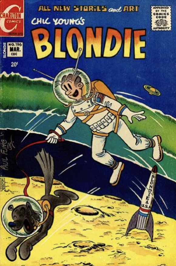
Paul Fung Jr.
—
12. Geronimo Jones #4, Charlton. GOTTA FIND OUT WHAT THE HELL IS GOING HERE!
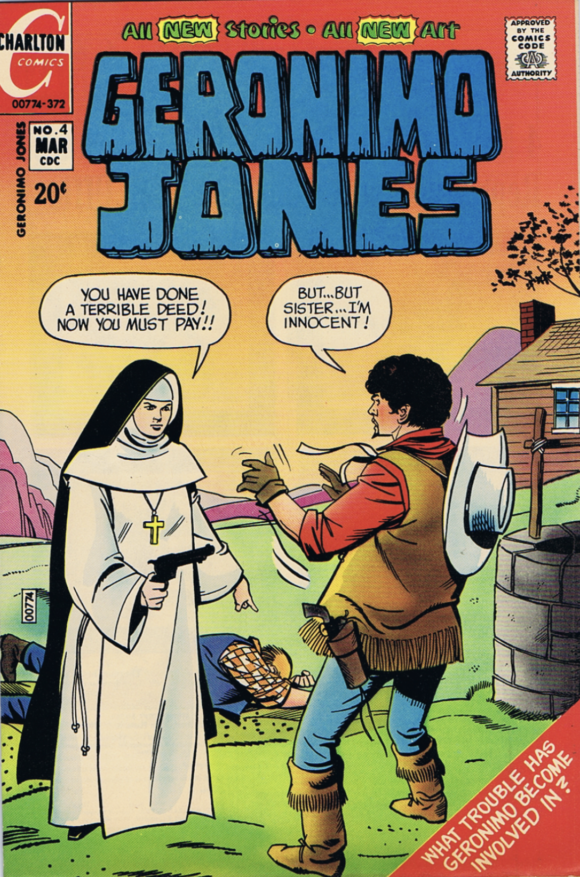
Jose Delbo
—
11. Superman #249, DC. I have always found this cover to be silly. But it’s memorable — and Neal Adams drew the eff out of that flying horse.
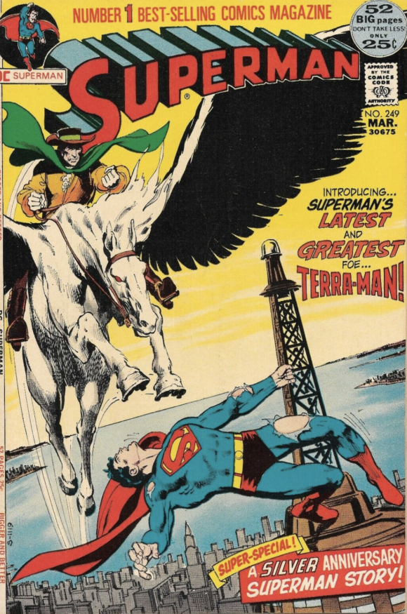
Neal Adams
—
10. Superboy #183, DC. Speaking of silly — how is it that I’ve never seen this cover before now? I really need to read this. Hello, eBay…?
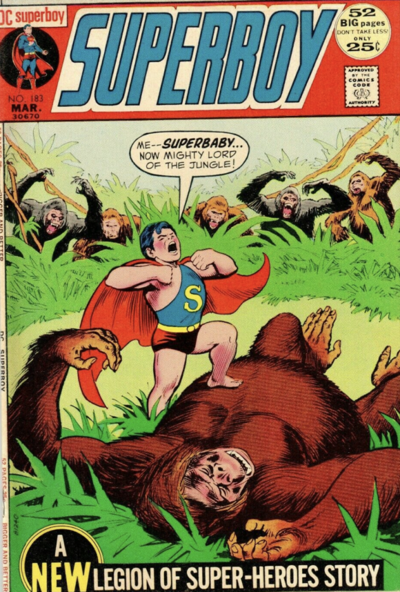
Nick Cardy
—
9. Fantastic Four #121, Marvel. Y’know there would be more Marvel on these lists if not for the early-’70s boxed image design. It cramps everything, unless you’re Gil Kane and you make everyone fly out of the panels. Imagine what Big John woulda done with the added space. As it is, he sets up a classic Fantastic Four tableau. (By the way, ever notice how great Marvel was at urban crowd scenes? They nailed that.)
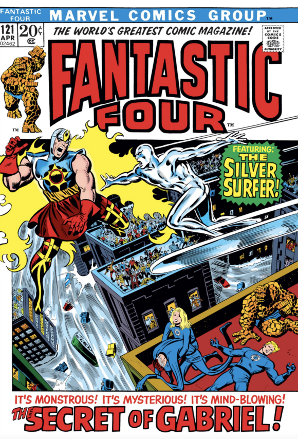
John Buscema pencils, Joe Sinnott inks
—
8. The Avengers #98, Marvel. Exactly what I said about No. 9, except substitute “Avengers” for “Fantastic Four.”
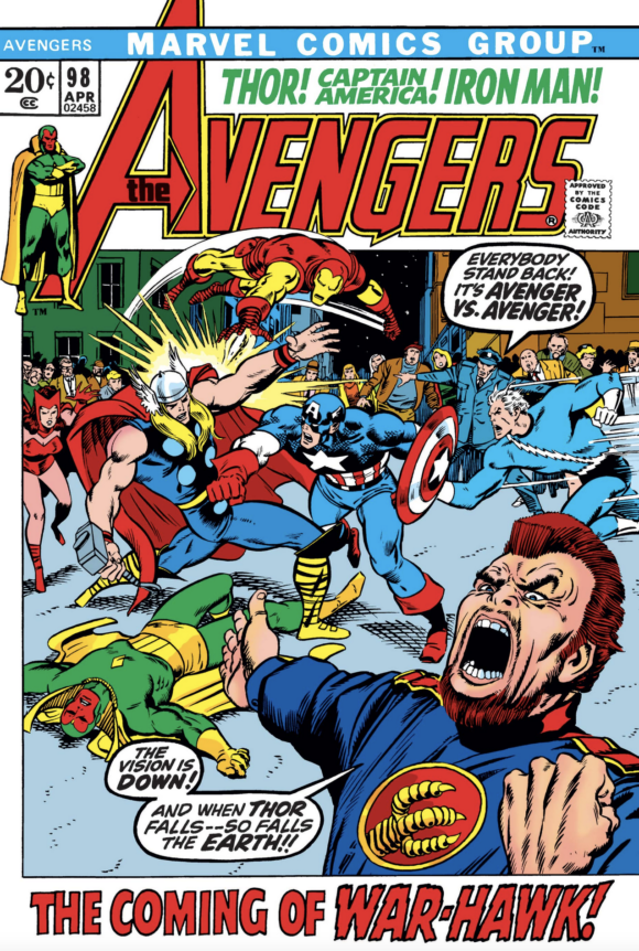
Buscema pencils, Barry Windsor-Smith inks
—
7. Adventure Comics #416, DC. Wraparound covers have a built-in advantage. Soooo much more space to work with. Unfortunately, this is such a hodgepodge of execution. Supergirl? Great! All the female heroes lined up at the bottom? Even better! (Love Batgirl, especially.) But between all the type and the five vignettes, the final product comes off as kinda sloppy. There’s a lot to like but it feels rushed.
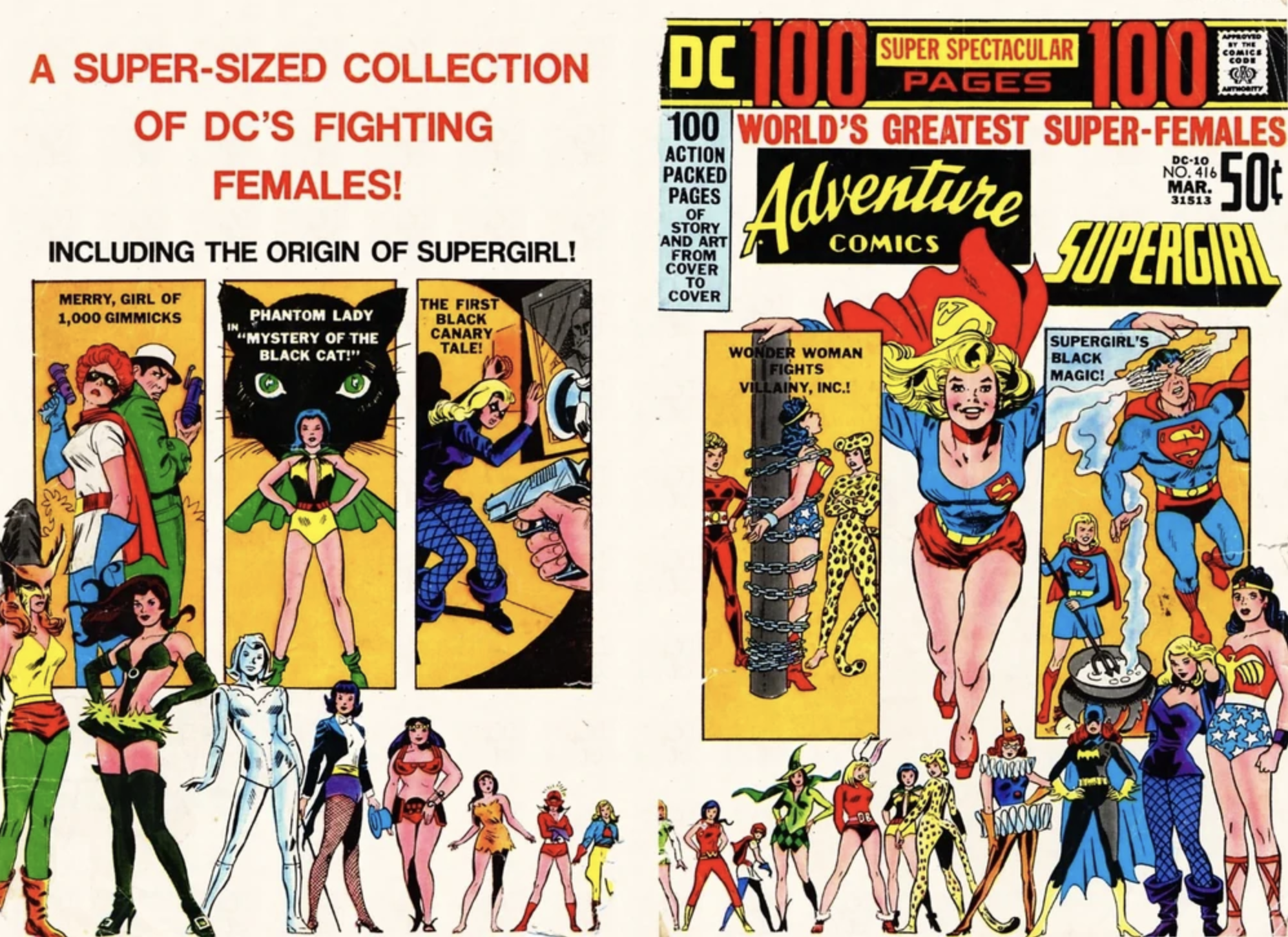
Bob Oksner
—
6. Ghostly Tales #93, Charlton. Good lord, this is legit scary. I can’t believe Brown Haired Guy on the left didn’t just drop dead on the spot in terror. Steve must have been really pissed that day.
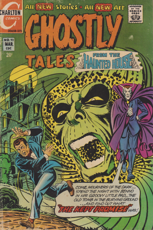
Steve Ditko
—
5. The Dark Mansion of Forbidden Love #4, DC. Go scroll up to No. 10, then come back. Nick Cardy, ladies and gentlemen! Big round of applause for the man who could draw anything and draw it extremely well. This is ethereal beauty.
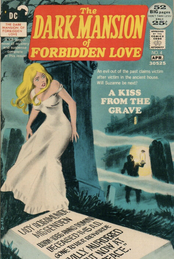
Cardy
—
4. Ghosts #4, DC. You can switch this with No. 5 if you want. I won’t mind. Either way, just check out that construction — you are pulled right in. It almost feels like that Hitchcock camera trick. (I don’t know who did the colors, but they deserve a special shout-out. The contrast between the bright blue and the darker tones contributes mightily to that telescopic effect.) Brilliant.
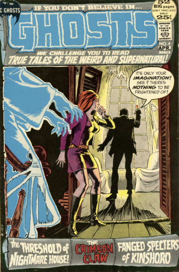
Cardy
—
3. The Phantom Stranger #18, DC. The special-effects whiz that is Neal Adams. What a gorgeous cover.
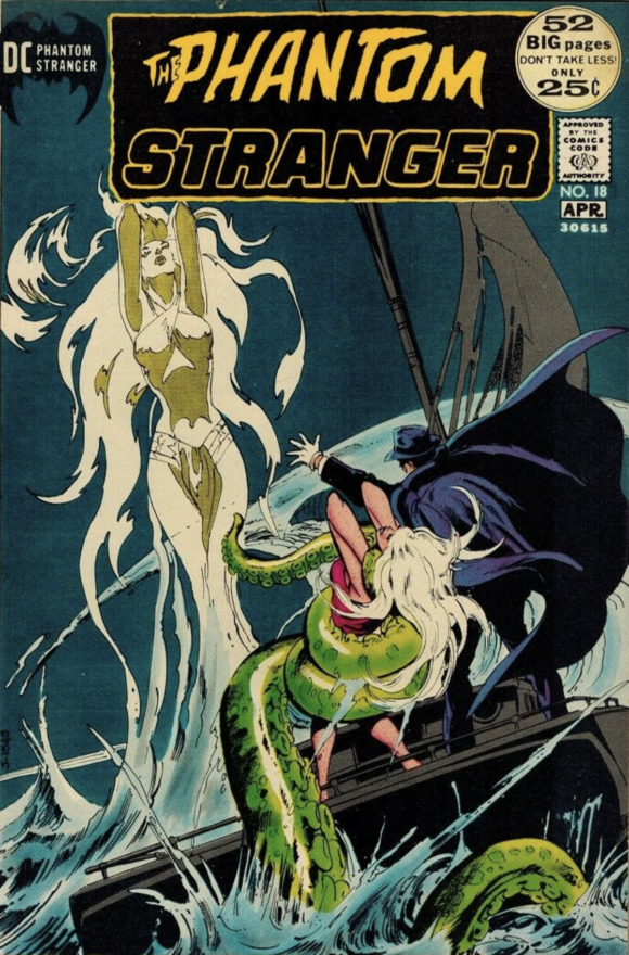
Adams
—
2. House of Mystery #200, DC. One of the greatest horror covers ever. A Mike Kaluta masterpiece, every which way.
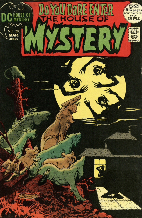
Michael Wm. Kaluta
—
1. Jughead #202, Archie. And for the first time in BRONZE AGE BONANZA history, an Archie Comics cover tops the list! I’ve always said that Archie is the best at capturing the sense of the season, but it’s usually the joyous parts like, say, going to the beach or hitting the slopes. Dan DeCarlo must have been really feeling just how much January sucks when he drew this. Jughead has just had it. The holidays are over and now it’s just cold and snow is a pain — especially when there’s not enough to close school. Plus, I don’t think I’ve ever seen Betty look better. That outfit is fab!
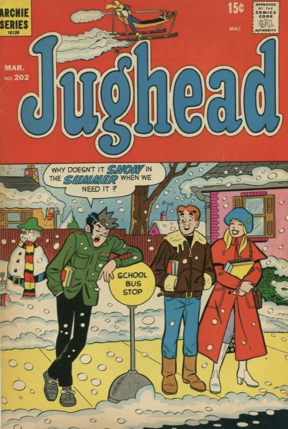
Dan DeCarlo pencils, Rudy Lapick inks
—
MORE
— BRONZE AGE BONANZA: The 1972 INDEX. Click here.
— BRONZE AGE BONANZA: The 1971 INDEX. Click here.
January 23, 2022
You put that Super-Baby cover next to either the FF or Avengers and the choice is obvious. Marvel was ages better than DC. Shoot the Ditko cover is worlds better.
January 23, 2022
I love these highlights but they cost me money! There’s always at least one book on the list I see and decide I have to have so I head over to Superworldcomics.com, highgradecomics.com or FourColorComics.com and buy it– this time around FF #121- Great Big John Cover! Curse you Dan!
January 23, 2022
Great selections. Thanks for continuing these – so much fun. The covers to those horror comics are really fantastic. The artwork is beautiful.
It really shows the diversity artists , like Nick Cardy and Neal Adams , who could show the mood and suspense of those books. Quite different from their superhero work. But there were some (like these two) who used that take to produce great work on their superhero stuff too.
Thanks for the effort on this!
January 23, 2022
Wait, what? Fantastic Four 121 – at number nine??? Really??? Not only would that cover be my #1 pick for the month, it’s in my TOP 13 OF ALL TIME. That’s one of the best Silver Surfer drawings I’ve ever seen, and Gabriel looks genuinely angry and menacing. The angles and perspective is also fantastic, and the fact that the FF are already beaten on the rooftoop as the Surfer gets there – it’s perfect! And I like that box cover era. The artists almost never stayed within the lines (so the action always looks like it’s bursting out), and the box allowed for a really cool story title at the bottom.
January 23, 2022
No mention of Wonder Woman 199??
That would be a real head-scratcher if it isn’t a mere oversight…
January 4, 2023
Some great choices here, though I’ll agree with the person who mentioned Wonder Woman #199. Though it continues a disconcerting trend of bondage in Wonder Woman covers, it’s just too darn good to ignore!