
BRONZE AGE BONANZA: The best of 50 years ago…

—
Welcome to BRONZE AGE BONANZA — our monthly series that looks at the greatest covers of the Bronze Age — exactly 50 years later. For more info on this feature, click here.
—
February may be a short month, but there was no shortage of groovy covers to gawk at in February 1972. (Ouch.)
Cardy, Adams, Kane and Ditko are only four of the big-name artists on the list, so dig the TOP 13 COVERS OF FEBRUARY 1972 — RANKED:
—
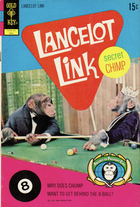
13. Lancelot Link: Secret Chimp #5, Gold Key. If there’s a Lancelot Link comic, it’ll be on this list. Every time. So figure on three more appearances down the line because this series lasted three more issues.
—
12. Fantastic Four #122, Marvel. Kind of a sentimental pick: This was the first issue of FF I ever got. Cool cover besides that if only because I love the idea of Galactus wreaking havoc in Coney Island.
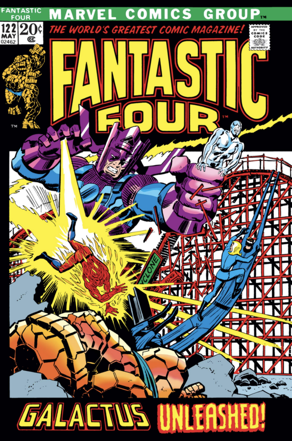
John Buscema and John Romita
—
11. Sub-Mariner #49, Marvel. Great Gil Kane construction but who am I kidding? This is all about MODOK!
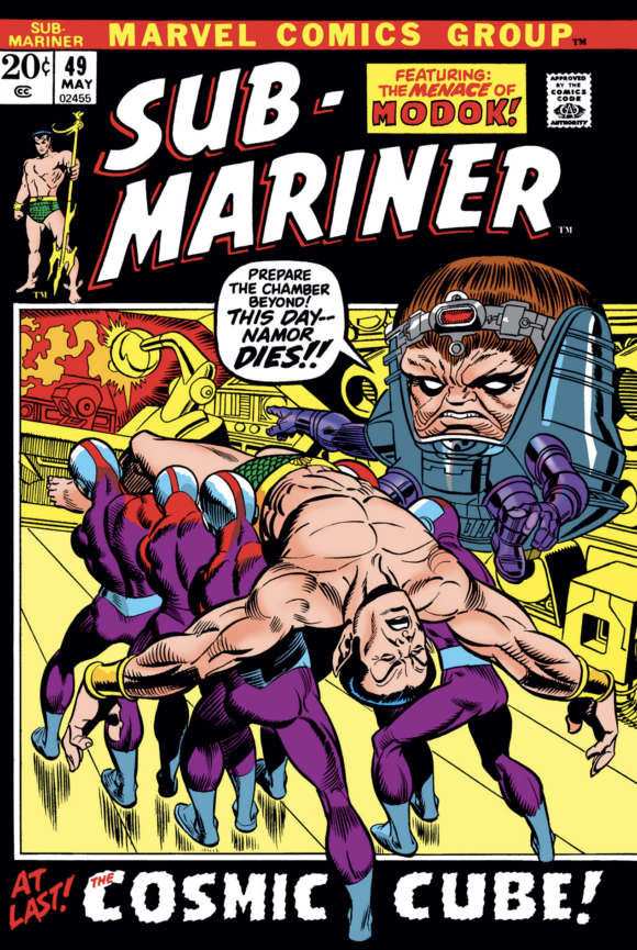
Gil Kane pencils, Frank Giacoia inks
—
10. Detective Comics #422, DC. A really dramatic, unsettling Neal Adams cover that bears little resemblance to the scene inside, in which Barbara Gordon tells her father she’s Batgirl. Also a rare case where Batman wasn’t the star of the main Detective image, though his ethereal presence still looms large.
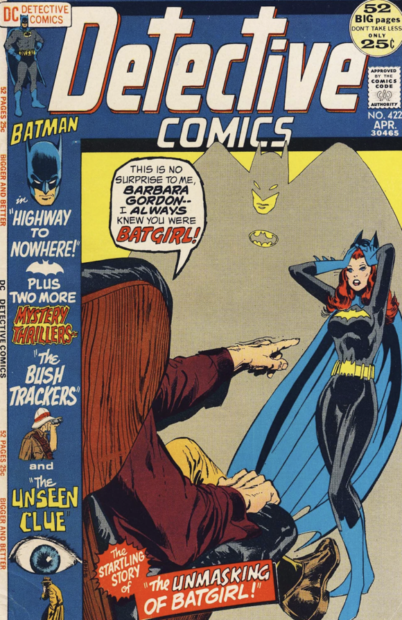
Neal Adams
—
9. The Flash #214, DC. Here’s what I said last month about wraparound covers: They have a built-in advantage. Soooo much more space to work with. But I’ll add that the extra space can sometimes be a burden. In this case, I really dig all the characters running straight at you — from speedsters to a literal lead foot. What I don’t dig is the loose blue space and uninspired vignettes on the back cover. The framing and color on the front cover are rock solid, though — except Barry Allen’s face looks weirdly off-model. Yeah, this is pretty uneven — but the cool parts are really cool.
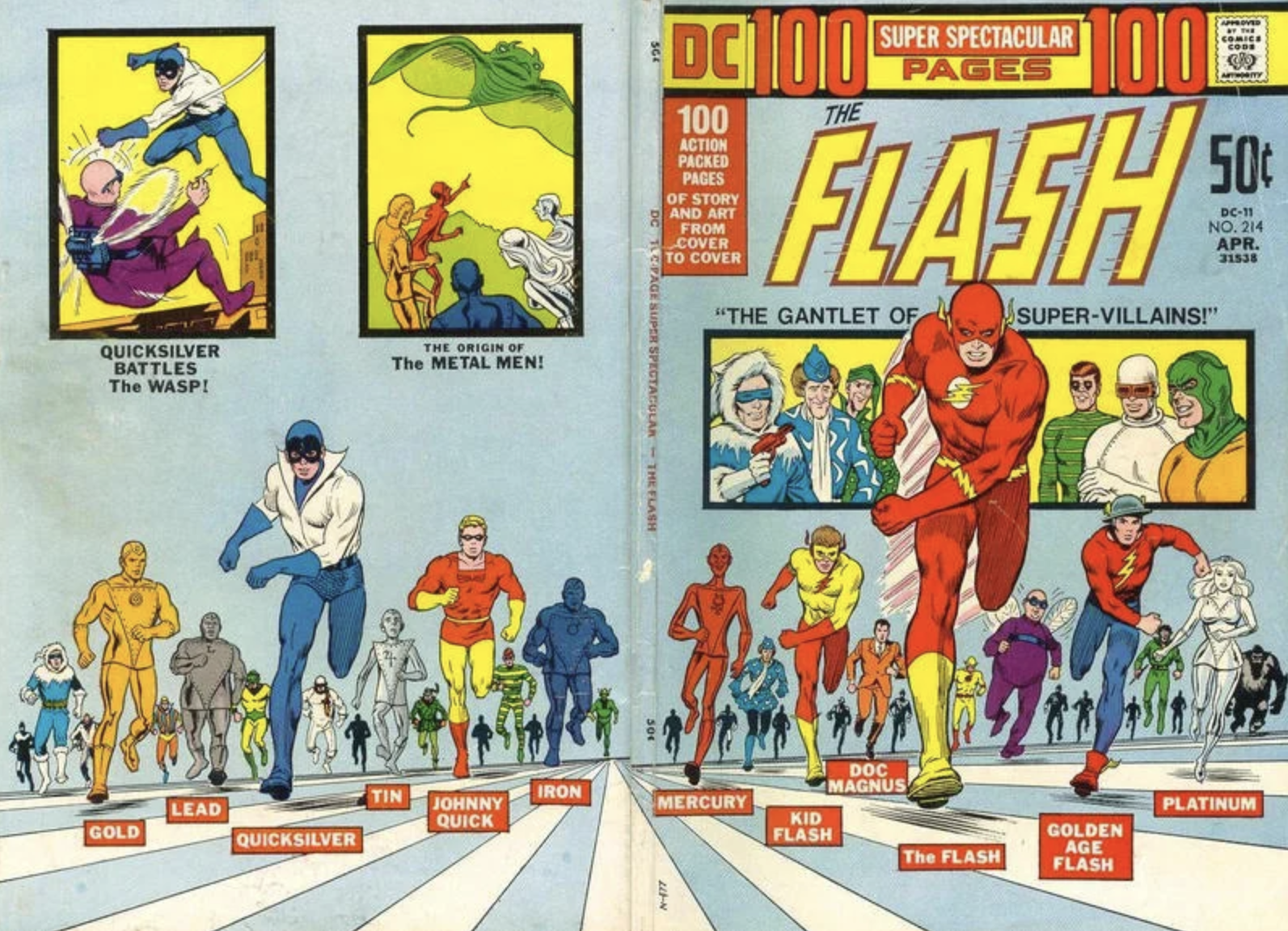
Nick Cardy
—
8. The Unexpected #134, DC. A darkly funny horror cover that looks superb. Nicely done, Mr. Cardy. And thank you, DC, for the cover blurb.
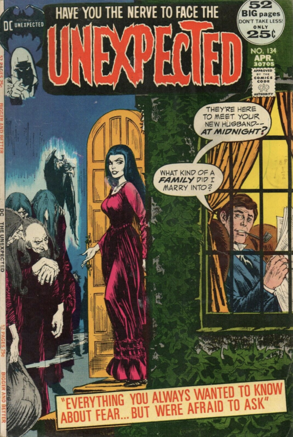
Cardy
—
7. Amazing Adventures #12, Marvel. That is a go-to Gil Kane pose, sure, but it is so beautifully rendered. Bask in that linework: Kane through the Sinnott lens, smooth as silk.
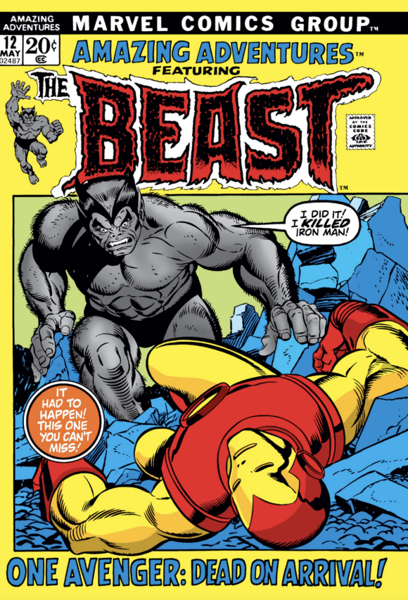
Kane pencils, Joe Sinnott inks
—
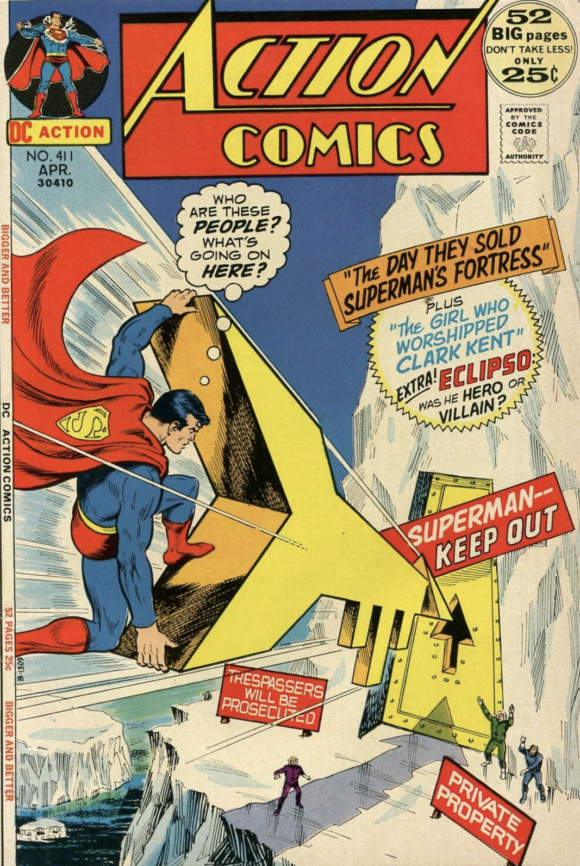
6. Action Comics #411, DC. Great layout, great perspective, great sense of movement — and a classically daffy Super-scenario. (Side note: My favorite Fortress key gag is Grant Morrison’s in All-Star Superman. If you don’t know what I’m talking about it, go read it. I don’t want to spoil it for you.)
—
5. The Forever People #8, DC. The action is subdued and in a mortal’s hands, this layout might be kind of a bore. But under Jack Kirby’s mad pencils (and Mike Royer’s thundering inks) it’s an explosion of magnificent, maleficent weirdness. Those creepy long faces. The hairy dude being paraded in stocks. The exceptionally disturbing foreground imagery. Mix it all with a spectacular color palette (by an unfairly unknown colorist) and you can visualize thousands of stoned college students just staring slack-jawed at this for hours.
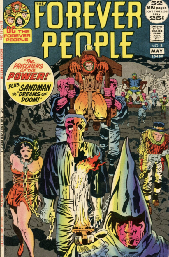
Jack Kirby pencils, Mike Royer inks
—
4. All-Star Western #11, DC. This is the first cover to full-on show off Jonah Hex and Tony DeZuniga leaves it all on the field. I don’t know what led up to this scene but whatever it was, it had to be horrible. And it wasn’t getting better any time soon.
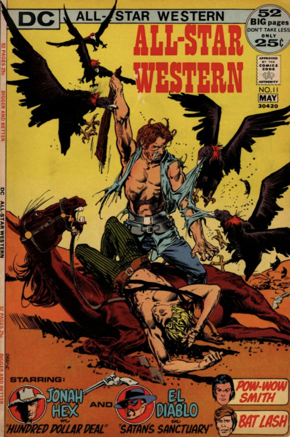
Tony DeZuniga
—
3. Tarzan #207, DC. Tarzan still had enough pop-culture cachet for this to be kind of a big deal. DC blasted this cover out everywhere it could and because of that — and because Joe Kubert was a killer artist — I’ll always see it as an emblem of the era.
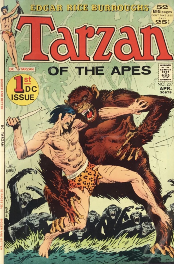
Joe Kubert
—
2. Ghost Manor #4, Charlton. One of the 1,001 things that are unjust about the comics world: that Steve Ditko isn’t as universally recognized as Salvador Dali. This batshit crazy cover belongs in a museum. And that’s the truth.
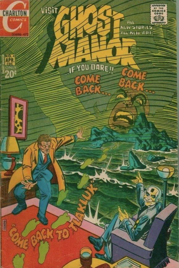
Steve Ditko
—
1. Batman From the ’30s to the ’70s, Crown Publishers. This is not the first time this cover has led a TOP 13 list and as I said then, I know it’s a bit of a cheat. This was originally a 1966 Carmine Infantino/Murphy Anderson pin-up. But to every Batman fan of the ’70s, this was the cover of the Batbible, an indispensable history of the Dynamic Duo. I couldn’t even begin to guess how many times I read it. The image itself has been marketed a million times by now but I’d argue that the prime wellspring of its enduring popularity is this beloved book.
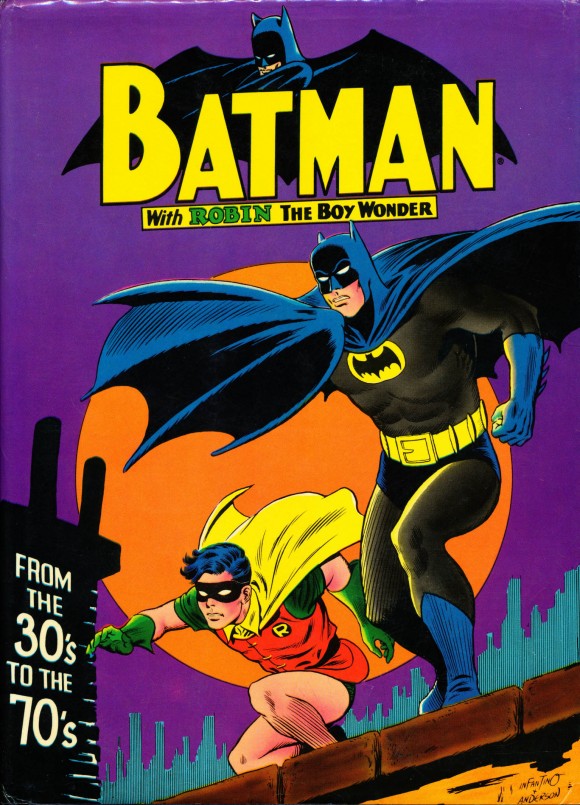
Carmine infantino pencils, Murphy Anderson inks
—
MORE
— The TOP 13 COVERS of JANUARY 1972 — RANKED. Click here.
— BRONZE AGE BONANZA: The 1972 INDEX. Click here.
February 13, 2022
Why is the Tarzan numbering start at 207? Was this a re-titled comic?
February 13, 2022
It was picked up from another publisher
February 13, 2022
No. It wasn’t a re-titled comic. DC continued the numbering from the previous publisher of Tarzan – Gold Key.
February 13, 2022
Did you notice the misspelling of “gauntlet” (gantlet) on the Flash cover? Oops 🙂
February 13, 2022
I questioned gantlet too. https://www.grammarphobia.com/blog/2006/08/is-it-gantlet-or-gauntlet.html#:~:text=A%3A%20The%20old%20%E2%80%9Cgantlet%2Fgauntlet%E2%80%9D%20distinction%20is%20rapidly%20being,involved%20in%20an%20old%20form%20of%20military%20punishment.
January 5, 2023
My understanding is that gauntlet is a medieval glove and gantlet is two rows of people dealing out punishment as you run through them.. Therefore, I believe gantlet is correct. But absolutely everybody gets that wrong. So congratulations to whoever wrote the cover copy for getting it right.
February 14, 2022
I’ve said it before… Gil Kane was the master of drawing unconscious heroes.