
BRONZE AGE BONANZA: One of the grooviest months of the year!

—
Welcome to BRONZE AGE BONANZA — our monthly series that looks at the greatest covers of the Bronze Age — exactly 50 years later. For more info on this feature, click here.
—
It’s the last month of the year — and an especially strong one, especially if you’re a big fan of Gil Kane, Nick Cardy and Neal Adams. But those aren’t the only big names, of course.
And don’t forget: At the end of this month, we’ll be doing the TOP 13 covers for ALL of 1971.
But until then, dig the TOP 13 COVERS OF DECEMBER 1971:
—
13. Girls’ Love Stories #166, DC. Two things: I LOVE that groovy screen next to the woman in the wheelchair. And it certainly looks like Nick Cardy drew each funky design, which makes it that much cooler. But here’s something else: When researching this one I kept finding the notation “wheelchair cover,” which I didn’t know was a thing. Also, I don’t think Margo and Chuck should marry.
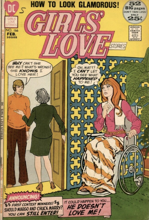
Nick Cardy
—
12. World’s Finest #209, DC. The Tempter really shouldn’t give Superman and Hawkman that much trouble but Neal Adams and Dick Giordano make this one of the most memorable Superman team-up covers. That’s how it’s done folks: Work with what you’ve got.
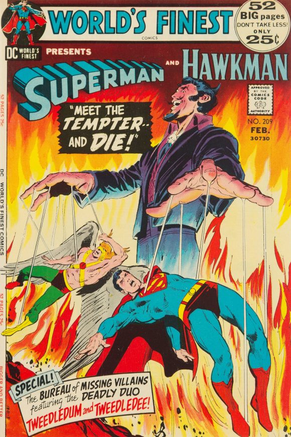
Neal Adams pencils, Dick Giordano inks
—
11. Superman #248, DC. One of the classic images of Luthor before the Jumpsuit Era. Also, post-apocalyptic Superman was really a thing in the early ’70s. Also, also: I didn’t know the Flatiron Building was in Metropolis. Cool!
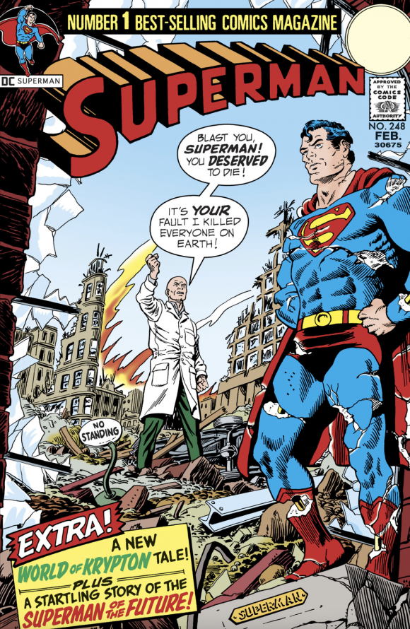
Carmine Infantino pencils, Murphy Anderson inks
—
10. The Amazing Spider-Man #106, Marvel. Just another classic Spidey cover pencilled by your friendly neighborhood John Romita.
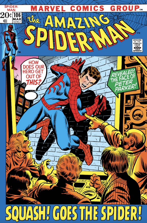
John Romita pencils, Frank Giacoia inks
—
9. House of Secrets #96, DC. Stop and take a moment with this one, a beautifully illustrated piece by Bernie Wrightson. I’m actually most impressed by the desk details — particularly the demonic gargoyles at the corners and the fringe on the lampshade. That’s hardly the point of the cover but those kinds of touches are what separate a master like Wrightson from so many others. Furniture matters.
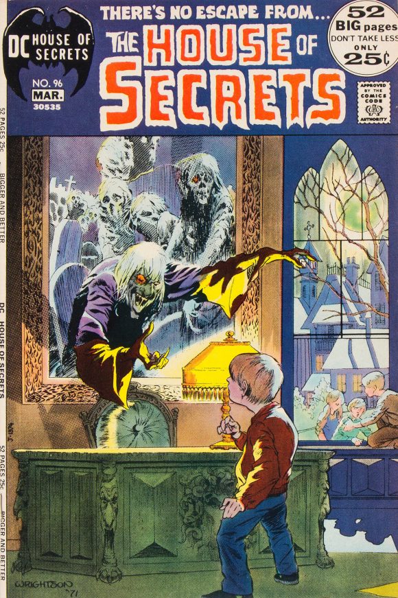
Bernie Wrightson
—
8. Amazing Adventures #11, Marvel. Lo! The first appearance of furry Beast! And Gil Kane again proves he was the artist best equipped to manage the space constraints of Marvel’s “framed” covers of the era. Breaking the borders makes hairy Hank look absolutely huge with almost Hulk-like power. But the underrated star of the cover is the Beast’s seething, cockeyed floating head to the left of the logo.
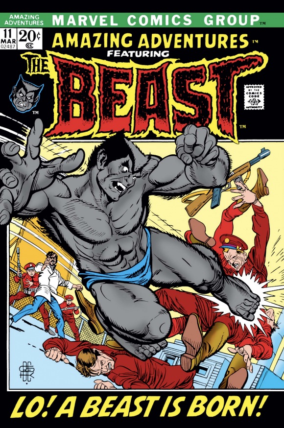
Gil Kane pencils, Bill Everett inks
—
7. Superman From the 30s to the 70s, Crown Publishers. I intentionally put this one smack in the middle of the list because I think you could make an argument that it should be much higher or much lower. On the plus side, it’s one of the most iconic covers of the ’70s — fronting what was essentially the Superman bible for an entire generation of kids (myself included). On the other hand, it’s a paste-up, albeit a wonderful one. So I’m splitting the difference and you can decide where you’d rather see it.
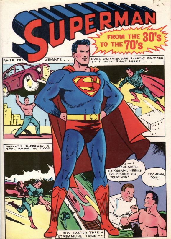
Main figure probably by Wayne Boring. Background by Joe Shuster.
—
6. Conan the Barbarian #14, Marvel. Oh, I dunno. Only one of Barry Windsor-Smith’s best-known Conan covers is all.
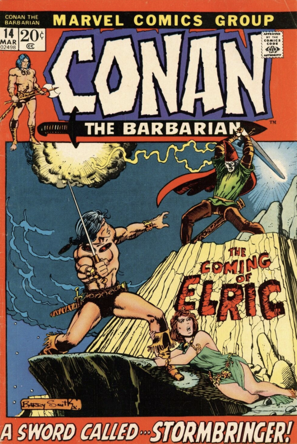
Barry Windsor-Smith
—
5. Batman #239, DC. I don’t read many modern comics anymore. I bear them no ill will like some do; I recognize that most comics today aren’t written for me and that’s fine: I’m glad the publishers are focused on developing younger markets. But here’s a little story: The other day, I picked up a Batman comic by a creator I really like and then put it down about six pages in because, as is so often the case, the Dark Knight was portrayed as an unduly harsh taskmaster with little empathy. That’s a mistake so many storytellers make.
The best Batman is grim and determined but he’s not cruel and unfeeling. He’s capable of great kindness. And great talent can bring that out. Adams (inked by Giordano) takes what could be really silly or mawkish or satirical — Batman dressed as Santa, visiting a poor little girl and her down-on-his-luck dad — and makes it meaningful and moving. That little girl has no idea what kind of joy is knocking at the door. And it’s not Superman or Wonder Woman on the other side. It’s Batman — and you buy it all the way. Plus, you just know that Bruce Wayne’s business card is in that sack to help Dad get a job. Bonus points for the lovely, seasonal green, red and white logo. A lesson in the meaning of Christmas — and Batman.
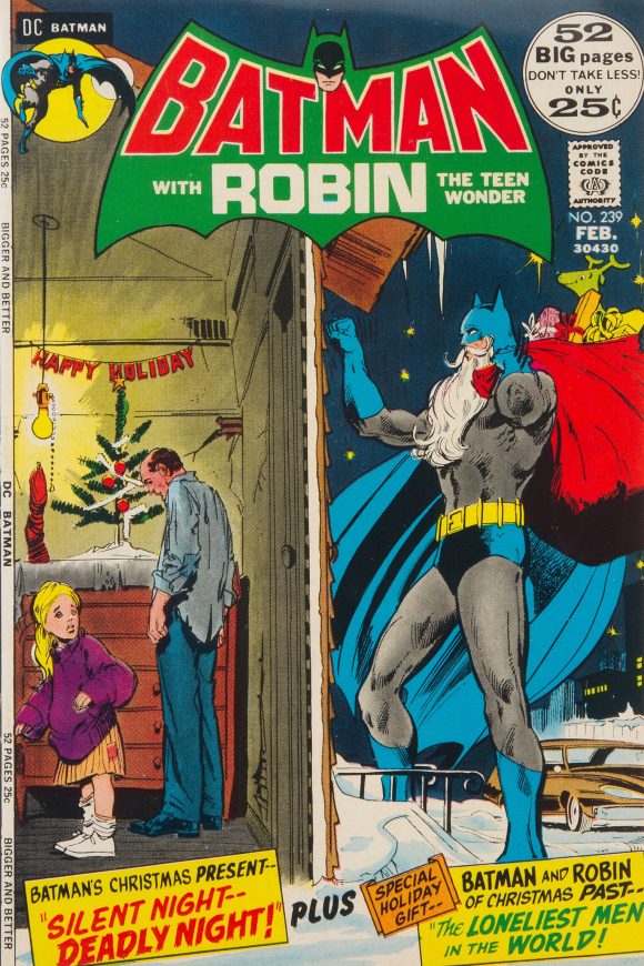
Adams and Giordano
—
4. The Avengers #97, Marvel. The finale of the Kree-Skrull War — and a spotlight on the Timely heroes. It’s another Kane joint inked by Everett, whose contribution here is particularly noticeable on the Sub-Mariner, whom he created 32 years before.
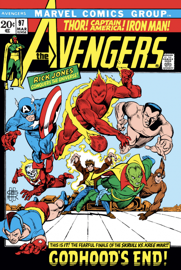
Kane and Everett
—
3. The Brave and the Bold #100, DC. This might be the first B&B I ever got — and I remember being terrified that Batman might not make it. Plus, they also squeezed in four (!) floating heroes on the left, not including the Batman spotlight — and it looks terrific. Great main image by Cardy, great packaging overall and a great choice using black as the frame color.
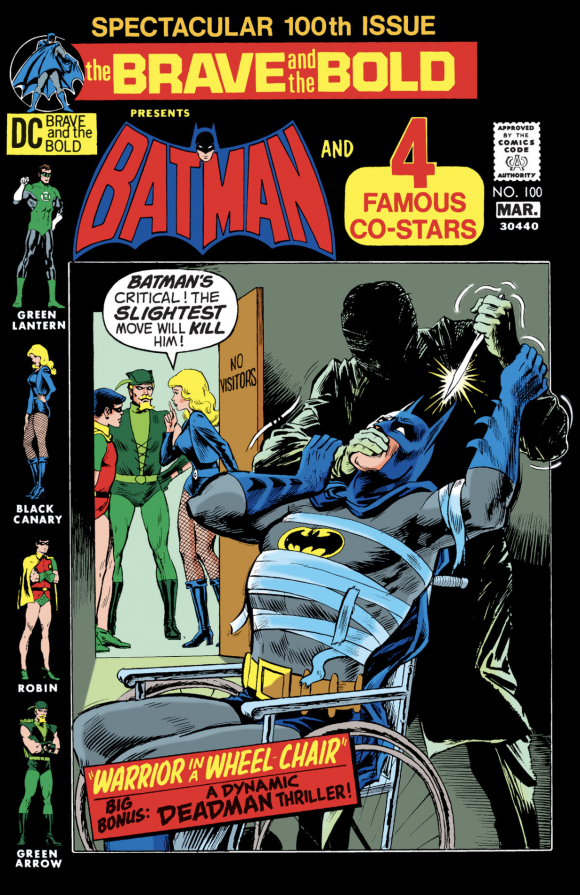
Cardy
—
2. Sub-Mariner #47, Marvel. Kane and Everett again! Namor is a supreme badass here: You just know that Doctor Doom thought he had the upper hand but Subby overpowered him anyway and, with no effs to give, hurled them both out of the window. And Kane manages to make the metal-masked Doom look terrified! You don’t mess with the Sub-Mariner.
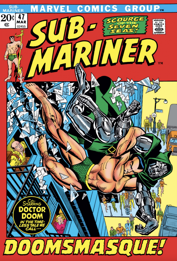
Kane pencils, Everett inks, with Romita alterations
—
1. Superboy #182, DC. Maybe I’m slightly biased: This was one of the earliest comics I got and I put the cover on my bedroom wall. Nevertheless, this is a thing of beauty. First, I’m a total sucker for covers that utilize “negative” imagery. Second, young Bruce’s unbridled rage is palpable (and he has a Robin haircut!). Most importantly, Cardy sells it. This is clearly a stupid idea for a story (sorry) but this cover demands that you buy it and read it, regardless. Because you just have to know what this is all about. A knockout.
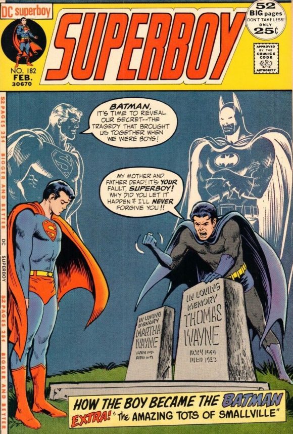
Cardy
—
MORE
— BRONZE AGE BONANZA: The 1971 INDEX. Click here.
— The TOP 13 COVERS of NOVEMBER 1971 — RANKED. Click here.
—
Sources: Mike’s Amazing World of Comics and the Grand Comics Database.
December 5, 2021
These 1971 covers are absolutely outstanding!
December 5, 2021
The interlocking initials of the artists on the Kane-Everett cover are cool.