
BRONZE AGE BONANZA: A significant month in comics history…

—
Welcome to BRONZE AGE BONANZA — our monthly series that looks at the greatest covers of the Bronze Age — exactly 50 years later. For more info on this feature, click here.
—
We’ve been doing this feature for almost a year and a half and one thing’s clear — some months are better than others. No surprise, of course.
Still, it really jumps out at you when you look at a month and see that there were a number of all-out classics that came out at the same time.
This was one of those months — so dig THE TOP 13 COVERS OF APRIL 1971 — RANKED.
As usual, these are based on sale dates, not publication dates.
Far out.
—
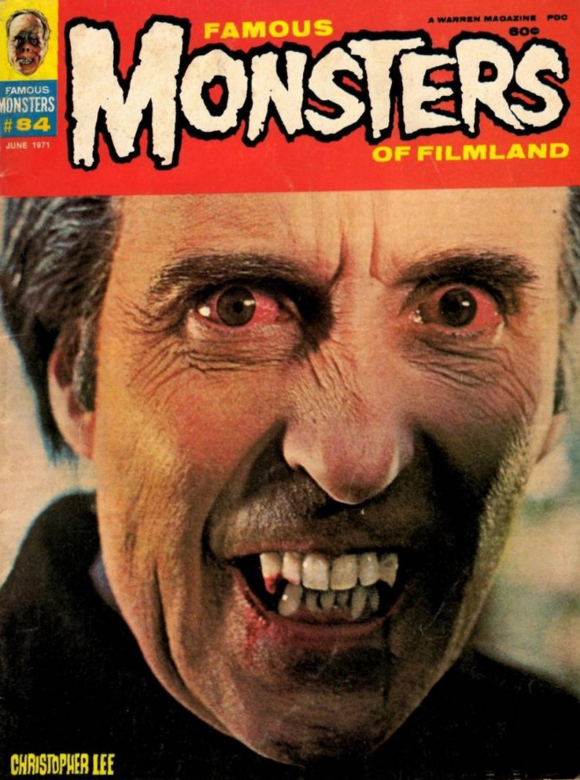
13. Famous Monsters of Filmland #84, Warren. I love Christopher Lee, and this is a damn great pic. Great crop. Great blood red banner. This must have freaked the hell out of anyone thumbing through the racks.
—
12. Edgar Rice Burroughs Tarzan of the Apes #200, Gold Key. George Wilson represent! But, jeez, Tarzan, punching out a chimp? Seems a little excessive, no? But at least you’re not using a machine gun.
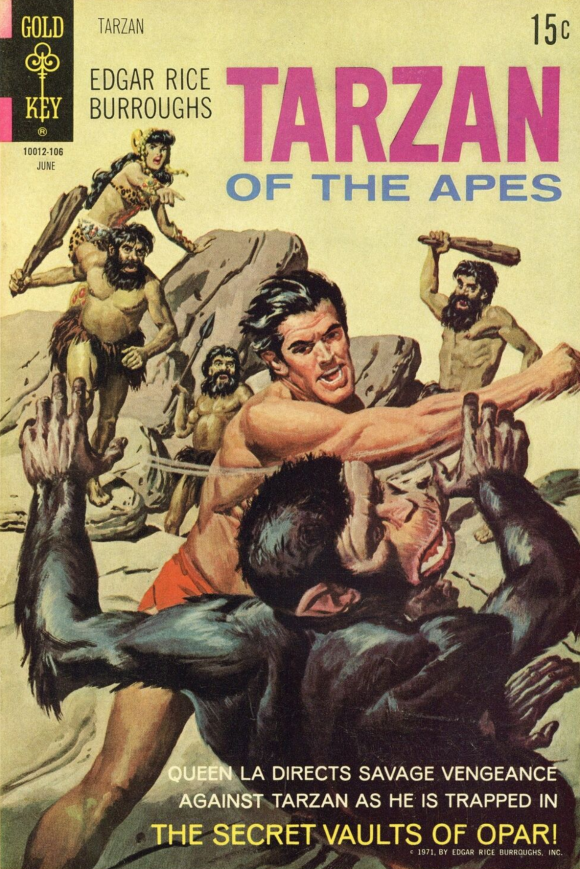
George Wilson
—
11. Iron Man #39, Marvel. Herb Trimpe is well-loved by Marvel fans but I can’t help but think he would have been an even bigger deal if he developed this more offbeat style. There are creeping shades of Moebius here, which I really dig.
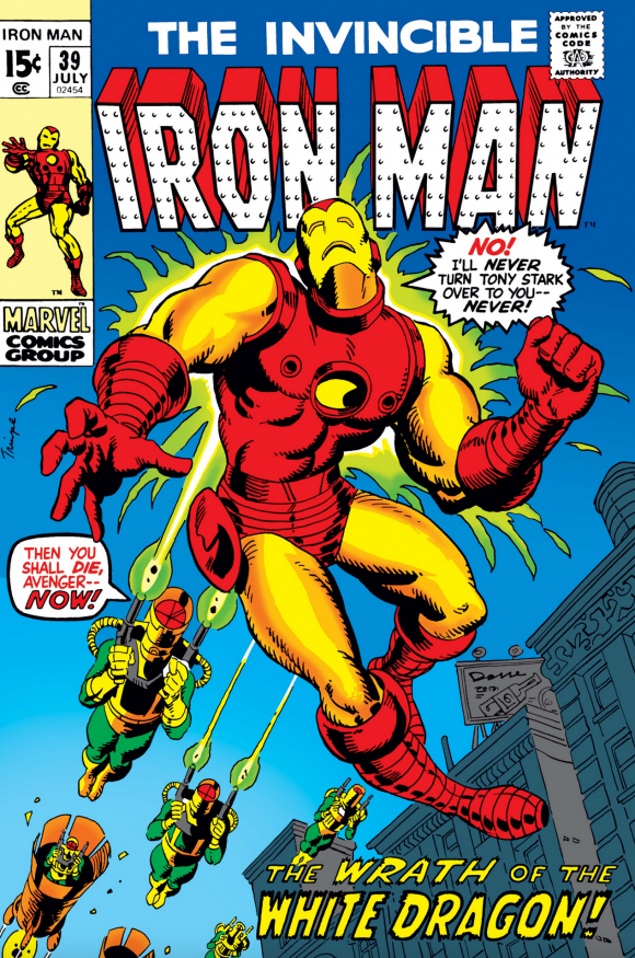
Herb Trimpe
—
10. The Many Ghosts of Doctor Graves #26, Charlton. Steve Ditko’s ’70s Charlton horror covers were mad, baby, mad!! But maybe the local Kentucky folks should do something about Cletus and Shep. I mean, if their deadly shenanigans are well known, perhaps they should be locked up? Just a thought.
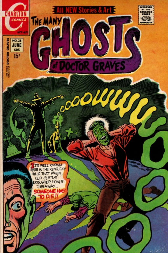
Steve Ditko
—
9. Nightmare #4, Skywald. I don’t think you’ll find a more 1971 cover than this one. Feel free to insert your own cheap Keith Richards joke.
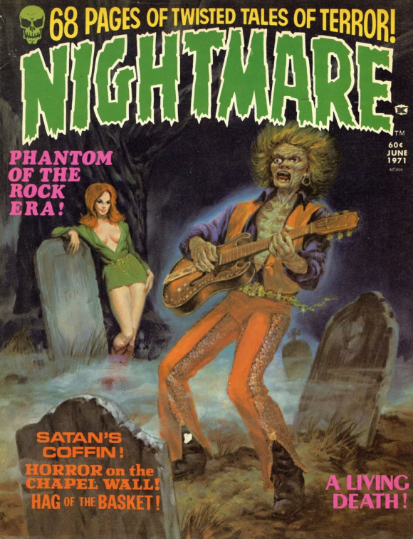
Harry Rosenbaum
—
8. Superman’s Pal Jimmy Olsen #138, DC. Jack Kirby was going through a serious montage-cover phase, but this one jumps out because it’s Kirby inked by Neal Adams. That’s like Godzilla and King Kong teaming up, even if their styles are so divergent.
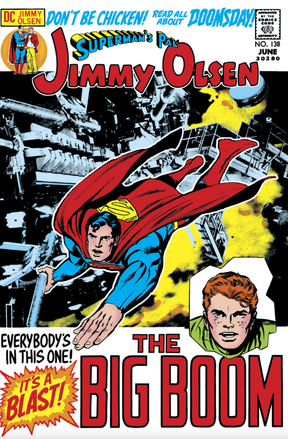
Jack Kirby pencils, Neal Adams inks
—
7. Adventure Comics #407, DC. Pro cover, great perspective, love the reflection in the mirror. But let’s face it, this one’s all about that outlandishly fab outfit.
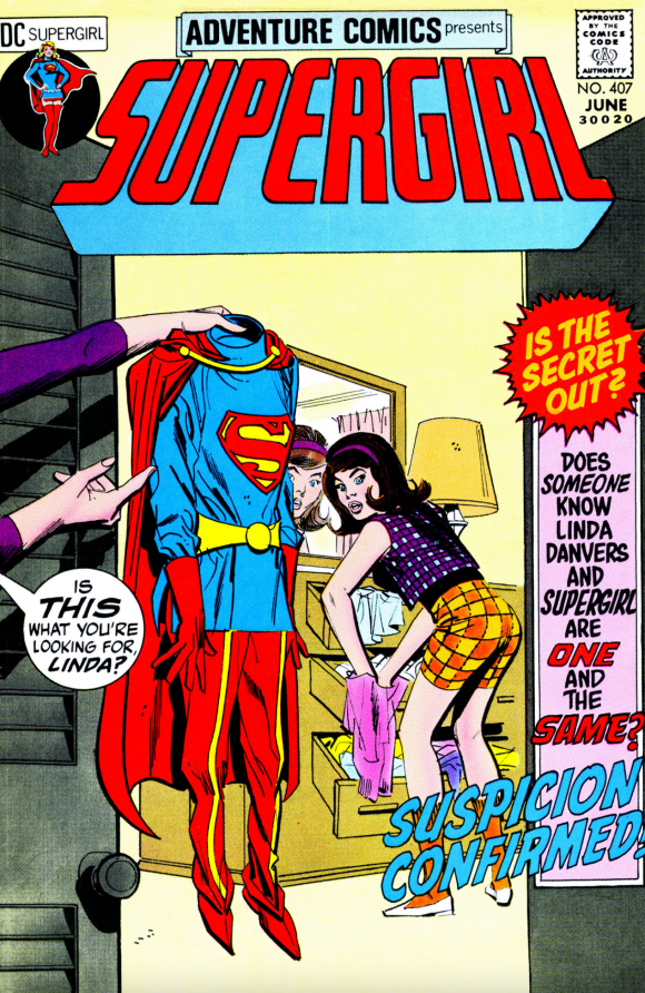
Mike Sekowsky pencils, Dick Giordano inks
—
6. Superman #238, DC. Easily one of the best-known Superman covers of the ’70s. Simple as that.
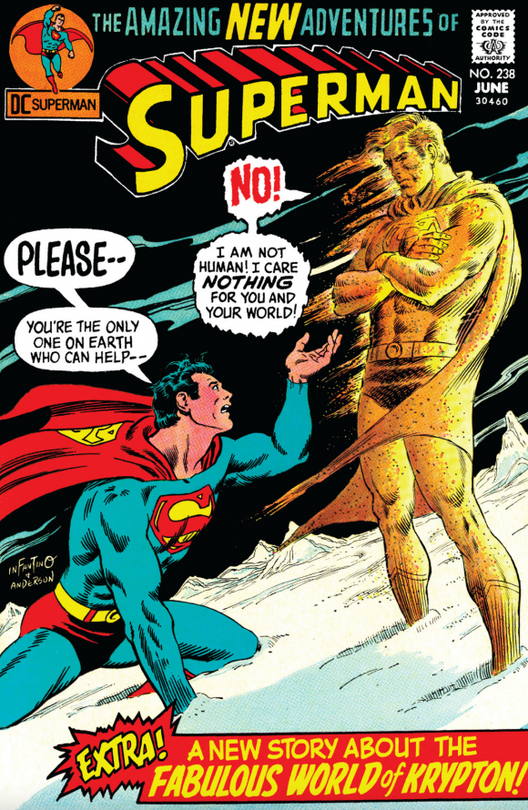
Carmine Infantino pencils, Murphy Anderson links. (Though it may just be an Infantino layout.)
—
5. The Amazing Spider-Man #98, Marvel. John Romita’s my fave Spidey artist, I dug Ross Andru’s work and I certainly appreciate Steve Ditko’s vision. But I can only imagine what a, say, five-year Gil Kane run on Spidey would have been like. He was born to draw the webslinger. I’ll take what he gave us but man, I wish there was more.
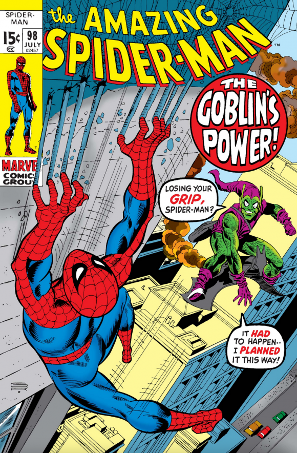
Gil Kane pencils, Frank Giacoia inks
—
4. The Avengers #89, Marvel. Conflict is the key to drama and comics artists routinely try to convey pain, anguish and fear. It’s foundational. But rarely have I seen a cover that succeeds on all those points on such a visceral level. One of Sal Buscema’s finest efforts.
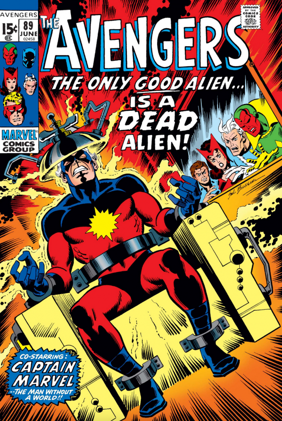
Sal Buscema
—
3. Fantastic Four #112, Marvel. Here’s the other side of the coin: The pitch black background puts all the focus on the nanosecond before these two goliaths land their massive punches. That focus and anticipation makes this probably the greatest Hulk vs. Thing cover ever. John Buscema and Frank Giacoia, ladies and gents…
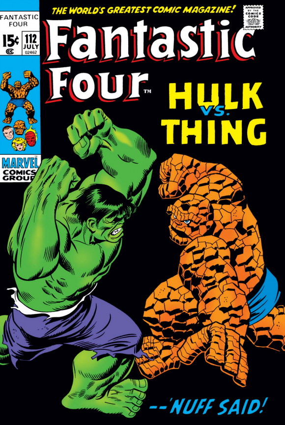
John Buscema pencils, Giacoia inks
—
2. House of Secrets #92, DC. Swamp Thing’s first appearance — or at least the proto version. I don’t think I can add anything to what’s been said so many times by so many others over the last five decades, so I’ll just encapsulate it all by pointing out what you know: This is a bona fide classic cover and one of the most famous in comics history. But how can it only be No. 2…?
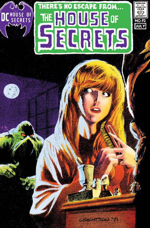
Bernie Wrightson
—
1. Batman #232, DC. This is why. Referring to an artist “at the height of their powers” is such a well-worn cliche that I rarely use the term. But Neal Adams’ landmark cover introducing Ra’s al Ghul is an exceptional example. This is the work of a visionary artist who married groundbreaking technique with startling imagery. If you’re going to introduce one of comics’ greatest villains, this is how you do it. Absolutely, startlingly brilliant. (By the way, the issue came out 50 years ago last week. Click here for an EXCLUSIVE column about it, by Adams himself.)
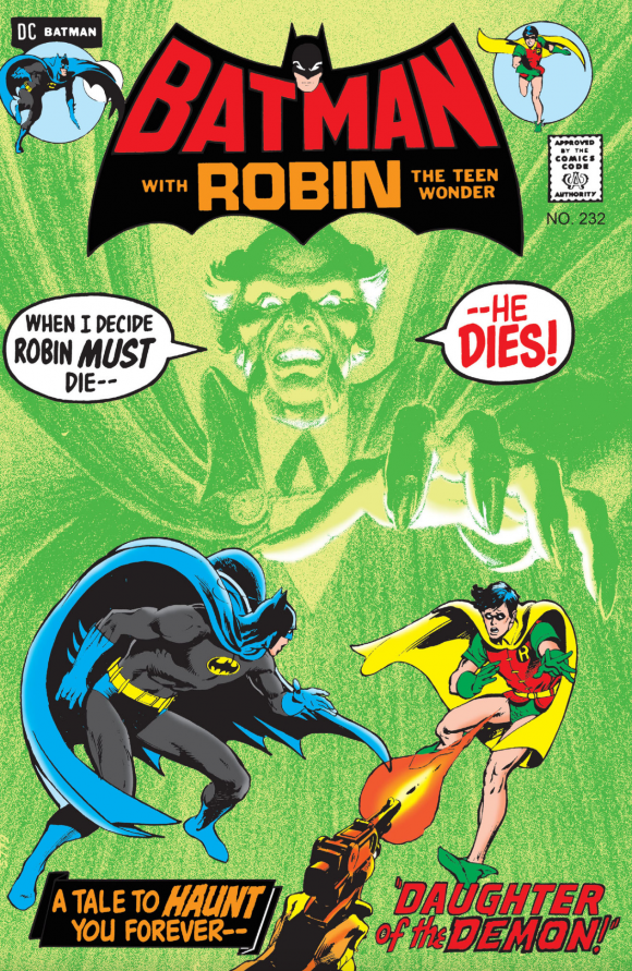
Neal Adams
—
MORE
— BRONZE AGE BONANZA: The 1971 INDEX. Click here.
— The TOP 13 COVERS of MARCH 1971 — RANKED. Click here.
—
Sources: Mike’s Amazing World of Comics and the Grand Comics Database.
April 25, 2021
Wow! There’s some very big books there.
April 25, 2021
That Iron Man cover by Trimpe was one of about a dozen I got signed by him just before his death. I asked him about the cover because it seemed like Iron Man was a Macy’s Parade balloon and way too cartoonish. He winced at the cover, not sure he’d even done it, and finally said that it had been a last minute rush job. I told him that I’d grown to love it and that it was totally unique among the other Iron Man covers. It looks even better on this page.
April 26, 2021
Huh, I always thought that Iron Man cover was Marie Severin. I’ve noted in the past that I love how it looks almost like an underground comics cover. Of these books, I only snagged five of them off the spinner rack, but oh, man, what good times. The introduction of Swamp Thing AND Ra’s Al Ghul in the same month! And my favorite era of Spider-Man!
April 26, 2021
Yeah, it was a helluva month. That Iron Man cover is a little trippy and I dig it. Would have liked to see that style more.
April 26, 2021
I never noticed Spidey is missing the spider-symbol on his back on the cover of ASM #98. But now I can’t unsee it, and you can’t either!
The Ra’s intro cover is such a game changer. I think the treasury reprint trumps it, but barely. I like the color here better, though. And even though we didn’t know about it then (and I don’t think Adams, O’Neil or Schwartz did either), it evokes the Lazarus Pit colors.
As a Kentucky native with a beagle, I can say the bay of a hound dog can be quite haunting…and infuriating at times! It may indeed signal death!
April 29, 2021
The introduction of Swamp Thing and Ras Al Ghul and the final issue of Stan Lee’s greatest Green Goblin story all in one week. It is possible that we call the wrong era the golden age of comics.