A fitting choice for October 31, doncha think?

—
UPDATED 10/30/16: Batman #237 is the greatest Halloween comic book ever. Simple as that. So with Halloween upon us, it’s time to once again present this interview with artist Neal Adams about this gripping classic. And if you’d like to see what writer Denny O’Neil has to say about it — and you do — click here.
—
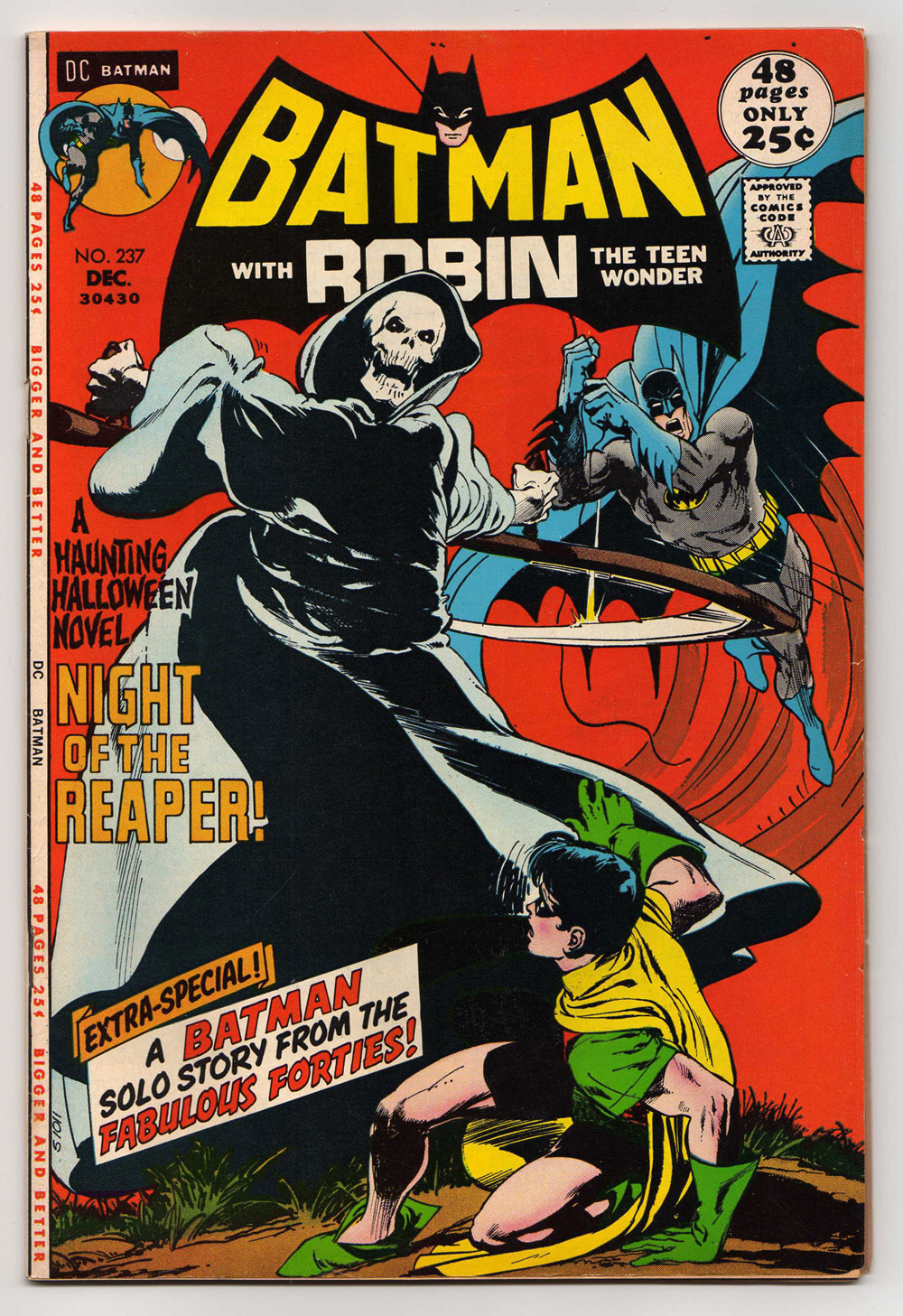
The cover to Batman #237 is one of those resonant pieces of art and it just might be the very first comic book that jumped out at me on a spinner rack, when I was about 4 or 5 years old.
Behold:
Jeez, just look at it.
It’s such a startling image and that red just pops out at you.
Having been weaned on Adam West’s Batman, this image was really unsettling to Li’l Dan. I remember having a visceral reaction: Robin really seemed like he was in serious danger and I wasn’t sure Batman was going to get there in time.
I got the comic and the concrete was poured for my path down decades of comics fandom.
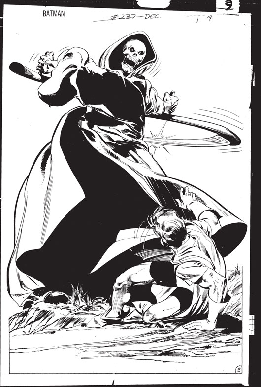
“Well, the concept behind the cover was first of all to make a cover doing horror,” Adams said in our lengthy interview at his Manhattan studio. “I had learned at DC a magical lesson: You don’t actually do the horror — you imply it’s going to happen. It’s going to happen in about two seconds, but not now. So I honed that weird craft in their House of Mystery stories.”
He explained that a lot of effective horror imagery comes from the notion of putting a youngster in peril while a cohort, particularly an older one, just might not be able rescue him.

“So if we put kids in questionable positions where adults can go, ‘Oh my God, get out of there!’ you’re implying a horror that doesn’t exist,” he explained. “Spooky, all these things are spooky, but they never deliver. It’s enough to be spooked. Well, take that same approach to this. Batman is trying to save Robin, who is in danger of this Grim Reaper. The younger one, Robin, is in danger. … The greater danger for Batman is not that so much his life is being threatened but Robin’s life is being threatened. Very good idea.”
In addition to the context of the image, its composition — a classic A shape — gives the cover power:
“It’s one of those things you have to look at. The A shape is right there and then you throw the red behind it to distract you. … Let’s leave the A shape there as a ghost and put the red around it — which is totally unrealistic and highlights the fact that it’s a ghost and you have to look at him. We are surrounding him with red and now making him scary. Yeah, and you look at that dark space in the middle and you go like, ‘F—, what is that?’ You know, it’s not just the sides, you go into the black space there and you get sucked up in there. … It’s amazing how these things relate back to one another. Red is the color. Red, that’s the big one.”
—
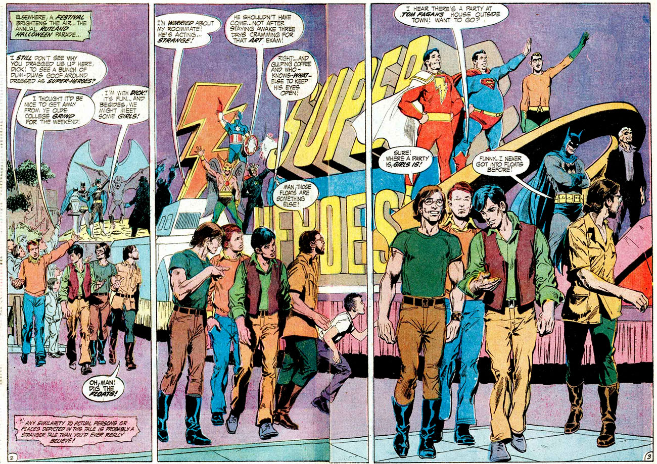
The story itself — Night of the Reaper! — was written by Denny O’Neil and it took place at the real-life Halloween Parade in Rutland, Vt., an event that traditionally featured revelers in superhero costumes. The parade still exists, though it’s more generalized now. But back in the ’70s, it was a thing for comics creators to check it out and party, so the event made its way into comics.
I LOVED this spread. I just thought that was the greatest parade you could possibly have.
“The guys used to go up there and they would wander through the woods and do all this stuff,” Adams recalled. “Denny made a full story out of it. And that’s one of Denny’s richest and fullest stories.”
—
NEXT: Orson Welles stops by. Click here.
—
MORE
— The complete NEAL ADAMS INTERVIEWS Index of stories. Click here.
— DENNY O’NEIL on BATMAN #237. Click here.


October 31, 2013
Good stuff!
What year is that from? Even though I was watching Batman reruns, I didn’t start reading Batman until like ’74 or ’75…
October 31, 2013
Thanks! Cover-dated Dec. 1971, which means it came out a few months prior. Obviously, it was timed for Halloween, so …
November 1, 2015
Great job, Dan! I loved the Rutland parade mentions in the comics. They lays made the parade seem SO cool.
November 16, 2014
i have this book and dont get me wrong, its fantastic BUT the first time i saw it and many times since, my initial visual reaction is that the ghosts arms just dont look right (yeah, i know, im critiquing Neal Adams, its ridiculous). hear me out though – while it may be by venerable mr Adams it doesnt mean its perfect. if you stare at it the right way it seems like the figure is facing forward and has his arms spread wide, instead of twisted around swinging the blade. the front-forward facing head doesnt help either it should be more 3/4 view to add a twisting to the figure… i just dont think seeing both arms like that would be possible, it doesnt look right to me.