Neal Adams’ miniseries features a wonderfully old-school banner…

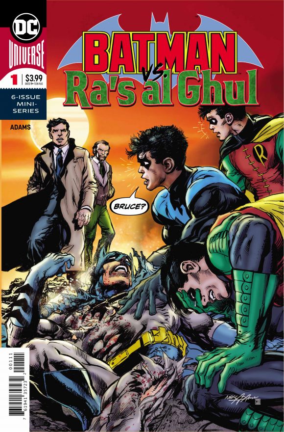
Neal Adams’ new miniseries, Batman vs. Ra’s al Ghul, debuts Sept. 4 after a brief delay — and just dig its groovy logo:

Neat cover, too!
Oh, see now that’s just lovely.
Of course, the Batman part of the logo is a direct riff on the Bronze Age emblem that was introduced with 1972’s Batman #241 and ran through 1986’s Batman #399.
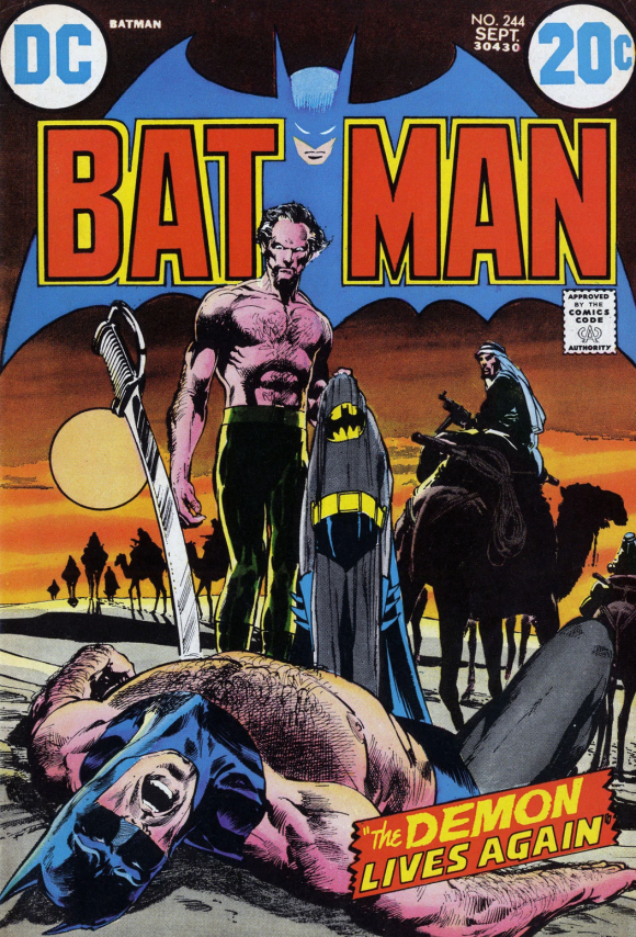
Not only that, the color palette apes Adams’ classic Batman #244 – the climactic chapter of the Darknight Detective’s first Ra’s al Ghul saga:

By the way, click here for Adams’ own commentary on that classic cover – and the very specific reason the logo featured that coloring. (It’s well worth your time.)
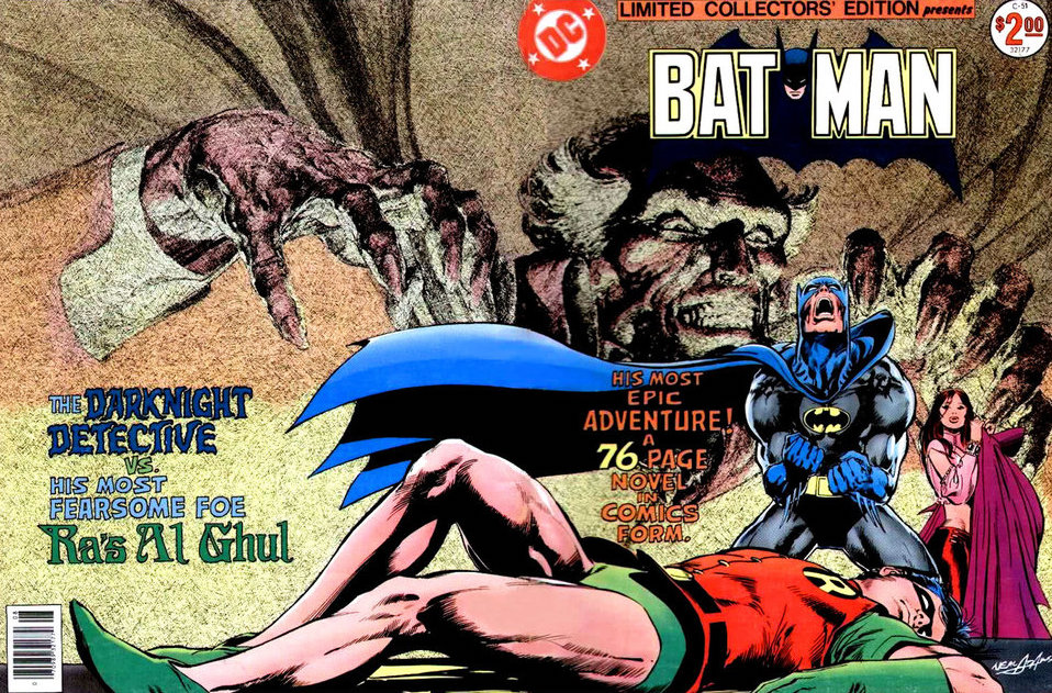
Oh, and the Ra’s al Ghul part of the new emblem? That green is reminiscent of the typeface used on Adams’ epic cover for Limited Collectors’ Editon #C-51:

If you’d like to see Adams’ commentary on that magnificent cover – and you do – click here and here.
Anyway, it’s remarkable what a great logo can do, isn’t it?
We’re just getting started, by the way. Come back Friday for an EXCLUSIVE PREVIEW of Batman vs. Ra’s al Ghul #1. (UPDATED: Here it is — click here to check it out.)
In the meantime, click here for our review of the Batman #232 Facsimile Edition, which was released last week in connection with the miniseries.
—
MORE
— BATMAN’s Complete, Original RA’S AL GHUL SAGA Returning to Print — At Last. Click here.
— The 13 Greatest BATMAN Logos — RANKED. Click here.

August 29, 2019
I’m so ready to read “Batman vs. Ra’s Al Ghul.”