13 QUICK THOUGHTS: Clothes do not always make the hero …
—
UPDATED 8/18/18: We’re on semi-vacation, so we’re re-presenting some of our faves from the 13th Dimension vaults. Summer reruns, if you will. These are stories that stand up as well today as they did when they were first published, so enjoy. And don’t forget to put on some sunscreen! — Dan
—
A few weeks back, I put together a piece ranking the 13 Greatest Superhero Designs (click here) — and as I was doing it, I already knew a sequel was going to rear its head. (Sequels, actually.)
Because if you think of the best, you always end up thinking about the flip side: In this case, if not the worst, then certainly the goofiest.
I mean, when you get right down to it, the whole notion of somebody dressing up in a costume to fight crime is inherently silly. So it’s even made more so when you cannot possibly imagine taking someone seriously if they actually wore the outfit we see on the page (Alex Ross’ paintings notwithstanding).
Now, the thing is, there have been far more oddball superhero designs in comics going back 75-plus years than there have been great ones, so I’ve put together a set of sometimes-contradictory guidelines:
The costume has to have stood the test of time and (for the most part) can’t be a faddish, momentarily lapse like, say, Electric Superman. Or all of the ‘90s. Or all of the armor and seams of the New 52.
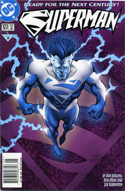
Generally speaking, these have to be concepts that have some symbolic, long-lasting value — which is why I’m focusing mostly on the Big Two. Still, there are some very of-the-time designs mixed in because sometimes you just can’t keep a silly idea down…
Here we go:
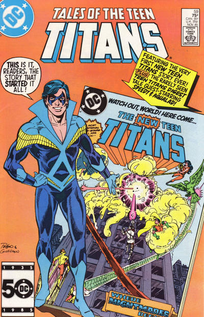
13. Disco Nightwing. Yes, it made my list of 13 Great Superhero Designs — but you cannot deny the inherent goofiness of this ensemble. That collar! That plunging neckline! Great hair, though.
—
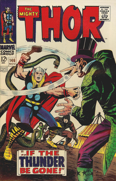
12. Thor. Yeah, I know, you’re going to come after me for this, but I never took the God of Thunder seriously. It’s not just the florid language — it’s those clothes! Even Iron Man made fun of him in The Avengers film.
—
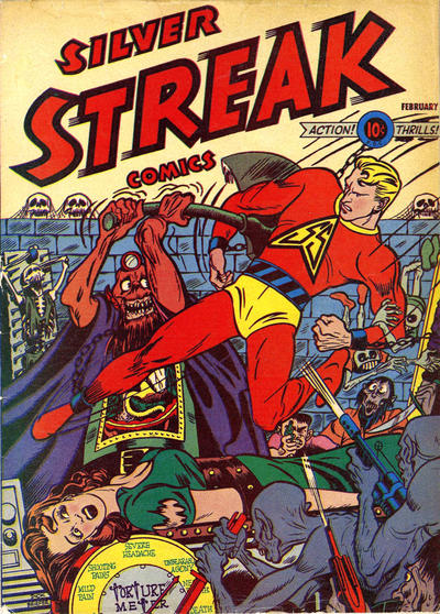
11. Silver Streak. I made sure on the list of 13 Greatest Superhero Designs to include at least one Golden Age superhero not from Marvel or DC. Same here. And I’m picking the Silver Streak because for the life of me, I cannot understand how he has that name — and an outfit with no silver on it.
—
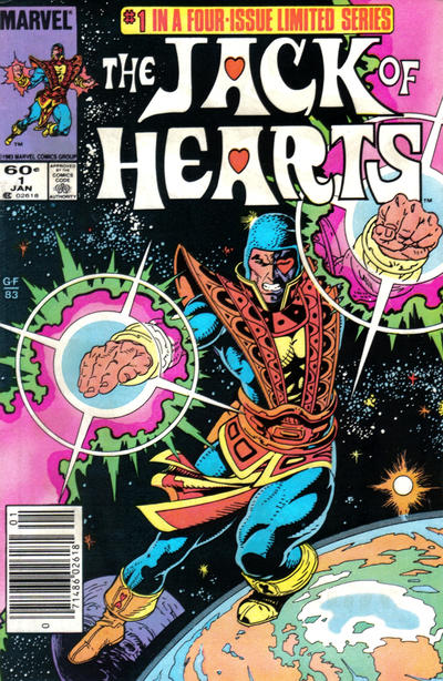
10. Jack of Hearts. There is so much going on here. So much. So much wrong.
—
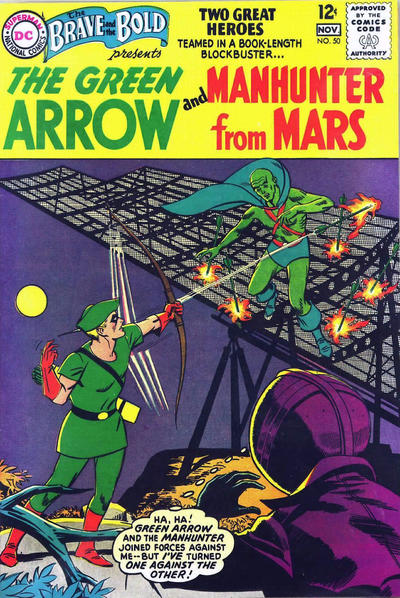
9. Martian Manhunter. Poor J’onn J’onzz. Can’t sell a comic. Retconned out of the original Justice League. Maybe if he only had a better costume. Nah, that can’t be it either, because he looks silly whenever they try to change it.
—
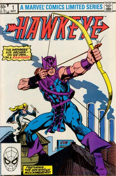
8. Hawkeye. Imagine Clint Barton actually wearing this on the street. No wonder he always hits his targets: Everyone’s doubled over with laughter.
—
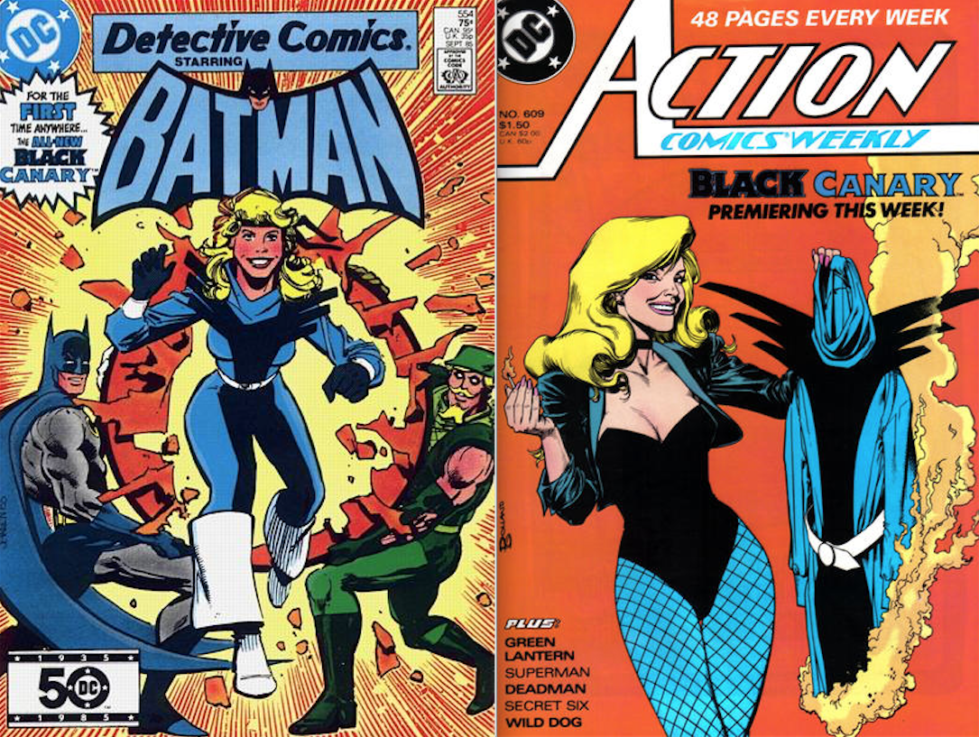
7. Black Canary (mid-’80s). I know this one of those faddish, of-the-moment designs, but still. I couldn’t leave it out.
—
6. Golden Age Flash. Barry Allen and Wally West’s classic costumes both made the 13 Greatest list — and each improved on this silliness. Look, I know people love Jay Garrick, and the outfit is OK from the neck down. But that helmet takes you right out of it. Sure, it’s fun for nostalgia’s sake. But that doesn’t mean it’s not silly.
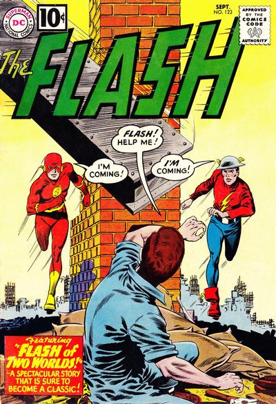
There is just no comparison.
—
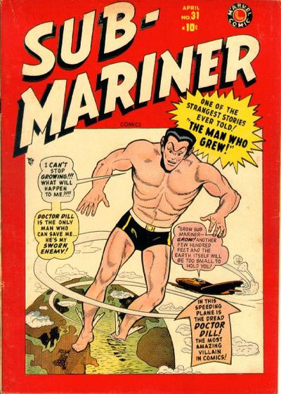
5. Sub-Mariner. It’s a dude in a bathing suit. And while that actually makes sense in the water, I have a hard time imagining him walking around dry land that way. And what’s with the wings on the ankles?
—
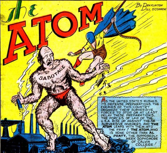
4. Golden Age Atom. Another Golden Age misfire. The bare legs, the full facemask, the plunging neckline. None of this works.
—
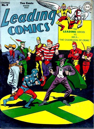
3. Star-Spangled Kid. Captain America gone haywire.
—
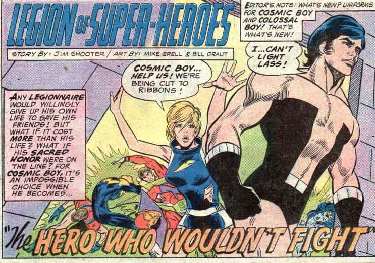
2. Cosmic Boy. Rokk Krinn’s cosmic bustier has to make this list. I don’t care if he only wore it for a few years.
—
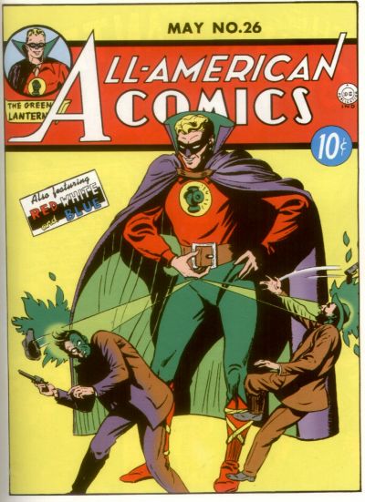
1. Golden Age Green Lantern. As with the Flash, DC knew that when they revamped the line in the mid-’50s, their heroes needed new designs. For Green Lantern, we got the gorgeously simple Hal Jordan look. Because there was absolutely no good reason to stick with Alan Scott’s costume. Again, putting aside the nostalgia, just look at it: Foofy sleeves, Dracula cape, criss-cross straps on the boots. And what green there is gets drowned out by the red, purple and yellow. Sorry, Alan.
(Have one to add? Just put it in the comments below or in whichever social-media thread you found this!)

July 2, 2016
Wow. Just….thank goodness it’s just your opinion. You are entitled to be wrong.
July 2, 2016
This is a truly awful list filled with heroes whose staying power outdoes the costume choice from 60 or 70 years ago. Do better research next time.
July 2, 2016
The reason for Sub-Mariner’s ankles is that it was because he is half human therefore it was later retconned he was Marvel’s first mutant.
August 20, 2018
Sorry, but you’re slightly off base on this one. Subby’s WINGS were a result of experimentation by the Atlantian Scientist Zolton, and the wings were a side effect of boosting Namor’s strength in some electrical chamber. They were not on his heels originally, however, they have since become canon. They have come and gone over the years depending on what the plot called for. But they were NOT a part of his original mutant nor hybrid nature… because neither parent had the attribute!
July 2, 2016
http://img3.wikia.nocookie.net/__cb20090703031101/superfriends/images/c/cf/Etrigan.jpg
July 2, 2016
Oh geeze…let’s just suck all the fun out of comics and superheroes. I always fail to understand the need to come up with the worst of, dumbest, etc. lists. They’re pretty much useless and ust come off snarky.
This list fixates on mainly golden and silver age characters that were changed eventually, or the characters were retconned. If you use the standards of this list, no superhero costume was good.
I keep seeing Cosmic Boy’s costume always listed in these lists. Anyone growing up in the 70s remembers, pre-Star Wars, most entertainment scifi fashion was either unisex or very skimpy. CB’s costume just reflected that. Had the Legion had decent artists after Grell that drew it correctly, it might now have been so bad. It eventually got changed anyway.
Fast forward to today, and the crap that’s getting passed off as comic book costumes. The entire DC New 52 looks like it was only designed so that they could connect up with action figures that could have lots of accessories. Armor and such. In the 90s, it was jackets and pockets.
It’s this attitude that has turned comics to crap and really taken any wonder or fun out of them.
July 3, 2016
Amen!
December 8, 2019
yep! you’re RIGHT! I grew up on Bronze Age comics and the costumes were half the fun! ESPECIALLY the LSH! One of the best memories I have at 47 is sitting in my room on a snowy weekend with a “grab bag” box of 100 comics from Mile High Comics. LOL, reading, reading and reading not being able to sleep because I want to read one more issue of the LSH or Blue Devil or the Defenders!
July 2, 2016
Cosmic Boy’s costume was held up by his personal magentism… no really. I liked both Canary costumes, and the Seven Soldiers of Victory were fun. Star Spangled Kid and Stripesy were redone as a girl/robot team. Comics are fun. I saw a GA GL at a recent con, and loads of folks were posing with him!
July 2, 2016
This list is lame-and the writer take this too seriously-comics are fantasy not real life-they are supposed to be over the top-not only that but the writer ignores the time periods and sensibility of the day-the whole premise of superheroes is ridiculous -once you start trying to put real world values onto it the whole thing falls apart’also lighten up
July 3, 2016
What about Mister Terrific? Both the Golden Age and Modern Age versions have lots of issues.
July 3, 2016
You’re not the first person to point that out. I wish I’d included it!
July 3, 2016
Mr. Greenfield is evidently unaware of the Golden Age Flash’s helmet being modeled after Hermes / Mercury, the speedster pagan deity who wore much the same headgear.
Mr. Greenfield, I recommend a crash course in Graeco-Roman mythology, which will not only completely nullify your snarky and uninformed remarks about Jay Garrick, but broaden your educational horizons in regards to Western civilization which, historically speaking, included mythology and religion and other philosophical influences in its makeup
July 3, 2016
Mr. Greenfield is aware of Greco-Roman mythology. Let’s just say the helmet looks better on Hermes/Mercury than it does Jay Garrick.
July 3, 2016
Jay Garrick’s helmet always worked for me as it was an allusion to Mercury’s helmet. But maybe THAT was goofy back in the day. 🙂
July 3, 2016
Hawkeye being on this list is just plain stupid.
July 3, 2016
How could you forget Wildcat?
July 4, 2016
I disagree heartily about Hawkeye (a really unique costume, I always thought) and the Golden Age Flash (yes, the helmet does not seem like a very functional choice for a guy who runs super-fast .. but it is so evocative of Mercury that I forgive it). I am a little more sympathetic about Thor, if only because the blue dots on his tunic never made any sense to me — but I don’t find his appearance unappealing. Here are my nominees for worst/goofiest ensembles:
1. Guy Gardner Green Lantern: The turtleneck and sleeveless tunic/vest that opens at the front, with a belt outside of it, never made any sense to me. And it was made worse after he was given a Three Stooges haircut.
2. The Peacemaker: What is up with that helmet? I find the brown shirt unappealing (plus, you know: fascist connotations). And evidently, parts of his costume conceal high explosives, which doesn’t seem that smart to me.
3. Colossal Boy (Silver Age).The Legion of Super-Heroes has some bland costumes, and some bad costumes. But this one (with the green shirt, red gloves, and yellow collar and shoulder fins) has an unappealing color scheme (yellow pants? really?) and is just too busy. It is less than the sum of its parts.
4. Tyroc (original costume) He looks like one of the Village People; too disco. His costume does serve as a good example, though, of what it would be like if super-heroes were costumed using the same aesthetics as super-heroines.
5. The Black Hood (classic). Because a mysterious figure-of-the-night with a black hood looks best with a yellow bodysuit. I mean, the color scheme is fine (e.g. Yellowjacket), but it doesn’t make any sense for the character.
6. Aquaman. I know, I know: it’s classic. And I even sort-of like it. But I don’t understand why a guy who spends most of his time underwater wants to wear chainmail. Concept fail.
7. Plastic Man. Again, I know: it’s classic. And the yellow diamond symbol was a clever device when used by Jack Cole (and those who followed him) to denote the shapes that Plas transformed into to disguise himself. But, he has the same problem as Tyroc: a little too much flesh. Is his costume a cast-off from the Rockettes?
8. Goliath (Clint Barton, Silver Age). You know, it really didn’t bother me at the time, but now I find myself wondering: What is the point of that yoke attached to his mask, and that weird harness over an otherwise-bare torso?
9. Hawkeye (Clint Barton, early 70s version). The maskless, open-front tunic was, I guess, easier to draw than the classic Hawkeye costume, but it seemed neither functional nor aesthetically appealing (to me). I am left wondering: is Clint Barton one of the biggest exhibitionists in the Marvel Universe?
10. Wonder Man (George Perez versions). I actually like the original Wonder Man costume from Avengers #9, and I think the most recent versions are okay, too. But both versions with the WM logo, and the safari jacket version, are pretty awful.
11. The Comet (Silver Age). The alternating green and orange color scheme, and the rainbow helmet. Just a bit too much.
12. Steel Sterling. MLJ/Archie’s answer to Superman has a pretty lackluster costume (although, for some reason, it works better on Tom Strong). In some versions, it looks like Steel is wearing metal trunks, with a little peak that would poke him in the abdomen if he bends at the waist. I guess he really wanted everyone to know how tough and invulnerable he was.
13. Mr. Scarlet. This character was Simon and Kirby’s effort to capture the excitement of an Errol Flynn movie on the comics page; he even had a little mustache. In some ways, with the emphasis on the acrobatics of Mr. Scarlet and his partner, Pinky, and the almost entirely red suit, Mr. Scarlet is a precursor to Marvel’s Daredevil (and both are lawyers, to boot!). But if that mustache was supposed to connote something devilish, that floppy thing on the top of his cowl spoils the effect, and just makes him look silly.
July 4, 2016
The Golden Age Green Lantern costume is so garish I just love it. Hawkeye’s original costume design is brilliant, one of Don Heck’s best ever (although that’s not saying a lot, Heck was never comfortable in the superhero sub genre, but I think he did a great job getting the carnie feel on Hawkeye’s outfit). Black Canary’s new outfit was pretty terrible, although really only by comparison with the original, which is a favorite of every fanboy… although, really, the idea of a world class martial artist and gymnast running around on rooftops kicking people in the face, in high heels, with a blonde wig on, is kind of ludicrous.
Cosmic Boy’s Sweet Transvestite outfit is a horror, yes.
Personally, I think the newer versions of Superman and Batman’s costumes, without the trunks and with a lot of unnecessary seams, are pretty awful.
As a general rule, though, the older I get, the less kick I get out of entirely subjective lists like this. Times change and so do fashions. In the Golden Age it was nearly unheard of to give your male superhero a costume that didn’t have swimtrunks over tights, it seems to be an element of the original Superman design that was adopted almost blindly and unthinkingly by every other comics artist. Maybe it made sense, from some angle, for a costumed aventurer to pull on tight trunks over his ballet tights, I suppose it might have given him better support for the old family jewels, when running around rooftops with Black Canary. (Personally, I would certainly have been wearing an athletic supporter and protective cup; maybe all the superheroes did, and the trunks helped keep all that gear more firmly in place.)
Capes and different types of masks have gone in and out of fashion for superheroes, as have flared gloves and rolled down swashbuckler boots. Even dramatic chest symbols have come under assault lately.
My point is, it’s easy to grab a fantastic and absurd costume design from seventy or eighty years ago and hold it up for people to laugh at. Why not write an article poking fun at how everyone wore a hat back then in their secret identities, how everyone smoked, how every one wore a business suit? How all the heroes and villains were white and Christian and heterosexual? How about examining the underlying premises of superheroics — how heroes, essentially, battle crimes of violence and crimes against property while for the most part ignoring social injustice?
I guess it’s easier to poke fun at the rube with the criss crossing straps on his boots — look at him, hee hee, he’s silly looking, not like that cool guy in the awesome black unitard with the big white cut out cats-eyes on his otherwise all black face mask. But this is all aesthetic, it’s all subjective, and it’s all incredibly disrespectful of people with a lot more talent than any of us, some of whom lived long ago and worked harder than we ever will for little money and absolutely no recognition.
Pissing on Martin Nodell or Don Heck or Bill Everett or Harry Lampert or Joe Certa or even Mike Grell… it just seems mean spirited, somehow. Where are all your great and innovative contributions to the field?
July 4, 2016
Kidding around is not the same as pissing on anyone. Good lord.
July 4, 2016
Don’t agree, with the exception of SS these are pretty cool, especially Green Lantern.
August 15, 2018
I enjoyed the list, but, WOW, the real entertainment is found in the hypocritical comments from a couple years ago. It seems my fellow commenters couldn’t detect the irony in their complaints: Dan “take[s] this too seriously” with his “snarky and uninformed remarks.”
As to the content of the article, no big disagreements. Martian Manhunter’s outfit makes me think of an artist poking fun at Robin’s bare legs, before another says, “Hold my beer.”
August 16, 2018
Heh. There’s not much I take too seriously about comics. Especially about stuff like this! But self-awareness is not always a hallmark of fandom.
August 17, 2018
boy, some people really got bent out of shape on this list. relax people. and yeah some of those costume designs DO suck. and hey, he could have also added another 13 of just Liefeld costumes, so he went easy on us.
August 19, 2018
The Earth-2 Robin’s first adult costume–half-Batman, half-Robin. An identity crisis in sartorial form.
August 21, 2018
I don’t agree, but it is a cool and funny article.
August 21, 2018
Fun, wacky list! Thor’s costume isn’t very “authentic”, or “historic”. What’s with those circles – balls? – on his trunks? J’onn and Namor have been saddled with bad costumes from the get-go. Surprised Hawkman didn’t make the list. I get that some costumes were modeled after circus strongmen – I guess Namor, J’onn and Carter were modeled after body-builders or boxers, maybe?