
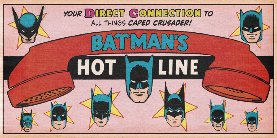
Dig these designs…
—
UPDATED 5/29/25: On Wednesday, we showed you the new Batlogo that will be introduced on the cover of September’s Batman #1 relaunch. Click here to check it out. Perfect time to reprint this piece, which first ran in June 2018 in slightly altered form. Dig it. — Dan
—
A lot of people like to knock DC’s New 52 initiative that kicked off in 2011.
I’m not one of them. I think it took an incredible amount of guts to completely relaunch an entire line of mainstream superhero comics and take a chance on titles like Men of War and I, Vampire.
That said, there were downsides, including the ill-considered reinvention of Superman and an overall unevenness of the titles themselves.
But there’s one thing that always bugged me and it’s a relatively minor issue in the grand scheme of things — the mags’ logos, especially Batman:
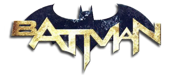
The Batman logo, an awkward and asymmetrical image, felt like an attempt at corporate synergy. It came out at the time the Arkham games were immensely popular and it felt to me that the publisher was seeking to subtly link itself to the video game’s iconography. I could be way off-base but it’s something that’s stayed with me.
![]()
Now, with the New 52 farther and farther in the rearview, DC has been upping its trade dress game. When Rebirth was phased out at the end of last year, the publisher introduced a slate of bold and enticing corner boxes. (This followed an earlier launch of a sharp new “DC bullet” that replaced the maligned “Band-Aid” version.)
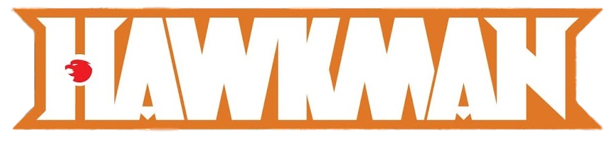
We’ve also seen new logos for Justice League and Hawkman, as well as a nicely streamlined Action Comics header that premiered with Issue #1000.
But what about Batman, one of the logos most in need of a revamp?
All this has gotten me thinking about the Logos of Batman Past, what worked and what didn’t.
I’m not limiting myself to the flagship title either (and in one case, I’m veering off comics). I’m considering pretty much any logo that features big Bat-iconography. The classic Detective Comics logo (likely by Ira Schnapp) for example, is one of comics’ all-time great lettering designs but it doesn’t factor into what I’m discussing here. This is about BATS, people.
So here for your edification and debate are the 13 GREATEST BATMAN LOGOS — RANKED.
(Oh, and a note on the dates below: Occasionally, DC would switch logos off and on. I’m giving basic ranges. I’m also allowing for whatever fine-tuning went on. Further, I’ve noted the designer where I have that info*. If you have any intel on these, share in the comments!)
Here we go:
—
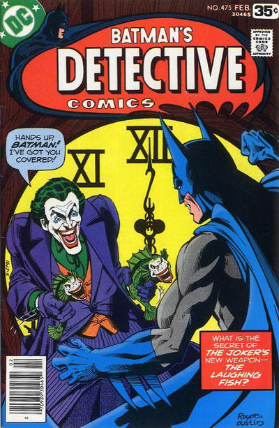
13. Detective Comics (1976-80). Detective Comics managed to go about 27 years without having to proclaim in its logo that Batman was the star of the comic. The cover image and maybe a corner bullet – plus perhaps readers’ familiarity — did the trick just nicely, thank you very much. That changed in the ’60s amid the TV-driven Batmania, when DC was eager to scream “HEY, YOU! BATMAN HERE! GET YOUR BATMAN HERE!” across the top of Detective. (They were in all likelihood also trying to catch the eyes of readers who often could only see the tops of the covers on newsstands.) Ever since, DC has almost always made a point of emphasizing Batman’s starring role in the Detective logo itself, with very mixed results. This is one of the better ones.
—
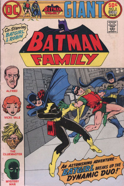
12. Batman Family (1975-78, though also used in Detective for awhile after the titles merged). This one’s a bit of a cheat because it’s a rejiggered version of the mid-’60s logo, which — SPOILER ALERT — you’ll see below. But it was still effective and the bottom half was used as a smart contrast against the top half and the rest of the cover imagery. It also gave the comic a bit of a historical feel since it originally included mostly reprints.
—
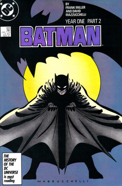
11. Batman: Year One (1987). Designed by Todd Klein, this look was used only for the four Batman issues that featured Frank Miller and David Mazzucchelli’s Batman: Year One. (The bat design was used later in Detective’s Batman: Year Two, as well.) I generally dislike asymmetrical Bat-logos but this emblem is better than a lot of other ones DC’s used over the last 30 years or so.
—
10. Wednesday Comics (2009). Remember Wednesday Comics? It was a 12-week anthology series printed like a Sunday funnies section that I wish had become a DC staple. For whatever reason, they used this logo, designed by Rian Hughes, for the series’ Batman story — and it rocks. Clean, clear, bold — with a tiny bit of extra detail by the left eye — this is the one that should be in use today. I’d move this waaaaaaay up the list had it gotten wider use.
—
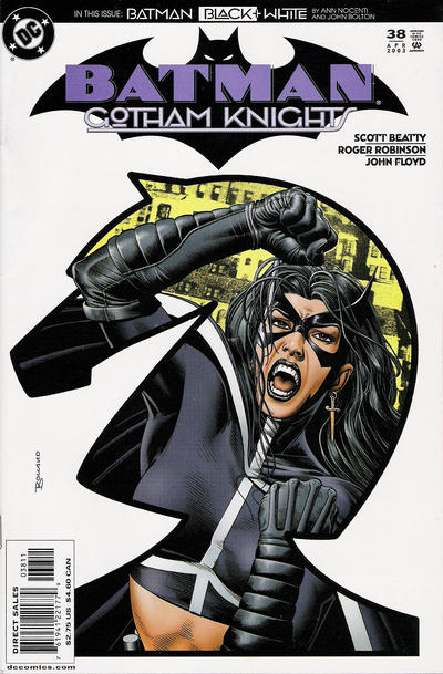
9. Gotham Knights (2003-06). This is just a plain, solid logo, by Chris Gardner. The lettering isn’t quite bold enough but it’s balanced and sharp. I always like Deco lettering.
—
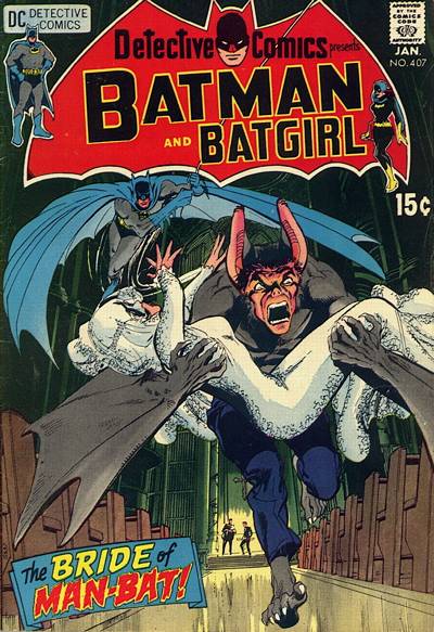
8. Detective Comics (1968-72). OK, now this is a hot mess. The lettering is unbalanced and awkwardly positioned in the bat. But I don’t care! I love its flamboyance, the way it cites Robin and/or Batgirl as co-stars of the book, and the little Carmine Infantino figures flanking the sides. And because of the off-kilter lettering pattern, there’s a lot of background color showing, allowing for some fun contrast against the main cover imagery. It’s hardly a good graphic design, but it is exciting. (Likely designed by Gaspar Saladino.)
—
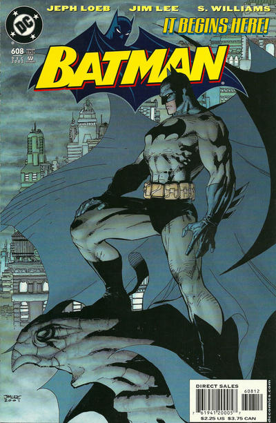
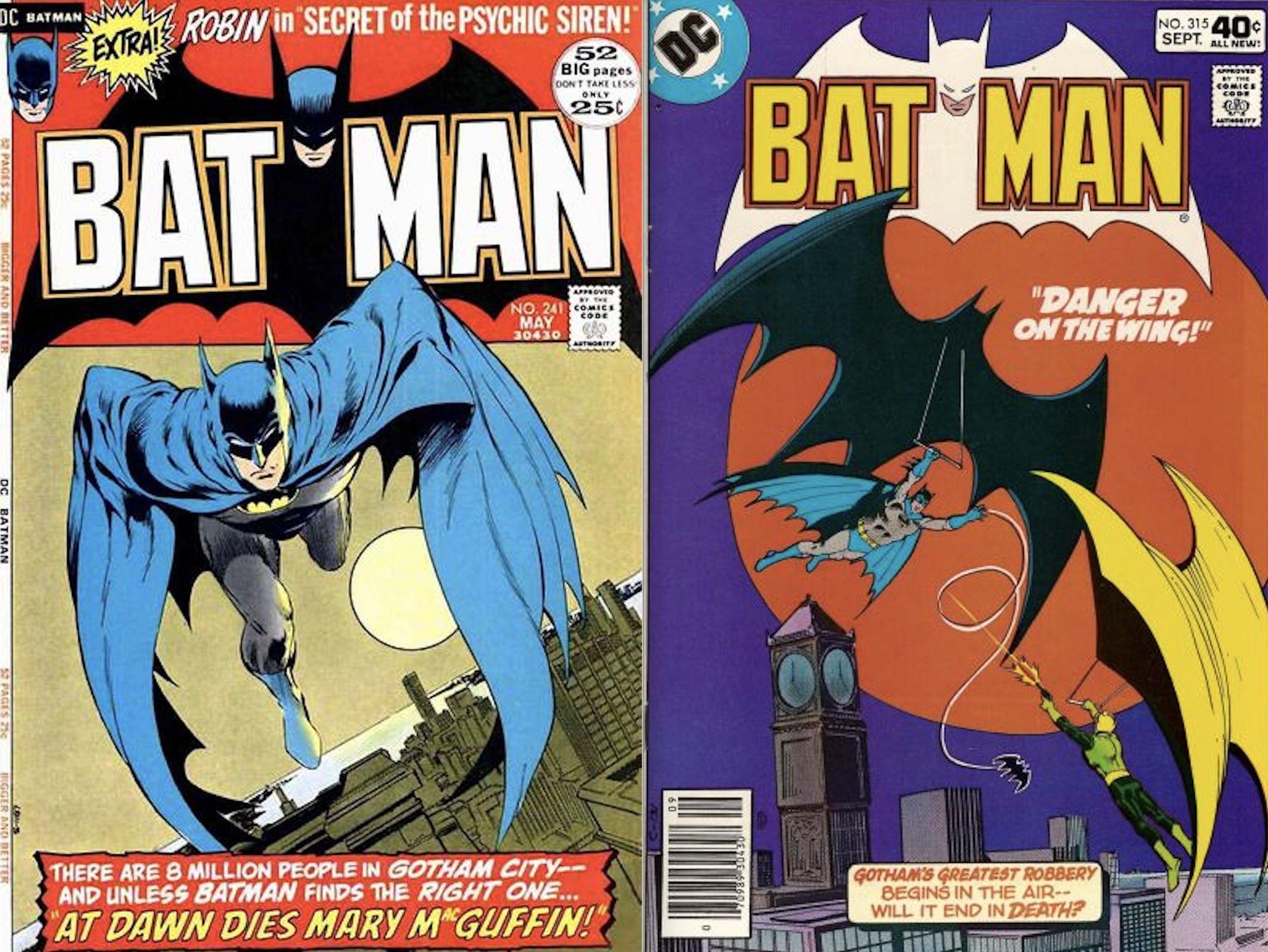
7. Batman (2002-06). A smartly designed image by Gardner that seemed like a modern riff on Batman’s mid-’60s comics logo. This should have gotten a much longer, healthier ride than it did. DC opted to drop the bat portion for the most part in 2006, leaving just the lettering. I’m not sure why they did it but it was a step back.
—
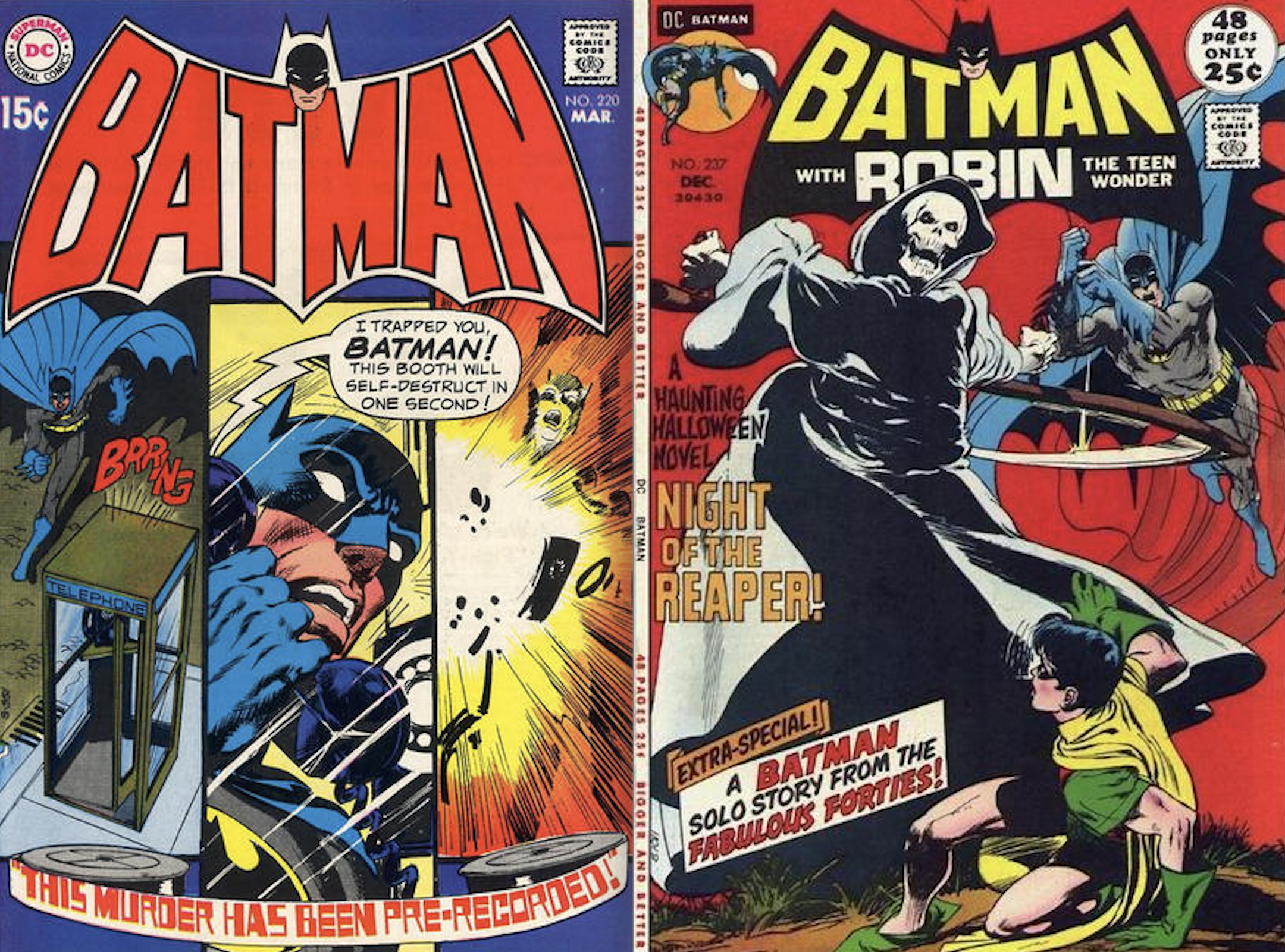
6. Batman (1970-72.) One of Batman’s most recognizable, enduring logos, it actually had a fairly brief initial run on the flagship title while finding greater exposure on merchandise. It was also used for The Brave and the Bold from 1970 to 1983, and the cover of Detective Comics from 1980 to 1986. I’ve always been a big fan of this one — believed to be designed by Saladino — and the way it lends itself to all sorts of color combinations and contrasts. Included here is a revised version that shortened Batman’s name to make room for Robin, who was appearing in the book as a back-up feature and guest star. Both versions work for me.
—
5. Batman (1972-1986). I have a love/meh relationship with this one, depending on the size and context. As Young Dan, it always kind of annoyed me that BAT and MAN were separated, even if they were similarly divided on the original, Golden Age version. I also liked it better after they shrunk the size as time went on. But mostly I dug it when they used unexpected color combos as opposed to the standard black background. Regardless, it’s a bold, strong look — probably a Neal Adams/Saladino job — that captures its time period but remains timeless all the same. Edges out #6 because of its longer term primacy.
—
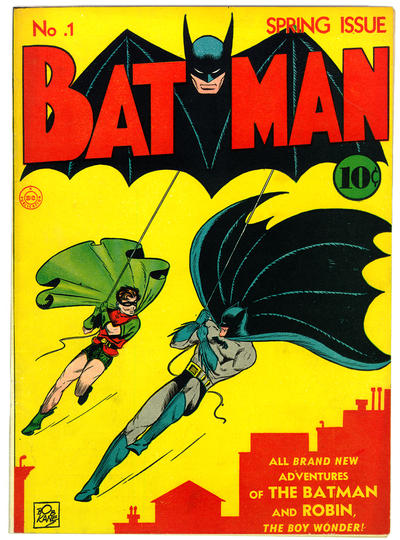
4. Batman (1940-64). Batman’s original logo (designed by Jerry Robinson, according to Klein) set the standard, though it’s been improved upon over the decades. I like the original, cruder version from the earliest issues as opposed to the more refined version that entered the picture in 1941. And, like the Detective Comics logo of the same era, it looks better splashed across the top of the cover, as opposed to shunted off to the left.
—
3. Batman ’66. (1966, 2000, 2013-Present). The TV show logo, which was repurposed by DC both for an obscure one-shot in 2000 and the recent Batman ’66 comics series, is a stronger, more evocative version of the original comics emblem. But instead of breaking up BAT and MAN, it incorporates the name with spooky, stylized lettering. The irony, of course, is that show wasn’t spooky at all. No matter. This is one for the ages.
—
2. Batman and Robin (2009-15). Another Rian Hughes job. This is a great logo. Just great. Classic yet modern, with plenty of opportunity to shift colors around as the cover image requires. As non-flagship logos go, this is as good as it gets.
—
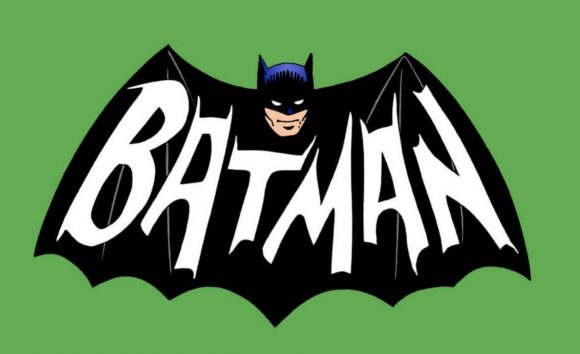
1. Batman (1965-69). It’s stylish, symmetrical and timeless — the bat is modern and the lettering (by Schnapp) is classic. It’s also one of the moodier logos — that Bathead by Carmine Infantino and Joe Giella** behind the cape is transcendent — which is surprising in retrospect when you consider that this was the comic emblem of the Camp Era. But it betrays DC’s intentions: It was first used on the cover shortly after the start of Batman’s “New Look” — a move to modernize the Caped Crusader and excise the alien-heavy, sci-fi silliness of the early Silver Age. Fifty years after it was in vogue, it remains Batman’s best cover logo ever.
—
MORE
— 13 DC COMICS Emblems — RANKED. Click here.
— The BATMAN VS. RA’S AL GHUL Logo Recalls Bronze Age Glory. Click here.
—
* NOTE: Most of the credits above were from letterer Todd Klein’s blog. A few years back he did a whole study of Batman logos. It’s invaluable and you should check it out here.
** Klein says Giella inked the head. Historian Arlen Schumer says it was Murphy Anderson. Both agree it was Schnapp who lettered it, and that’s good enough for me.
June 2, 2018
great list, dan! fyi, re: your #1 (and mine), the lettering is indeed by the great ira schnapp, but the bat-head behind it is by infantino and inked by murphy anderson, not joe giella.
June 3, 2018
Thanks, Arlen!
June 3, 2018
I agree with the number one designation, but my second favorite is missing. It was frequently used on the interior of World’s Finest stories with Superman (probably why it isn’t included).
June 3, 2018
I stayed away from interior logos — though maybe I’ll revisit that another time! Thanks, Dean!
June 2, 2018
Dan, I want that 65 to 69 logo on a Tshirt! Let’s convince Retropolis to do it! I’d even take an enamel pin!
June 3, 2018
I totally agree with Lou!!!!!
February 29, 2020
anybody having any luck on finding this logo on a tshirt?
June 3, 2018
What is all this “probably by” stuff? My research is clear on the ones I identified. No probably about it.
June 3, 2018
I strive for accuracy, Todd. I’m only going by what you wrote on your blog.
In a number of cases you indeed equivocate. Statements like “All these things, plus the time period (1965) point to Ira Schnapp as the designer here…” or “I don’t know who did the art, but considering that Neal Adams had been doing many of the Batman covers just previously, and has done this one, it’s a good bet that he was asked to do the logo head as well” or “This logo is probably also by Gaspar Saladino…” do not convey 100 percent certainty.
I was not going to go any further than you appeared willing to.
In addition, there’s someone in this thread of comments who disagrees with you on the provenance of one of the logos.
I have changed the wording on the Robinson design and one of the Schnapp mentions.
Thank you for reading nonetheless.
June 5, 2018
Thanks, you’re right, where I’m not sure I say so, and so should you. Arlen may well be right about the inker on #1.
June 5, 2018
Much appreciated, Todd.
June 3, 2018
Great article. Totally agree with #1 – that’s the Batman logo I grew up with in the late 60s and my favorite as well. I’m also partial to the Golden Age logo that they reverted back to briefly in 1969 before going to the 1970 logo (#6 which is reminiscent of the TV show logo to me).
I absolutely HATE the current logo. It’s UGLY. They should use the Jim Lee era one (#7) again. But keep the bat behind it. I hated in the late 80s when they started to only have the letters occasionally. BORING.
June 3, 2018
My two favorites are #3 (surprise, suprise) and #1.
I actually dislike all the others very much.
June 4, 2018
I respectfully do not agree with most of your list. Sorry Dan. Remember, this all in fun. No deep resentment here.
Firstly, the Batman Family logo is in essence the 65-69 logo. The word “family” while making it technically a different logo is really moot, thus should not be on the list.
Secondly, making the Batman and Robin logo from 2009-2015 2nd is not what I would have done.
Third, the Gotham Knights logo is also not a choice I would have included.
My ranking for top four:
4) 1943-1964 logo
3) 1943 movie serial logos
2) 65-69 logo
1) 1966 TV series logo
Thank you for all hard work you do. I love your work!
June 4, 2018
Thanks, John! No offense taken!
June 4, 2018
I’m with John for the most part but I’d go with a top 6…
6- 1943 Movie Serial
5- 1940 early crude Batman Logo
4- 1966 TV logo
3- 1970-1972 Batman Logo
2- Wednesday Comics Logo
1- 1965-1969 Batman Logo
I really dislike that Batman and Robin Logo– yuk. I’m with you 100% on the logo from the Wednesday Comics– that should be used on Batman today.
How wacky is it that a group of grown men can sit around and rank Batman logos? THIS is why our wives don’t want to hang out with us boyz.
June 4, 2018
As a huge fan of the TV series as well as the Batman 66 digital comics I’m curious to know more about the “obscure one shot” comic from 2000 that you referred to. Do you have a title and or release date so that I can look this up? Is it associated with the Adam West Batman? Any information you can give me would be greatly appreciated.
June 5, 2018
It was part of a series of one-shots called Realworlds. They’re not necessarily superhero stories. They’re more about how superheroes inspire people in real life. The Batman issue, which was pencilled by Marshall Rogers, used the TV logo for its masthead.
June 5, 2018
Oh, OK. I was hoping that it was going to be in the vein of 2005’s “Batman A-Go-Go”. Not quite Batman ’66 but, as close as they could legally get at the time.
Thank you for the reply.
June 4, 2018
Doing my best to set aside nostalgia (I like the ’70-72 mark because of its association with ’70s and ’80s merchandise, for example), I think the strongest of these masthead designs are:
3. 1972-86 – as long as you can set aside the gap between BAT and MAN, this one is clean, sturdy, and symmetrical
2. 2002-06 – precise and attractive take on the classic logo. Has the right amount of implied action with both nostalgia and contemporaneity.
1. 1966 series – I personally think of Batman when I see the type from the older logos, but I’ve been a fan all my life. The Deco letters are more period- than character-specific. The TV show logo, on the other hand, has the most distinctive typography yet does not sacrifice legibility. It is self-contained and balanced without being stiff.
While the 2009-15 masthead meets some of my criteria, I don’t care for the bat-shape, and it is very obviously computer generated. While the logo is well considered, the artist’s own hand is not so visible.
The 1965-69 logo falls a little short because of the way the type protrudes below the the bat-shape. It creates a vertical imbalance. I dig the Batman head, though.
June 4, 2018
Everyone to their own opinions but I think #2 and #7 are ugly as sin.
June 5, 2018
I agree with you about the current Batman logo. It is awful and ugly and should have been replaced at the beginning of DC Rebirth. The Wednesday Comics logo (#10), which I have never seen before, would make a great masthead for the current comics. Maybe tweak it so the word “Batman” is slightly tilted, like the splash page logos used in 1940’s Batman #1?
Like you, I also felt “meh” about the classic bronze age logo (#5). To me it looked like an inferior revamp of the 1940 Batman #1 logo. These days, when I see it, my first thought is “disco era”. I prefer the original to the remake.
I also prefer the “Mego era” logo (#6). This one would be #2 on my list. As a kid, I imagined the guy who created the Monkees’ guitar logo was given the task of revamping the Batman TV series logo for the comics and toys – it looks like a blend of the Monkees and TV Batman logos.
And I agree with your #1 choice. I think it may be the best Batman logo of them all. If anything, I would suggest it be slightly tweaked for use today so that the shadows on Batman’s cowl would be more contemporary, and have less of that 60s look.
A quick note on Detective logos: the original is without question the best, and its a shame DC hasn’t kept it in use, as they have with the classic Action logo, favoring instead to go with inferior logos. The slightly updated version in use from issues #569 thru 574 should be the one in use today. I also have a fondness for the masthead in use from #421 thru 436. The font, plus the way it is laid out, and the trade dress of those issues, in my opinion, gave Detective the look of a magazine, rather than a comic book.
June 11, 2018
I’d like to see DC make the logo used on the cover of BATMAN #223 as the new permanent logo for Batman. It’s the same as the 1970-72 logo but minus the bat shaped enclosure. Just refine it a bit to give the letters a depth or texture to make it more contemporary.
June 12, 2018
And you can see it here: https://www.comics.org/issue/23623/cover/4/
September 2, 2019
*HOT DAMN!* Not only is that variant version of the 1970-1972 logo incredible, but the Curt Swan & Murphy Anderson cover artwork that accompanies the logo is absolutely stellar! A win-win cover!
October 17, 2018
Well… damn. I never noticed the new Batman logo’s resemblance to the Warner Bros. logo and now I can’t unsee it. I didn’t think the logo was that bad before but now that you pointed that out… ugh lol
October 17, 2018
Sorry!
August 31, 2019
To me, numbers 5 and 6 are my favorite Batman logos. Those were the logos being used when I started reading the comics and they’ve always stuck with me as being memorable. I always get that feeling of nostalgic youth picking up a Batman, Detective, or B&B book with those two logos. I do like you’re number one, but I did prefer the modernized version that started on the Hush issues (number 7 on your list).
I will agree that the current logo appears a little disjointed and seems to be a comic variant to the logo used in the Arkham games. The lettering of the current comic logo being the main reason. To me, the letters make the the logo appear disjointed and, at worst, grotesque.
September 2, 2019
The current Detective Comics logo reminds me of the version used in Detective that you show in #6.
My favourite is #5 (’72-’86) as that was the logo in the comics right from when I started reading comics up through my teen years. So, it’s got a lot of nostalgia value. As does #3 (the TV show logo).
September 8, 2019
Not sure how ‘symmetrical’ can be used to describe the Batman (1965-69) logo. The B is larger than the rest of the typeset and the Batman head is at a 3/4 view, unlike the straight-on shot on the Batman (1972-1986) and (1970-1972) logos. Nice article though, Iwould like to see logo reviews for other DC titles.. and for the DC bullet as well.
September 8, 2019
Your wish is (almost) our command: https://13thdimension.com/13-dc-comics-emblems-ranked/
May 29, 2025
The problem with 2011’s New 52 was the same problem DC always has: no line wide editorial oversight. They just threw 52 ideas together with no idea how they would work together and guess what, they didn’t.
May 29, 2025
#6 is my personal fave… but in a different setting. As I became a regular comic book buyer as a kid to begin the 1980s, it’s use for DETECTIVE COMICS is the standard bearer.
May 29, 2025
I’d say a lot of the New 52 mastheads are better than some of the new logos of the last few years, which are often flat, with no telescoping or shadows or whatever to add extra interest.
Bat-wise, I love no 6 and no 1.
And I love it when the logos are massive and in a box. I’m chuffed this week, having seen that a more classic Action Comics logo is coming with the new Superboy run. Stick it in a box!
May 29, 2025
My guess as to why logos have become more simplistic and minimalist is because they want to let the cover art have as much room as possible. With all of the variant covers DC does now with minimal trade dress, I bet some of the regular cover artists want their art to shine, too.
Just looking at the logos on the past month’s worth of DC output, all the logos are more horizontal than vertical, fairly flat, and lot a lot of effects. Most of the logos are white or black, too. In fact, most of the logos are as tall or barely taller than the left corner box. Only World’s Finest, Detective, Batman & Robin, and Teen Titans Go! really drop significantly below that box.
I can tell you that it’s pretty hard to design a killer logo. I’ve been a graphic designer for years, and logos can be the most tricky. Evoking the whole concept of the entity in the letters? There is a balance there that can be hard to achieve. It’s generally a fun challenge, but there are hundreds of bad designs for every good one you actually see.
Oh, and #5 & #2 are my favorites.
May 30, 2025
Thanks Jeff, it’s good to hear a professional’s perspective.