
The celebrated Mr. K pays a birthday tribute to one of the Superman greats…
By PAUL KUPPERBERG
I don’t think it’s as true as it once was, but it used to be that a surprising number of comic book artists looked like the characters they drew. Gil Kane looked like a Gil Kane character. Don Heck like a Don Heck character. The same for Jack Kirby, Kurt Schaffenberger, Steve Ditko, and so many others. And it made sense; it’s common practice for artists to use their own faces to model expressions, so why wouldn’t their characters look like them?
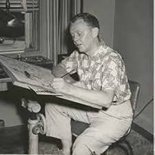
I only found out about these similarities later on, when I started meeting the artists, but even as a kid, I always envisioned Wayne Boring (June 6, 1905 – February 20, 1987) to look like one of the characters he drew, very stiff and old school, dressed in a high, 1890s cellulose collar, wearing pince-nez clipped to his nose under a balding head. But in the early- and mid-1960s, this old-fashioned artist was one of the regulars in rotation on the Superman Family of titles, along with Curt Swan, Al Plastino, George Papp, Schaffenberger, John Forte, and Jim Mooney, so I never thought twice about his style or place in the Superman artist line-up. Until…
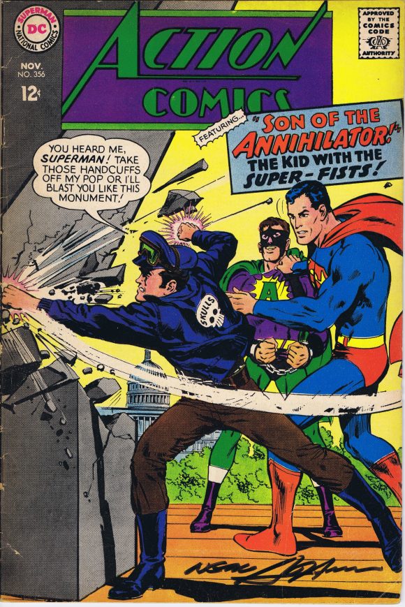
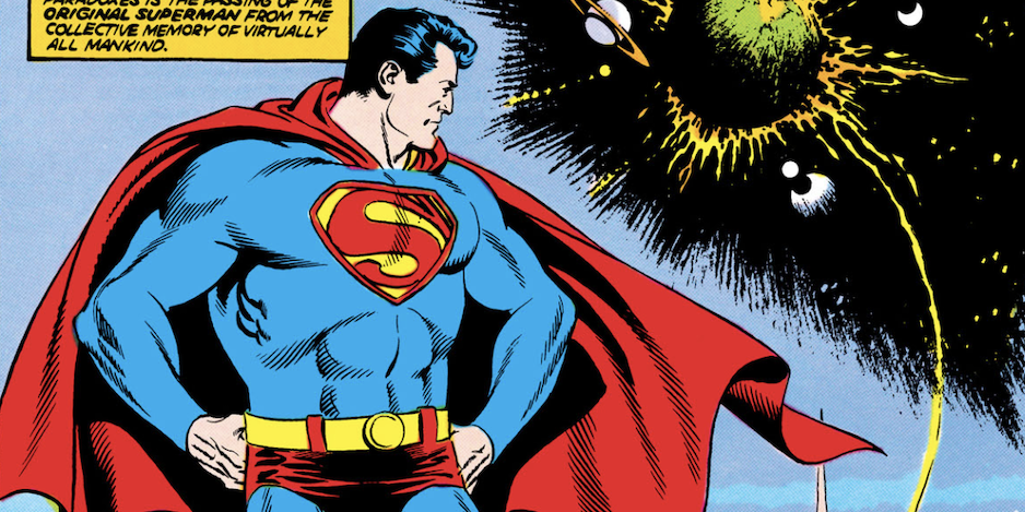
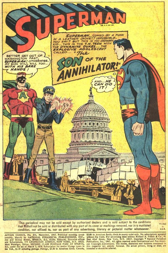
To be fair, the cover of 1967’s Action Comics #356 made me have to rethink just about everything I liked in comic book art. I was 12 years old and only just starting to get into collecting in any serious way, and as a hardcore Superman fan, I bought everything Man of Steel I saw on the newsstand. Action #355 had been a perfectly fine for the era story, “The Mighty Annihilator,” by Leo Dorfman and Wayne Boring, with a cover by Swan and George Klein, and featured, unusual for the day, a continued tale. And #356’s “The Son of the Annihilator” by the same creatives was also standard fare for the time.
But the cover wasn’t.
The cover was what the future was going to look like. It was Neal Adams’ first (or maybe second, but the first I ever saw) time drawing Superman. And I remember picking it up from the spinner rack in the candy store on the corner of Seaview Avenue and Rockaway Parkway in Brooklyn and opening it up to see the stark contrast of that suddenly archaic-looking Wayne Boring splash, and, well, suffice it to say, adolescent brain cells started exploding at a prodigious rate. That book meant enough to me that I asked Neal to sign it for me 50 years later.
I’m afraid in the fannish years that followed, with the ranks of comic-book artists mushrooming with a new wave of innovative creators, from Neal to Steranko to Wrightson to Smith and beyond, we started to look at the art of Wayne Boring as, well, boring.
Stan Kaye inks
Of course, it wasn’t and isn’t, although it’s very much a product of its time. He started as an assistant in Superman co-creator Joe Shuster’s studio on features like Slam Bradley and Doctor Occult before signing on to become one of the artist’s uncredited ghosts on the newly launched Superman newspaper strip from the McClure Syndicate. Boring would eventually move out from behind Siegel’s shadow and be credited under his own name. A check of his accomplishments listed on Mike’s Amazing World of Comics shows a virtually unbroken string of hundreds of Superman and Superman Family credits between 1940 and 1968, including a quarter century’s worth of the daily and Sunday newspaper strip.
And there was a reason for his longevity. Wayne Boring brought a sense of grandeur and dynamic action to the Man of Steel, helping to define his look as the square-jawed, barrel-chested hero.
As for Boring himself, I never did have the opportunity to meet him, but I long ago reconciled my 12-year old’s rejection of the old and recognize what his art brought to so many stories important not only to me as a reader but to the Superman mythos. And as for my dated mental image of the man… well, I wasn’t even close!
Here then, MY 13 FAVORITE WAYNE BORING SUPERMAN SPLASH PAGES:
—
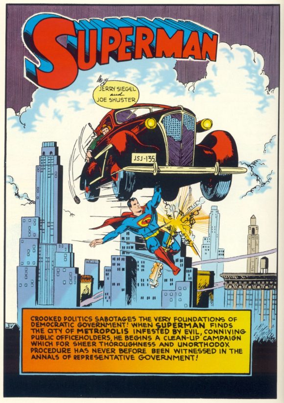
Superman #7 (Nov.-Dec. 1940). Like, do you even gotta ask? “Superman’s Clean-Up Campaign,” a Boring-ghosted tale, scripted by Jerry Siegel.
—
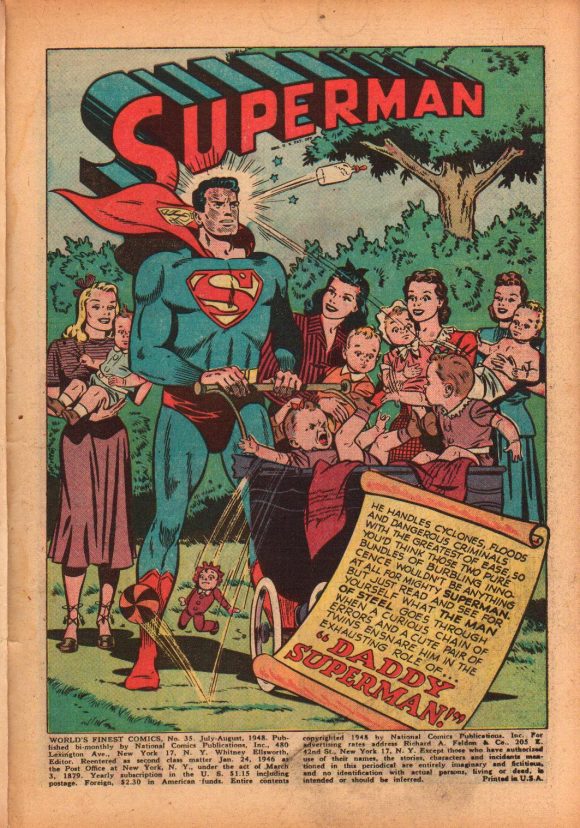
World’s Finest #35 (July-Aug. 1948). Points for drawing good-looking ladies and babies that actually look like human babies. “Daddy Superman” was written by Alvin Schwartz and possibly inked by Stan Kaye.
—
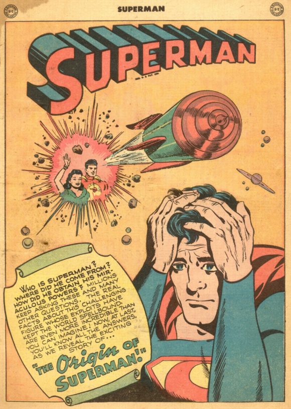
Superman #53 (July/August 1948). A seminal story, Bill Finger’s “The Origin of Superman” was an early retelling of this modern myth, with a beautifully angsty Boring splash, inked by Kaye.
—
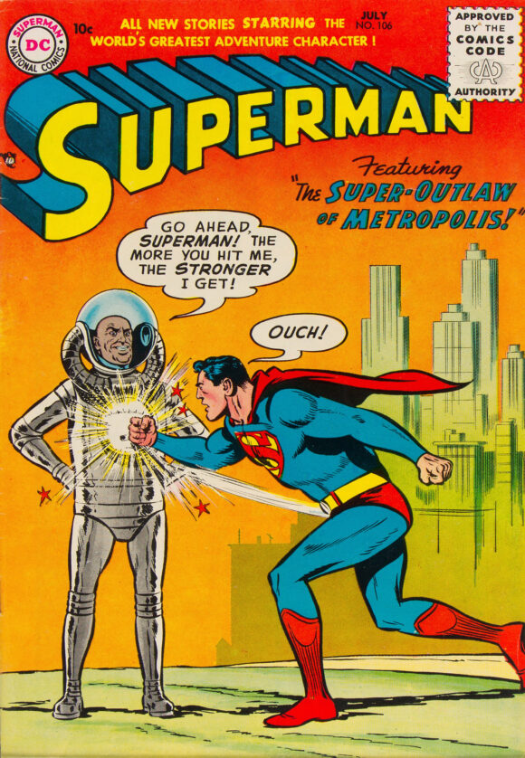
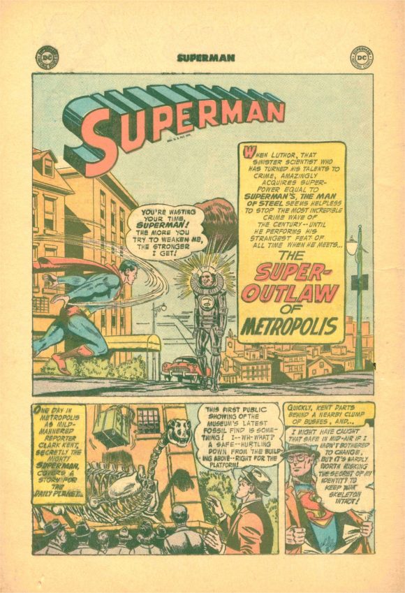
Superman #106 (July 1956). Technically, this is only a splash panel, but “The Super Outlaw of Metropolis” is both a really cool Boring image and, I believe, may also have been the first time Lex Luthor donned battle armor. Story by Jerry Coleman, inks by Kaye.
—
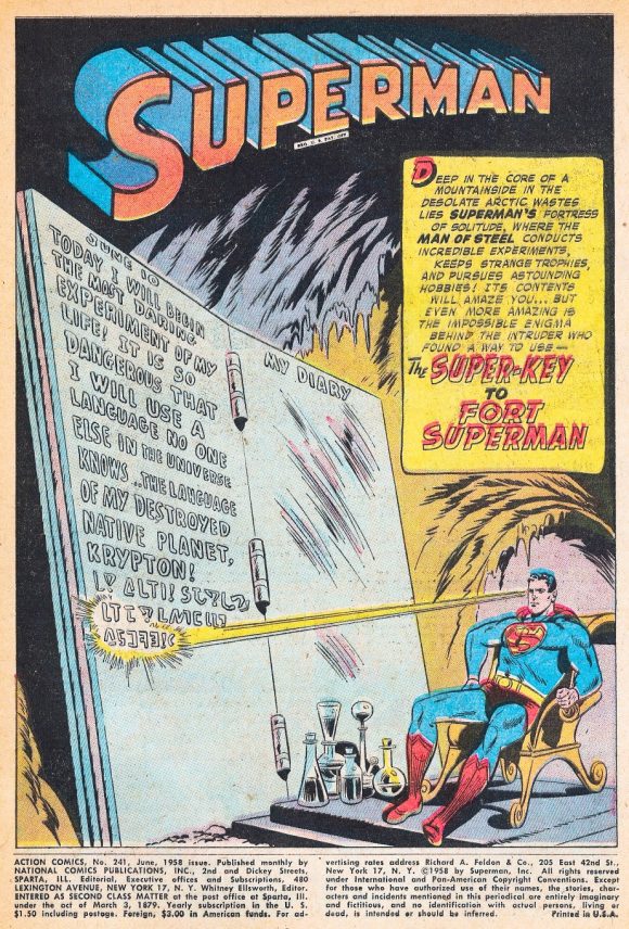
Action Comics #241 (June 1958). Superman in repose, a Boring specialty! “The Super-Key to Fort Superman,” story by Coleman, inks by Kaye.
—
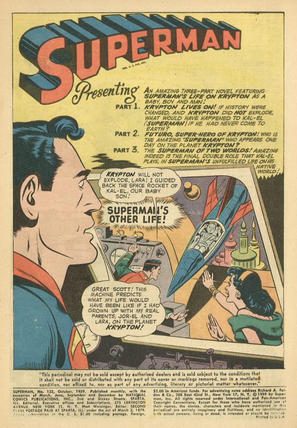
Superman #132 (October 1959). “Superman’s Life on Krypton,” another one of those stories I mentioned above so important to the mythos, written by Otto Binder, inked by Kaye.
—
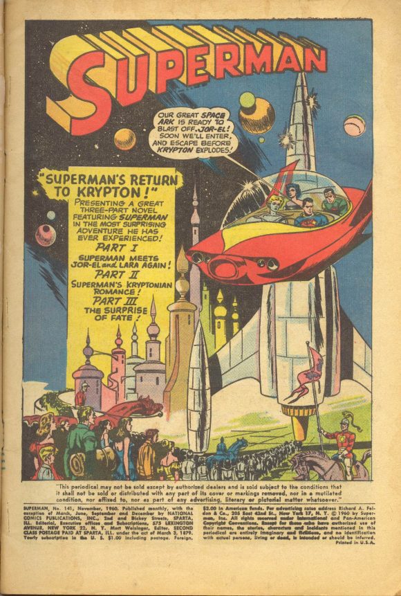
Superman #141 (September 1960). And here comes yet another! Is it just me or is there something very EC/ Wally Wood about the splash to “Superman’s Return to Krypton,” written by Siegel, inked by Kaye.
—
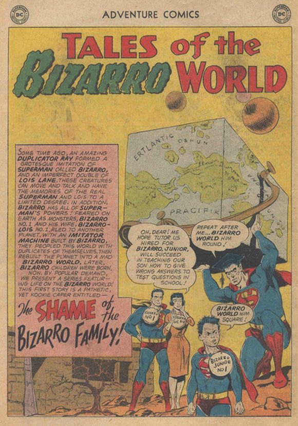
Adventure Comics #285 (June 1961). Me hate this one! “The Shame of the Bizarro Family,” writes by Siegel, inks by Kaye.
—
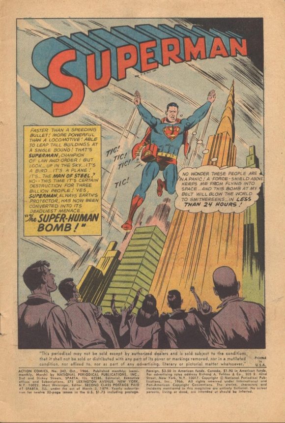
Action Comics #342 (October 1962). It ain’t a Wayne Boring tribute without Superman walking on air! “The Super-Human Bomb,” written by Jim Shooter.
—
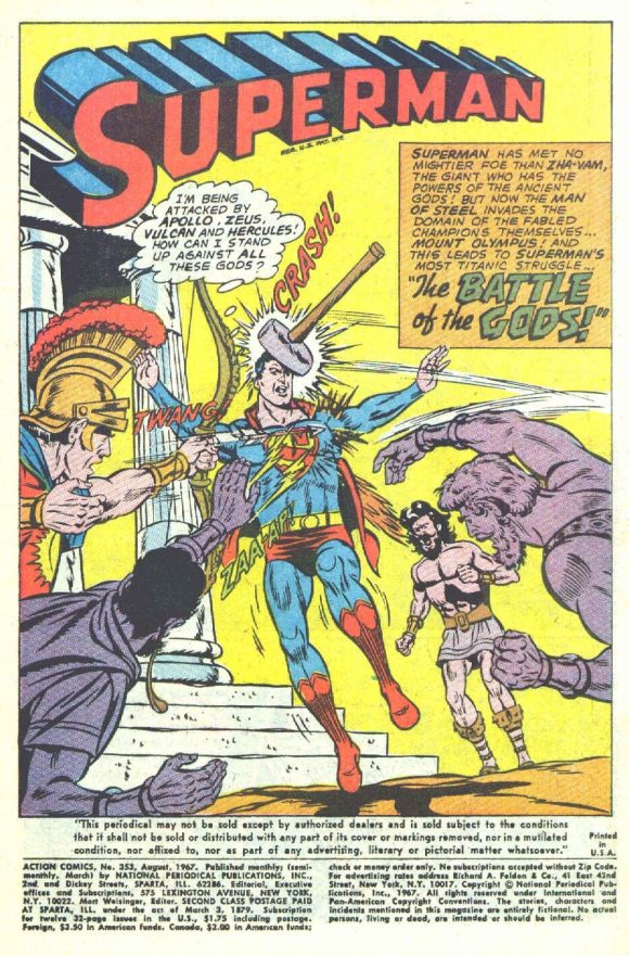
Action Comics #353 (August 1967). Another popular trope: Superman getting the crap beat out of him by mythological beings. “The Battle of the Gods,” written by Binder.
—
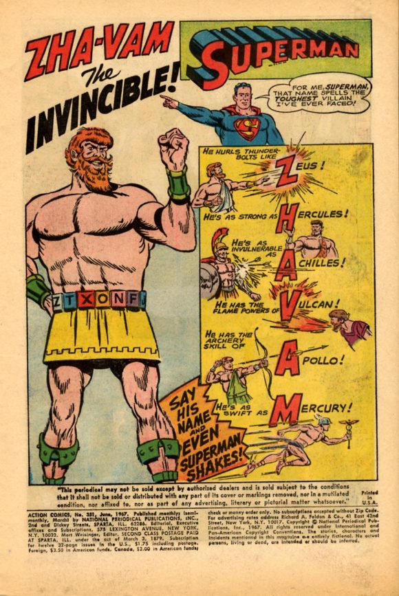
Action Comics #351 (June 1967). “Zha-Vam the Invincible” Zha-Vam has the powers of several Greek and Roman gods and heroes that he summons by speaking an acronym of their names. Writer Otto Binder used to write Captain Marvel. You do the math.
—
Action Comics #356 (November 1967). See my introductory remarks! “Son of the Annihilator,” written by Dorfman.
—
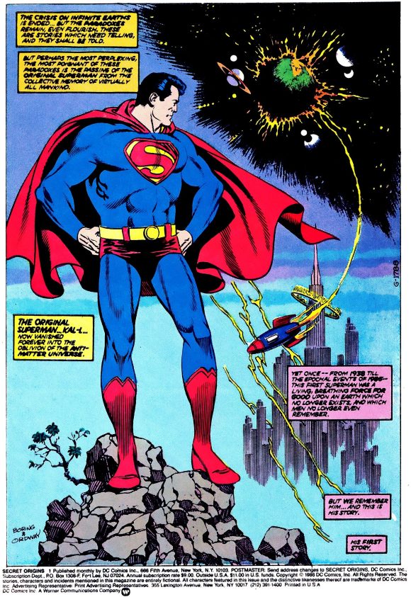
Secret Origins #1 (April 1986). Boring came back to comics for a few stories in his final years, and “The Secret Origin of the Golden Age Superman,” by Roy Thomas and inked by Jerry Ordway, would mark the artist’s farewell to the character he had made fly for so many years.
—
MORE
— 13 COVERS: A WAYNE BORING Birthday Celebration (2023). Click here.
— 13 COVERS: A WAYNE BORING Birthday Celebration (2021). Click here.
—
PAUL KUPPERBERG was a Silver Age fan who grew up to become a Bronze Age comic book creator, writer of Superman, the Doom Patrol, and Green Lantern, creator of Arion Lord of Atlantis, Checkmate, and Takion, and slayer of Aquababy, Archie, and Vigilante. He is the Harvey and Eisner Award nominated writer of Archie Comics’ Life with Archie, and his YA novel Kevin was nominated for a GLAAD media award and won a Scribe Award from the IAMTW. He also wrote an essay for DC’s Aquaman: 80 Years of the King of the Seven Seas. Check out his new memoir, Panel by Panel: My Comic Book Life.
Website: https://www.paulkupperberg.net/
Shop: https://www.paulkupperberg.net/shop-1
June 5, 2025
This is probably a minority opinion, but I think DC made a mistake when they promoted Curt Swan to be the number one Superman artist over Wayne Boring. I’ve always found Swan’s artwork to be incredibly bland (and is probably why people of my generation (Gen X) turned away from Superman comics until the John Byrne reboot). Boring’s artwork, on the other hand, while definitely of its time, was so much more visually dynamic and stylized. When I flip through the Superman Silver Age Omnibus, I find myself lingering on Boring’s stories and admiring the artwork, while just skipping past the Swan-drawn stories.
(No offense to Curt Swan, obviously. From what I’ve read, he seemed like a genuinely nice person. His artwork just wasn’t for me.)
June 6, 2025
I agree with you. Swan is a great artist of course, but Boring has spent too long in his shadow. And while Swan could be placid and sometimes Bland, Boring wasn’t as stiff as people think. He was good at showing characters in a state of anguish or agitation–that’s why his art works so well in great melodramas like “Return to Krypton.” And he was just as good at imparting an air of dignity and grandeur to Superman and his world. This might have looked old-fashioned by late ’60s, when adolescent readers were more excited by the athletic realism of Neal Adams, but as an adult I find a noble, eccentric, unique ality in Boring that is absent from modern comics. No one else made Superman look so substantial and mighty, or gave him more gravitas.
June 5, 2025
What a great birthday tribute to Wayne Boring! Paul’s observations track closely with my own history—including his surprise when he finally saw a photo of the artist.
Despite my lifetime as a Superman fan, my appreciation for Boring only blossomed recently. My epiphany came as a result of finally viewing his work on the newspaper strip, beautifully presented in the volumes “Superman: The Dailies” and especially “S: The Sundays.” Boring’s art truly soars in that medium; you can see that he’s creating a complete “visual world,” comparable to Gould’s Dick Tracy, Capp’s L’il Abner, or Sprang’s Batman strips. I can’t recommend those books highly enough.
BTW, Roy Thomas’ mag “Alter Ego” (from the redoubtable TwoMorrows publishers) is currently featuring the work of Wayne Boring and other early Superman artists, by presenting Eddy Zeno’s sequel to his valuable books on Curt Swan and Al Plastino. The first of two issues is out now, and it’s great reading for this Summer of Superman.
June 6, 2025
I always thought Boring’s Superman looked like Rock Hudson. He was even a longer taller Superman like Hudson. Wonder if he was influenced by the actor. Like, some others on here I preferred his take to Swan’s.
June 6, 2025
As a boy, I usually preferred the Curt Swan/George Klein team but I thought Boring’s style made for the best Bizarro stories. He really captured their kooky awkwardness and bizarre appearance like no one else.
June 8, 2025
Thanks for the fun ride back into back issues! I think it was in a Ron Goulart book on comics they reprinted the classic Boring art of Supes getting hit by lightning and yawning with the caption “Wayne Boring Superman.”
June 8, 2025
I loved Boring’s Superman ever since reading the very first Best of DC digest as a young child. I was immediately taken by that noble, expressive version of Superman, and Boring remains my favorite Superman artist to this day. I recall being very excited when he came back to the character for an All Star Squadron Annual and Secret Origins. And I have also been thrilled to see his newspaper strips in print.