
The celebrated Mr. K takes you on a tour of Go-Go Checks and groovy four-color hype…
—
UPDATED 8/14/25: Who doesn’t love house ads? They rock! So dig this reprint from January 2021 — and check out the links below for more! — Dan
—
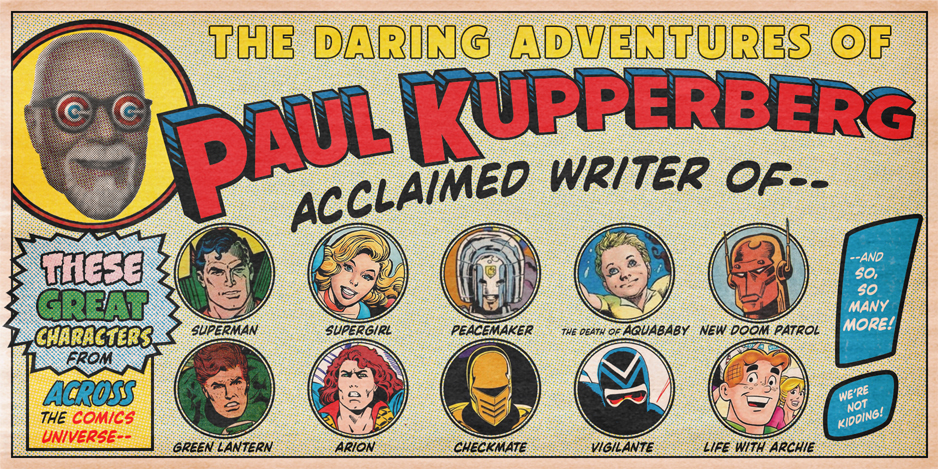
By PAUL KUPPERBERG
Come gather ’round, young ’uns, and hear a tale of comic books before the internet and spoiler alerts, going back to a time when publishers had only one way to get their young readers excited about what was coming up in the comics: the house ad.
The 1960s was a sort of Golden Age of house ads. Not that they weren’t plentiful in previous decades — house ads were (and still are) what you print when you can’t fill those pages with paid advertising — but they seemed to take on a new, more assertive tone, certainly at DC Comics. And they were plenty eye-catching, assembled by DC’s crack production department and stunningly hand-lettered by either the great Ira Schnapp or the great Gaspar Saladino.
This is one of those topics that I had trouble whittling down to just 13 selections; every time I thought I’d gotten to that target I’d remember another favorite that I had to get in there. Eventually, I had about 30 “13 Favorites,” which wasn’t very helpful, so I stopped the Googling and whittled my list back down to the necessary number.
Dan Greenfield has requested a string of 13 Favorite House Ads columns: DC in the 1960s and 1970s, Marvel ditto, and, because he’s a greedy bastard, a separate one devoted to the Charlton house ads, so here, in no particular order are MY 13 FAVORITE 1960s DC COMICS HOUSE ADS:
—
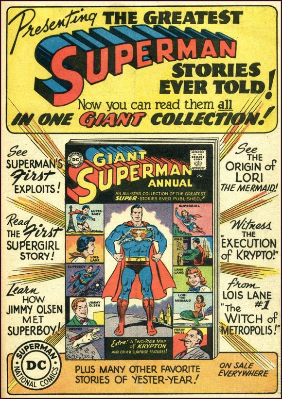
Giant Superman Annual #1 (1960). See what I mean? Big, bold, beautifully designed, and boastful. What young reader (and in 1960, the vast majority of readers would have been adolescents and pre-adolescents) could resist that promise of a Giant collection of origins and firsts? The ads for Mort Weisinger Superman titles were always jam-packed with information, complete with teasers and story titles. You got the feeling Mort liked to lecture.
—
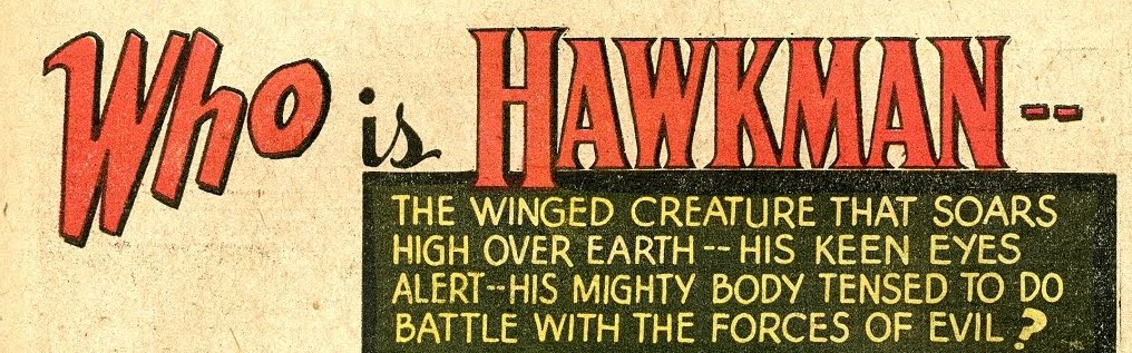
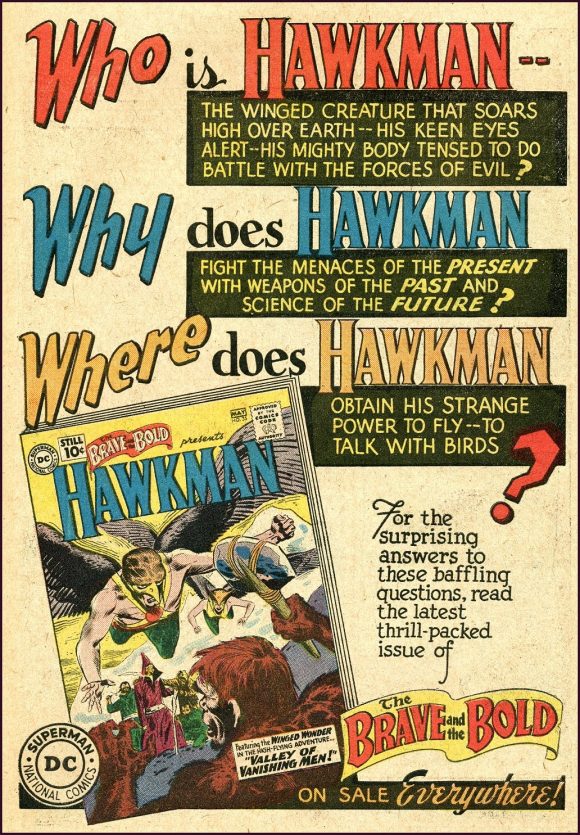
The Brave and the Bold #35 (1961). Julie Schwartz, on the other hand, preferred to engage in a Socratic dialogue with his readers, posing universal questions for which the advertised comic offered the solution. DC reused the same ad for all three issues of the Joe Kubert Hawkman revival in The Brave and the Bold in 1961, just swapping out the covers and on-sale dates. If readers hadn’t been curious about this “new” Winged Wonder before, the ad “blitz” (one of the three issues also shared a full-page ad with Aquaman’s concurrent appearances in Showcase), almost certainly caught their attention.
—
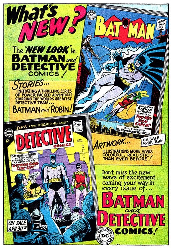
Batman #164/Detective Comics #328 (1964). This ad’s Schwartzian question answered itself, touting the “New Look” (and new editor) for Batman after too many years of Jack Schiff’s cringey science fiction-tainted Batman stories (lots of aliens, giant robots, and evil scientists). The copy promised readers “a thrilling series of power-packed adventures starring the world’s greatest detective team” and “illustrations more vivid, colorful, realistic than ever before!” (Mee-ow!).
—
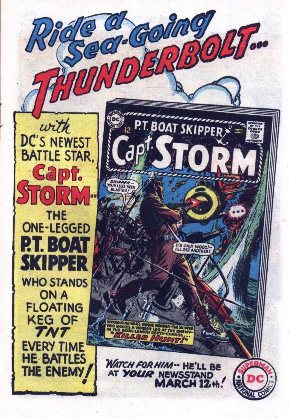
P.T. Boat Skipper Captain Storm #1 (1964). While the killer Irv Novick cover is the attention grabber of this ad, Captain Storm, the “one-legged P.T. boat skipper” was a novel concept for a 1960s DC war-comic hero. Created and written by Robert Kanigher, Captain Storm was a Moby Dick tale, swapping out the great white whale for a Japanese commander who wiped out his previous command and cost him his leg, and bluntly dealt, with typical Kanigheresque intensity, with all the psychological and physical problems that followed. It’s notable that DC launched Captain Storm, a new, non-superhero character and title without any previous Showcase or Brave and the Bold appearances. The title lasted 18 issues.
—
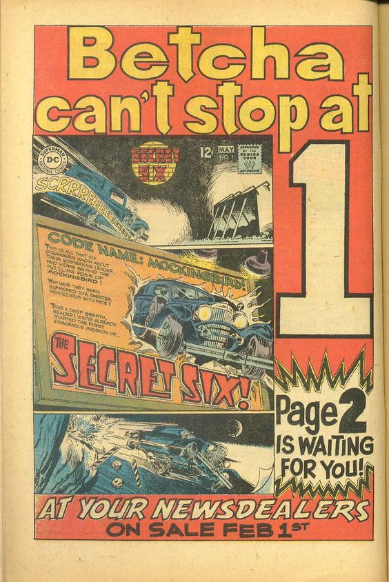
The Secret Six (1968). Like Captain Storm four years earlier, the Secret Six (created E. Nelson Bridwell and Frank Springer) appeared fully formed and out of the blue to land in its own title in 1968. With no superheroes, it was the story of six people blackmailed into working for the mysterious being known as Mockingbird in a sort of Mission: Impossible set-up. The big mystery was “Who is Mockingbird?” (I asked Nelson the 1980s; he wouldn’t tell me), and the ad played off the gimmick of using the first page of the story for the cover to entice readers to see where this literal driving off of a cliff led to.
—
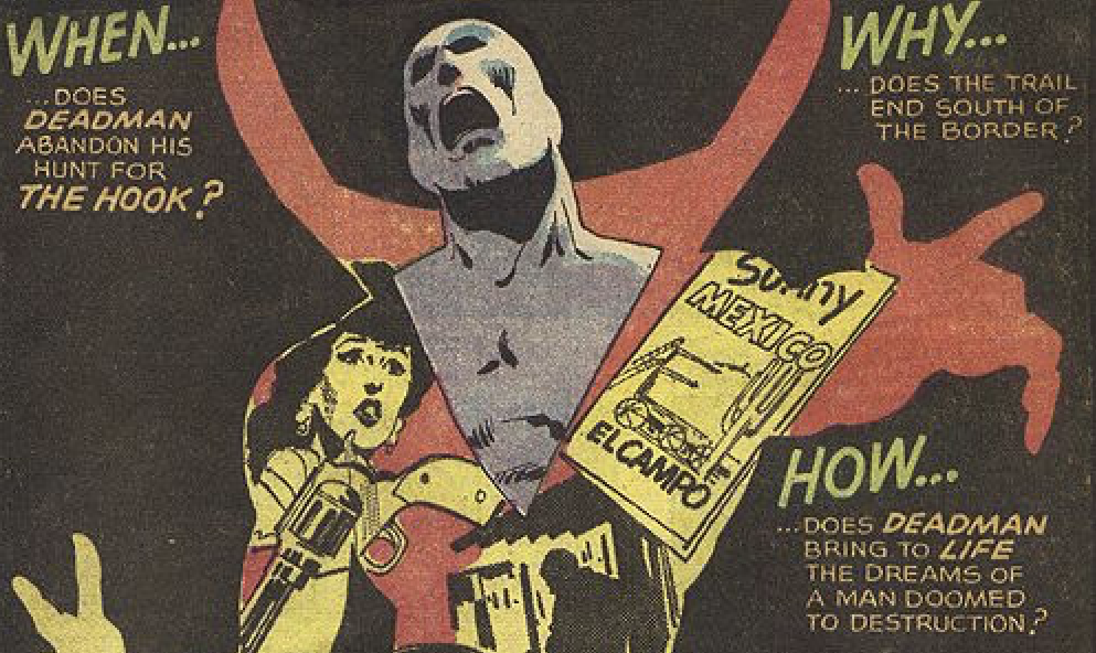
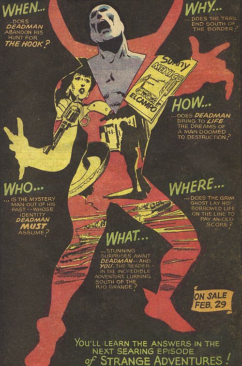
Strange Adventures #211 (1968). It looks like editor Jack Miller also had a few questions for readers of the new Deadman strip in Strange Adventures, and he made sure to first get their attention with a grabber of a graphic by Neal Adams, a different and riskier tactic from the usual use of the issue’s cover. By showing the cover, buyers knew exactly what to look for on a crowded newsstand or spinner rack; maybe that’s why Deadman would be gone and replaced by Adam Strange reprints half a dozen issues later.
—
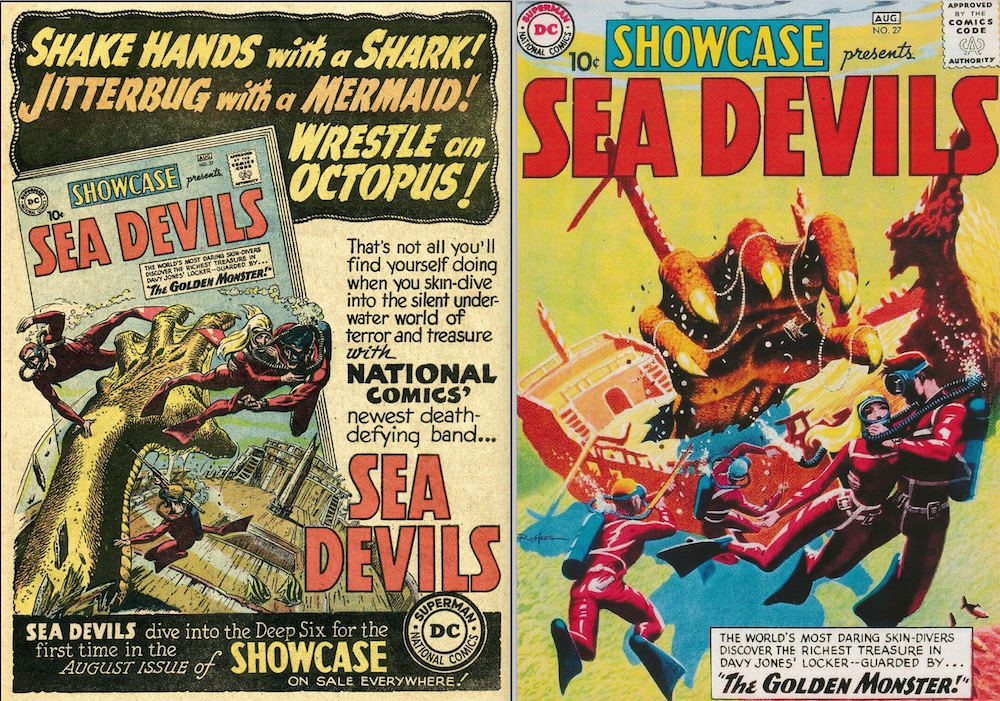
Showcase Presents the Sea Devils #27 (1960). This ad for the introduction of the Sea Devils is double cool because (a) it’s the introduction of the Sea Devils, and (b) it features an alternate version, cobbled together from the issue’s splash page, of the published Russ Heath cover, recolored but without any of Jack Adler’s added wash tones.
—
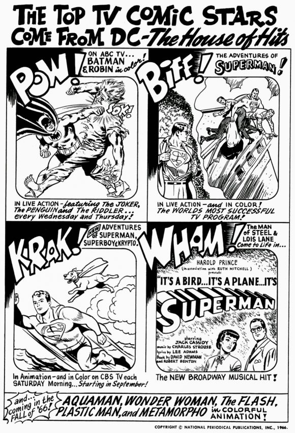
The Top TV Comic Stars (1966). Yeah, it’s all small time compared to the current blizzard of comic book films, TV and animation, but in 1964, fans were grateful for whatever other media our heroes showed up in. This 1966 house ad, which ran in black and white on the inside front cover of DC’s mags, riffed off the “Pow! Biff! Wham!” conceit of the Batman TV series and featured the hit ABC-TV show along with “the world’s most successful TV program,” reruns of the George Reeves Adventures of Superman, as well as the Saturday morning New Adventures of Superman (and Superboy and Krypto) on CBS-TV, and the Broadway musical “hit” (it actually lost $600,000 and at the time was considered Broadway’s biggest flop) It’s a Bird… It’s a Plane… It’s Superman! The ad also teased animated adventures of Aquaman, Wonder Woman, the Flash, Plastic Man and Metamorpho for the coming fall of ’66. (Only two of those came to fruition). Holy cathode ray tube, Batman!
—
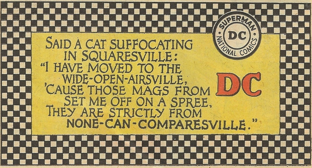
DC Comics Go-Go Checks in None-Can-Comparesville (1966). WTF, right? It was a joke even back when I was a young reader about how tone-deaf DC Comics was to its readers and the times. A lot of it had to do with the exclusively middle-aged white male make-up of the writers and editorial staff. They had just about wrapped their heads around the hipster dialect of the 1950s Beat Generation when along came all those darn hippies with their long hair and language of their own. By 1966, the only place anyone was talking like this was in DC Comics and TV shows like Dragnet, and that’s a fact, ma’am. Those groovy DC daddy-os who wrote these things never did quite get their minds out of Squaresville, dig?
—
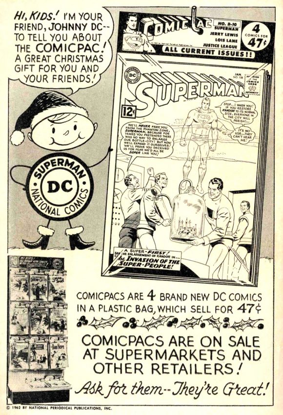
Johnny DC and ComicPac (1962). The original bagged comic books! It wasn’t that you saved a whole penny by buying four 12¢ comics bagged together for 47¢, it was just that the whole idea was so cool. While it bragged that “Comicpacs are on sale at supermarkets and other retailers,” I don’t recall ever seeing one of the pictured displays, although a few did show up now and then on the spinner rack at John’s Bargain Store on Church Avenue in Brooklyn. The problem was not knowing exactly which issues of the listed titles were sandwiched behind the visible books; duplicate issues were a waste of money for me because I didn’t have anyone to trade with.
—
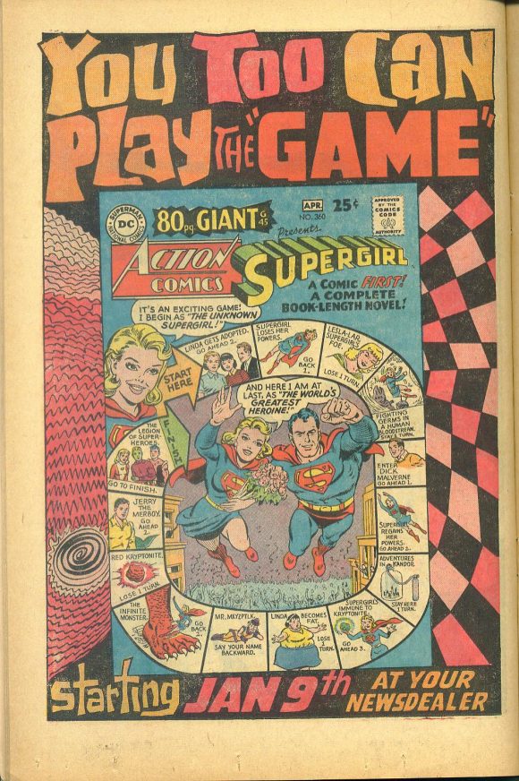
Action Comics 80-Page Giant #360/G-45 (1968). One of the first titles I started collecting was Action Comics since it starred my favorite character, Superman, and had as its back-up my favorite feature, the Supergirl strip. As I’ve noted previously, the Jerry Siegel/Jim Mooney Supergirl strip relied much more on continuity than just about any other DC series besides The Doom Patrol. I’m not quite sure what all the scribbly stuff on either side of the cover image is supposed to be, but the Pop Art lettering and use of cool, mod psychedelic colors made this ad pop off the page.
—
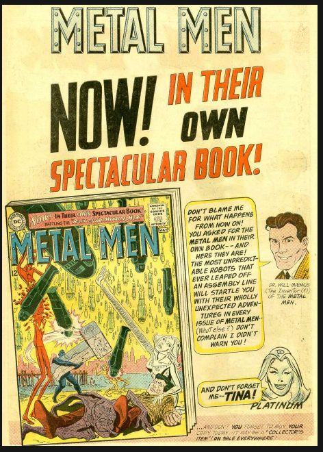
Metal Men #1 (1963). It’s raining robots, hallelujah! Metal Men was another Bob Kanigher feature, the concept created and first issue famously written over a weekend to fill an empty slot in an issue of Showcase. For the first issue of their ongoing title, Doc Magnus personally invited the readers to join the action… but accepted no responsibility for the behavior of his robotic creations with human emotions.
—
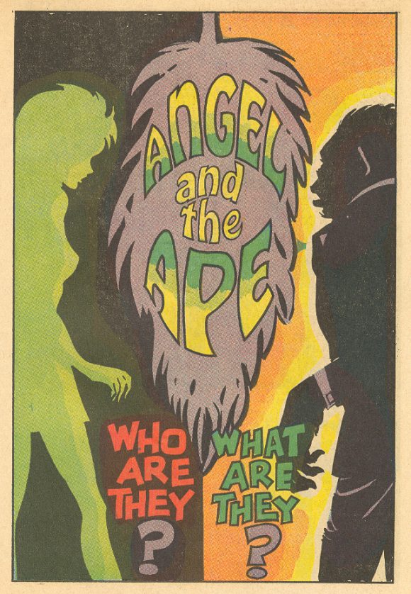
Angel and the Ape (1968). It looks like the silhouettes in this teaser ad for the feature that would debut in Showcase #77 were drawn by editor Joe Orlando, but Angel and the Ape was a co-creation of E. Nelson Bridwell and Bob Oksner. The strip starred a scatterbrained artists’ model and detective and her partner, detective and cartoonist Sam Simeon, a particularly well-dressed talking ape. It was short-lived but funny feature, and this teaser ad left its mark on me.
—
MORE
— My 13 Favorite 1960s MARVEL HOUSE ADS. Click here.
— My 13 Favorite 1970s DC COMICS HOUSE ADS. Click here.
— My 13 Favorite 1970s MARVEL HOUSE ADS. Click here.
—
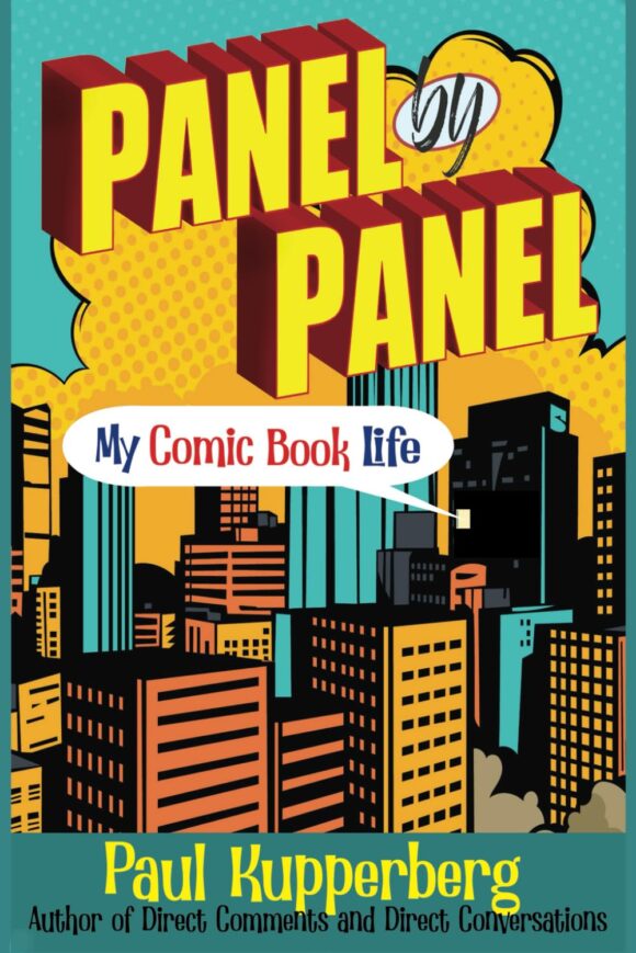
PAUL KUPPERBERG was a Silver Age fan who grew up to become a Bronze Age comic book creator, writer of Superman, the Doom Patrol, and Green Lantern, creator of Arion Lord of Atlantis, Checkmate, and Takion, and slayer of Aquababy, Archie, and Vigilante. He is the Harvey and Eisner Award nominated writer of Archie Comics’ Life with Archie, and his YA novel Kevin was nominated for a GLAAD media award and won a Scribe Award from the IAMTW. Check out his new memoir, Panel by Panel: My Comic Book Life.
Website: https://www.paulkupperberg.net/
Shop: https://www.paulkupperberg.net/shop-1
January 26, 2021
So… that Bat Lash teaser… Would it have saved the list? Or ruined it?
January 27, 2021
The Bat Lash ad was definitely on my short list, but I only had 13 slots…
January 27, 2021
I love that house ad for DC bragging about all of their TV shows and Broadway Play (albeit a flop). As you mentioned in earlier posts, after Filmation scored the biggest hit of the 1966-67 Season with The New Adventures of Superman, DC comics opened the vault to Filmation. Per Lou Scheimer’s Filmation book, once the animated rights to Batman was secured, Fred Silverman scrapped the other DC animated projects. It would have been cool to see a Wonder Woman and Plastic Man cartoon back in those days.
January 28, 2021
Love that Deadman image.. but is it just me or does it look more like Jim Aparo than Adams? Looking at the woman’s face…
August 26, 2023
I noticed that as well…I think the ad is Aparo, not Adams.
February 1, 2021
The New Look Batman was obviously given both a sales boost and real-life grounding by the inclusion of The Hootenanny Hotshots. Holy Cornfed Crossover, Caped Crusaders!
March 13, 2022
I bought a few Comic Pacs back in the day! A neighborhood drug store had them on the magazine rack.
March 13, 2022
I distinctly remember getting Green Lantern 39 and World’s Finest 151 in the same Comic Pac.
June 11, 2022
Novick has to be the most underrated artist in DC history. The guy was simply brilliant but typically overshadowed by everyone from Infantino to Adams to Aparo.
June 12, 2022
Nelson wouldn’t tell you who Mockingbird was? Because I’ve spoken (or written) to several people who he did tell.
June 12, 2022
Loved the house ads as kid in DC comics. No only did enjoy reading them but it helped me look for the books. The cover was always a selling point for me. If I liked the cover, I knew I would the stories in the comic.
September 12, 2025
Thanks for reprinting that ANGEL AND THE APE ad. It was better than anything in the comic!
January 20, 2026
Loved seeing the ad for DC on TV, as well as Broadway! Yes, “It’s a Bird, It’s a Plane, It’s Superman” WAS a flop, but is quite a cult classic, for it’s wonderful score by Charles Strokes (“Bye Bye Birdie,” “Annie,” and “Those Were the Days” from All in the Family), as well as featuring a young actress – Linda Lavin – singing the biggest “hit” from the show, “You’ve Got Possibilities.”
January 20, 2026
Charles STROUSE!