
A five-part series on the great DC Comics logo designer and hand-letterer of the Golden and Silver Ages, by Arlen Schumer.
Fifty years later, Ira Schnapp is still selling comics. Over the last few years, having rounded out my Batman collection, I started widening my Silver Age reach by picking up books that I remember seeing in DC‘s old house ads. Those ads were dynamic, fun and — most importantly to the publisher — great sales tools. It was only in the last 10 years or so that I learned they were largely the handiwork of Ira Schnapp.
So when Arlen let me know about his upcoming exhibit at the Type Directors Club of New York, I jumped at the chance to serialize his lecture for an Internet audience. Whatever you already know about DC‘s house style of the Golden and Silver Ages, I promise you that you will learn more. And if you’re a neophyte, then this will be an especially fizzy, colorful journey over the next five weeks. — Dan Greenfield
—

Portrait of Schnapp by DC colorist Jack Adler, circa 1960s.
By ARLEN SCHUMER
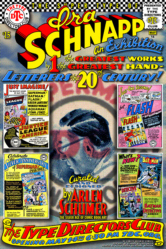
(Based on Arlen Schumer’s upcoming lecture and exhibit, The Super Type of Ira Schnapp at the Type Directors Club of New York, opening Thursday, May 14 at 6:30 p.m. The exhibit will run through the summer.)
Would you believe that the artist who designed in engraved Roman letters the slogan, “Neither snow nor rain nor heat nor gloom of night…” atop New York City’s main post office at Penn Station is the same man who designed the famous, iconic Superman comic book logo?


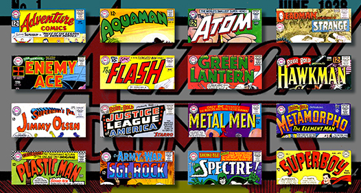
Both are the works of Ira Schnapp (1892-1969), a descendent of stonecutters, calligrapher and hand-letterer who defined the “house style” of DC Comics for over 30 years, starting with the Action Comics logo on the cover of Superman’s first appearance in 1938, and continuing with scores of others for the company — including hundreds of house ads promoting their monthly comics that are among some of the greatest examples of hand-lettering in the 20th century.
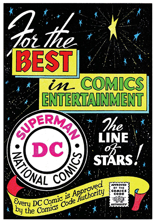
DC Comics house ad, 1957
Yet, for all of his ubiquitous works, to the comic book audience, as well as comic book historians — and of course the general audience — Schnapp’s name and legacy are unknown and forgotten.
But I aim to change that with my lecture and collateral exhibit on Schnapp for the Type Directors Club of New York.
Like an entire generation, I grew up with Schnapp’s DC Comics logos and house ads, and always loved them without ever knowing his name; it wasn’t until relatively recently that his name leaked out in various fanzines and such (and thanks to the great comics history blog, Robby Reed’s Dial B for Blog, we wouldn’t know much of anything about Schnapp.
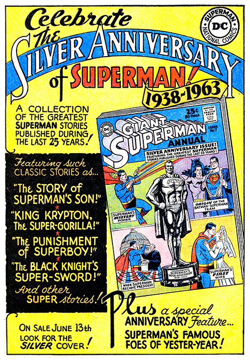
DC Comics house ad, 1963
Schnapp’s career peak came during the Silver Age of comics (circa 1956-70), so my book, The Silver Age of Comic Book Art (Archway Publishing) is a bit of a showcase for Schnapp’s work in the DC artists’ chapters. In my own comic book-style illustration work over the course of my career, I’ve kept Schnapp‘s style alive by incorporating his unique hand-lettered fonts into my own comic book-styled illustration and design, which you can see here.
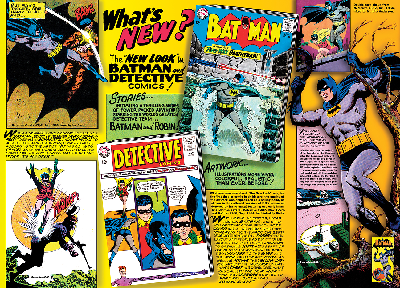
Schnapp’s house ad is front and center of this Batman spread in the Carmine Infantino chapter of my Silver Age book.
So I’m really excited that the Type Directors Club has afforded me the space to create a dream come true: an exhibit of Schnapp’s “greatest hits” on a grand scale. I’m getting to blow up his Superman logo 14 feet long — thanks to the great, oversized prints provided by A to A Studio Solutions, the producer and sponsor of the exhibit — befitting his legacy! Finally both comic fans and New Yorkers — and visiting tourists — will know who created some of the most recognizable graphic icons of their lives.
So to whet your appetite for what’s to come, each week leading up to my opening-night lecture on May 14, I’ll be presenting some of Schnapp’s best work here at 13th Dimension — starting with his greatest DC logos.
See you next week!
—
To order a signed hardcover of The Silver Age of Comic Book Art from Arlen directly, hit up www.arlenschumer.com. There are also links to Archway Publishing (an offshoot of Simon & Schuster) for the unsigned hardcover and an e-book edition.

April 16, 2015
You can listen to Arlen Schumer talk about dirt and it would be interesting, educational and ENTERTAINING! This is a GREAT topic and I highly recommend you check out Arlen’s talk about Mr. Schnapp. I just saw Arlen in front of a packed and captivated room filled to capacity that gave him a standing ovation when he was done talking about Art and Comic Book Art.
April 16, 2015
You’re wrong. Arlen knows nothing about dirt. But he knows EVERYTHING about Silver Age comics!
April 22, 2015
Thanx for those kudos, guys! Register for Schnapp online: http://www.eventbrite.com/e/the-super-type-of-ira-schnapp-tickets-16397918616
June 22, 2015
Well – you learn something every day…Arlen, apparently, allegedly, doesn’t know anything about… dirt…
June 22, 2015
Glenn??? I don’t understand your comment???
June 22, 2015
Oh, wait, now I get it; I just re-read the previous comments! SHEEESH!!!