Week 4 starts in earnest with Superman, Batman and Wonder Woman. Sounds like a great idea for a movie!
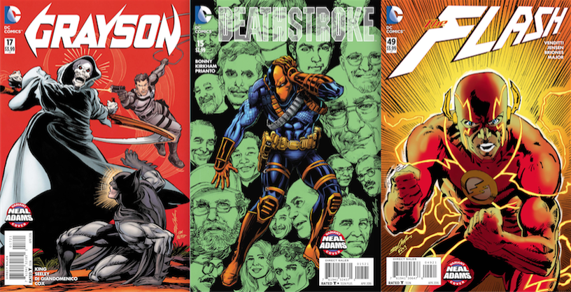
Some of the Week 4 books due out 2/24
It’s NEAL ADAMS MONTH here at 13th Dimension, and we’re featuring daily commentary by Adams on his variant-cover project for DC Comics. Each of his 27 variants is a twist on one of his famous covers from the past. He provided the pencils, and the inks and colors were handled by some of the biggest names in the business like Frank Miller and Dave Gibbons.
For the full NEAL ADAMS MONTH INDEX of stories — click here.
Our last installment featured Wonder Woman #49, which was based on Superman #243. (Click here.)
Today, it’s Superman/Wonder Woman #26 — out 2/24 — which is based on World’s Finest #180.
—
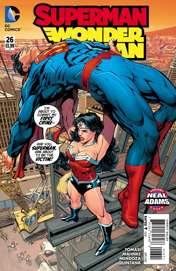
Pencils by Neal Adams, inked by Danny Miki and colored by Hi-Fi
Neal Adams: Since I was a kid, I was always a fan of World’s Finest. I can remember—I can probably draw the picture!—when the two of them (Batman and Superman) are changing their costumes in a (cruise’s) state room and it’s dark and they don’t know each other’s identities and the light comes through the porthole and they see their real identities! (Laughs) Wow! That’s a moment there. So cool!
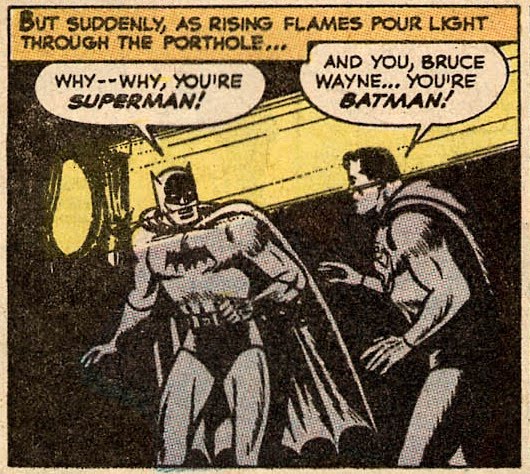
Superman #76 (1952)
So they realize who they are and now they’re gonna work together, but of course one’s a human and one’s an alien. So the opportunity to do these covers appealed to me and that idea (gestures to World’s Finest #180) was not my idea. I don’t even know where it came from.
The idea of Superman throwing Batman down would not have occurred to me. I don’t know why. I don’t even know why I say that. So when it was presented to me, let’s have Superman throw Batman off the construction, I thought, “No! You don’t wanna do that! You could have Batman throw Superman, but (the other way) that’s not cool!”
But, of course, being a professional, I accepted the idea. And then of course I tried to come up with a better way to do it, all right? Now, Carmine Infantino didn’t have anything to do with this but it’s a typical Carmine composition. I borrowed Carmine’s (mindset) and I made the composition because I could thrust that character to the foreground without regard to corrective anatomy or doing anything else.
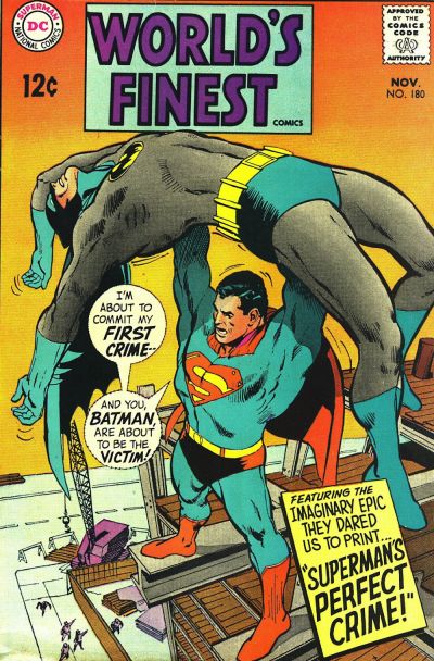
Dan: It does look like Batman’s awkward.
Neal: Yeah. He is. So I corrupted a Carmine Infantino composition in order to do that. So then when I decided to go ahead and do this cover (Superman/Wonder Woman #26) I thought, “Oh, shit! All my sins are gonna come back and bite me in the ass on this! I have to find a way to make it similar but to have the anatomy work.”
Well, the problem with this anatomy (points to Batman’s shoulder) is that there’s a joint in your shoulder that will allow your arm to go so far back but then if you pop it, it’ll let it go back even further. So I popped it consciously. Because he’s unconscious! And then the rest of it worked OK because this hand really shouldn’t be up there. It should be over here because then you’re, like, even, balanced, so that makes a certain amount of sense. The feet worked.
Now, I had to draw a Wonder Woman who looked like she could hold Superman. So I did. Which is the kind of thing Adam Hughes does. Which kind of gripes me because Adam Hughes is so good, there are times I think he does things better than I do. (Dan laughs) And it just makes me crazy. Which is wonderful. He’s like a son, you know? Yeah! Go, Adam! I love that.
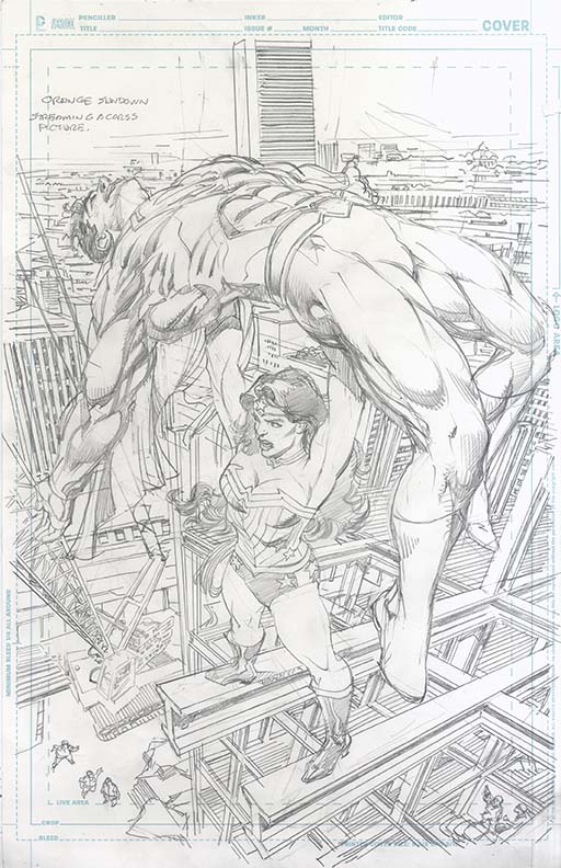
But then I had these girders to work out that I just did as throwaways. Now I have all this stuff that I have to figure out where everything goes and then if I’m gonna make my perspective right, then my horizon has to be here. See, I faked it over here (on the old cover). My horizon disappeared. So if I make my horizon where it belongs, then how do I get my orange?
So what happened was I penciled it and it got inked and, of course, the colorist colored it but the colorist colored it with regular color. So then I took a piece of tracing paper and I magic markered over the orange. I said, “Look. Just kill some of the color and then throw the orange over as if the sun is rising back there and it’ll work.” And it did.
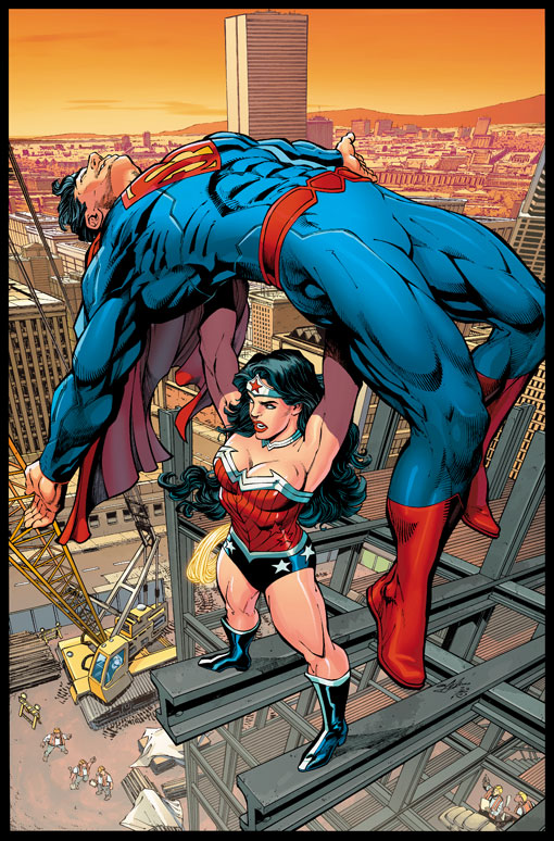
It’s one of those, like, it went down the chain of problem-solving until it got to the colorist and the colorist did the logical thing. And then we entered illogic into it and…there’s nothing wrong with that! As a solution, it works perfectly.
So we were able to get back to the composition of the orange going into the yellow…and it worked. In spite of the fact that we have a full background behind it, which is, again, a pain in the butt for the inker because he had to ink all that crap.
By the way, that’s another cover that I think is better than the original. It’s richer.
—
NEXT: Superman … out for a run: Click here.
—
You can also find more on Neal Adams at his website, here.

Trackbacks/Pingbacks