
An instant classic…
It’s easy to get spoiled being a Batman fan.
He’s DC’s most popular character so the publisher always has top-flight talent working on him. But sometimes something pops up that stands out even beyond the typically first-rate writing and art associated with the Dark Knight.
Take Matt Wagner’s cover for September’s Batman #54, written by Tom King, that was shown off this weekend at San Diego Comic-Con:
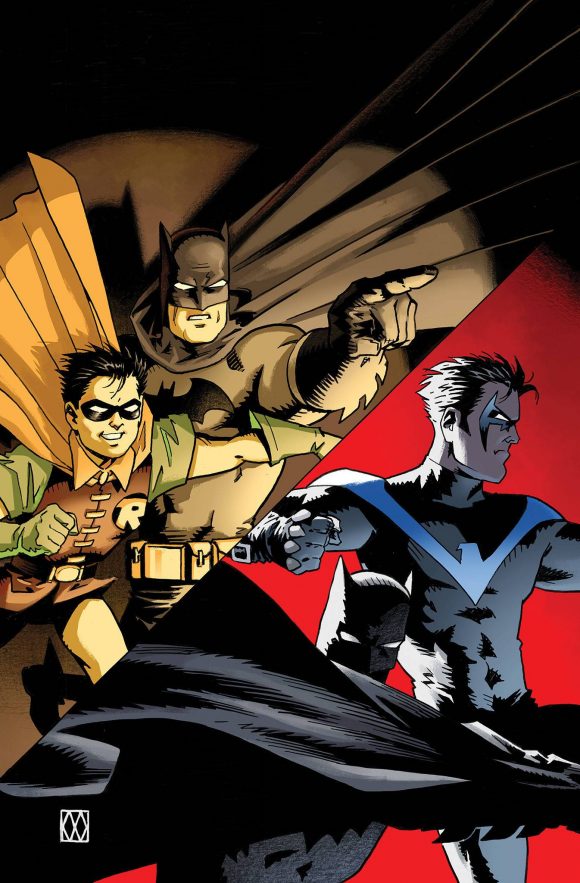
That right there is the best Batman cover I’ve seen in years. It made me gasp when I first saw it.
Let’s start on the left.
The image looks like it takes place one second after the scene shown on one of Batman’s most famous covers:
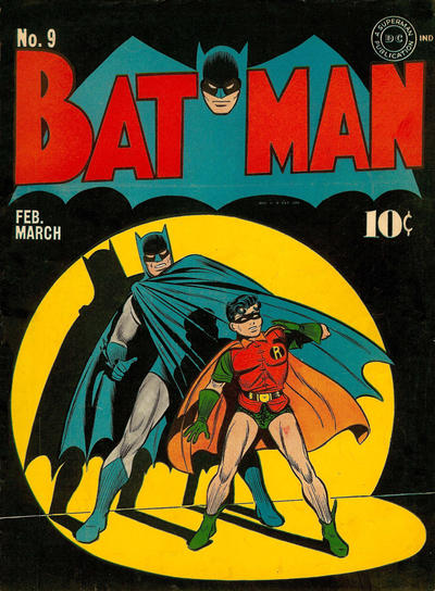
Fred Ray pencils, Jerry Robinson inks.
Batman #9 has been homaged many times over but I like that Wagner took it that extra step.
It also reminds me that I would love nothing more than a modern-day, canonical Batman and Robin: The Early Days ongoing comic, featuring Bruce Wayne and Dick Grayson. (And thanks to Wagner for putting Robin in his classic outfit instead of that execrable retconned uni they now usually show in flashbacks.)
But let’s not forget the image on the right, which shows our heroes today. The cover actually tells a story: On the left, Batman is giving Robin direction, setting him loose upon whatever villain or gangster thinks they have the Dynamic Duo cornered. But on the right, we see Batman and Nightwing working together, separate but in tandem.
All fitting for an issue that will delve into the Caped Crusaders’ storied partnership.
In total, it’s a beautiful image and an elegantly simple way of conveying the passage of time for the greatest team in comics history.
July 22, 2018
With this cover it looks like DC may be going back to Dick’s pre-new52 Robin outfit as well!
July 23, 2018
Haven’t read any monthlies in a long time. What does Robin’s retconned flashback costume look like?
July 24, 2018
Here, Matt: http://dc.wikia.com/wiki/Richard_Grayson_(Prime_Earth)?file=Dick_Grayson_Robin_Prime_Earth_001.jpg
July 24, 2018
Ugh. Terribly overwrought.
July 25, 2018
Oof. I’m with Matt D. Not a fan. How does he even put that on?
July 25, 2018
What am I not getting? It’s a very generic looking cover– I don’t see a connection to #9 at all.
July 25, 2018
It’s kinda loose, but I think it evokes #9 with the spotlight (and all its subsequent imitations), but it looks as much like the Dark Knight Returns statue where he’s crouching next to Robin and pointing.
I’m not at all a fan of Matt Wagner these days. All his art looks rushed. The characters are rough, and there’s literally no background that isn’t digital coloring.
July 26, 2018
OK.