
FRANCO’S FREE FOR ALL FRIDAYS!

By FRANCO
Aquaman gets a bad rap.
Yeah, he’s easy to make fun of, but for some reason I’ve got a soft spot for these characters that people make fun of.
But there was a time in his history where there was a fundamental change in this character and it shifted the focus away from him being a cartoonishly clown-like figure into a serious and gritty superhero.
No, not when he lost his hand and had to replace it with a pitchfork. Or the gruff but handsome (I’m all grown up now) beard!
It was that new suit. You know which one I’m talking about:
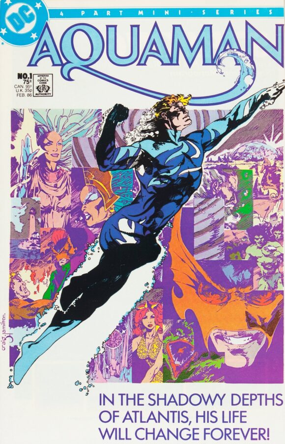
1985’s Aquaman #1. The blue suit debuts!
That blue suit — designed by Neal Pozner and illustrated by Craig Hamilton — was cool! It made a heck of a lot more sense than the orange shirt and green pants — which I also love, but make him look like a giant goldfish.
I mean, if you were a shark and you see this giant goldfish swimming up to you and start bossing you around, tell me you wouldn’t try and take a bite out of him.
Don’t even get me started on that giant seahorse. Storm. I mean, that’s gotta be a mutant, right? Seahorses just don’t grow that big! What is happening under the waves of the oceans of this world?

I could go on forever about those sea monkeys there used to be ads for in those old comics. I never sent away for them because they terrified me.
Why would I want a giant, kinda nude sea monkey family living in a fish bowl in my house? How much would they eat? My parents would definitely mind. I never did read the small print about how big they actually were or their actual size.
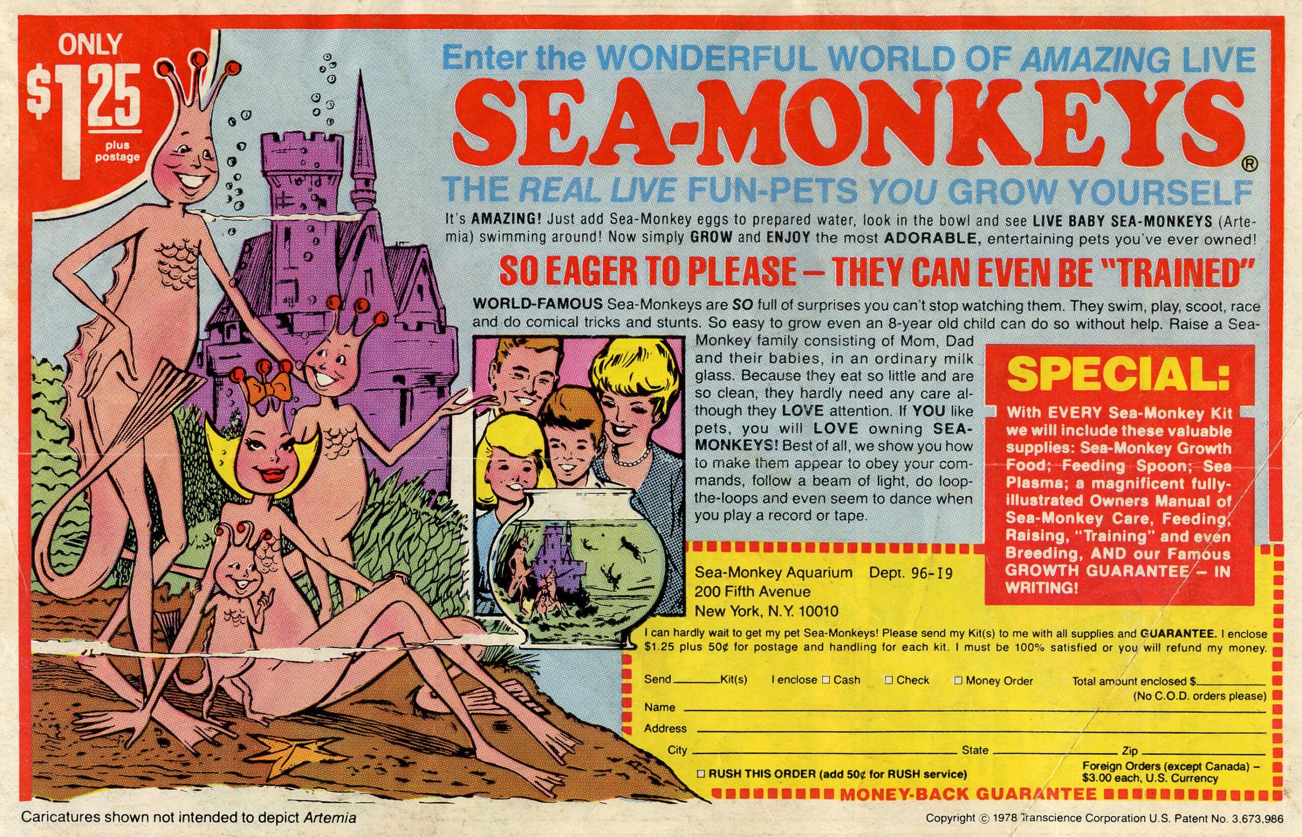
Also, why were there no stories involving Aquaman fighting those things? They were right there every time I picked up a new book! They looked like something he would have a conflict with. (Dan adds: Especially since they were invented by a white supremacist. Really. After all, the Sea King battled Nazis in his very first adventure.)
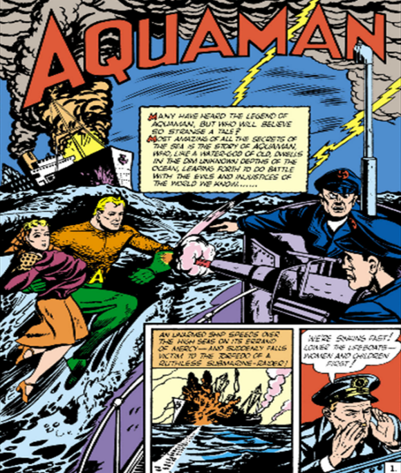
1941’s More Fun Comics #73. Script by Mort Weisinger. Art by Paul Norris.
Anyway… the blue suit is way cool and makes a lot of sense as an underwater garment.
Water is clear, but for some reason you put a whole bunch of it together in one place like an ocean and suddenly it’s blue. I don’t really know science. But the blue suit made sense to me in a blue ocean!

But I also like the orange and green…

—
MORE
— FLASH! The Power of Using Comics to Teach Kids to Read. Click here.
— The GEORGE PEREZ Comic That Inspired Me to Become a Pro. Click here.
—
Franco and his forehead have traveled the world and he writes and draws stuff. Franco is the creator, artist and writer of Patrick the Wolf Boy and Aw Yeah Comics! Franco has worked on books/comics, including Tiny Titans and Superman Family Adventures. Franco was also a high-school teacher and is one of the principal owners of Aw Yeah Comics retail stores. Dan made Franco add that he has won three Eisners.
February 28, 2025
This was such a great, albeit brief, chapter of the history of the Sea King.
I am beyond shocked that DC has yet to reprint a hardcover deluxe edition of that GORGEOUS miniseries.
March 1, 2025
I would buy a hardcover deluxe of this Aquaman miniseries. I loved the costume, the story, the art.
And while I’m at it, I’d also buy a hardcover deluxe edition of the Mike W. Barr/Trevor Von Eden/Dick Giordano Green Arrow mini. C’mon, DC, take my money!!!
March 1, 2025
Modeled on 80s model Jeff Aqualon
February 28, 2025
I love love this series and the blue costume. Craig Hamilton’s art is great.
I still have my copies.
March 1, 2025
I, too, still have mine. The blue costume was one of the best costumes Aquaman had. I guess it was too hard for the artist and inker to draw and ink.
March 4, 2025
It actually didn’t make sense underwater. all the blues and the whites were in the wrong places and the wrong shades.