Artist Christopher Mitten lifts the veil…

The latest Hellboy series launches Aug. 21 with Hellboy and the BPRD: Saturn Returns #1, by Mike Mignola, Scott Allie, Christopher Mitten and Brennan Wagner. Cool, right?
So, over two days, we’ll be giving you an EXCLUSIVE behind-the-scenes look at series artist Mitten’s first two covers for the three-parter.
Today, he gives you the rundown on Issue #1’s cover, which you can find below. On Wednesday, we’ll give you the FIRST LOOK at Issue #2’s cover, again with Mitten’s commentary. (And here it is!)
Let’s get started, shall we?
—
By CHRISTOPHER MITTEN
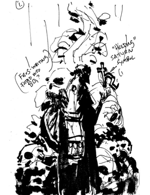
Thumbs: Going in, I had a pretty clear idea of what I wanted this cover to be—and hoped Mike, Scott, editor Katii O’Brien and assistant editor Jenny Blenk would agree—so, if memory serves, I sent in a couple thumbnails, pretty much just variations on this layout, and hoped all involved could decipher my doodles and scribblings enough to give me thumbs up or down.

—
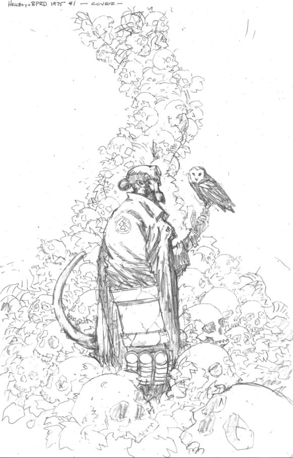
Pencils: Happily, I got the go-ahead on the design and I jumped into the pencils. For the better, it was decided the Saturn symbol should be dropped. Instead of Hellboy holding that, I figured an owl would suit. It fits the story, makes a better image, and I just enjoy drawing birds. So, it was kind of an all-around win, really. (Plus, having a couple editors with good eyes and great sense doesn’t hurt, either.)

—
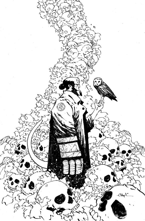
Inks: The inks have always been my favorite part of the process. It’s where I have the most fun and am the most relaxed, dialing it in and seeing it come together. And seeing this one come together made me smile. Because if I can’t have fun with Hellboy—or any of Mike’s creations, really, because his sense of design is exceptional—I’m in the wrong line of work. In this case, quite literally.

—
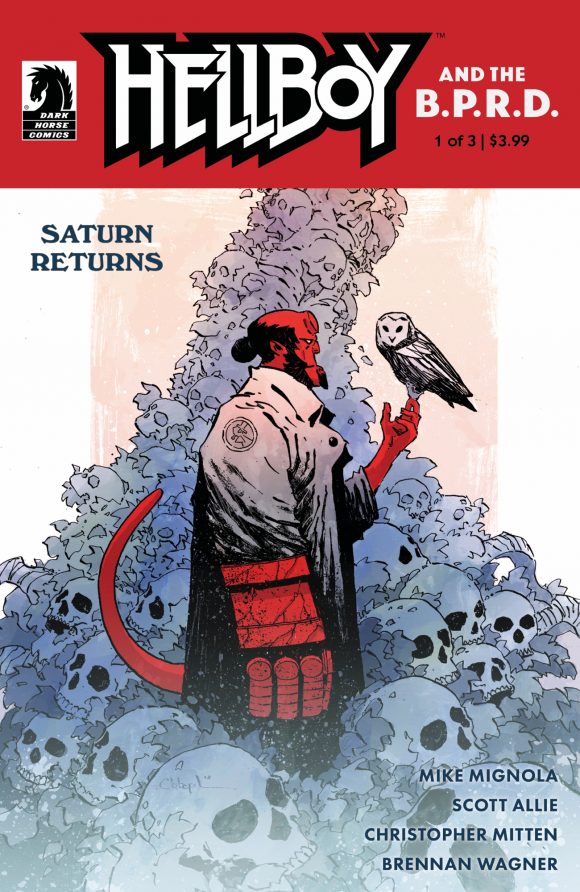
Color: Like the inks, I have a lot of fun with the coloring: It’s one last chance to play with the image, to try and give it the right mood and feel, to really try to make it sing and to have it stand out on the shelves among other books. Initially, I’d pictured the “frog writing” faded lightly behind the image, but in the end, it was just too cluttered, and the simplicity of Hellboy and the tree of skulls against a plain light-colored background worked far better.

—
NEXT: Mittens reveals the cover for Issue #2. Click here.
—
MORE
— 13 PANELS That Capture the Magic of HELLBOY. Click here.
— VIDEO SPECIAL: Mignola Talks HELLBOY, Painting and Creativity. Click here.
