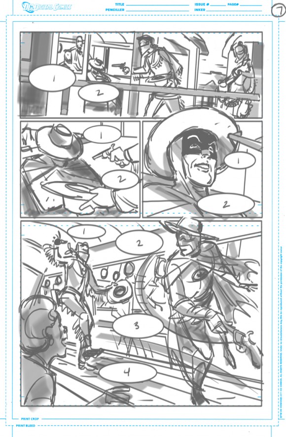
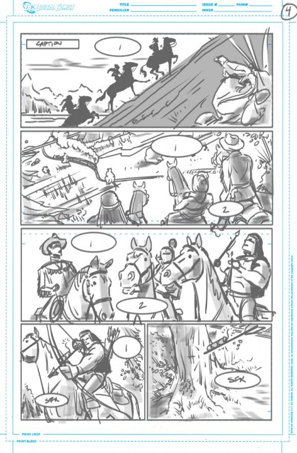
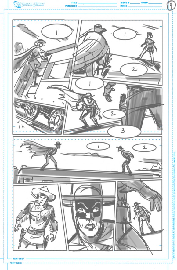
Boy, I wish I could draw. And I wish I could draw – and paint and sculpt – like artist Ruben Procopio. Ruben is one of the artists on DC’s digital-first Batman ’66 comic and today he lifts back the veil to show you exactly how he put together the art for the current Shame storyline.It’s a veritable treasure trove of gorgeous material and I have to tell you I’m as proud to deliver this as I am just about anything else I’ve published on the site. It’s wonderful to get this kind of glimpse into how art is created.
So I’m going to let Ruben take over here and I want to give a special shout to the folks at DC for agreeing to such a rare glimpse behind their scenes. Issue #27 is out Wednesday, Feb. 5, written by Jeff Parker:
By RUBEN PROCOPIO
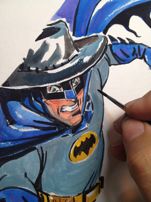
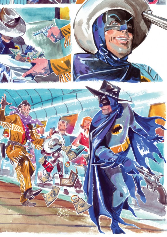
For each Batman ‘66 story I’ve gotten, I’ve had a hankering to try a different medium. When the Shame story came in, since it was set in the unexpected location of the Old West rather than Gotham City, it warranted a different look and color palette.
I thought it could look like the old Western paintings you see in a museum, and it felt only natural to try it out in water color. Also … the way Jeff wrote it was to practically pack a movie -length script into (a) concise, action-filled dynamic comic … with a very accessible story lending itself to these visuals, compared to, say, the Tut story which felt more epic, even weaving in time travel to ancient Egypt and back.
Plus Jeff’s direction was to illustrate the show as though it had a huge budget like in a feature film. And the fact that Jeff’s script is funny to read, with Shame’s dialogue in that Western twang.
Sure enough, editor Jim Chadwick said it was OK to do watercolor, and this gave me the opportunity to do my own colors as well. I had not picked up my paintbrushes and water colors in many years, so this story gave me a great chance to brush up (no pun intended) on my watercolor skills.
I kept in the back of my mind the old spaghetti Western movies by Sergio Leone. Another inspiration was, believe it or not, the old Singer clothing patterns package designs from the ‘60s, which I ultimately got to paint in similar styles, colors and patterns on the train passengers to get the ‘60s style wardrobe look.
I did quite a bit of research for the story, as I do for each, and in this case I had several handy subjects.
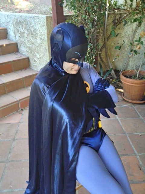
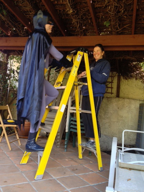
My good friend and cosplayer extraordinaire Scott Sebring, who has a replica wardrobe of the 1966 Batman and Robin costumes, and Sam McClellan, posed for me as Batman and Robin. This was a tremendous reference to have on hand, especially when trying to get all the nuances right on the cowl, cape, etc.
I first thumbnailed and did rough layouts of everything in the poses that I wanted and then invited Scott and Sam over and took pictures in my backyard.
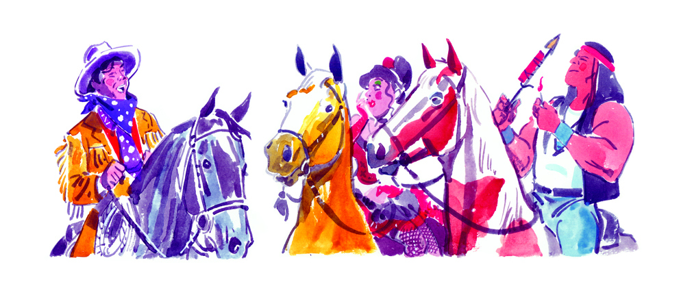
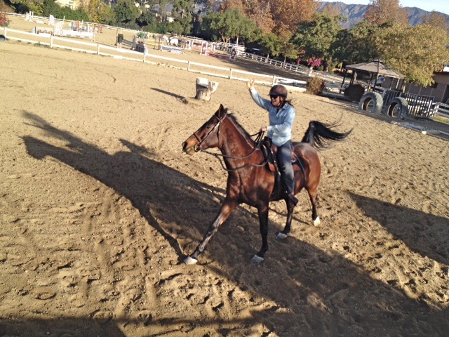
For the horses, since we own a horse and my wife rides, we had him pose in all the different poses in each panel where the horses appears, which especially made it easier to figure out those complicated angles.
Loxley (as in Robin Hood of Loxley) got to be Batman’s actual horse stand-in, and he also got to be Robin’s buckskin, Shame’s black horse, Millie’s palomino and Thunderhawk’s pinto.
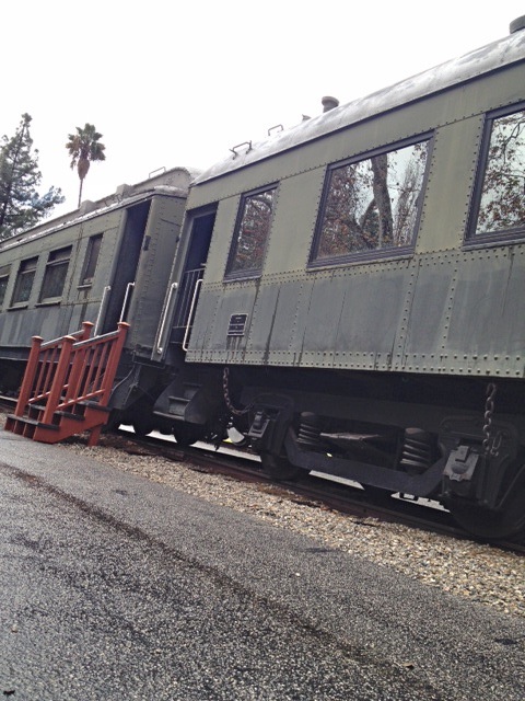
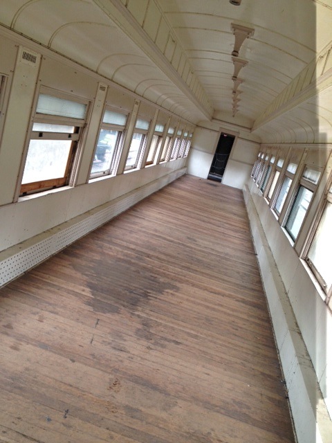
For the train sequences, I went to nearby Travel Town in Griffith Park here in Los Angeles, where they house many vintage locomotives and passenger train cars. This helped to get a good feel of what it’s like to be inside the train and how the locomotives worked inside and out, including how they hitch to each other.
Since I was using water colors I tried to make the most of the medium by looking at many reference photos of beautiful skies and sceneries, and from my experience in filmmaking I tried to use the colors to match the mood.
I used yellows and blues when it’s calmer and reds and purples when it’s more tense, such as the sky being red in the train sequence when Batman and Shame are about to duel with guns.
I also purposely left the brushstrokes visible especially around each panel border so it has that water color painting feel. I know that this process is a little out of the norm, although there are painted comics out there, so I hope the fans like this approach and feel it’s appropriate to the subject matter.
It was also great on the Shame story collaborating with Jim on what we could do in the digitally enhanced version, where I painted each layered version of the action separately. Jim has done this so much that he has a really good feel and comes up with a lot of great ideas, and my animation background also comes in handy in the action scenes where the characters swipe from one pose to another.
For more on Ruben and his Batwork, check out more awesomeness here.
—
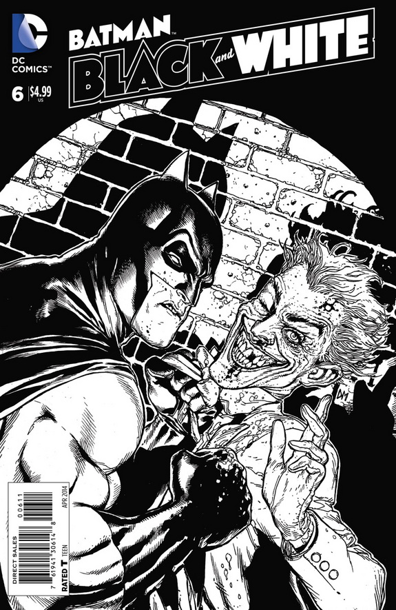
From the Batcomputer: I know I’m in the minority here, but I was never a big fan of the original Batman Black & White run. I can’t tell you why, really. It’s just not a concept that intrigued me all that much. Maybe it’s because I read them all in trade and it got very samey after awhile. On the other hand, the new mini run, which wraps this week with Issue #6, has been superb. I’d love to see it keep going if this level of consistency could be maintained.
There are a number of other Batbooks worth a look this week: You have the one-shot Joker’s Daughter #1 — and I swear I’m gonna write more about her one of these days; Detective Comics #28 and the “Gothtopia” storyline (as well as the Batwing #28 tie-in); DC Comics Presents Harley Quinn reprint collection; and, Forever Evil #5 and Forever Evil: Arkham War #5.
Hey, you! Leave a comment below!


![photo[1]](https://13thdimension.com/wp-content/uploads/2014/02/photo1-e1391519304316.jpg)
Trackbacks/Pingbacks